In part 1, we briefly explored the history of typographic emphasis and the development of cursive hands. In this piece, we’ll be taking another look at slanted Devanagari styles in an effort to reconsider how we use them today, along with some other potential ideas of creating emphasis in Devanagari text:
1. Reconsider how we use slanted Devanagari
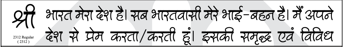
There is a kind of built in idea in text editors that assumes all writing systems use italics for emphasis. This can be seen in the way modern typesetting software allows one to slant letters using the 'italics' button on text editors. Slanted Devanagari, however, existed long before digital fonts.
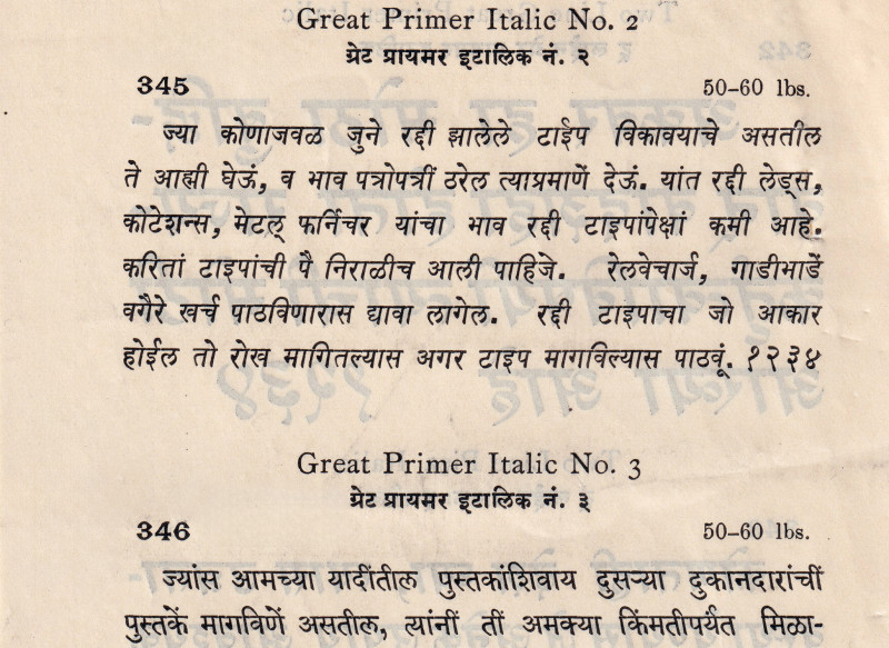
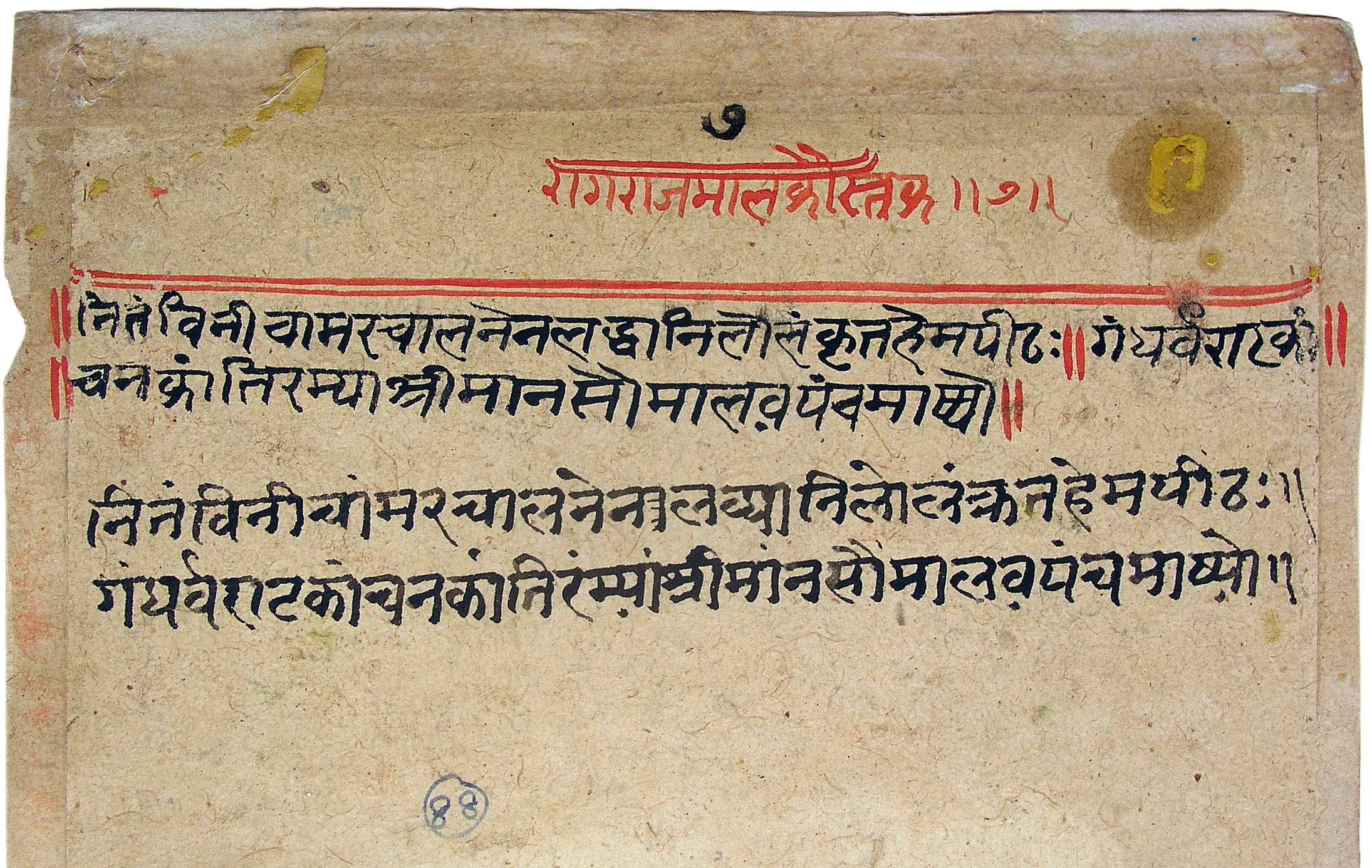
A 1957 letter from the secretary of the typographical committee at Monotype requested the Type Drawing Office to provide a report on cutting Devangari italics –
“I attach two specimen pages showing italic Hindi produced by the Gujarati Type Foundry of Bombay.
Mr. Radmore has asked whether it would be possible for us to cut an italic Devanagari to satisfy various enquiries received from our customers in India who state that with the increasing use of Devanagari they find it necessary to have a type face which can be mixed with our existing face in order to emphasise certain expressions in Hindi.”
Produced as a rough trial by a member of the staff of Monotype’s Bombay office (identified only as Mr Woodley), this may be the earliest example of an attempt – though unsuccessful – at designing a ‘secondary style’ for Devanagari in the age of hot metal.
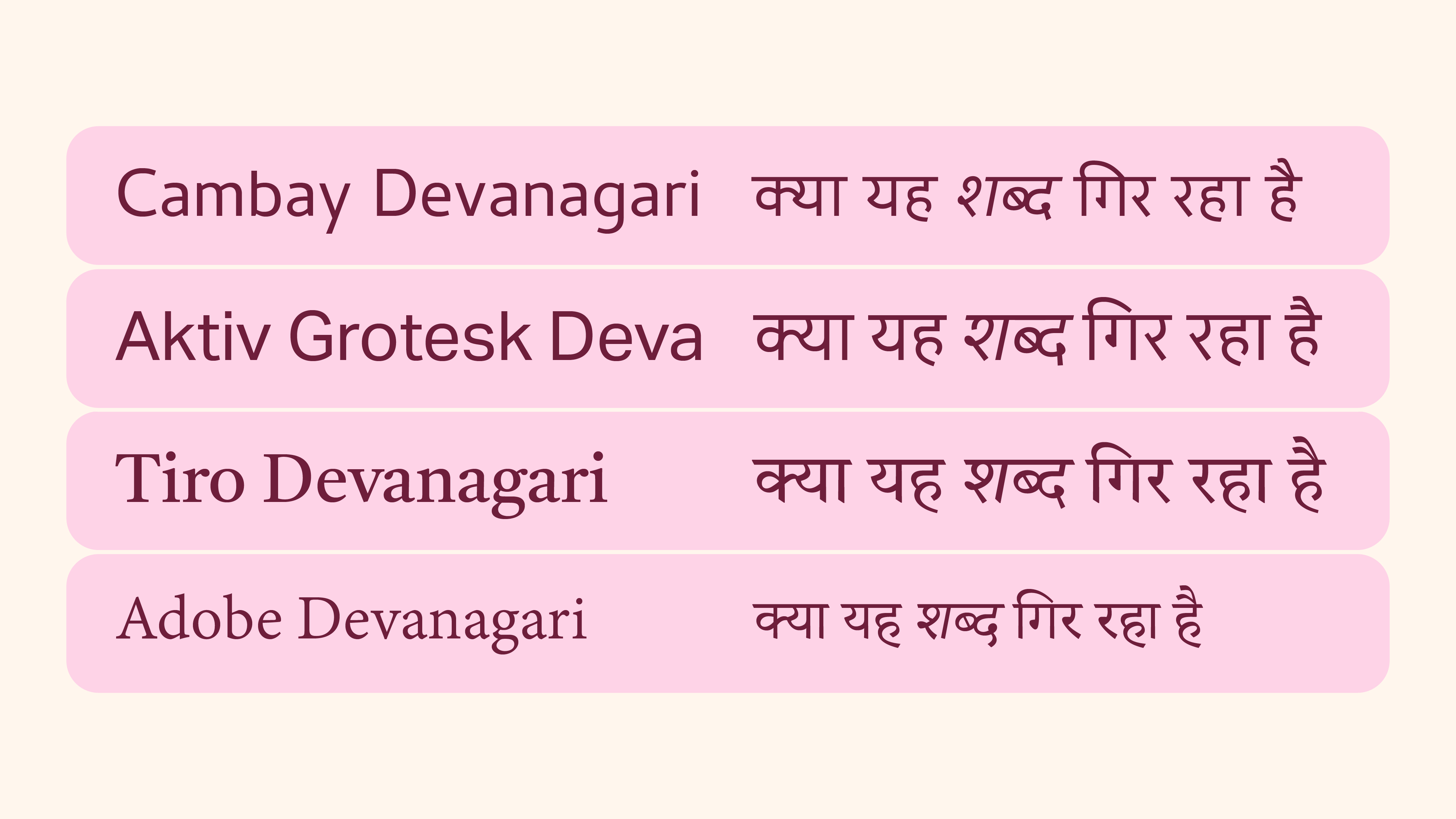
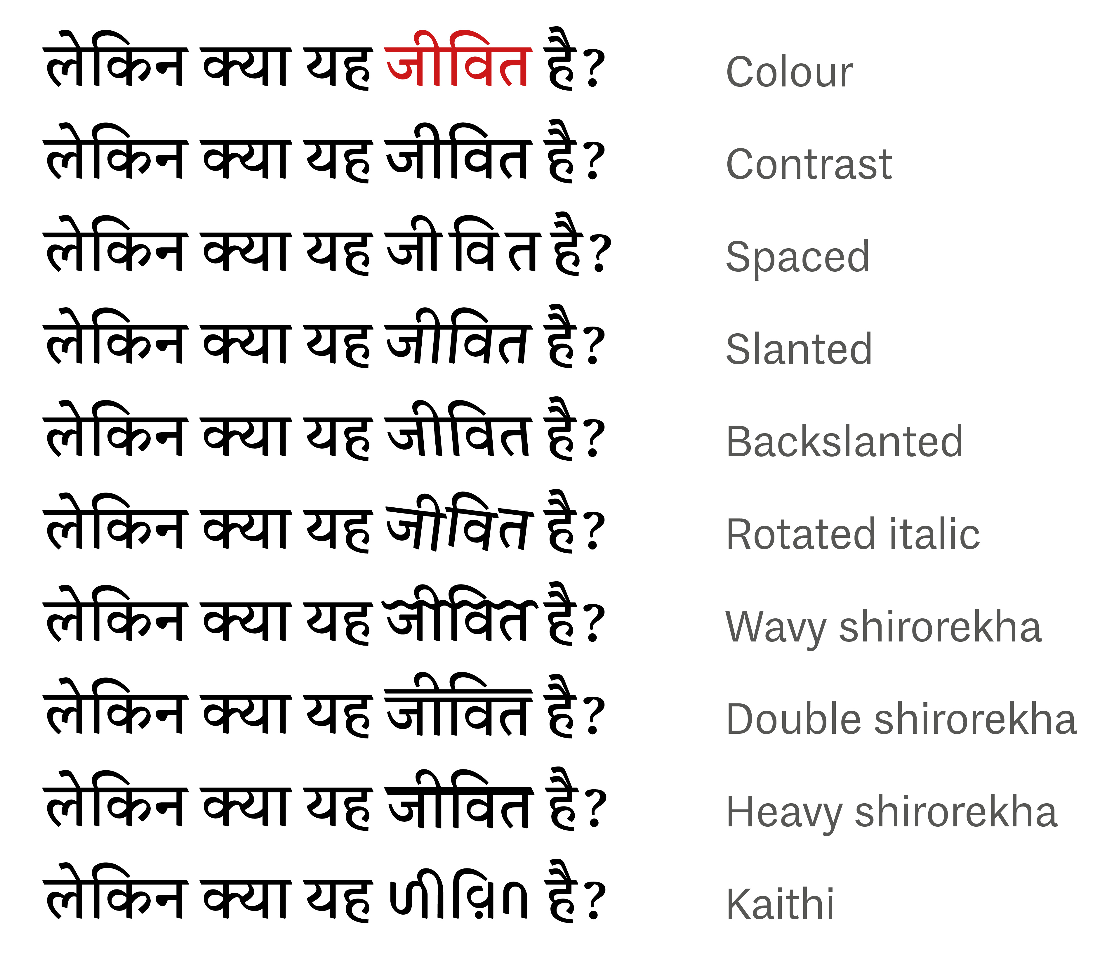
A right-leaning slanted Devanagari is received well in text, with Latin’s italic precedence lending itself to readers’ habits. Even so, these slanted versions provide a great opportunity to intervene and question if the slant should be left-leaning or right-leaning.
This is not a novel question; Indian typefounders offered italics that leant both ways as common practice.
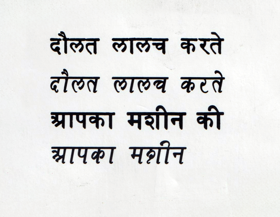
The above is a great side-by-side comparison of two slanted versions at the same size. Some letterforms actually work better in the backward slant, such as इ, द, क, ज, ट.
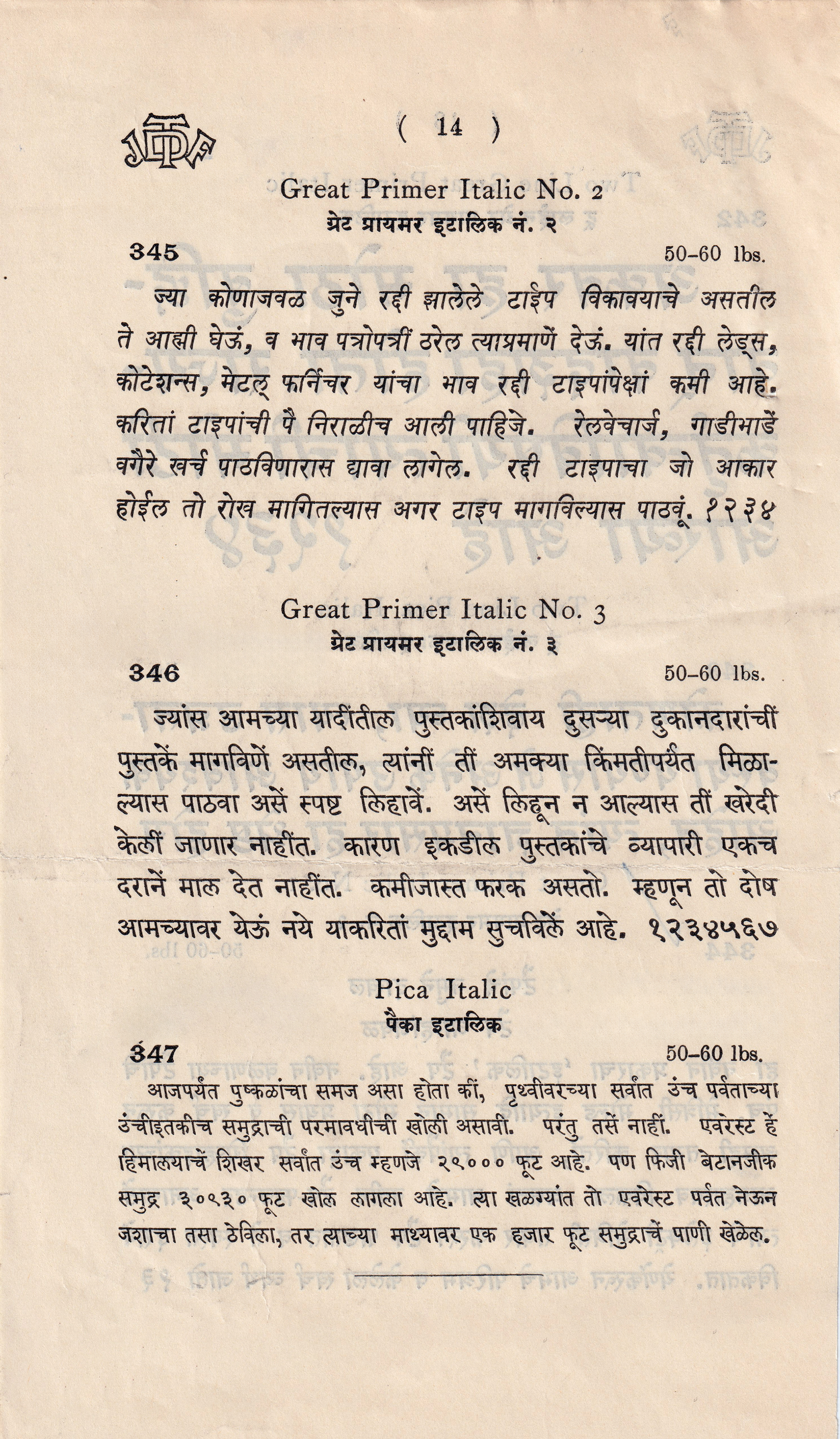
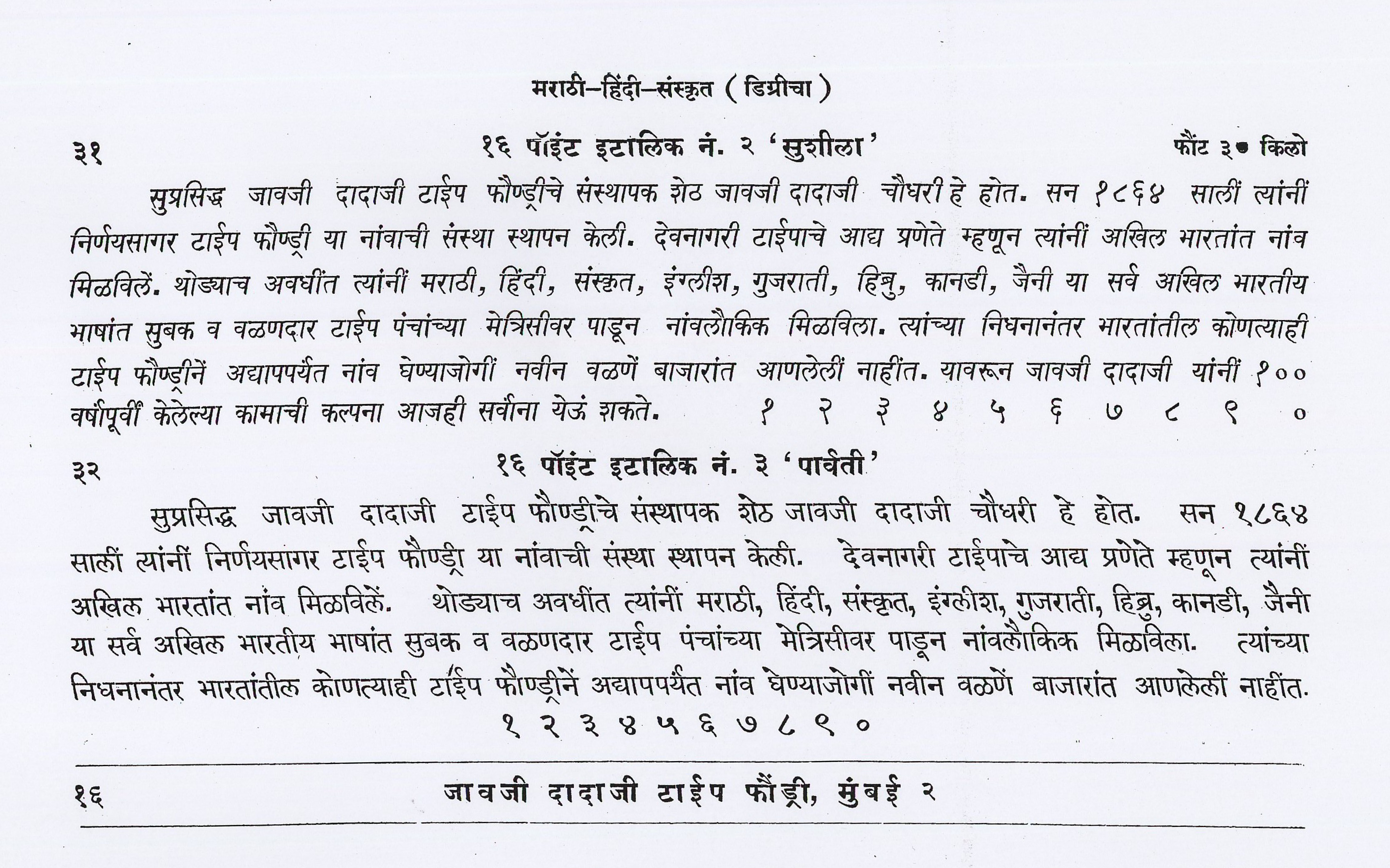
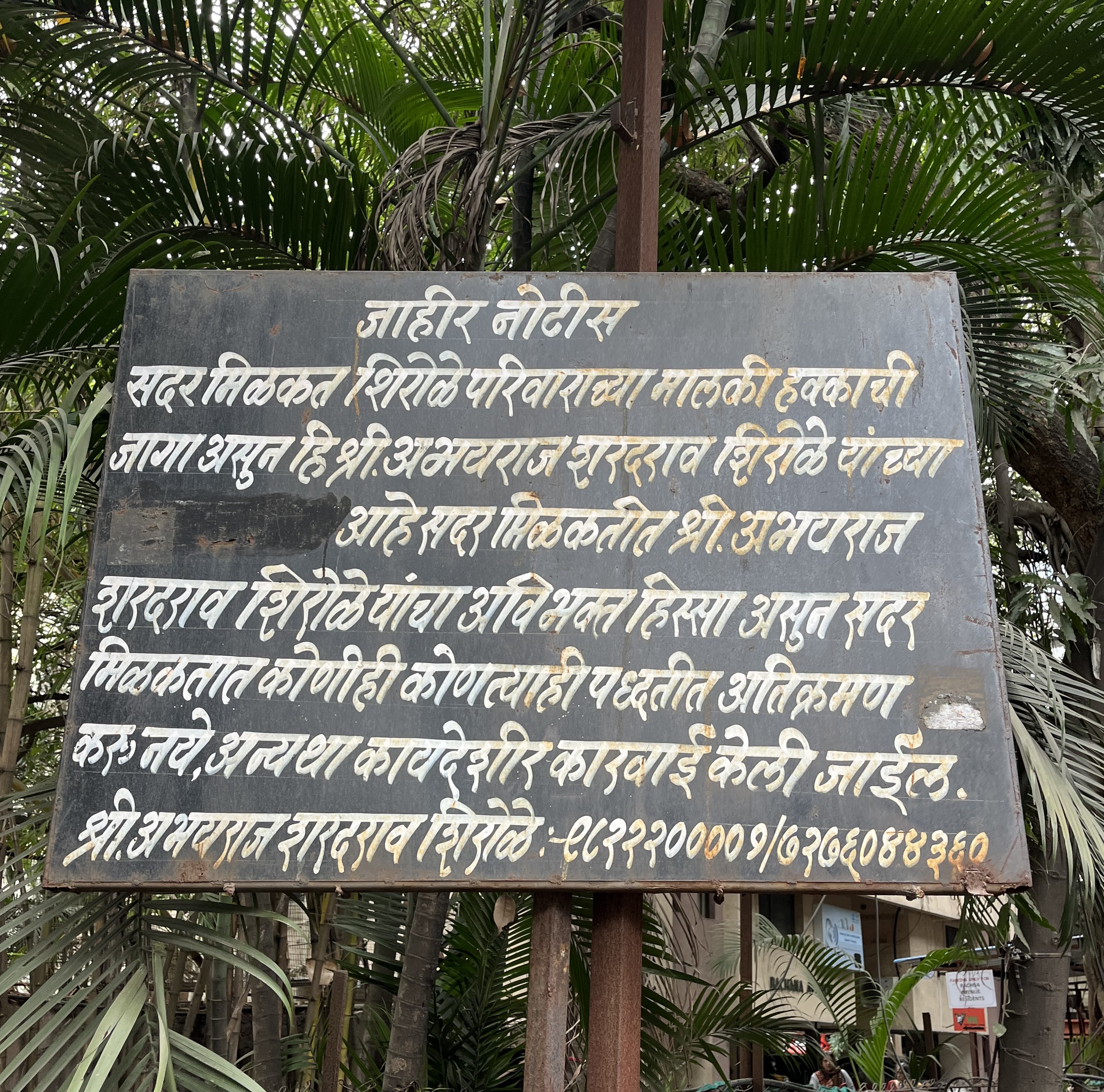
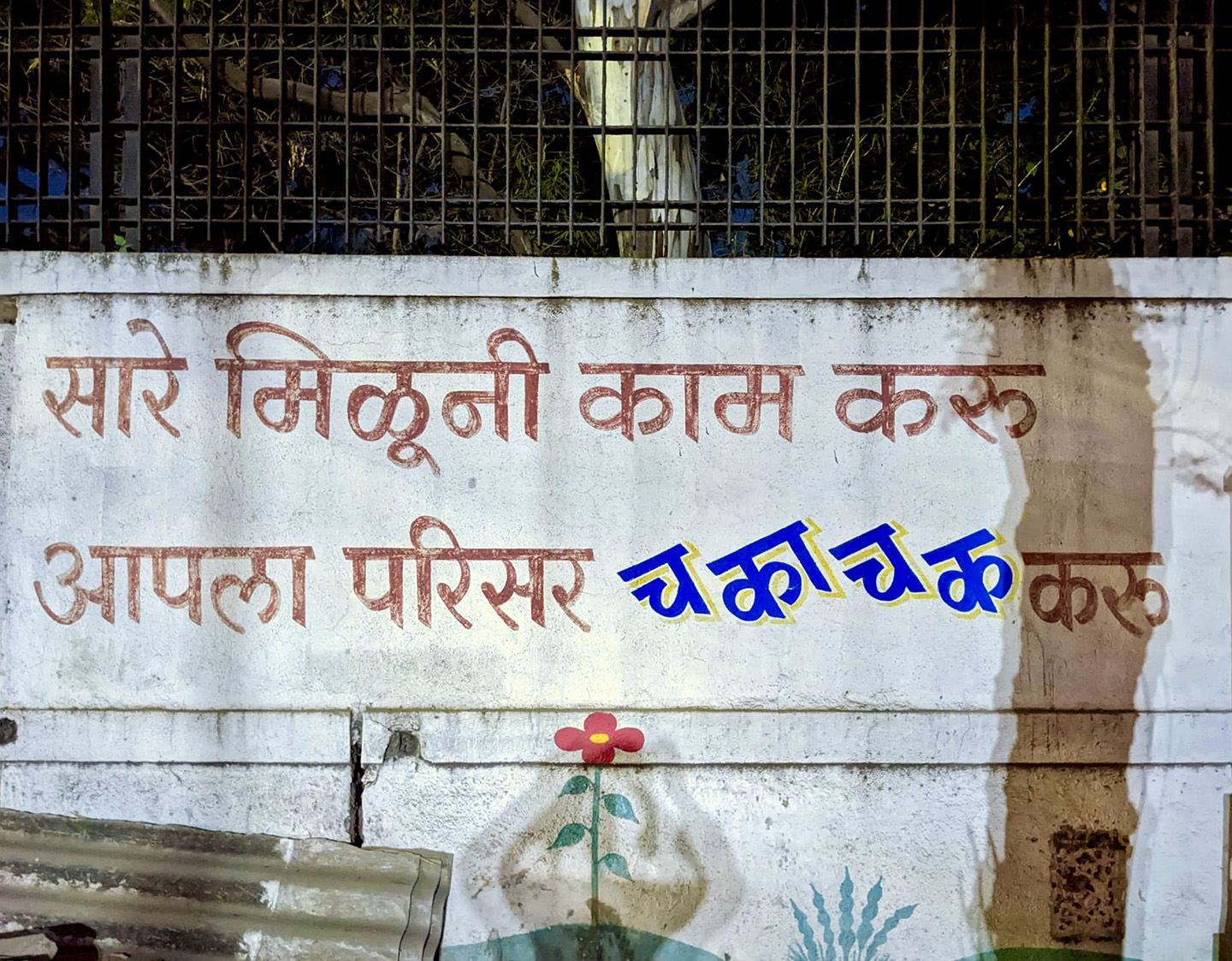
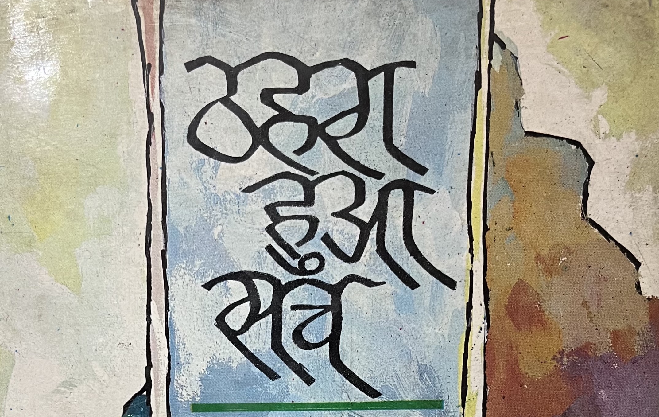
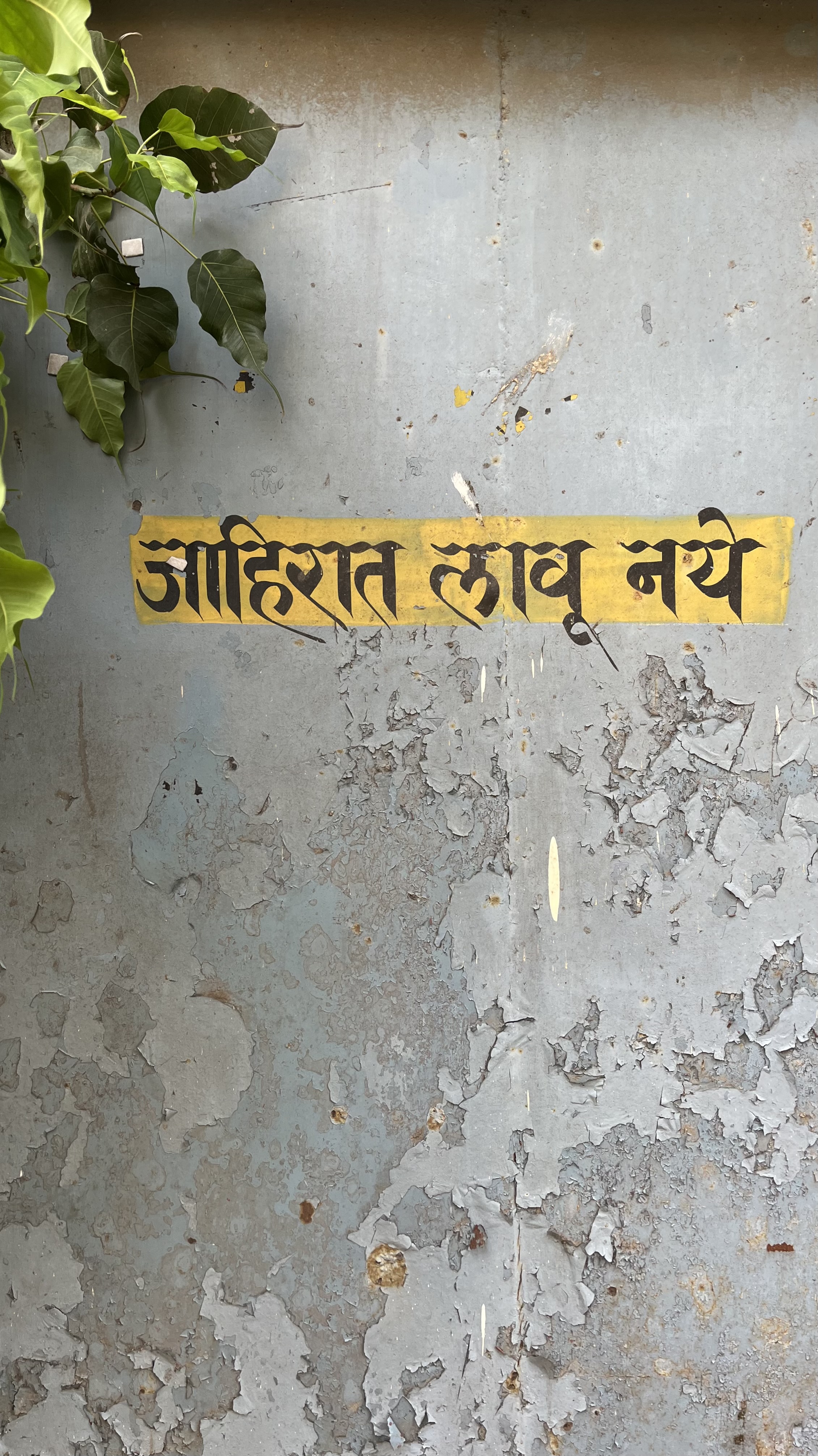
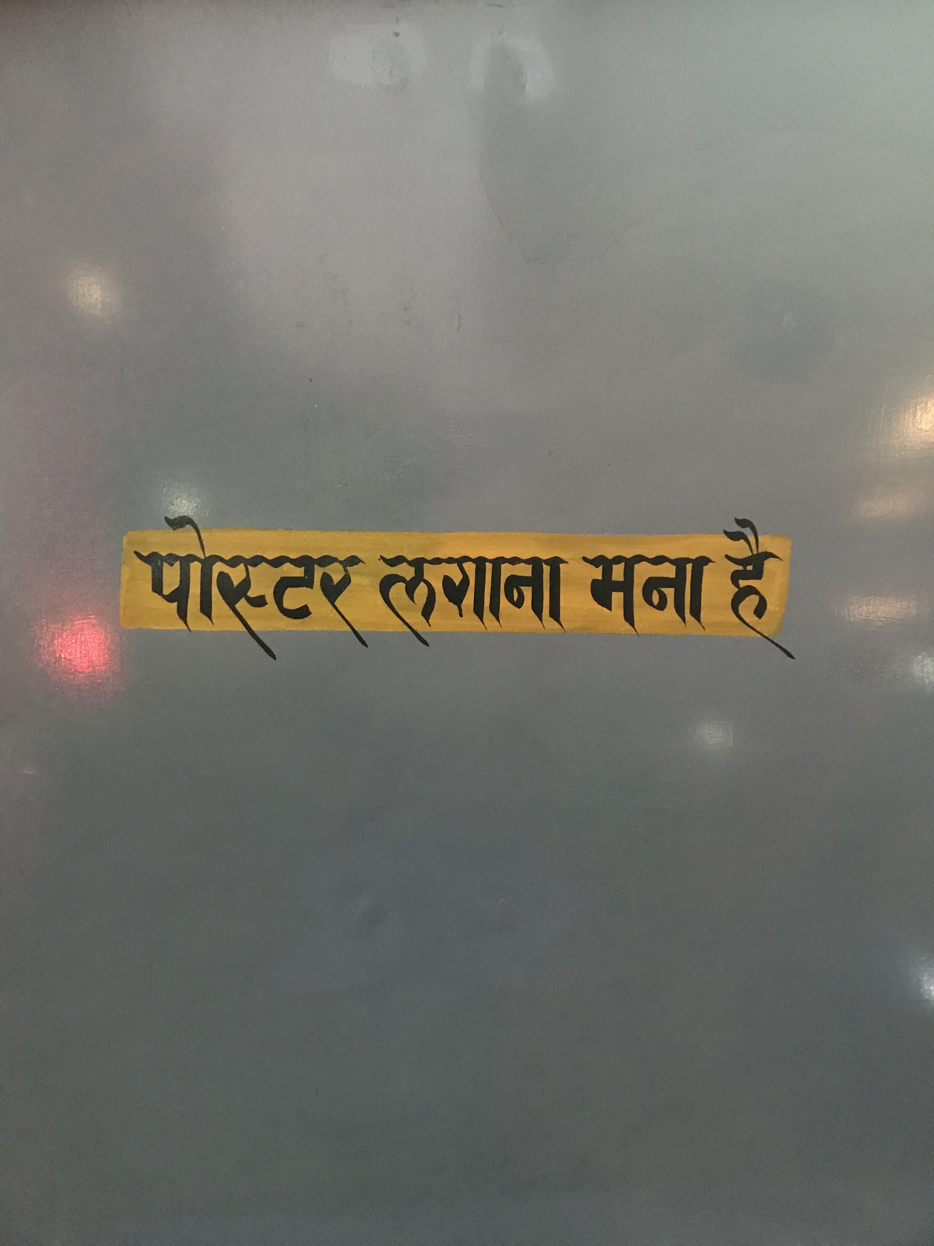
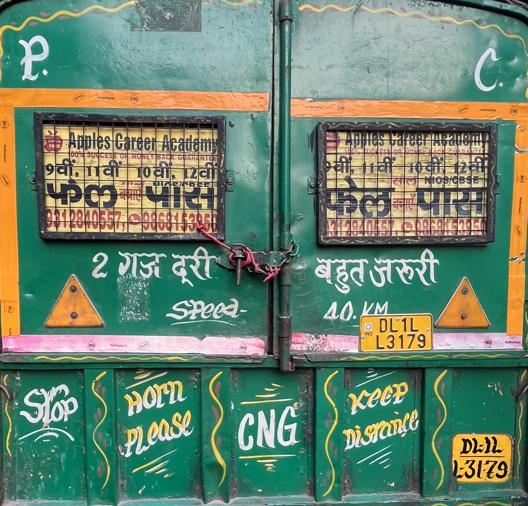
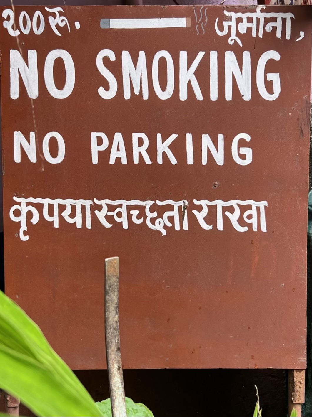
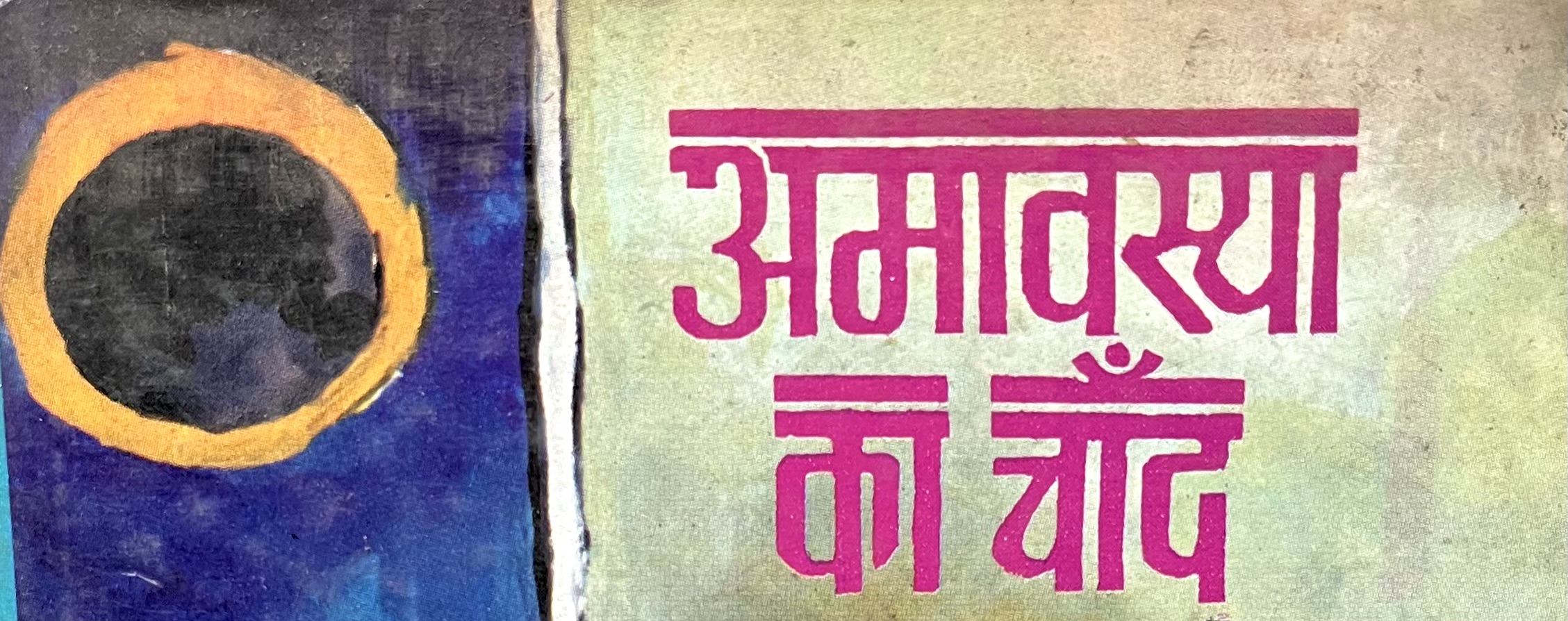
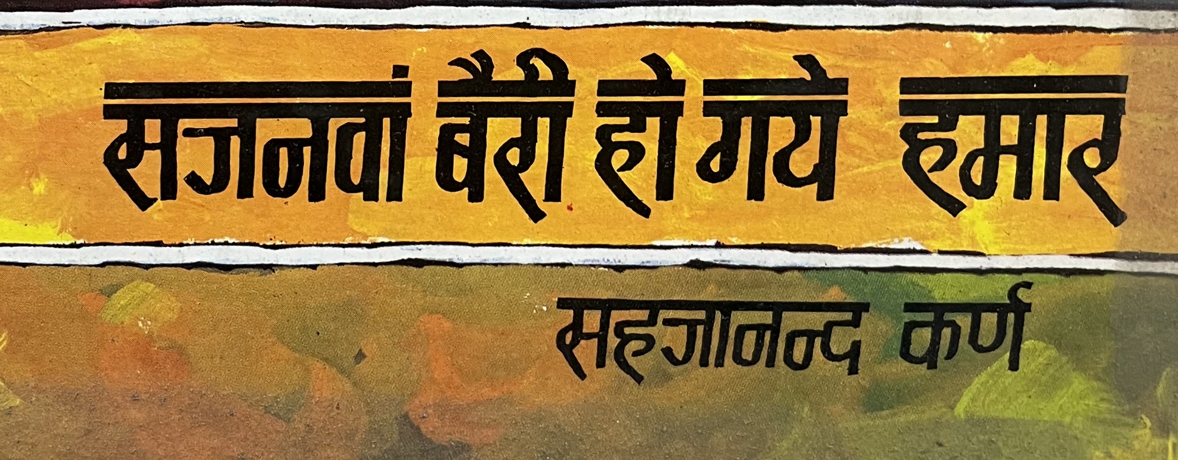
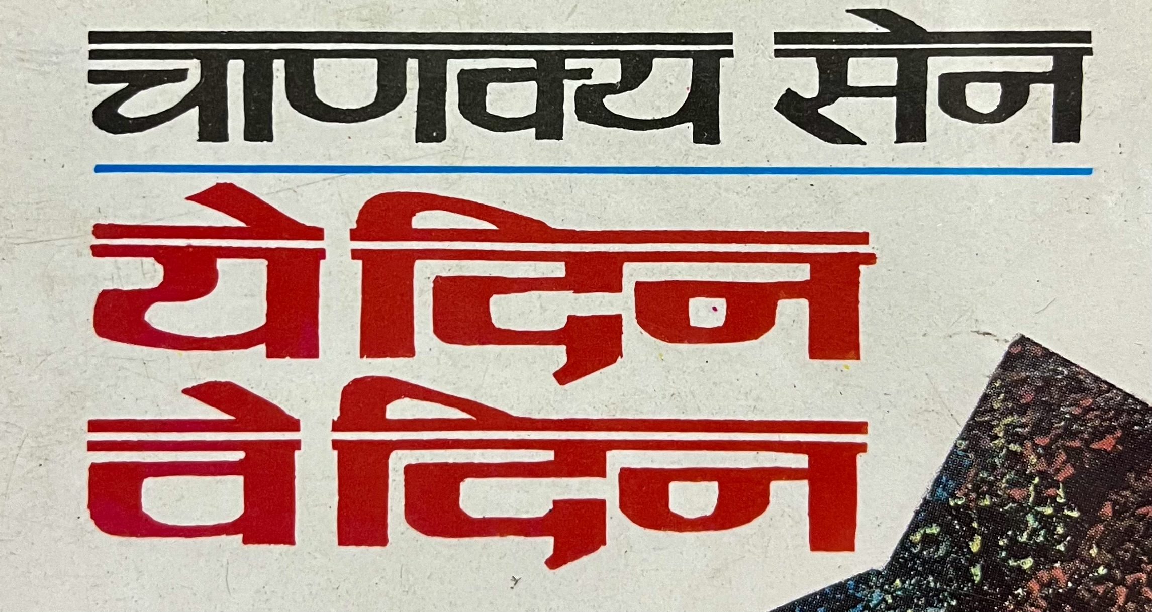
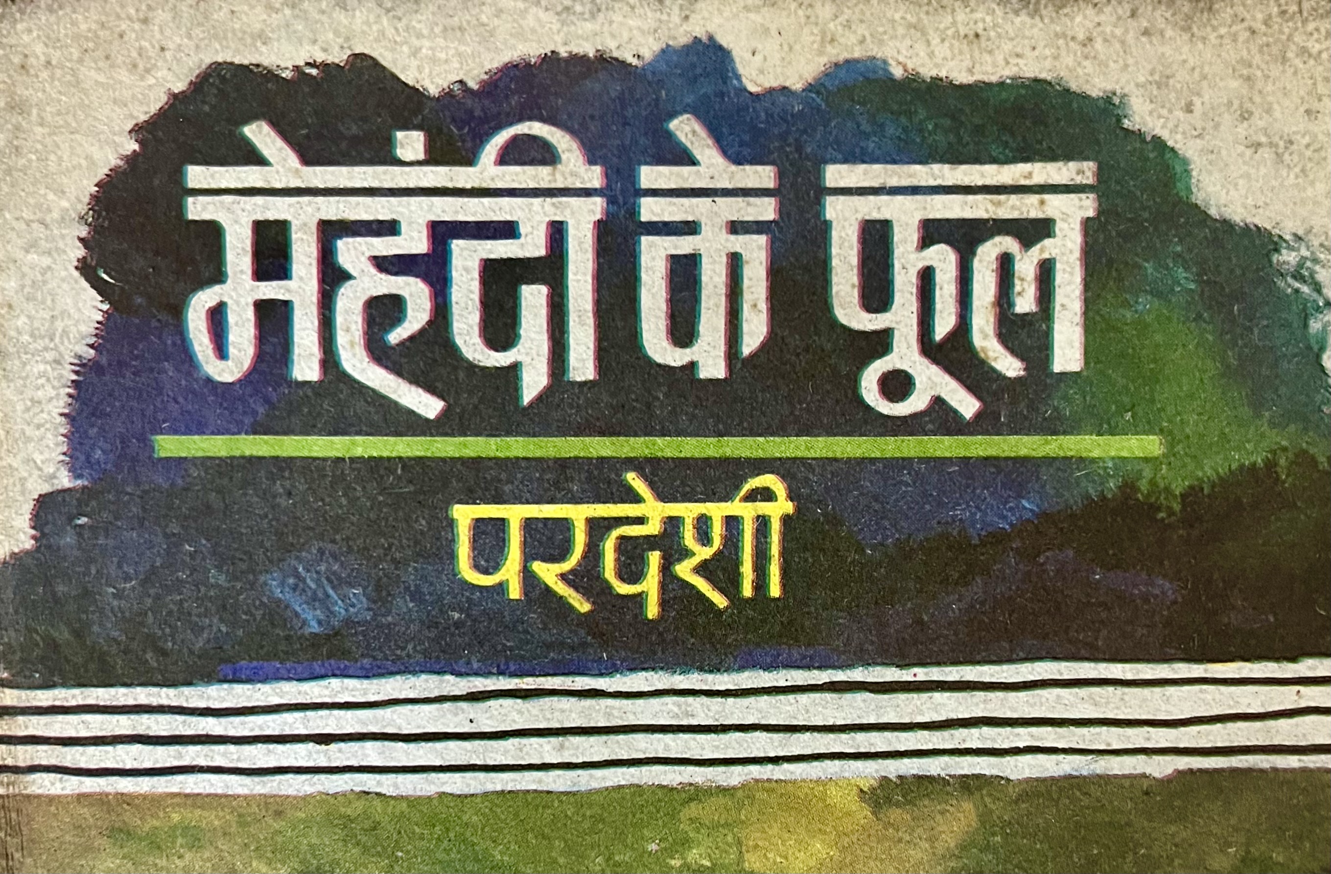
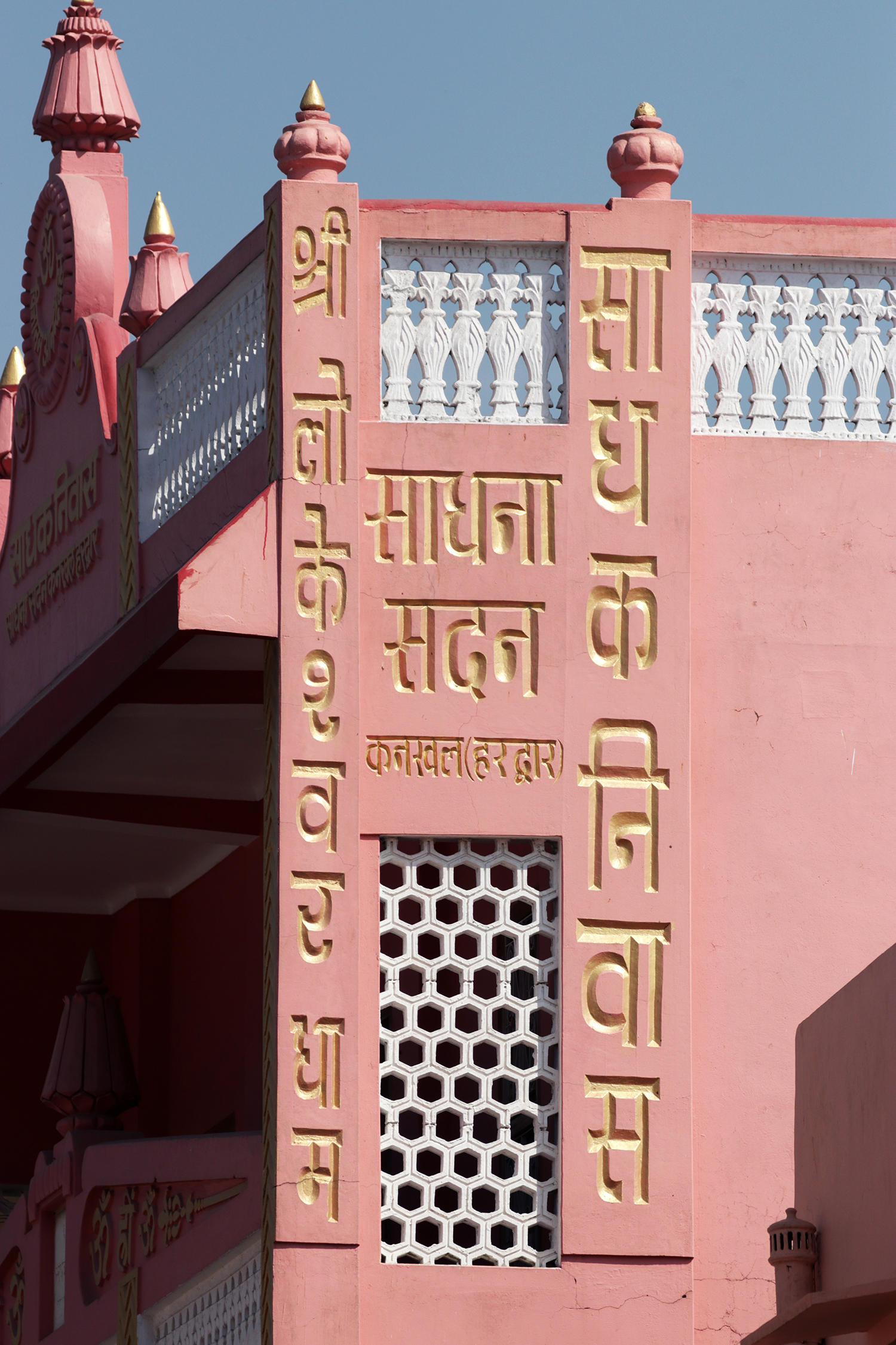
And hot metal type is not the only place you can find slanted Devanagari, it is also used extensively in street signs, book covers, magazines and more.
2. Adopt rotated Italics
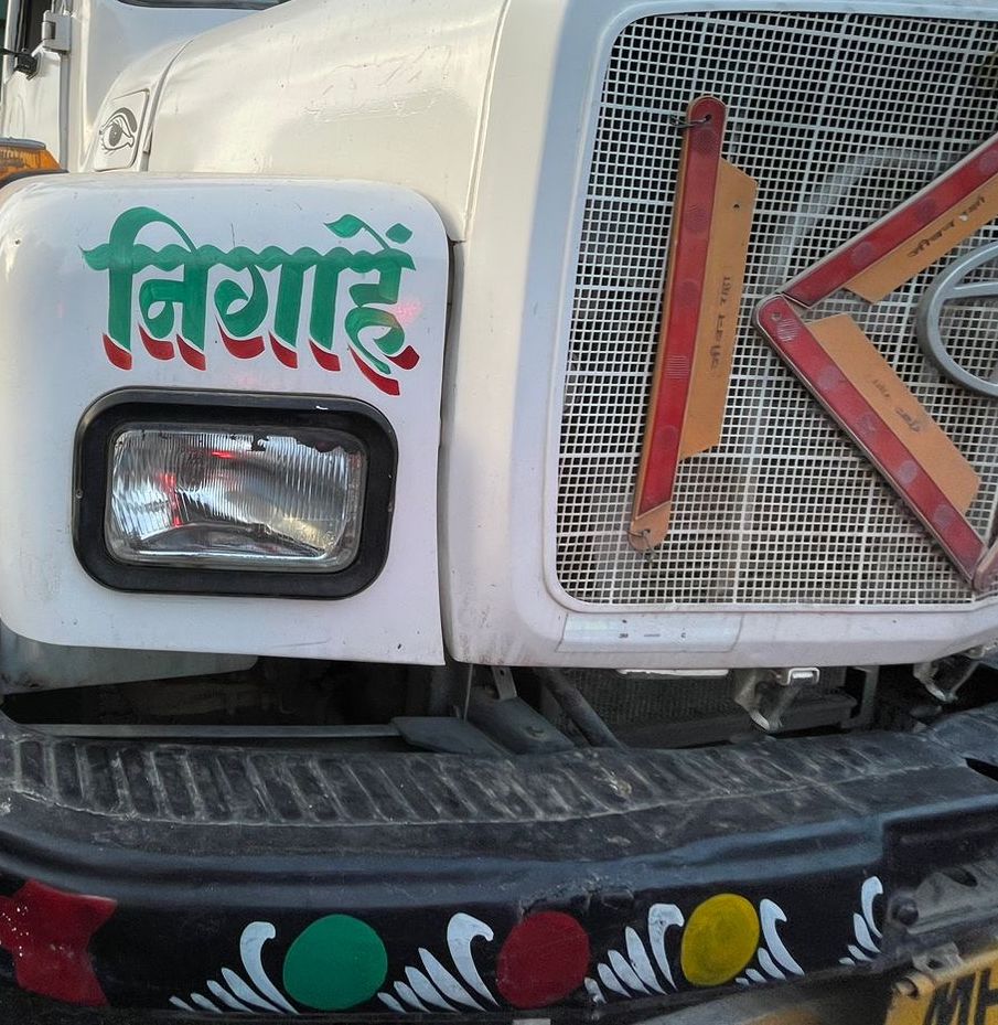
While slanted styles do a sufficient job at breaking the rhythm of text and demanding attention, a broken shirorekha along a rotated angle works impressively well, especially at big sizes. Note how the angle chosen by a computer/printer leans towards the right, whereas the sign painter chose the left.
3. Explore the use of shirorekha variants
An important feature of Devanagari, the shirorekha directs the eye from letter to letter and combines a group of letters to form a word. Sign painters, magazine covers, book titles and decorative stickers all create hierarchies using various methods, and I think explorations with the shirorekha could result in exceptional outcomes in the matter of emphasis.
Shown below are some examples ofcalligraphic scalloping shirorekha, visually reminiscent of handwritten Bengali.
Wavy shirorekha, usually found in brush painted signs, also make for a great display variant.
Heavy shirorekha - which are an efficient and simple way to direct the eyes and create emphasis.
Double shirorekha – a personal fav, which offers a mix between a bold and underline which works well at both sizes.
Broken Shirorekha or spaced letters - help create hierarchy in text, and also work to typeset words vertically.
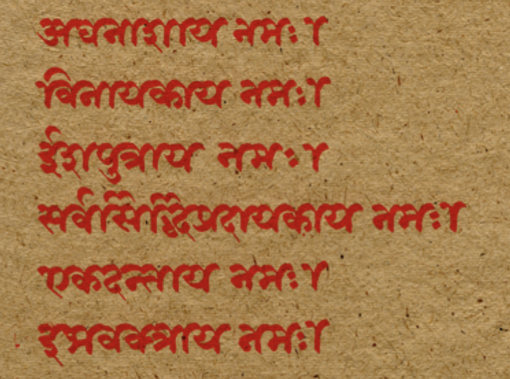
4. Revive Kaithi as a cursive form of Devanagari
Kaithi is a cursive script that has historically been used for emphasis – and there are many accounts that support this, especially in documentation dating back to the British Raj.
Although it’s convenient to talk of Kaithi as ‘derived’ from Devanagari, this is not accurate. The two alphabets arose simultaneously, one adopted from older inscriptions as a running hand (Kaithi), and the other as a more ornate style of hand-writing (Devanagari). The relationship between the two is more appropriately described as a parallel development, rather than a linear descent.
George Abraham Grierson, in his Linguistic Survey of India, noted that: based on the same origin as Devanagari, and closely resembling the ordinary, Kaithi is employed all over India. In Specimens of Bihari and Oriya Languages (Linguistic Survey of India, Vol 5, Part 2) he states: “While not so complete as the Devanagari, for some of the rarer letters are altogether wanting, it bears to that alphabet much the same relation that the English current written hand does to the printed character.”
Hornle’s A Grammar of the Eastern Hindi (London, 1880) notes that Kaithi is the most widely spread of the four principal types of alphabet: Kaithi, Bengali, Odia and Gurumukhi. It also notes that Kaithi is often considered a corruption or cursive - परिवरतिता रुपा (parivartita rupa) or घसीटा शैली (ghasita shaili) form of Devanagari.
“Devanagari is the type adopted for printing in Hindi and Marathi and exclusively taught in schools, it will probably in the course of time entirely supersede the Kaithi; perhaps not altogether an advantage, as it can be written with less rapidity and ease than its rival.” - Hornle, 1880
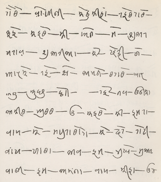
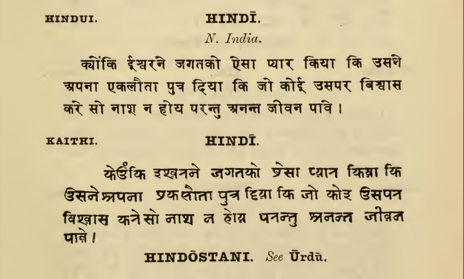
Historical evidence of widespread usage and ease of writing aside, I found it remarkably easy to read the Kaithi when typeset in Hindi. Handwriting samples from the Handbook of Kayithi were also surprisingly easy to read, even though I do not speak Bhojpuri or any of the languages featured. Try reading the sample above!
As script usage evolves with rapid technological developments, looking into alternate ways to emphasise outside of slanting for different contexts might be an exciting way to form usage behaviour. Devanagari, along with other Indic script letterforms have long gone through a fair amount of breaking and reshaping to fit into printing processes that weren’t built to handle complex scripts. But what of readers, you ask? How will they respond or adopt such explorations? The readers of these scripts are intelligent, and formidable, and have adapted to reading broken letterforms, vowel marks flying across the length of the shirorekha and more. It would be a disfavour to not take into account their adeptness and hanker to read.
Bringing more expressions of tone from our immediate environment, and scripts that were pushed out back onto the typeset page are suggestions from one person. And the team at UT and I look forward to hearing from you and starting a dialogue after years of mulling this over on my own.