
As a novice designer, I asked myself a lot of questions when I was experimenting with letterforms for a handwriting font: could Devangari handwriting forms be considered a starting point for an italic? Is there a cursive form of Devanagari? Why is the standard ‘italic’ Devanagari a slanted one? Are there other ways of creating emphasis, outside of the influence of Latin type, and can we adopt them in text?
Indic type design sits at a pivotal time. We have the means to look at what formed our current typographic practices, and the unique opportunity to set the tone of how they develop. This piece is an effort to investigate what we have, and I share it in the hope that others will find it as fascinating as I have.
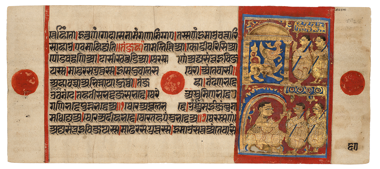
The printed word is one way of communicating the spoken; and one way to express the more idiosyncratic parts of speech such as volume, expression and gesture is to give prominence to a set of words on the page. Ancient Jain scriptures would commonly do this by using colour – usually red ink to emphasise parts of a text of black ink.
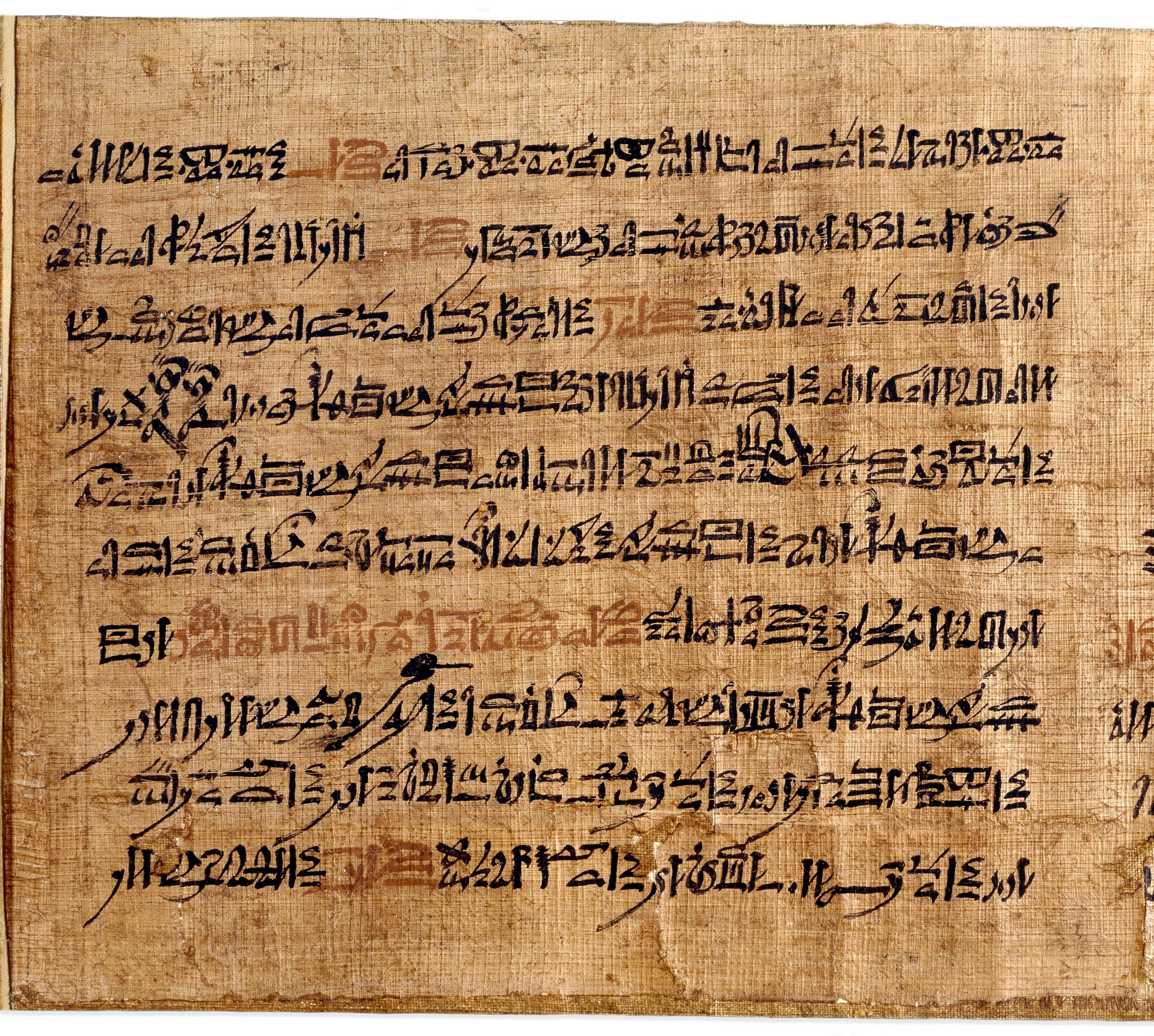
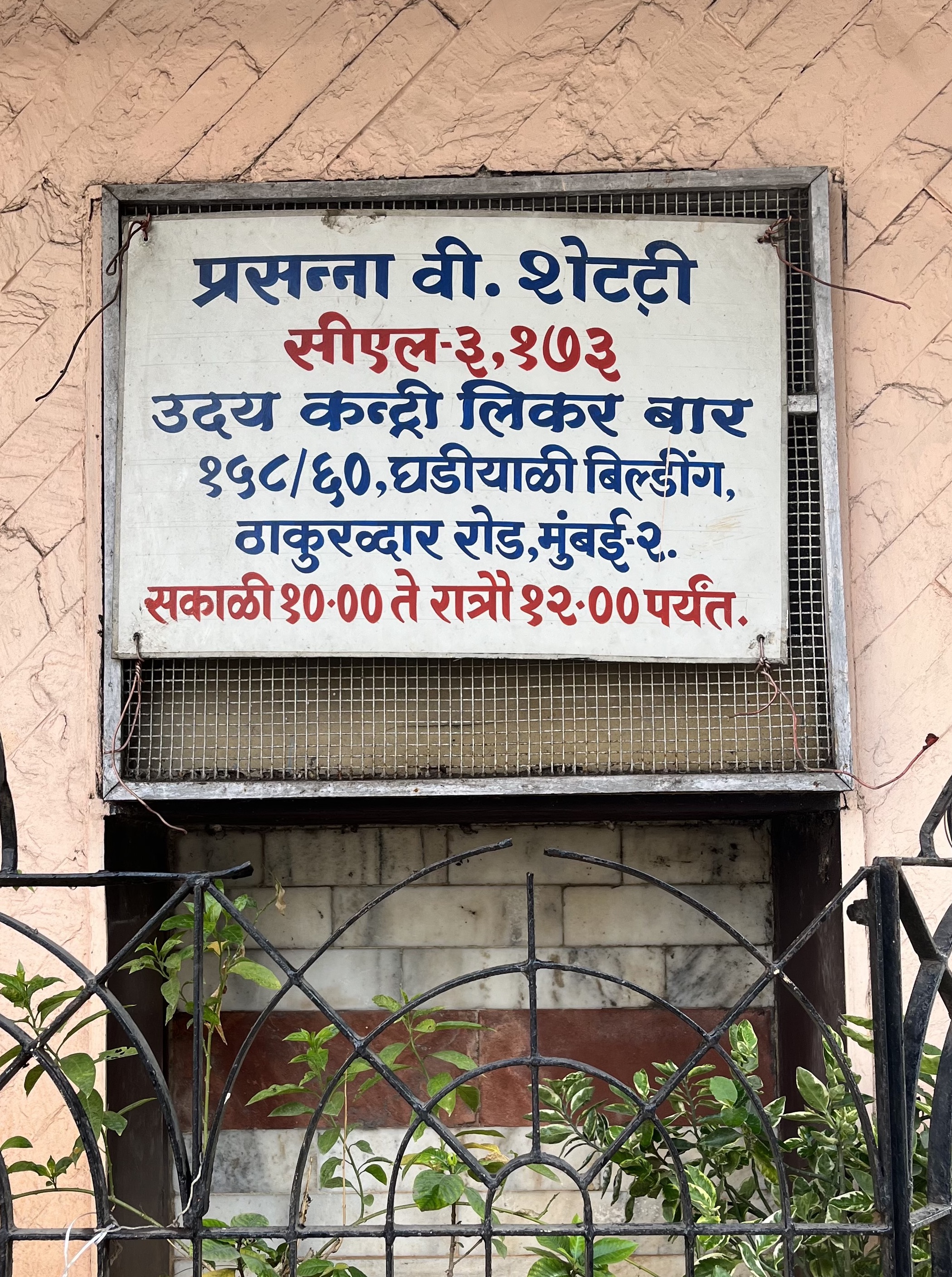
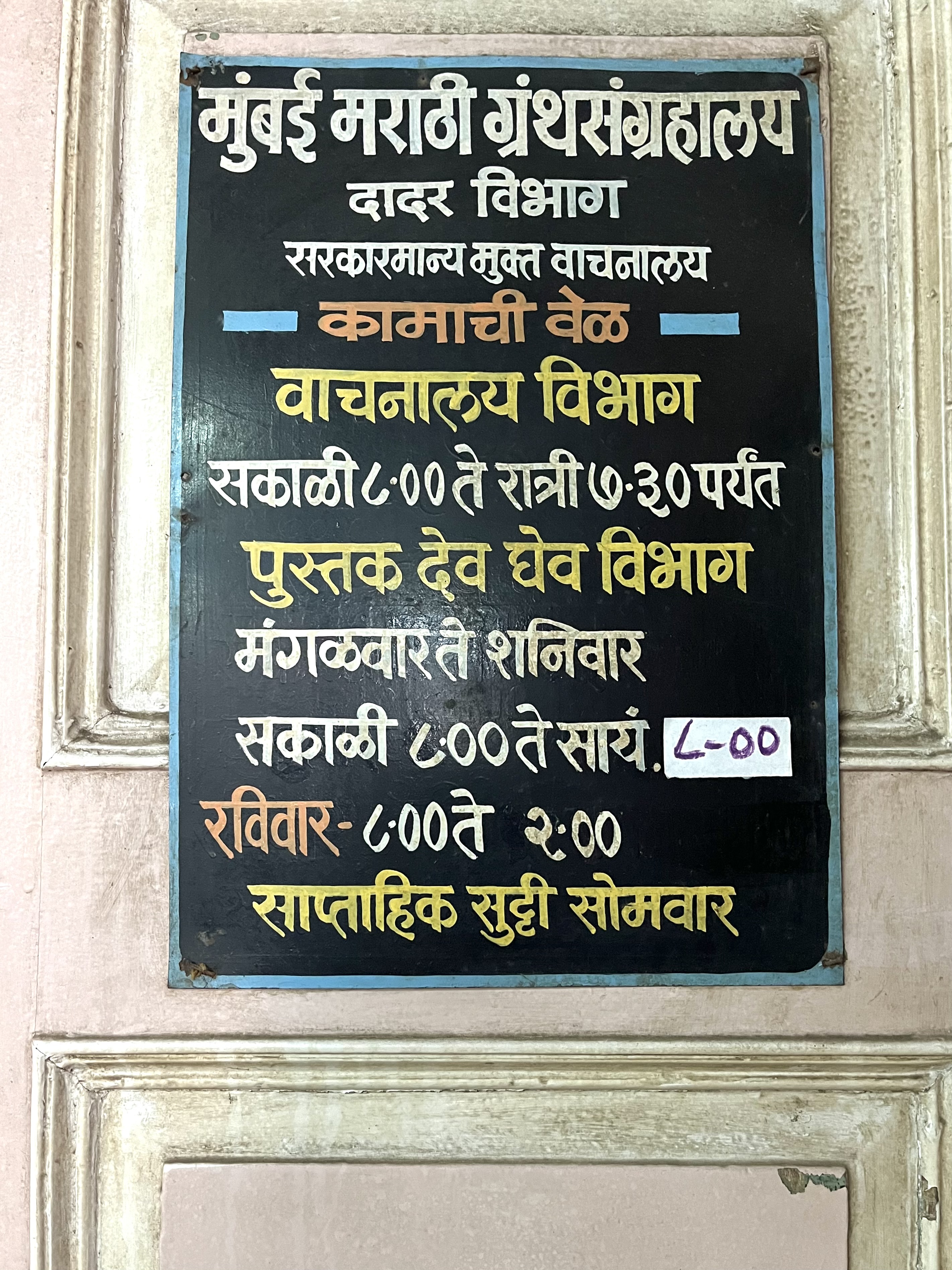
Ancient Egyptians used red ink in a similar fashion, and today, the use of colour as emphasis in hand-painted street signs persists.

But while the advent of moveable type allowed for coloured inks, the making of books for the most part has been in single colour. As a result, a valuable way of determining emphasis in text had been lost.
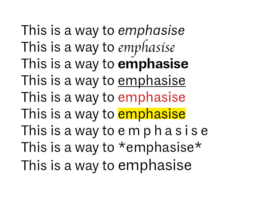
Modern day digital typesetting does allow type setters freedoms that weren’t easily attainable in the early days of printing. For example, here are some quick ways to provide emphasis and distinctiveness in a modern, digital text editor:
To understand how emphasis works, we need to look at the evolution of various cursive hands, which has undergone a very long period of development. In cursive handwriting models, writing efficiency plays a major role; there are two ways to make a cursive form so that a script can be easily written on pen and paper.
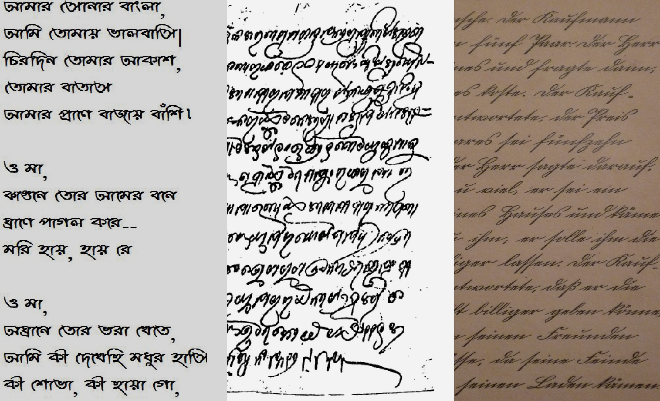
The first method would be to preserve the framework of the letters and alter the shape so that it can be written without lifting the pen from paper, eg: Bengali cursive, Karani (Odia cursive) and Kurrentschrift (a German language-based cursive).
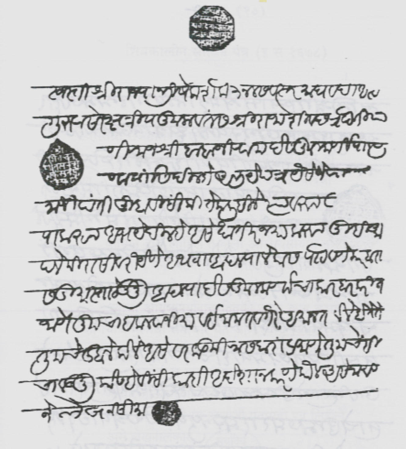
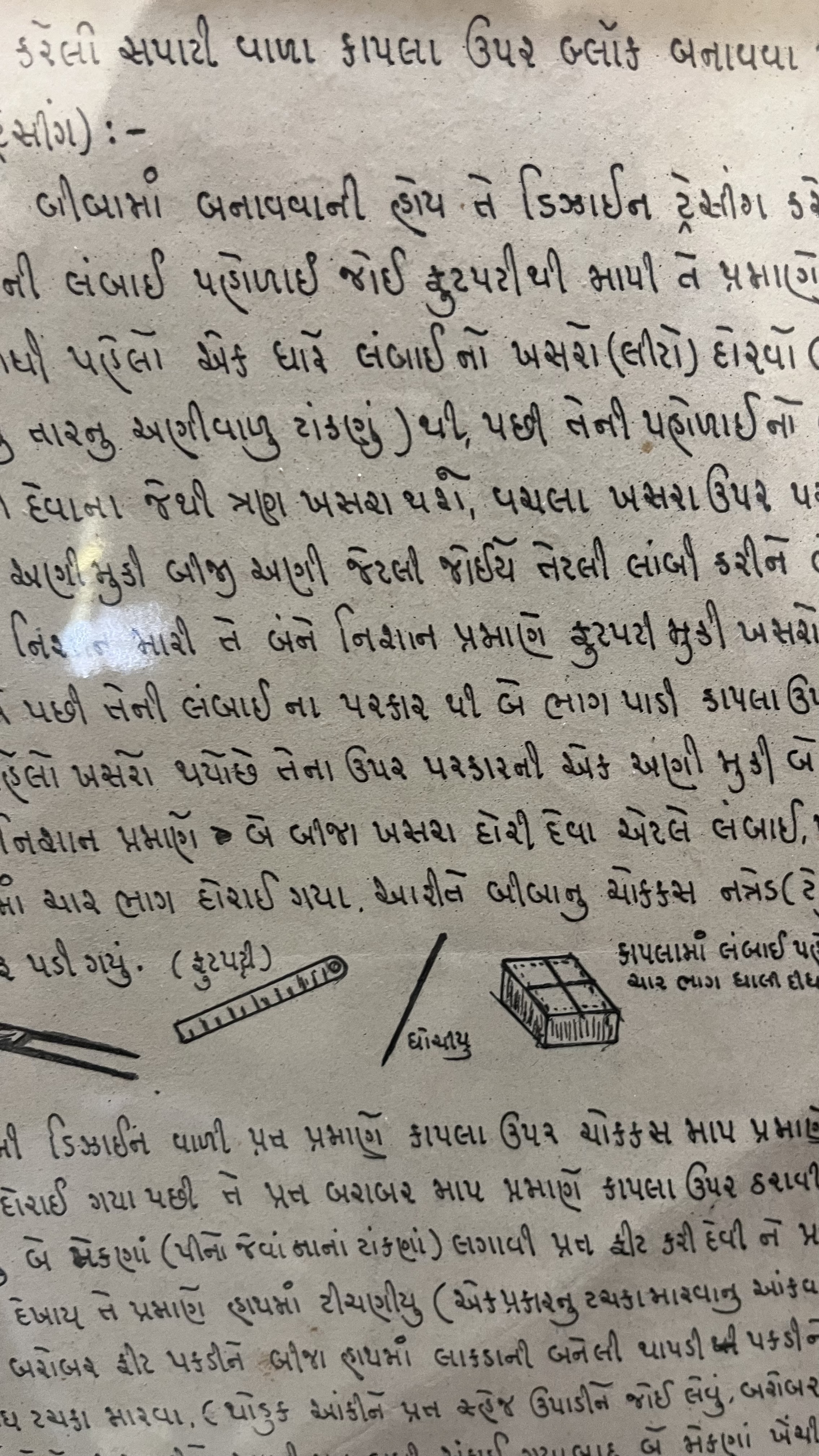
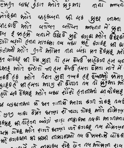
The second method would be to discard the repeating horizontal and vertical strokes, leaving the essential part of the letterform so it can be written as a single stroke, eg: Modi, Gujarati, Kaithi.
Aldus Manutius, hailed as the pioneer of italics for the Latin script, produced them as a way of creating text that echoed humanist manuscripts, but it wasn’t until much later that italics were used for the purpose of emphasis. Robert Estienne’s dictionaries show one of the first uses of italics in the 1540s.
By the sixteenth century, italics as a secondary variant were commonly used for distinction in text, if not emphasis, such as for foreign words or phrases.
There are other examples of secondary styles across history, for example Blackletter being used in the same way bold types would later be used.
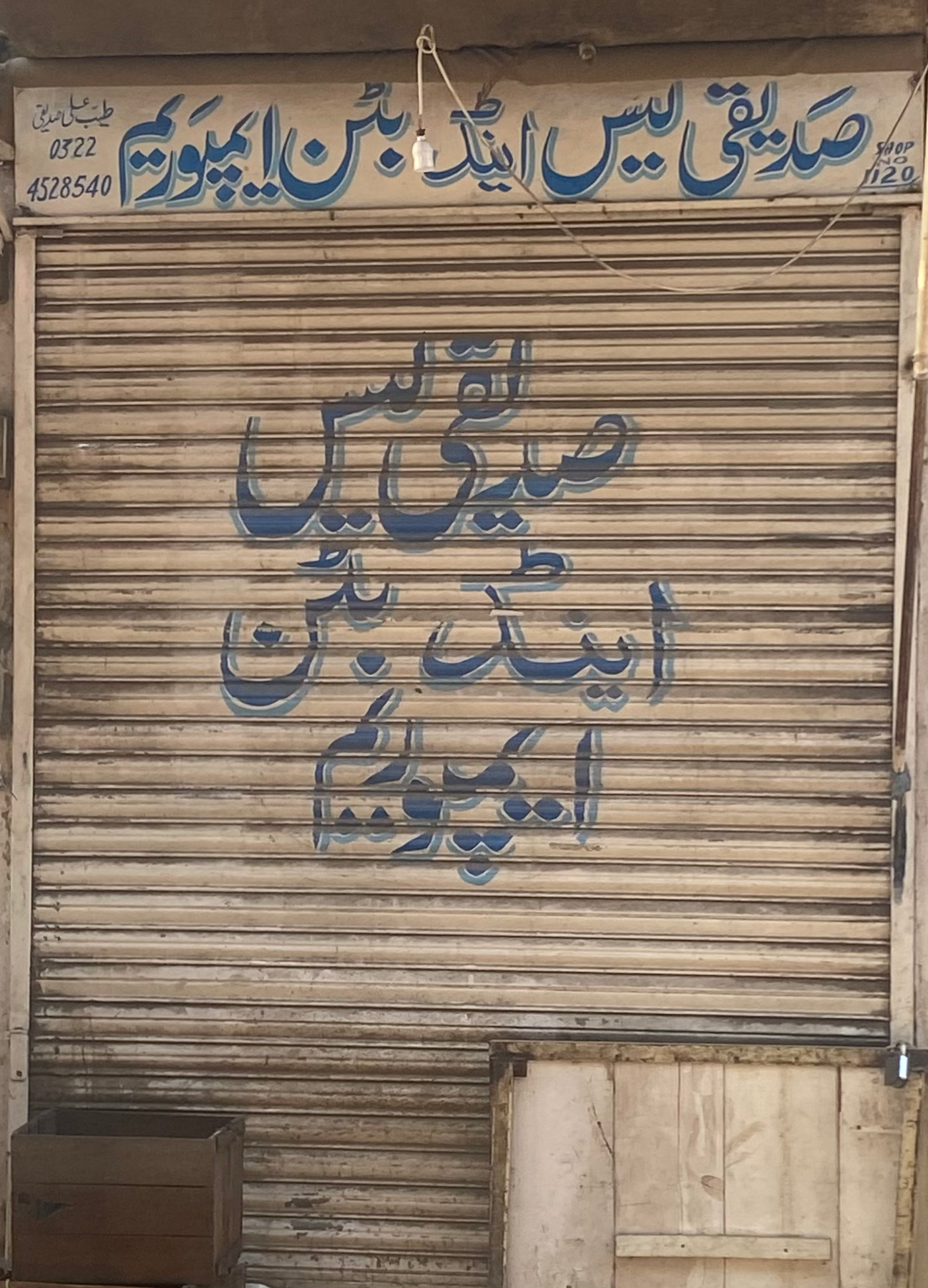
In Pakistan, the use of Naskh amongst Nastaliq – as a way to emphasise transliterated text – is common in hand-painted signs. Outside of that, naskh is usually used for distinction as a way to create hierarchy.
In part two I’ll be discussing the different methods that could be used to create emphasis in Devanagari, including reviving a script, using rotated italics and shirorekha variants.