India has 66 different scripts written across the country. But this project is not about them. In 2013, I was a student of Graphic Design at the National Institute of Design in Ahmedabad.
While studying I met Banwang Losu, a teacher from the northeastern Indian state of Arunachal Pradesh who explained that he belongs to the Wancho tribe, which has never had any written script. All the literature in the Wancho language has been either spoken or transliterated into English. But there are some inexcusable failures that happen when important sounds from the Wancho phonetic system are transliterated in this way. Banwang had designed a script for his language, which I decided to take up as my final semester project.
Introduction to Wancho
THE TRIBE
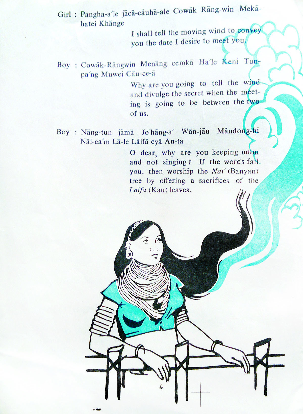
The Wancho are an Indigenous people inhabiting the Patkai hills of Longding district in Arunachal Pradesh. I didn’t know much about them, and the internet had very surface level information on the tribe – which consists of less than a hundred thousand people. But I did find some interesting facts. The Wancho had a culture of tattooing, and until 1991, human headhunting was practised among the Naga people. Because of government and missionary intervention it's now restricted to animals. There were a few short documentaries on YouTube which explored Wancho tattoo culture, and showed people living in small huts and eating only hunted animals. Of course when I visited Arunachal Pradesh myself, the reality was much different - it was a harmonious mix of traditional and modern living. I’m not suggesting that modernism is better than the Wancho’s traditional roots, but it wasn’t a stereotypical tribal community. Everyone I met was very delightful and caring, and being a small community shared a strong bond with one another. Another important thing that I came face to face with was that none of the tribes living in Arunachal had any written scripts. Everything I saw was transliterated into English.


THE SCRIPT
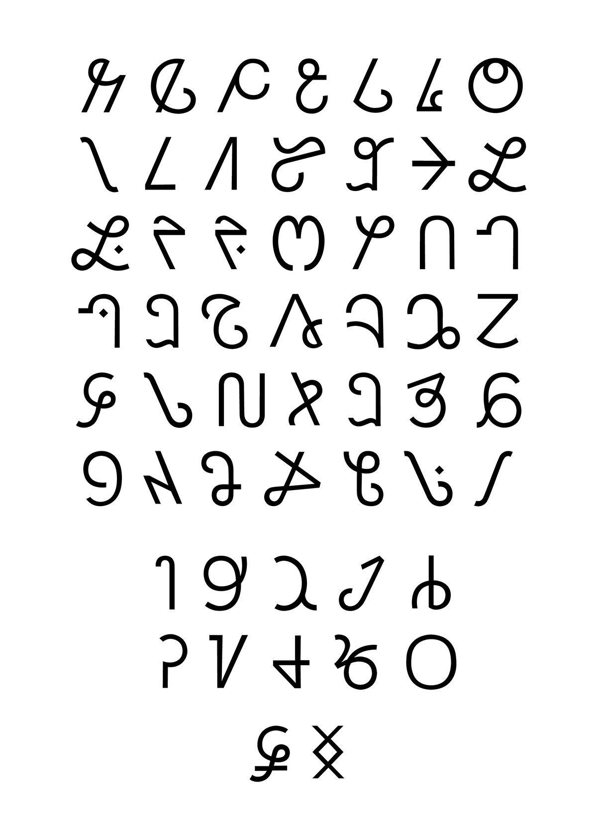
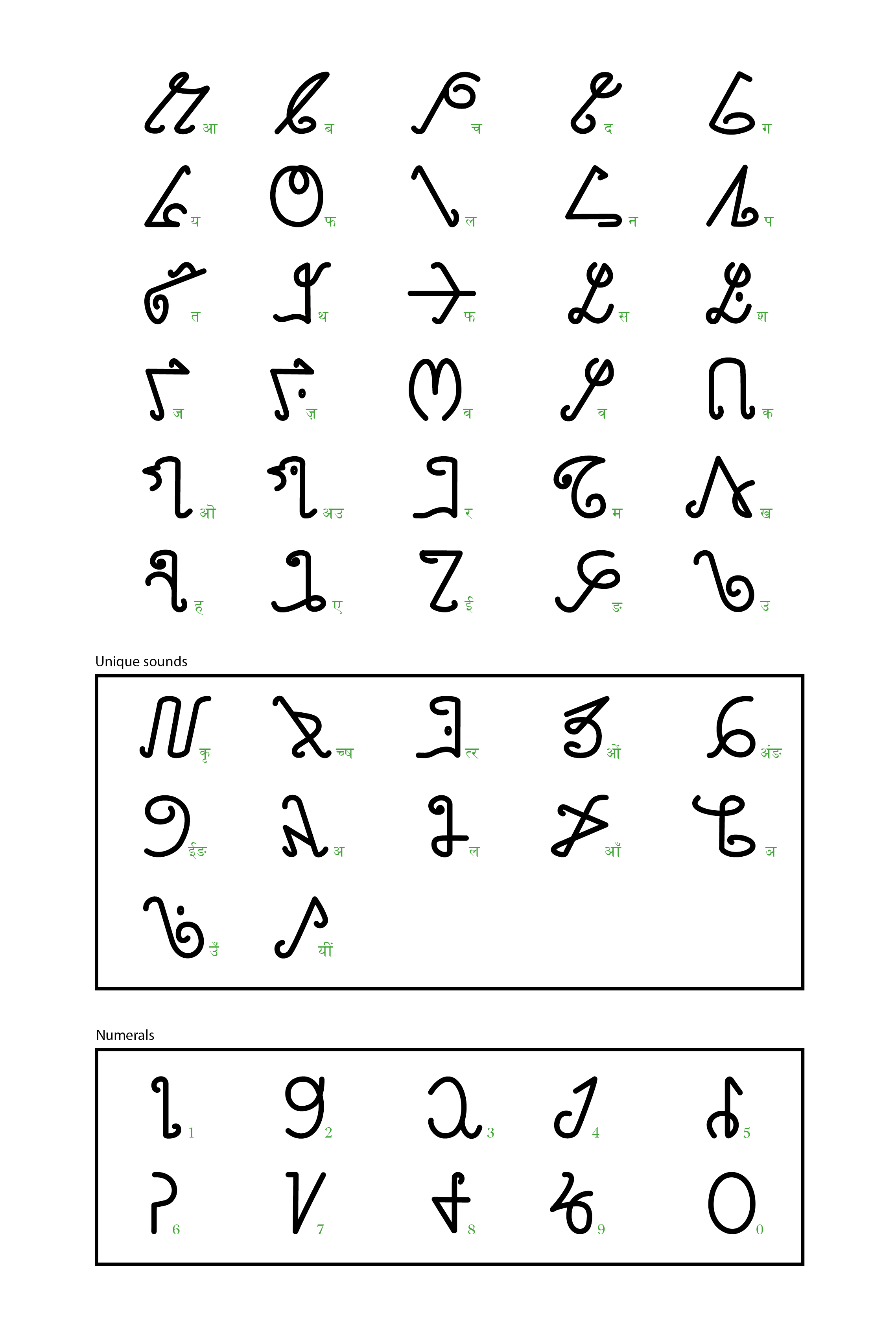
The Wancho alphabet consists of 42 speech sounds (29 consonants and 13 vowels) and numerals from 0-9. Each letter produces different sounds, and some of the letters produce unique sounds which cannot be written or transcribed in English or Hindi. The Wancho script has not been plagiarised from other scripts. It has its own independent symbols. The letters are arranged systematically, beginning with the letter “a” and ending with “m” . Some of the characters represent human actions, as well as the appearance of animals, birds, plants, tools, furniture and tattoos. The direction of writing is from right to left, like most scripts, and doesn’t have the concept of uppercase or lowercase. The script is Cyrillic in nature and belongs to the Indo-Tibetan family of languages.
The Process
FIRST LOOK AT THE SCRIPT
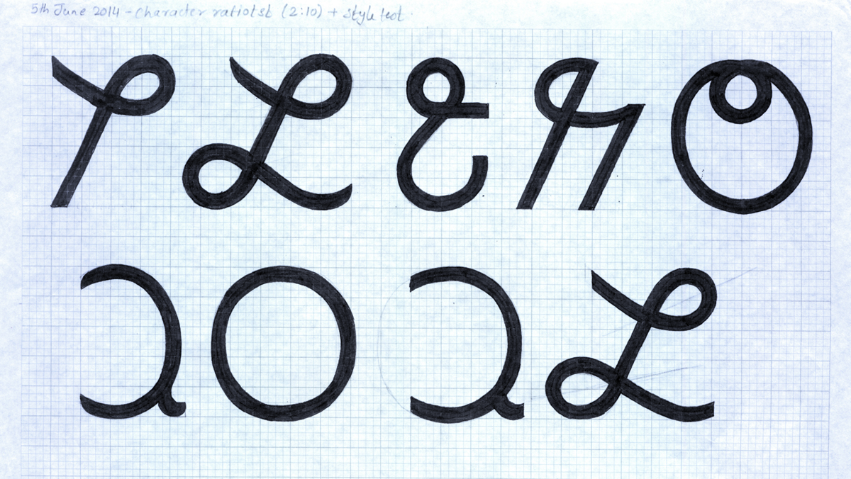
To start with I examined Banwang’s font, which was a first attempt at digitising Wancho handwriting. It had lots of inconsistencies in the quality of construction, and the counters were narrow, but it did give me a good idea of the skeleton of the script. Many glyphs were simple in design, and very geometric in nature. Each alphabet had a small curve going outward, which I interpreted as its serif feature. On first look the script felt alien to me; I had never seen anything like it before. The shapes were not so unusual, but using those shapes in the form of a written script was. I saw the texture of a text written using the script and that also felt very jarring to my eyes, with the inconsistencies in the drawing becoming even more exaggerated in the texture. My initial reaction was to improve the contraction, and work on bringing some uniformity in the skeleton structure.
LEARNING TO WRITE
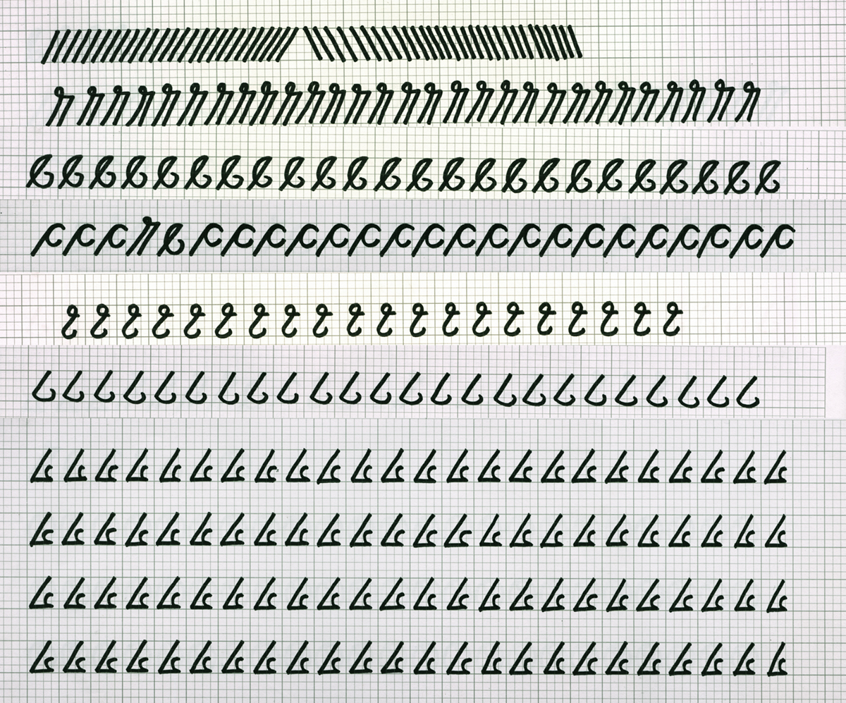
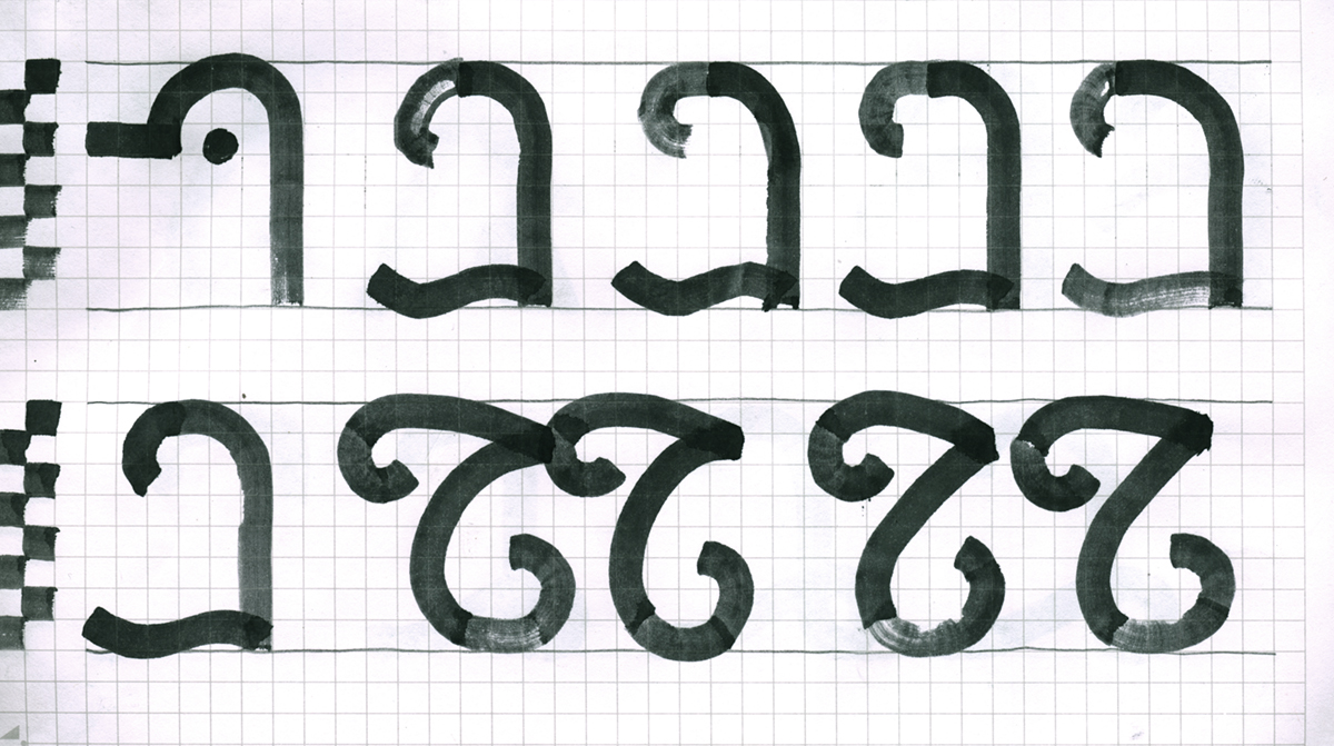
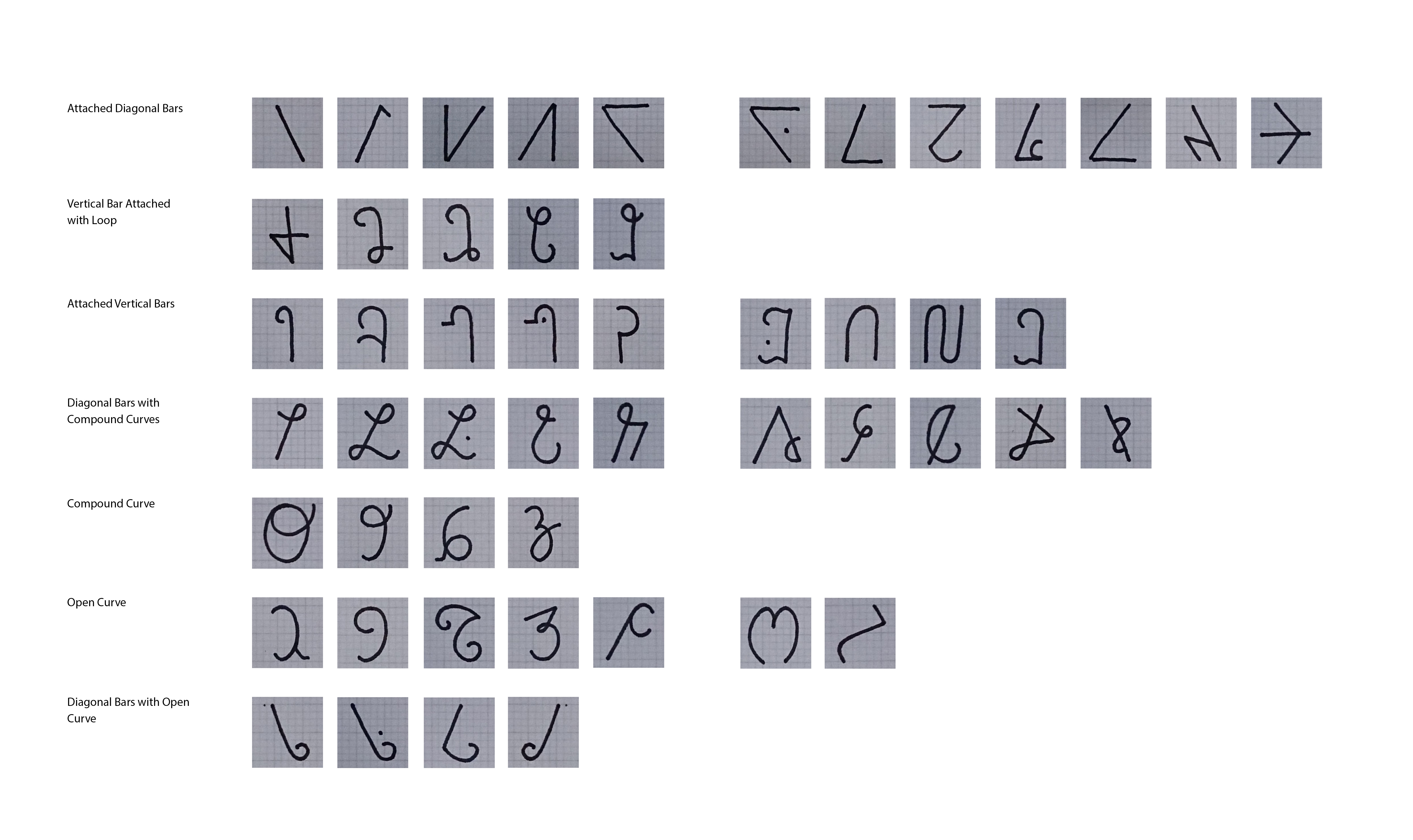
Before I could go any further in the project, I needed to familiarise myself with the Wancho alphabet so I could understand the start and end points of the characters and how the hand naturally behaves while writing them. I needed to write them a lot, and repeat them many times. This exercise also helped me find a pattern and similarities between the glyphs, which in turn helped me classify the character set based on its shape.
WRITING TOOLS
Almost every script has a traditional writing tool which affects how the letters are formed and changed over time. The Latin script has the chisel which was used to carve letters into stone, and Devanagari has the reed pen with which it was written on paper. But what tool did the Wancho use? I had to figure that out. I looked at many references in their culture, through their tattoos and through their stitching. And both these processes use a pointed tool, the needle. Based on that I decided to keep the font mono-linear, assuming it's written using a sharp writing tool such as a ball pen or a pencil.
PROPORTIONS AND CONSTRUCTION
Once I decided on a mono-linear design, I started exploring different broad nib pens to test how the design will change between extreme weights. To give uniformity to different features of the script, like the loops, knots and joints, I divided the skeleton into three zones and worked on their proportions based on that.
This typeface was going to be used under very different circumstances to most other typefaces. The Wancho people were not used to seeing their language like this, and it would be a big learning curve for everyone, especially the children. Like any other script it will evolve with time and use, but the way it will be introduced to people will lay the foundation of its evolution.
To make the learning process easier I decided to simplify the design and remove the ‘serif’ features to make the skeleton clean. This also made the design look more contemporary, turning it into a geometric grotesque typeface. The curves and loops were more proportional to each other, and the extra loops had been simplified to bring out a cleaner looking shape – but still relating to the first iteration of the script.
The final digitisation was done by tracing the refined drawings on Adobe Illustrator and then exporting to font developing software and generating the font from there. I would never even think about doing it this way now, but I was limited by my own knowledge back then.

Conclusion
Since the Wancho script didn’t have Unicode given to its glyphs, the typeface was mapped on an English keyboard. But because of the resilient nature and hard work of Banwang Losu, the Wancho script finally was added to the Unicode list of scripts in 2019 and now can be mapped on its own keyboard.
It is also being taught in schools in the Tirap district, located in Arunachal Pradesh. Looking back I can’t help but criticise my own work a bit. Since that project I have had the luck of working with some very experienced designers and have learnt a lot from them. If I was to do this project now, I would take a different route altogether.
Instead of making the font simpler, I would keep the skeleton of the first iteration. I believe that making the features of the shapes proportional to each other didn’t achieve the intended texture in body text. A project of such depth needs a much longer timeline to explore different directions and to analyse things better, which I didn’t have. But working on this I learned a lot of new things, and was introduced to a culture I was previously unaware of. The experience itself was very enriching. Although I was unsure about a lot of things while working on this project, time and work helped the pieces to fall in place. I hope and plan to one day return to this project, and approach it with a new perspective.