Part 1: The Setting
Like many type designers, I spend a lot of time buried in old type specimens and manuscripts. From my stacks of research on the Devanagari script – used to write many languages spoken in India – I kept noticing a strange letter that I hadn't encountered before staring back at me:

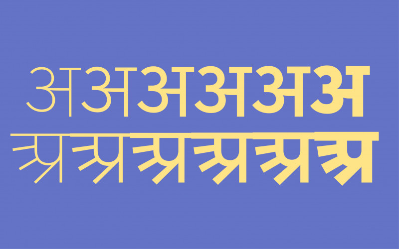
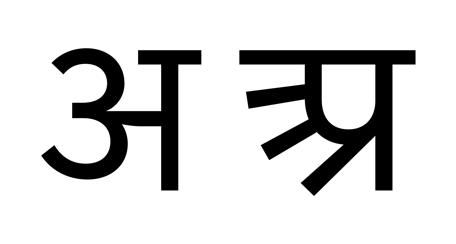
Let's call this X (see fig.1) till I activate the historic feature in this font. Was it a conjunct1 of त्र and प? Or did it represent a different sound that I’d somehow skipped learning about during my Hindi lessons at school? I admit I wasn’t the best student when it came to Hindi, but still, that would have been highly unlikely. What did this letter stand for and why has this shape disappeared from the script in use today? My curiosity had been lit. I had to get to the bottom of this.
I brushed up on my history, began a deep dive into the subject, and discovered that X is an archaic form of the letter अ2 . But there’s a longer answer that satisfies the curiosity better. I’m not a trained linguist or paleographer, however I took a jab at understanding what had happened and this is my humble attempt to tell you the story of the Devanagari letter अ.
Part 2: The Origin Story
Let’s first take a look at our origin story - where both the styles of अ and X come from. The Devanagari script is used to write many languages, the most popular of which include Hindi, Marathi, Sanskrit, Nepali, Pali and Sindhi. For the purpose of this narrative I’ll focus on Hindi and Marathi.
The script originated from the ancient Brahmi script which existed as far back as the 4th century BC. The first inscriptions can be seen on the Ashokan Pillars. These are edicts erected by the Mauryan ruler Ashoka during his reign in the Indian subcontinent during the 3rd century BC. The script was used throughout the Ashokan empire with various forms of the letters developing in different parts of the country. These were due to many possible reasons such as recasting before engraving, multiple instances of copying and dialectic differences. Just think of a written version of the game of Chinese Whispers.
The Brahmi script slowly developed into other scripts that were divided into Northern and Southern groups and then further into more branches. So many branches that the Government of Maharashtra’s official calligrapher, Laxman Shridhar Wakankar, actually drew a diagram in the form of a tree to navigate all of them in 1962. In the north of India, Brahmi developed into the Nagari script in the 8th century, while its South Indian form was termed Nandi-Nagari. The western styles of the southern group were prevalent in parts of Gujarat and Maharashtra. The Devanagari script itself could be distinguished by the 9th century.
The western branch of Devanagari further evolved into simpler forms which may explain the evolution of the अ construction. It developed into Shastri Lipi in Gujarat and Balbodh (meaning easy for the child) in Maharashtra. The Balbodh style is important to our story as the अ that we use today originates from this style.
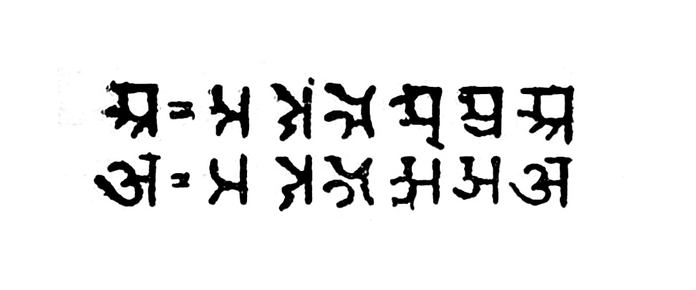
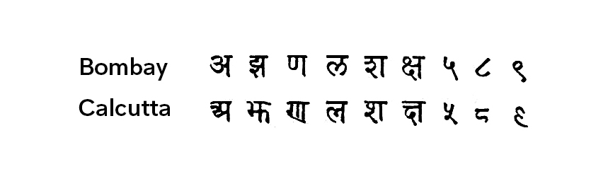
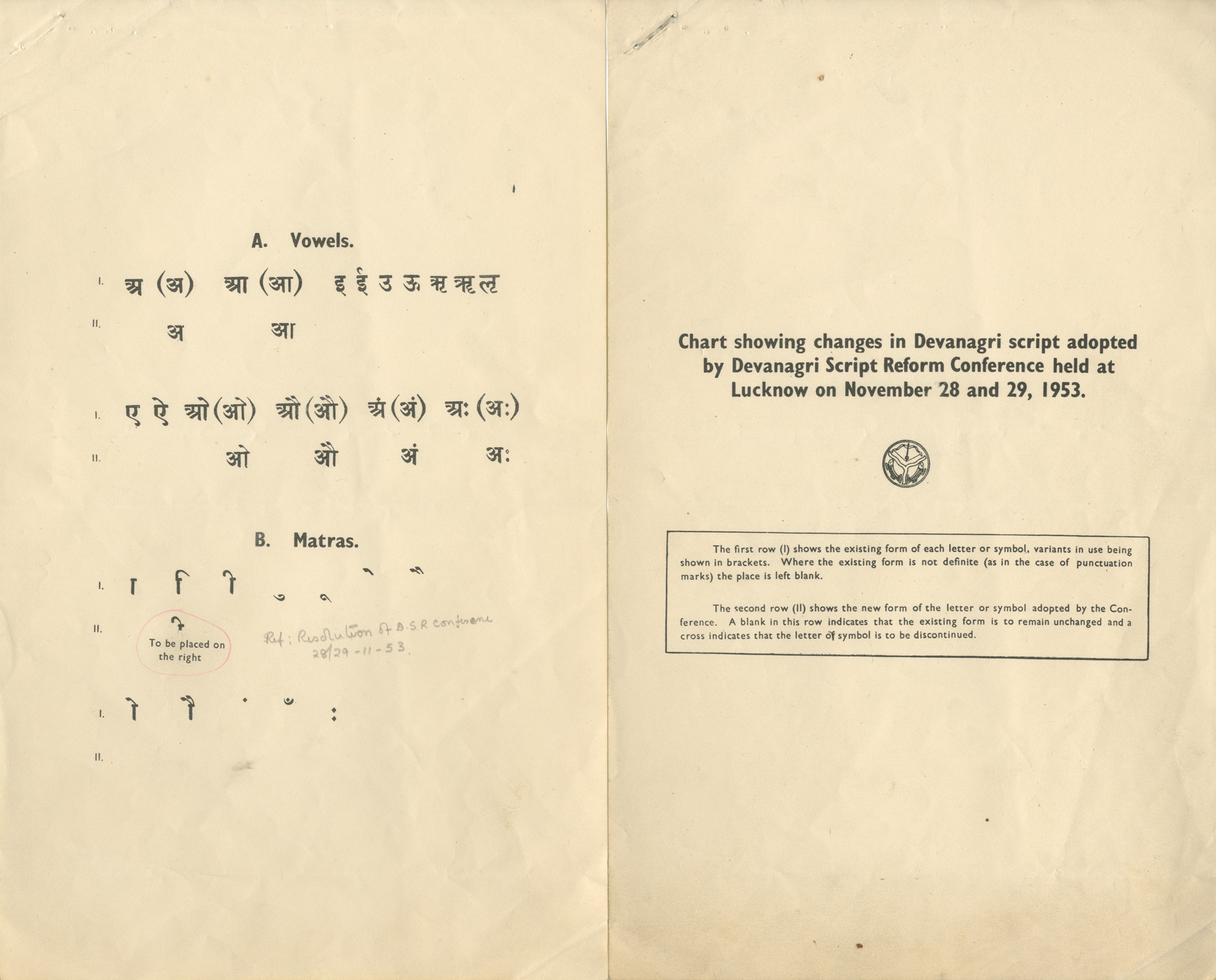
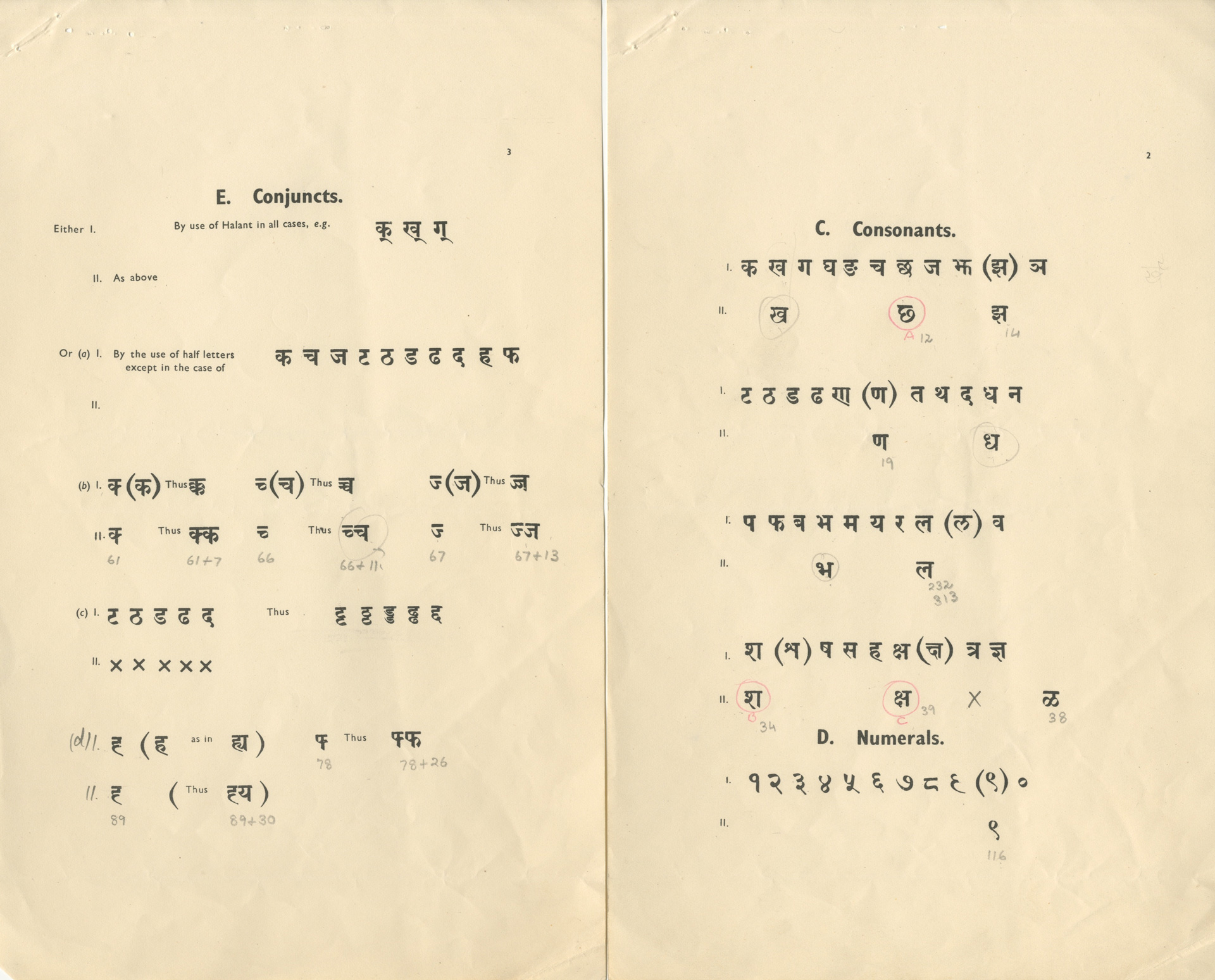
So what we now have is two forms of Devanagari which were more commonly known as the Bombay (or Balbodh) style from Maharashtra, and the Calcutta (or Hindi) style from North India. They differed from each other only in a few letters. The current अ comes from the Bombay style while X originates from the Calcutta style. What I learnt was that it wasn’t only the अ (a) which was different, but also other letters such as the झ (jha), ण (nna), ल (la), श (sha) and क्ष (ksha) and the numeral figures of ५ (5), ८ (8), ९ (9) (See fig.3).
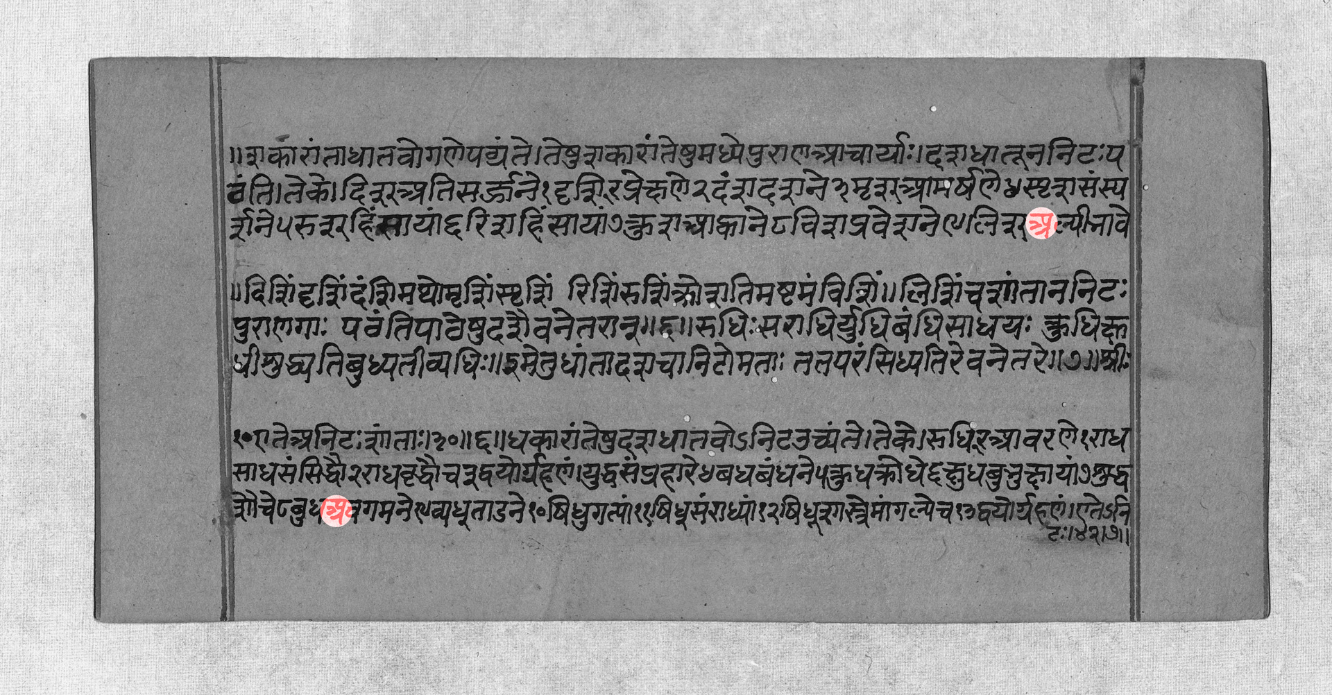
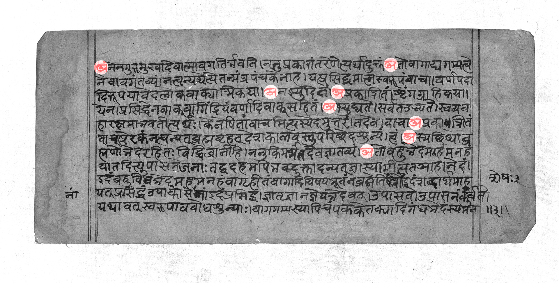
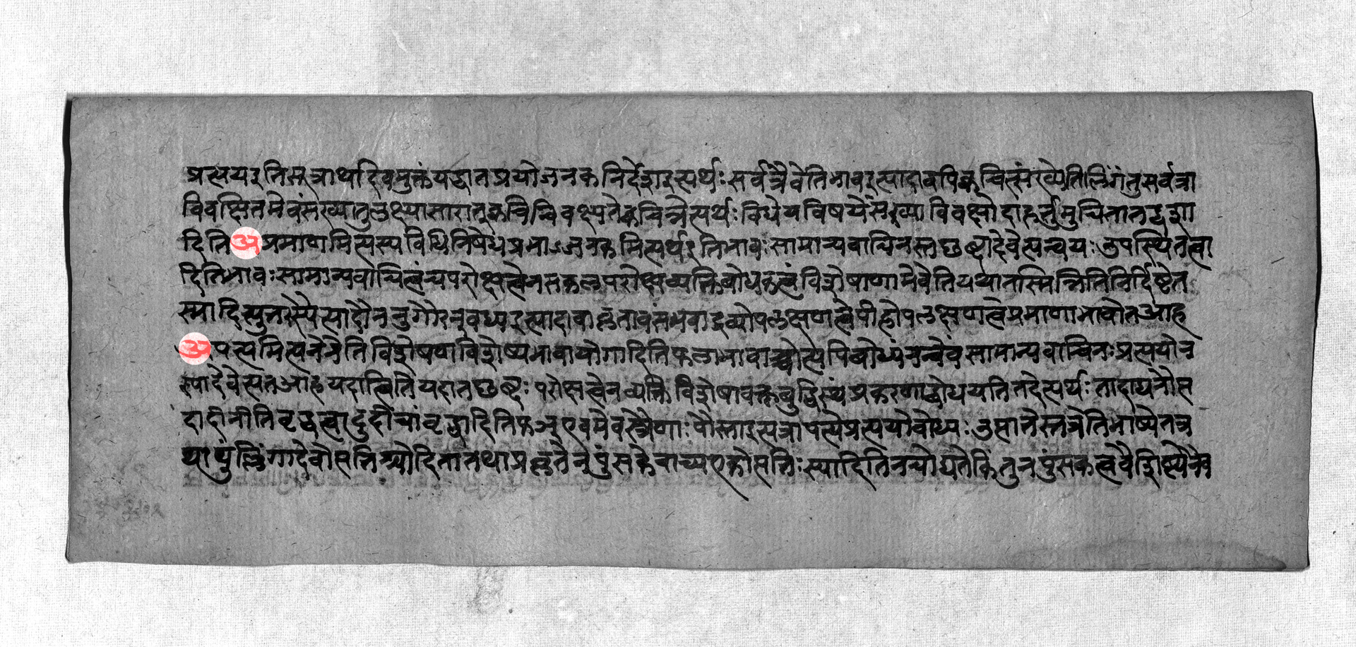
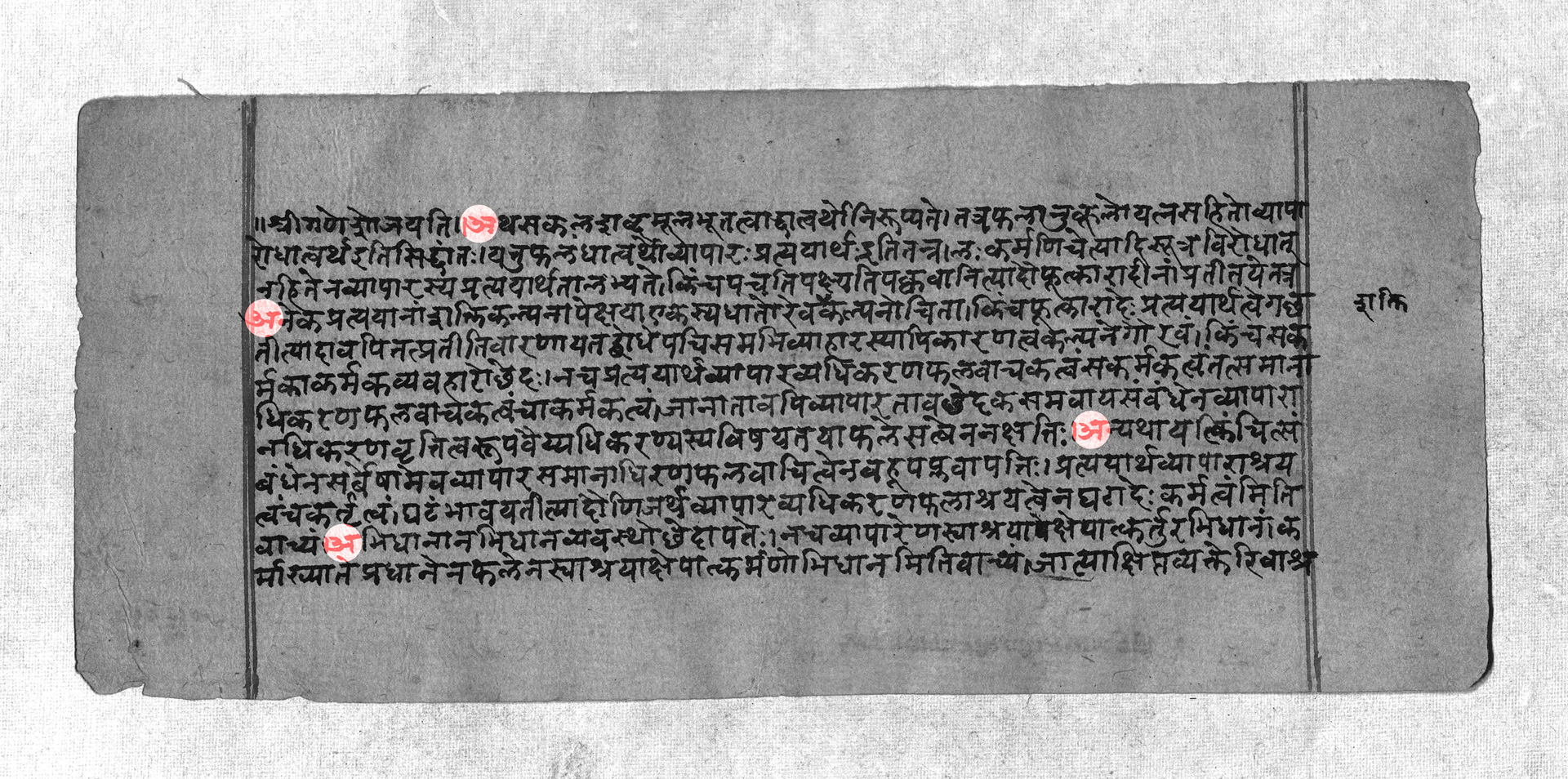
At this point I thought it’d be a good idea to look at some old manuscripts to determine when and where the different styles were used in the country. I visited the Bhandarkar Oriental Research Institute in the city of Pune for this purpose, and was welcomed with a monumental 28,000-odd manuscripts to pick from. I selected a range from different parts of India during different centuries to gain an overview, and what I discovered was that both styles of अ were in use right until the beginning of the 20th century.
Part 3: Age of the Script Reforms
After our mini history lesson into the development of the forms, let's look at what was going on in the 20th century. We have evidence that both styles of the अ were still being used at this time. Having different styles of characters used in different parts of the country meant that the script was not standardised - which was addressed with the advent of printing.
For industrial, cultural and scientific advancement of the country, the government felt that Hindi needed to spread quickly. And there were issues with printing technologies which were becoming a hindrance to the speed at which this could happen.
Mechanical presses which were introduced in India were designed with the Latin script in mind, which has a much smaller character set. In addition to the size of the set, Devanagari is a much more complex script. Typographers faced a challenge in producing all the graphemes and combinations required to construct full letters and conjuncts. They were working with a minimum number of matrices, while trying to stay true to Devanagari's design and functionality.
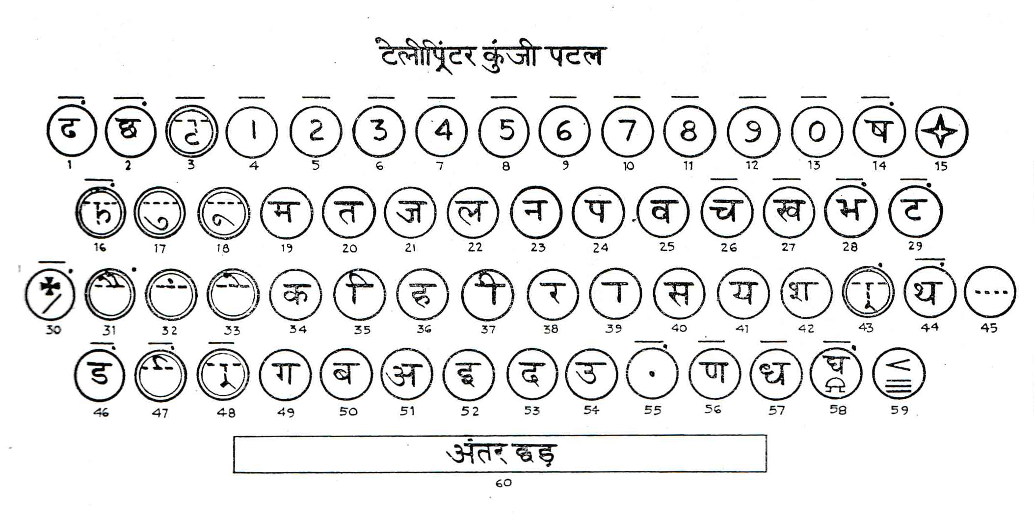
The problems increased with the advent of machines such as Monotype, Linotype and the typewriter. Now they were challenged by a limited number of matrices that could be cast or, in the case of the typewriter, a limited number of characters on the keyboard. Essentially, the Devanagari script had too many characters for this technology. As a result there was a push to standardise the script for printing, handwriting and typewriting. And so began what I’d like to call ‘the age of script reforms’ in the country. This started at the beginning of the 20th century and the discussions went on for more than 60 years before final decisions were reached!
Script reformers proposed numerous ideas and systems through conferences and committees that were organised at different levels and places in the country. The directions that they worked towards can be broadly looked at as the following:
- Adoption of the Roman or Latin script for setting the languages that currently use Devanagari.
- Modification and simplification of the Devanagari script to work on the mechanical presses.
- Adapting the machines to suit the script and accommodate the features of the Devanagari letters.
While there were some advocates for the first direction, many also disapproved as it would mean a loss of culture. Too many changes could leave the script unrecognisable to future generations – requiring a costly and time-intensive reprint of old materials. Reformers instead proposed smaller modifications of the script.
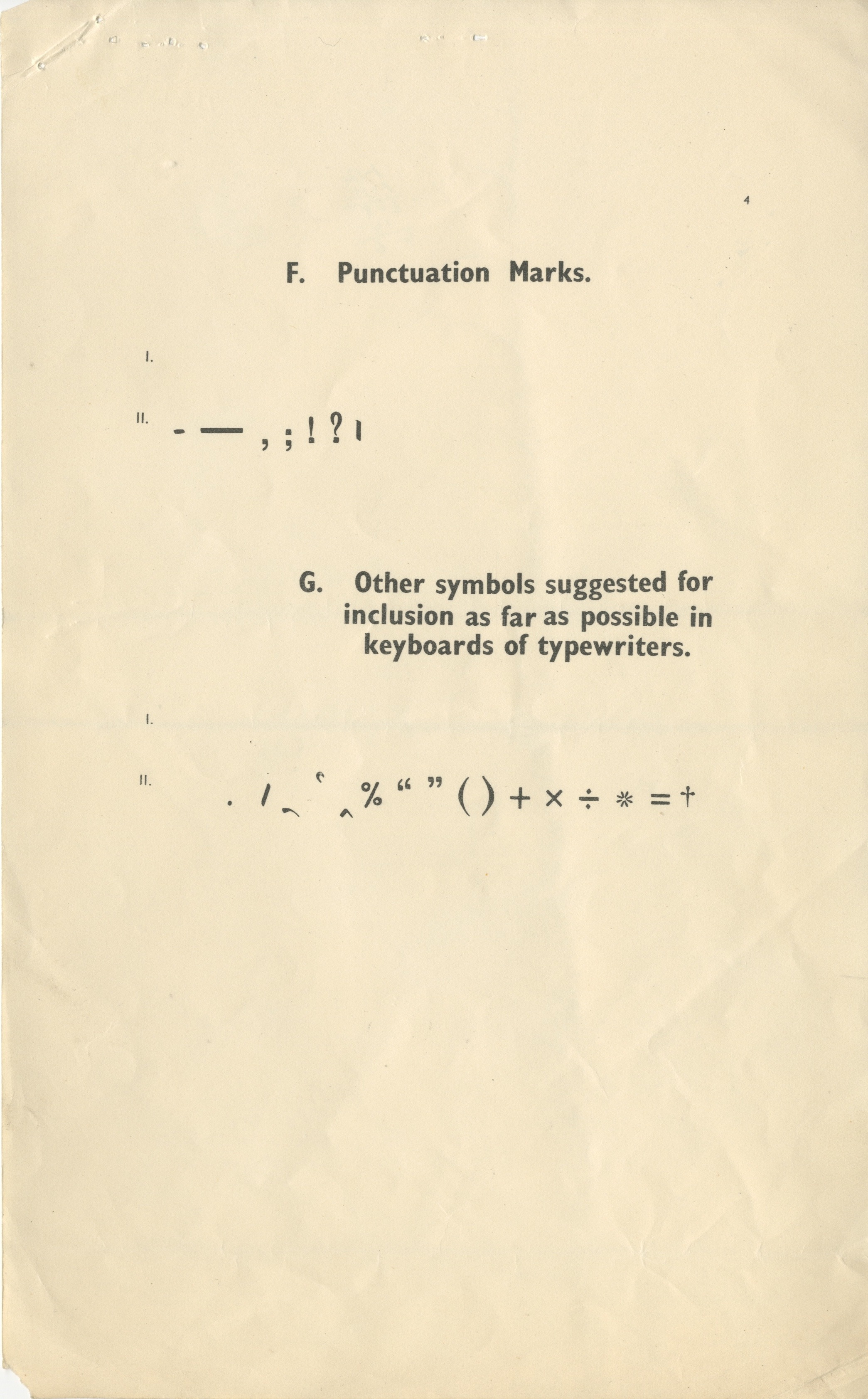
In almost all attempts there was an emphasis on reducing the number of characters and complexity of the script. Some recommendations include a proposal of a linear system for easy usage on mechanical presses - setting of vowel signs alongside the consonants on the same line. Another push was for the increased usage of halants (diacritic to signify the absence of the inherent vowel a), and barakhadi of अ where the other vowels would be substituted with अ along with their vowel signs. Others recommended a common script for Gujarati, Hindi and Marathi where the shirorekha or headline would be removed, and symbols added for aspirated letters.
This brings us to the question of the अ. As we have seen, most committees and state governments had several different recommendations - some quite far fetched, some quite simple. But what seemed to be the consensus of most committees such as the Maharashtra Sahitya Parishad (1931-35), Hindi Sahitya Sammelan (1934), and Baroda State Script Reforms Committee (1936), was that the Bombay Style of the अ was preferred over the Hindi or Calcutta style.
After a multitude of state-level committees, and a national level one in 1950 in Madhya Pradesh, an all-India conference was held at Lucknow in 1953. It was recommended that the forms of अ, झ, ण and क्ष among some other letters may be accepted in preference to the other styles.
Finally in 1962 through a Government Resolution3 , the Government of India and Ministry of Education accepted the final recommendations made by the Education Minister’s conference on the Standard Script of 1960 with slight modifications. With this we have an official acceptance of the current अ.
The resolution was accepted by various state governments. The government of Maharashtra accepted it with a few changes in respect to the ख, ल,and श, but accepted the Hindi forms of these letters in a later resolution. This was probably due to the standardisation of the keyboards. When typewriters were introduced into India there were over 18 keyboards. To achieve conformity with the Standard Script, which was approved under the Government Resolution, the keyboard was also standardised.
Despite the standardisation, for a while the different styles continued to be used. We can see evidence of this in the character sets of typefaces designed after the resolution was passed - such as that of Univers Devanagari which was designed in 1973 by Mahendra Patel and Adrian Frutiger. Popularity, familiarity and commercial demand finally led to the acceptance of the standardised script as we use it today.
Part 4: The End
And there you have it. That's why we read and write अ instead of X. Why this shape over the other? My guess is that it's a simpler form - easier to write and more easily distinguishable from other characters which allows for easier reading. Kalapi Gajjar, co-founder of Universal Thirst, is of the opinion that the current shapes became standard because, commercially speaking, better types and matrices were produced in Bombay and Pune and these were preferred over ones produced in the North. You can find the Northern form of अ in some fonts produced by the Bombay foundries, however, this was rare. Type designer Mahendra Patel simply feels that greater familiarity and commercial demands of these specific shapes led to them being preferred over the alternatives. I’d have to travel back in time to understand exactly why. Or if you do know the answer please write into the Gazette. Whether it's time to bring back the older shapes now that digital technologies have entered the scene and completely changed the game is a question open to debate.