How Iceland’s 50 kr note is an homage to the country’s history of printing
The 50 kr is quite possibly the only bank note displaying movable type and honouring the history of printing.
The 50 kr is quite possibly the only bank note displaying movable type and honouring the history of printing.
In the beginning of 1981, Iceland’s 100 kr note had two zeroes removed from its value, and became the new 1 kr. It called for a new design for the bank notes – the earliest of which displayed the Danish king, since Iceland was under the Danish Crown until 1944. With Iceland’s independence the portraits on the notes changed, and between 1944 and 1981 politicians became the subject.
Prominent Icelandic designer Kristín Þorkelsdóttir – founder and owner of one of the largest advertising agencies in the country at the time – was approached to design the new bank notes. She accepted the challenge and in 1977 preparation started. The ambition was to make people feel they possessed something of value, and also design bank notes that could be easily distinguished 1 . In 1978 Þorkelsdóttir invited one of her members of staff from the agency, Stephen Fairbairn, to collaborate on the execution of the notes, as it was important for her to have an exceptional illustrator and designer to work with during the process. The team went on to design Icelandic currency together for around 35 years, creating a total of eight bank notes for the country, with the latest released in 2013.
Initially the plan was to release four notes: 10 kr, 50 kr, 100 kr, and 500 kr, with 1,000 kr, 5,000 kr and 10,000 kr expected to follow in the coming years. This meant that the entire collection needed to be considered at an early stage, even though only four notes would be released in 1981. Size, colour, and overall structure had to be adaptable to bigger notes.
When choosing the visual language for the bank notes there was only one requirement: that Jón Sigurðsson, who was the most prominent figure in Iceland’s fight for independence in the 19th century, would have a place on one of the notes. Apart from that Þorkelsdóttir realised she had quite a lot of freedom when choosing the motifs, and was supported by the National Museum of Iceland when it came to considering options.
One of the biggest obstacles she faced when developing her proposal was the lack of portraits, particularly of women. For most prominent figures only an indication of their appearance was often available, however for some, such as bishop Guðbrandur Þorláksson, who adorns the 50 kr bank note, portraits had been made in their time. Þorkelsdóttir proposed two options, the first one being prominent natural scientists and the latter being cultural scholars. The latter was chosen.
But the bank notes don’t only honour pioneers in Iceland’s cultural history; they also reflect historical works related to each person’s life or career. They provide a window into the visual history or style that was highly regarded in their time. Collecting and mapping patterns, different variations of craft, signs, symbols, type, furniture, and other visual material was a significant large factor when it came to the design of the bank notes.
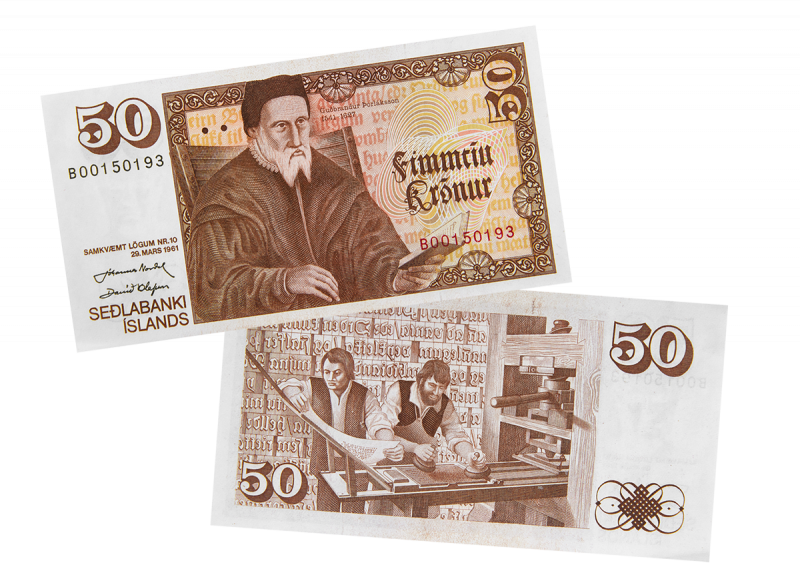
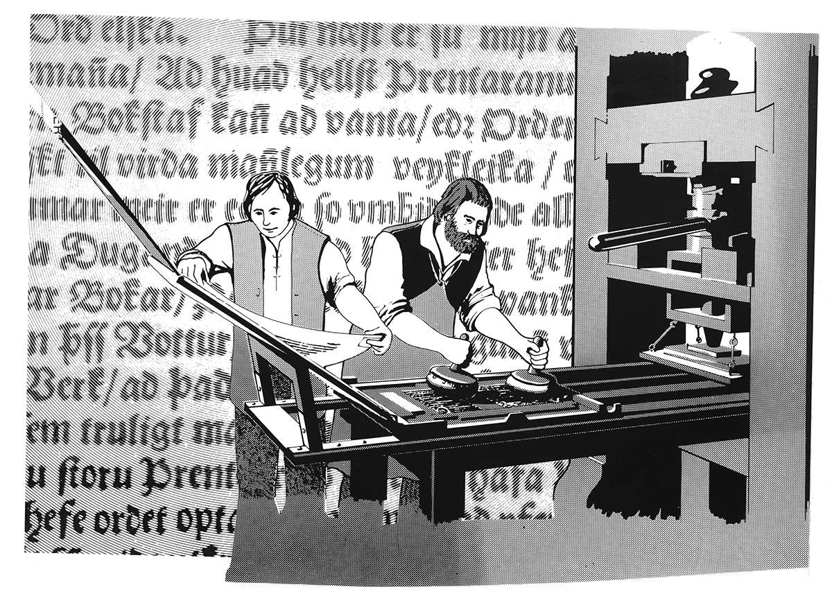
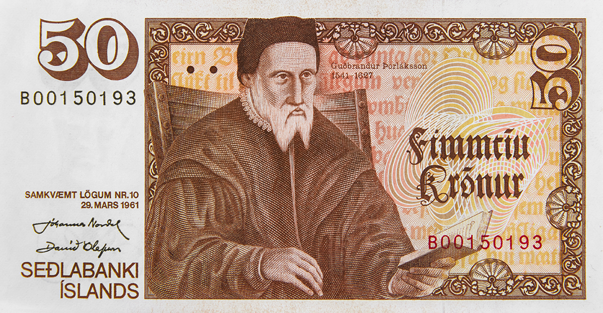
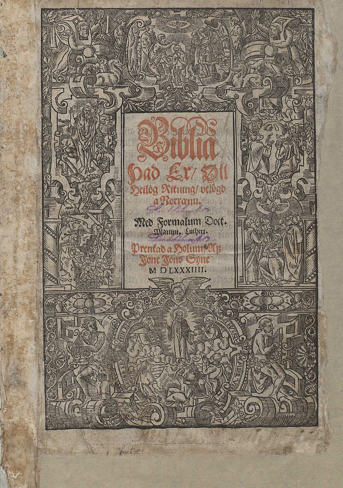
For type designers the Icelandic 50 kr bank note might be of special interest as it displays familiar motifs. The front shows a portrait of Guðbrandur Þorláksson (1541/42–1627), a bishop at Hólar who is said to have been extremely intelligent, a great scholar and a good craftsman. Þorláksson published around 100 books, of which 79 have been preserved, and is suspected to have written 11 books himself. According to Þorkelsdóttir he was chosen because of his great printing achievement.
Little less than a 100 years after Gutenberg first introduced his invention – the printing press and movable type – bishop Jón Arason (1484–1550), the last catholic bishop in Iceland, imported the first printing press to the country in ca. 1530. Þorláksson later acquired the press and set out to promote the printing of religious literature and verses. Þorláksson was the first Lutheran bishop in Iceland, therefore the beginning of printing in Iceland has been attributed to the conversion from Catholicism to Lutheran, since both bishops are said to have acquired the press to promote religious texts. This brings us to Þorláksson’s greatest printing achievement, the bible, always referred to as Guðbrandsbiblía (Guðbrandur’s bible), the first complete reproduction of the bible in Icelandic.
The printing of the bible is believed to have started in 1582 with seven people working on its production until its publication in 1584, including three men handling the typesetting. Four more worked on the printing, most likely using two printing presses. It’s estimated that it would have taken one man over three years to complete the bible. It hardly needs mentioning that the production was extremely expensive, with a running edition of 500 copies, according to Þorláksson’s notes.
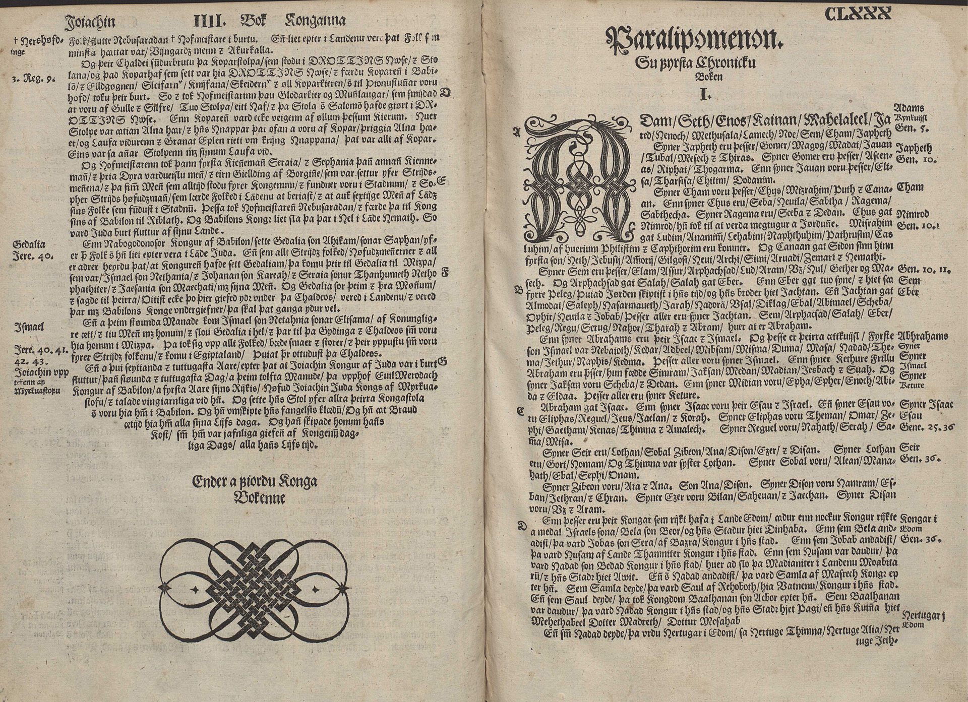
Many images appear throughout the publication, it being the first illustrated book printed in Iceland 2 . Early speculations considered Þorláksson to be the main producer of these illustrations, however later research has shown they are in fact German and most borrowed from abroad. Þorláksson is however rumoured to have cut some woodblock type himself. The book is printed in Schwabacher type, with a justified setting.
When Þorkelsdóttir and Fairbairn started their research they quickly became aware of how complex the process of designing banknotes really was. The specialised printers, Bradbury, Wilkinson & Co, who managed the printing, was later sold to Thomas de la Rue printers, who took over. The designers visited the printers in the UK to understand the many dos and don’ts regarding specialist security printing, including how the margins should be designed, how many colours they could use, and various other technical requirements.
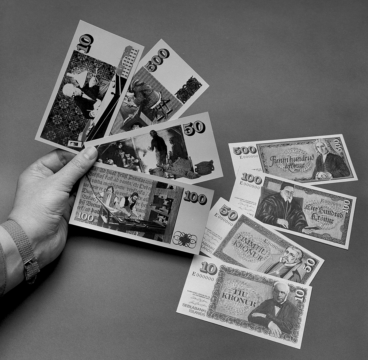
The imagery on the 50 kr banknote revolves around the printing of Þorláksson’s bible. The main colour of the 50 kr note is brown with a portrait of Þorláksson on the front holding a book – which is how the bishop is usually depicted.
The colour system is one aspect used to help people distinguish between each note, as well as them being of different lengths. What determined the colour also corresponded to some degree to the previous notes, and mirrored the previous value, so the 10 kr was blue, like the previous 1,000 kr note, and the 50 kr note was brown, like the previous 5,000 kr note.
Ornamental frames and pattern-structure for the note are all based on the ornaments and type of this first printed production of the bible in Icelandic. One can see a clear reference from the title page in the frame on the front of the note. The lettering on the front, indicating the amount ‘Fimmtíu krónur’, is also based on the type used on the title page of the bible, whereas the amount in digits is displayed in Clarendon – a typeface much-loved by Þorkelsdóttir, who’d previously used it in her book cover design work.
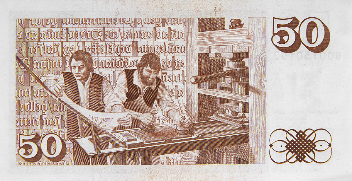
The illustration on the back shows two men managing a printing press in the 16th century. In the background one can see a representation of moveable type depicting a fraction from the epilogue in Guðbrandur’s bible. On the front, a mirrored impression of the type is in the background of Þorláksson’s portrait. In the margin you can see a representation of an ornament from the bible, presumably cut by Þorláksson himself. Ornaments such as this were often used as decoration or to fill in blank areas 3 .
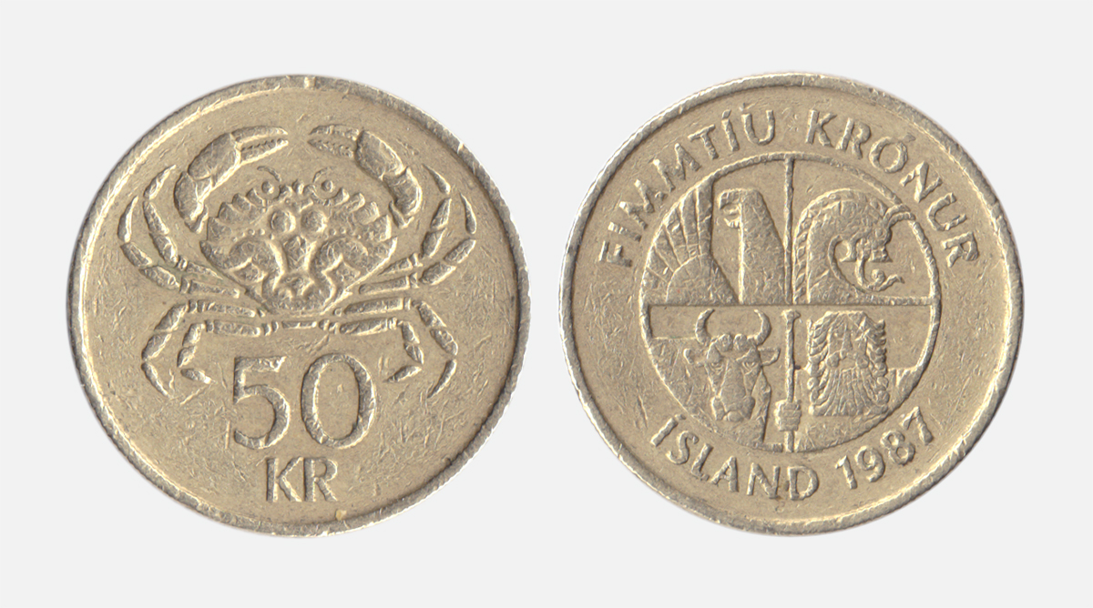
Since 1987 the Icelandic 50 kr bill has not been in production, and has been taken out of circulation with the demise of its value – sadly, this means the history of printing in Iceland has vanished from the country’s currency. Its successor is a golden coin depicting a crab on the front and the Icelandic national emblem on the back.