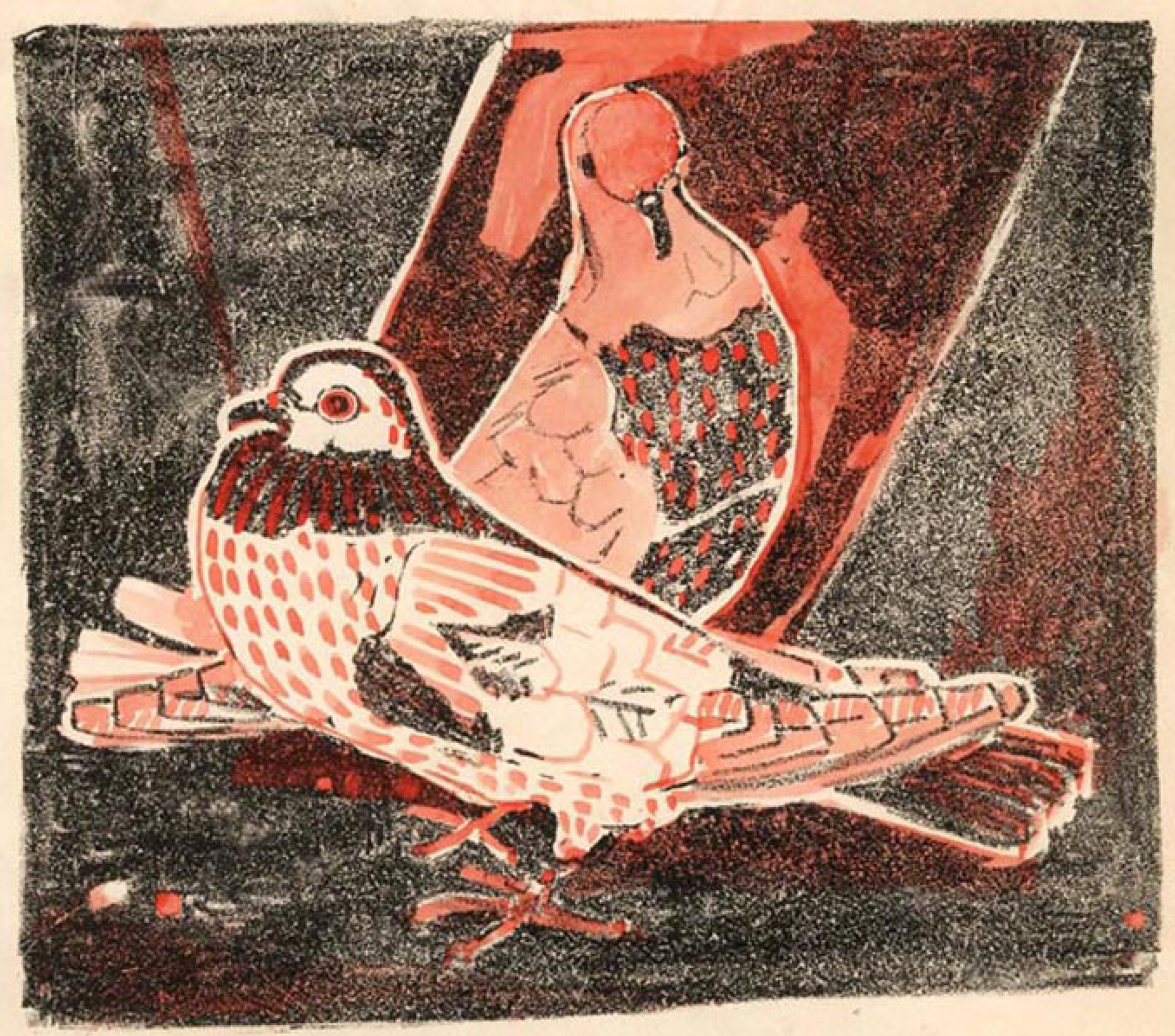
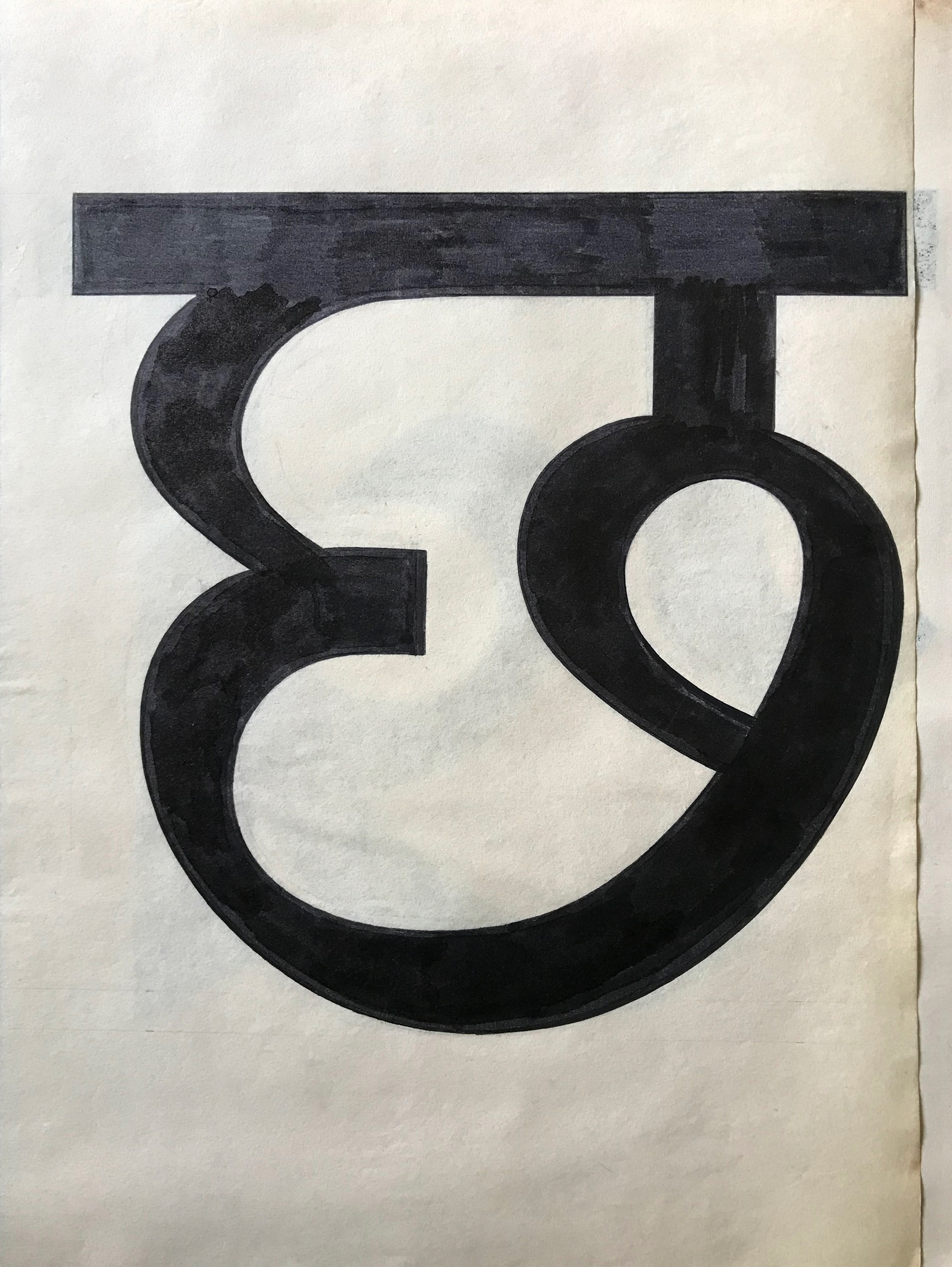
Mahendra Patel: a 60-year journey of design in India
Part 1
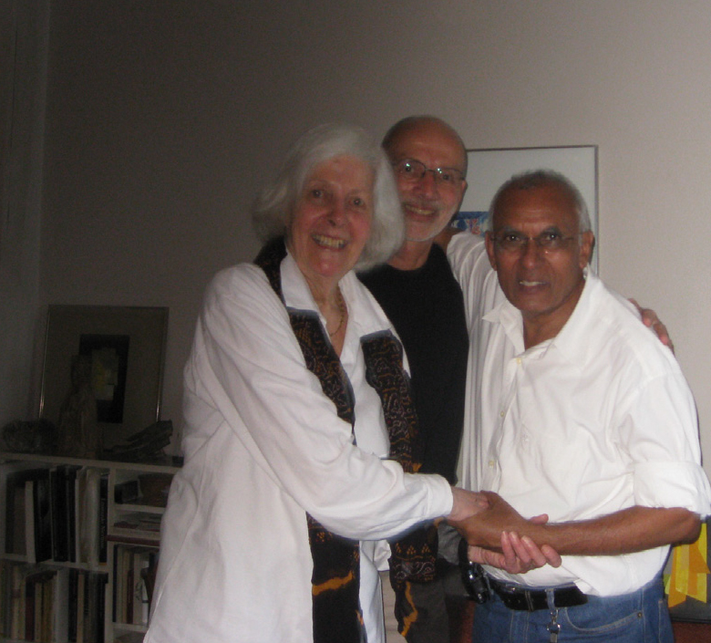
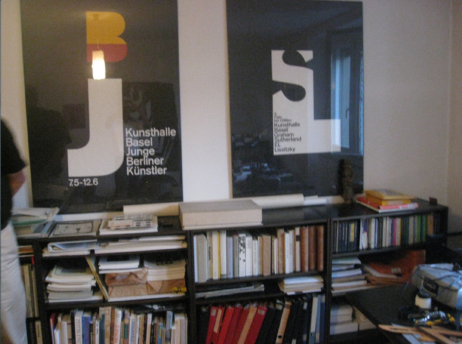
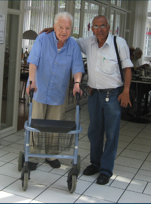
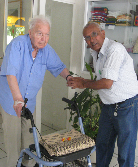
Mahendra Patel is a household name in the field of type and graphic design in India. With an astounding 39 years under his belt as professor at the National Institute of Design, Ahmedabad, he has accomplished what many others could only dream of during his vibrant career in design. A few years ago, Mahendra crossed paths with Gunnar Vilhjálmsson and Kalapi Gajjar, co-founders of Universal Thirst. A shared interest in the future of type design in India led to a collaboration between them. Anurag Gautam, type designer at Universal Thirst, is now working with Mahendra on an exciting new project.
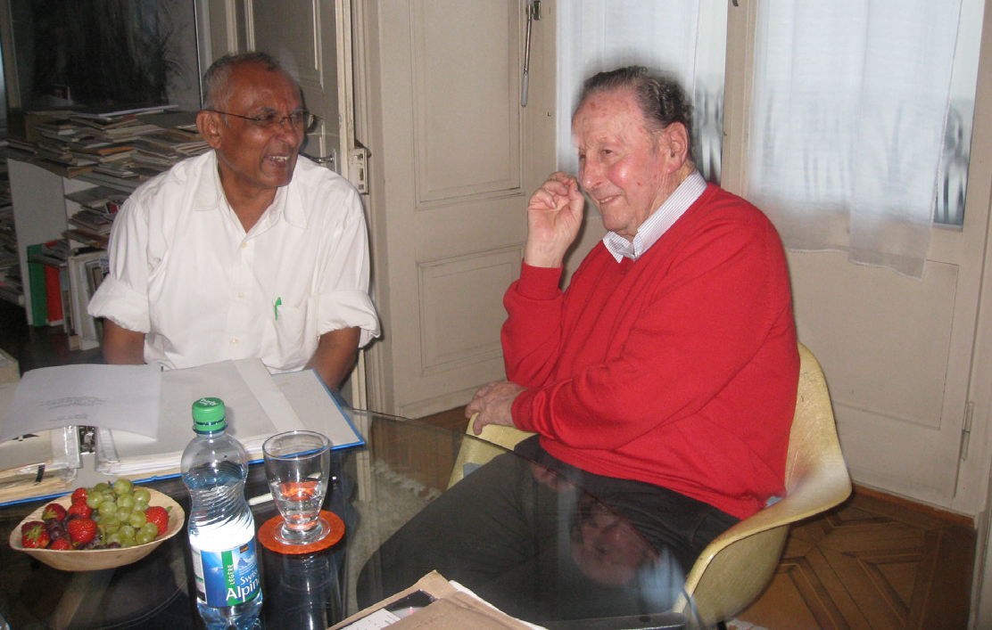
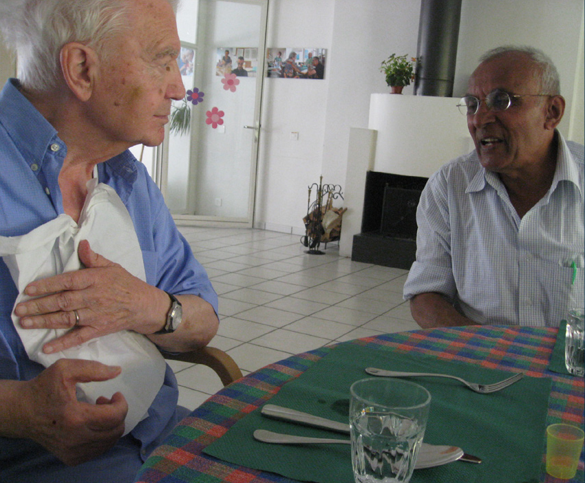
We were interested to learn more about Mahendra’s life and journey, so we sat down for a conversation online (of course). Mahendra spoke to us from Pune, Gunnar tuned in from the studio in Reykjavík and I (Salomi) logged in from Mumbai. We had so much fun together that we ended up talking for hours. It also went over two days owing to an internet blackout in the state of Maharashtra. Mahendra shared and reminisced about the National Institute of Design in Ahmedabad (NID), attending the School of Design at Basel, visiting Paris, working with Adrian Frutiger and having his home-cooked spaghetti among many other things. So you don’t miss out on anything, we’ve split this interview into two parts. And trust me, this is just the tip of the iceberg.
Mahendra Patel is a household name in the field of type and graphic design in India. With an astounding 39 years under his belt as professor at the National Institute of Design, Ahmedabad, he has accomplished what many others could only dream of during his vibrant career in design. A few years ago, Mahendra crossed paths with Gunnar Vilhjálmsson and Kalapi Gajjar, co-founders of Universal Thirst. A shared interest in the future of type design in India led to a collaboration between them. Anurag Gautam, type designer at Universal Thirst, is now working with Mahendra on an exciting new project.
We were interested to learn more about Mahendra’s life and journey, so we sat down for a conversation online (of course). Mahendra spoke to us from Pune, Gunnar tuned in from the studio in Reykjavík and I (Salomi) logged in from Mumbai. We had so much fun together that we ended up talking for hours. It also went over two days owing to an internet blackout in the state of Maharashtra. Mahendra shared and reminisced about the National Institute of Design in Ahmedabad (NID), attending the School of Design at Basel, visiting Paris, working with Adrian Frutiger and having his home-cooked spaghetti among many other things. So you don’t miss out on anything, we’ve split this interview into two parts. And trust me, this is just the tip of the iceberg.
Salomi: What was the start of your journey into type design at NID (National Institute of Design, Ahmedabad)?
Mahendra: Well my exposure to art, the so called fine arts, started at school. I was studying in a village. I was the son of a businessman. I was born in Ahmedabad and went to a village to study. Normally people from villages go to the city to study, but it was the other way round because I was not keeping good health in the city. And my father was worried. This doctor had said - Gaon ki hava khilao, gaon ka pani pilao or - have rural water and rural air and you will get well.
My mother had to come to the village with me in order to educate me. So in the 5th standard I went to the village and did six years there. In those days [school] was till the 11th [standard]. And from seven to eleven [standards] I was always in the drawing room. I was very brilliant in science and mathematics – I was a first and second ranker – but I loved to draw. In the village drawing means painting the floor, painting earthenware and so on. My teacher organised those sorts of projects that might help for inspection at the school. When I finished my school with first class, my science teacher wanted me to pursue architecture engineering. My drawing teacher wanted me to do painting.
And I had a senior student, one year elder to me, who was a son of a farmer. He said - Mahendra, you have a business, your father earns more and you can do business anytime. We are villagers, we don’t have jobs. We have to expand to make money. So why don’t you do something that you like? And that struck me. So I went to the Baroda Faculty of Fine Arts.
Under the British period, my father had studied only till the fifth [standard]. So he said I should attend college. For him everything was college and it didn’t matter to him which college, in the end I’m going to go to join his business. So he didn’t even take much interest. At the age of 16 or 17 I went to Baroda, Ahmedabad and Vidyanagar to find which colleges taught art. I met the deans and the teachers and decided to do my painting in Baroda.
Salomi: At the M.S. University?
Mahendra: Yes, I did fine arts painting at MS University, Baroda from 1960-64 under K. G. Subramaniyam, and I was a second ranker. I did it very well. And as I planned, I thought I’ll do business with my father. In my spare time I’ll do painting. So, I went to my father’s shop in ‘64 after graduating. But doing business and painting was a complete opposite. Painting has a human sensitivity, while business … you have to cheat people in order to earn. You have to block in order to earn. That doesn’t suit my temperament.
Salomi: What did you decide to do? Did this experience take you back to the arts?
Mahendra: I went back to Baroda to my good teacher, K.G. Subramaniyam. I told him about my plan to do business while painting in my spare time. I said - Sir I don’t want to do business anymore, I want to do a MA He said a very nice thing. He said - Mahendra, you are one of my best students. Aap BA karke kuch nahi kar sake, toh aap MA karke kya karege? Go to Africa and kapde ki dukaan kholo. (If you could not do anything after doing a BA, then what would you do after doing an MA? Go to Africa and open a clothing store). I said - Sir don’t be so harsh. So he took a little paper and wrote a little note on handmade paper to Gira Sarabhai. She was searching for young people for NID during those days.
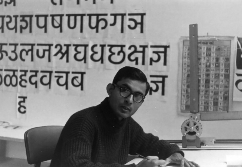
I went on my bicycle - in those days bicycles were a luxury. I had a green coloured bicycle which I took with my imperial size portfolio between my legs. The owner of Calico Mill, Gira Sarabhai, took my interview, and luckily I was painting and a little bit good in English. I wasn't so good, but Gujaratis are not good in English either, so I was better than others. Somehow she was impressed, and she asked me when I wanted to join. I said that I had come prepared and to tell me where to sit because I was fed up with business and wanted to do something different. She said no, not today, come tomorrow. So on Saturday 16th December I started with NID.
Salomi: What was your first project after joining the institute?
Mahendra: In NID they had an exhibition by Charles Eames, American furniture and exhibition designer. We were working on an exhibition in December 1964, so they gave me a job to cut up slips to be pasted on the history wall. I had never used a centimetre scale or a set square. I never measured things while painting. I had that sort of a mindset of painting which is beautiful, lovely, full of feelings and expressions. And suddenly I had to measure 18mm by 75 mm and then give a margin of 5 mm on the top and 5 mm at the bottom, and cut wide strips. Which was a completely different world for me. But, it was a problem of survival. I didn’t want to go back to business so I tried to keep this up. I thought this was a golden opportunity, so let me put my heart into it. These sort of tasks went on for almost one to one and a half months till Armin Hoffman, the father of graphic design, arrived from Basel. He had a one-year contract with NID to train 16 of us in graphic design. I was a trainee for the future faculty for NID.
Gunnar: Why did Armin Hoffman come to India?
Mahendra: The Sarabhais invited him. They had very good connections. Their daughter was studying at Yale University, so they know about design everywhere. They know people who are known like Armin Hoffman, Leo Lionni, Adrian Frutiger, Gujelo (for furniture) from the old school. So they got people to train us. Instead of us going there, they invited them to NID so we had a very close relationship and good learning from them. Sometimes one to one.
Gunnar: How was your experience with Armin Hoffman?
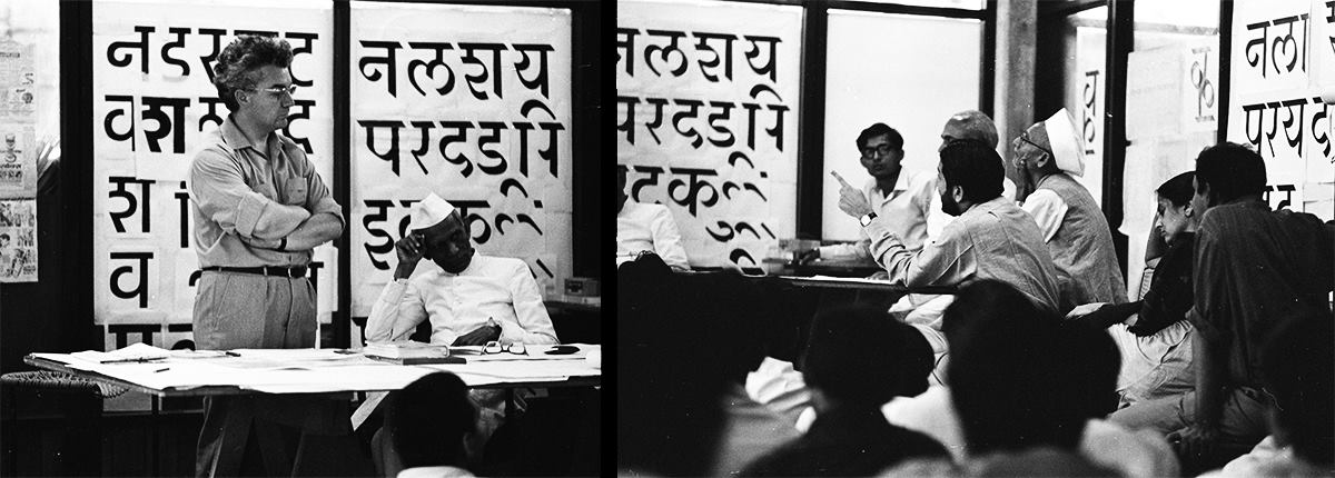
Mahendra: Armin didn’t speak English, and I don’t speak German. But he had a beautiful wife, Dorothea, who translated what he said into English and we learnt from him. Dorothea was a student of Armin Hoffman, and they got married. She had learnt letter design in Basel, and so she was teaching letter design at NID. My other friends who did applied arts and commercial arts in Baroda, in Bombay or other places, were very overconfident. For me everything was new. I jumped into letter design and somehow I started seeing sculptures and good forms in letter design rather than text. So I excelled in her course, and within six months I became the best student. She recommended to Gira Sarabhai that I should be trained for typography. In those days, typography was a known word, but type design was not very familiar. So they called another person from Basel, Peter Teubner, and I had one-to-one ratio training on hot metal typography.
I jumped into letter design and somehow I started seeing sculptures and good forms in letter design rather than text.
Salomi: Where did Peter Teubner come from?
Mahendra: Peter is in Chicago now. He was a student of Armin from the Basel school. So on a one-to-one ratio I assisted Peter Teubner and he gave me an assignment. Our institute starts around 8:30 am, and I go at 7:30 am and finish all my tasks, and I’m ready - I’m hungry for the next task. So by the time he finished one year I’m almost equivalent to him. I can do much better work than him. And Sarabhai liked that, and then Armin Hoffman recommended that I should be sent to Allgemeine Gewerbeschule-Basel for an advanced education to be a teacher. I was one of the three people to be studying in Basel in 1967.
Gunnar: And who else was there with you?
Mahendra: With me there was Vikas Satwalekar who became director of NID in 2010. For 11 years he was the director. And there was Ishu Patel who went to the National Film Board of Canada. The national film board had a French section and English section, and he became head of the French part of the department. He’s retired and in Kingston now. And Vikas died just a year ago.
Salomi: How was your experience at Basel and studying in a different country too?
Mahendra: When I reached Basel, Buhler was the typographic teacher there. He also didn’t speak English. So there was one German student who translated for me into English and I learnt from him. Buhler said to me - Mahendra, you know everything. Whatever we teach in Basel you have done everything. What more can we do? I told him - Sir, I have not come to learn. I have come to learn how to teach. So I’m observing how you deal with students, how you deal with typography, how you deal with workshops and assignments and other things ideally. But I had enough time and I thought this sort of an opportunity in life would not come again - for a person from a village and a small middle class family to have a year in Switzerland.
Salomi: You must have been very excited!
Mahendra: It was my first time. I had never been abroad. And I saw all those people eating with a fork and knife for the first time (laughs), I had never even eaten eggs in my life in India. And in the beginning I couldn’t even spend money. Oh that foreign money looks like a museum piece to me! The Swiss Francs had a beautiful sculpture on them. So I was a miser to spend money there.
Gunnar: Who taught you at the school in Basel?
Mahendra: There was a teacher there, called André Gürtler who was teaching letter design. He was very good in the history of letter design, and somehow we clicked together. And he said - Mahendra you should do more of letter design and type design. He was an assistant to Adrian Frutiger in Atelier Frutiger before he joined the Basel school. He worked there for one and a half to two years. When Frutiger started his studio he was the first employee for him. Now I was studying with Armin all the time, I didn’t have much time to do other things. So I attended evening classes which are for technicians with André Gürtler. From seven to nine at night I used to go and learn letter design from him, and he was very ambitious and very proud to teach an Indian. We were the first international students for Basel school. I did very well with Gürtler.
I attended evening classes which are for technicians with André Gürtler. From seven to nine at night I used to go and learn letter design from him, and he was very ambitious and very proud to teach an Indian.
Salomi: You had met Frutiger at NID before Basel.
Mahendra: Frutiger visited NID in 1966, one year before I went to Basel. He was on the way to Japan. He was working on OCR in those days - Optical Character Recognition for computers. They had heavy body American letters and they said that they can be read by a machine but not by human beings. So Adrian was developing something different - which can be read not only by a machine, but also by a human being who can read and comprehend the letters.
He had come for only two days to Ahmedabad and for only one evening at NID. During his visit he gave a big lecture on the future of text composition by computer and how computers would read everything. I’m talking about 1966 - computers came in 1984 in India. But believe me, everything went above my head. I didn’t understand anything that he was talking about. (laughs). He later returned to NID for a two-week workshop with all experts from typography and printing. And Adrian remembered me because I was assisting him. I was the only typography person [at NID] and I helped him during the sessions.
On the last day [of Frutiger’s second visit to NID] while going to the airport there was very heavy rain in Ahmedabad. It was pouring and nobody came to see him off. But I went on my bicycle to the institute and I asked him - Sir can I come with you to the airport to see you off. He was more than pleased. So we went in an old Ambassador car to the airport.
In those days at the airport there was a sofa where you’d sit and then you walked down to the plane, so while waiting for the plane I was sitting with him. To kill time he asked me - Hello, who are you, what do your parents do? I said - My father is a businessman, my grandfather is a farmer. And he said - Do you know Mahendra, my father is a weaver. So we connected and we had a very good - about 45 minutes - talk with each other. And we felt very close to each other. Immediately he said - Mahendra, next time you are with me, I’ll write to Sarabhai and I would like to help you and I want to have you in my studio.
Gunnar: Did you meet him during your time in Switzerland?
Mahendra: When we went to Basel, he knew that we were coming there. He was a very busy guy in those days. He specially arranged for a friend to take me from Basel to Paris in his car, and drop me off at his guest house because we arrived at night. At the gate he left a note: “Welcome to my guesthouse. There is rice and garlic in the fridge. Help yourself. I’ll see you tomorrow”. And the key was hanging on the door. I was embarrassed by the gesture he made and I had a very good week in Paris.
At the gate he [Adrian Frutiger] left a note: “Welcome to my guesthouse. There is rice and garlic in the fridge. Help yourself. I’ll see you tomorrow”.
He gave me ten free tickets and he took me to the nearby underground Metro station and he said - Mahendra, you should visit yourself, I don’t have the time. This is the underground station, Porte d'Orléans. From here you take it, come, take a bus and go to La Vache Noir, where we had the studio on 18 Ville Moderne. He gave me his whole house - his mother-in-law’s house - for me to work there. It was a gala time. And we just discussed what is Devanagari, what can be done, just one hour or two hours during the day, and then during the rest of the time I looked into Paris and roamed around, and he also arranged for me to go back to Basel after the one-week Christmas vacation.
Salomi: And this meeting led to another longer collaboration in Paris with him?
Mahendra: We came back to India in 1968. I started teaching. And he remembered his word, and he was more impressed by me. He wrote to the Sarabhais that I should be there and that he wouldn't charge anything to NID. He gave me a free internship at Atelier Frutiger. In return I would work half a day on his project and half a day he would work with me to help me in understanding what type design is for Indian scripts.
I went in January 1971 and in March 1972 I returned to India. I spent 13 months there. I had a gala time with him. Everyday we met for one hour. Sometimes when he was busy hardly one hour a week. I used to get frustrated because he couldn't meet me, so sometimes he took me to his country house. He has a lovely country house, around 80 miles away from Paris. It is an old farmer’s house with a horses’ house and a duck’s house. And the farmer’s house he had turned into a weekend home. So he would take me there, we’d take our work, discuss, he would cook for me. I mean imagine, Adrian Frutiger would cook for me! And he would take me around to an old church. He gave me exposure to French life.
Gunnar: What did he cook for you?
Mahendra: He knows I love garlic and rice so he would cook rice for me, soup and spaghetti. And he loves wine and he loves meat. So he ate that but he knew that I am a pukka (strong) vegetarian. He took me to his family also. He had two young daughters and a son - Sylvie, Annik and Stéphane - and I used to play with them. They were small and I loved Lego and other games. Sometimes I visited them at their house, which is around 15 minutes walking distance from the studio.
For six months I worked, worked and worked. I went in the evening to learn French to communicate with and understand Parisian life. And after six months he comes to me and says - Mahendra you have done a whole year’s work. Don’t do so much work and give back to NID. We never work so much, here is a paid vacation for you. He created a four-day paid vacation to Spain, and he gave me a ticket including a stay and everything. He said - go and enjoy. You have worked enough. So I had a gala time to Spain. I visited Barcelona and Madrid, and saw that dance, that Spanish dance that they do at midnight.
For six months I worked, worked and worked. I went in the evening to learn French to communicate with and understand Parisian life.
Gunnar: Flamenco?
Mahendra: Yes, Flamenco. He bought tickets. He did everything. And he knew I don’t drink so he advised me to take a - I remember - he said gin with tonic. Take Mahendra, some lady’s drink - a mild drink. You would enjoy it (laughs). I had a really nice time.
Gunnar: Did you visit any other places besides Spain?
Mahendra: I went to Normandy on another paid vacation.
Salomi: You also visited Frankfurt for work.
Mahendra: Actually I worked on the Walbaum typeface that he was working on with Monotype in Frankfurt. And one interesting thing which I’m very proud of - Linotype always sent work back to him for correction. He corrected the work and sent the corrected work along with me to Frankfurt, and told those people that Mahendra Patel - this Indian would correct my work. Even for Germans it’s a privilege to correct his work. And he says here is Mr. Patel, I trust him and he would correct my work there. So they were very, very, how would you say, jealous or suspicious about my capability and Adrian warned me.
There was a typographer called Bruno Pfäffli working with him, and he said - Mahendra do you know what are you going to? You are going to German people. They are very precise and they are very, very particular. So then I went there. I was prepared to face the top type. So being Indian I said - Sir I am coming to Frankfurt for the first time. I am here for two weeks, but I would love to visit Frankfurt and around, and I also want to go to Mainz - to the Gutenberg museum. So if you don’t mind, I’ll start early in the morning, at 7:30 am, and finish my work by 11:30–12 pm. And they agreed. Luckily it was Adrian’s recommendation, so they had no choice in agreeing (laughs).
Gunnar: How was the experience working at the Linotype office?
Mahendra: I worked, and they gave me a studio with a special key, and people opened it for me. That studio was very, very secretive. Nobody else should see. You had this in those days in type design, where you don’t have to share with anybody - like we have a non-disclosure agreement. But one time, on my drawing board, I could see somebody had flipped my work. So they were checking in my absence what I was doing.
Salomi: They appreciated your work at Linotype.
Mahendra: Mr. Hunsinger was the art director at that time. And he was really happy. And I had a really nice time. It was one of the most proud moments for me.
Salomi: That must have felt great to feel such a sense of achievement. Was there any other such moment which you feel proud of?
Mahendra: Another moment - I finished my one year with Adrian. It was the time he offered me a job. He said - come Mahendra, I’ll pay for your family. My mother-in-law’s apartment is there. You don’t have to search for any apartment. He said - it is yours. Come and work with me. So I said - sorry Frutiger, here I would be one of a thousand people working in Europe as a type designer. In India I would be one of the few people. And NID have invested so much in me, and trusted me so much, I don't want to break that trust. So I would like to go back to India and work with NID.
I said - sorry Frutiger, here I would be one of a thousand people working in Europe as a type designer. In India I would be one of the few people.
He appreciated that feeling very much. So he says - now I want to give you something - whatever you want from me. He had his painting, a sculpted painting called a festival of life or human being, embossed with a black paper board, in Frankfurt. Two paintings were done. One for him, one for his wife. His painting was hanging on the wall in the studio. I had a studio on the second floor, he had a studio on the first floor, and on the ground floor was a typography studio. I used to walk up and always see that painting, so I told him, - Adrian, if you want to give me something, I want your painting. He said - I’ll make one more for you. I said - No, I would like to have that one. He said - It’s broken on a corner. I said - I love it even more because I have a close association with it. It’s not broken for me, It is very precious.
Bruno, the typographer, told me that Adrian had promised him a painting for the last seven years and he had never done it, so Mahendra never trust him and take that only (laughs). He pleasantly gave me that painting. He packed it well and carried it with him to the airport to see me off. He instructed Air France that this person is precious, please take care of his painting to reach India. I was very overwhelmed. You know a person like Adrian coming to the airport to see me and instructing them to take care of his masterpiece. That was the relation with Frutiger.
Salomi: Did you explore any other projects during your time in Paris?
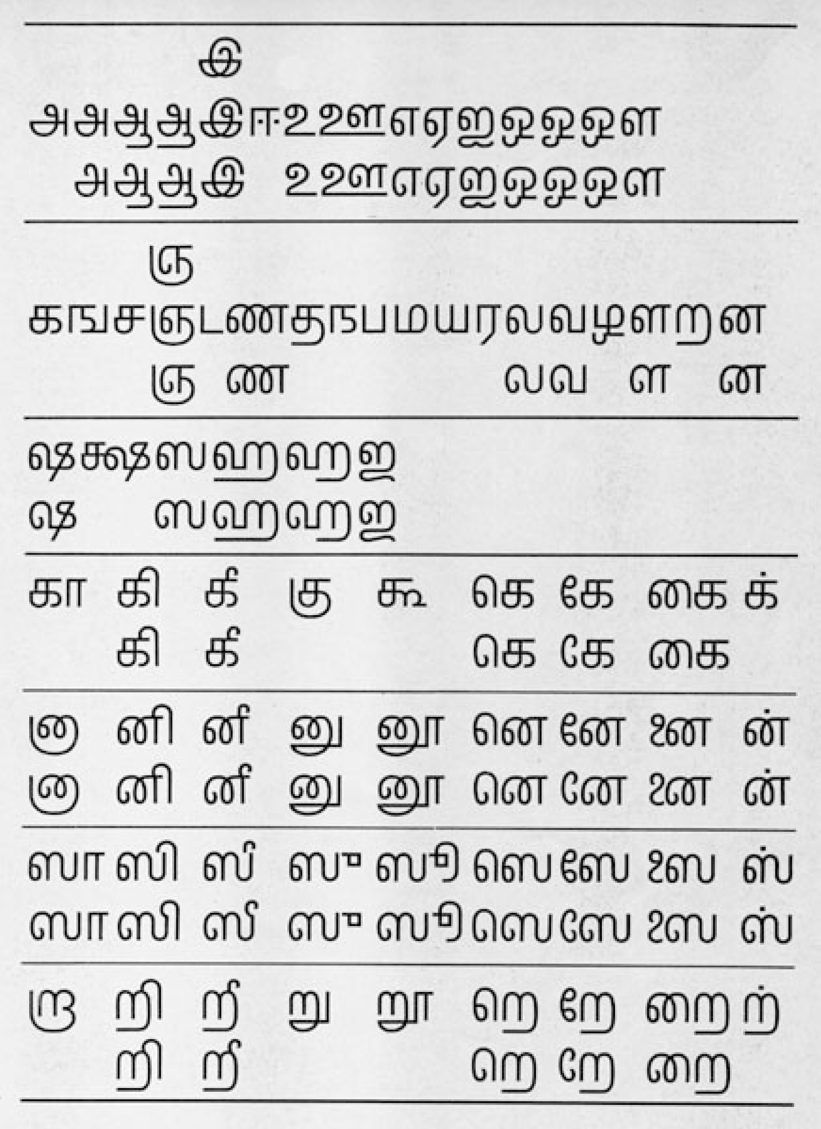
Mahendra: While working on Univers Devanagari, I had some free time. I was very excited to make the most of Adrian Frutiger’s association so I went to the Louvre museum and researched Tamil because I was away from India, and Tamil is a completely South Indian script. I didn’t know anybody. But the Louvre museum has very good resources on Indian scripts.
I went there, and I even went to the London National Gallery where they have a good manuscript section. I collected some data and started working on Tamil as a hypothetical project. I took ordinary paper, a sketch pen, and a sort of mechanical pen, and filled it up. But because of my control over here, when I draw even by hand it is almost equivalent to a French curve. It was so good and smooth. I had a magnifying glass with a mm scale which is further divided into 10 parts so we could see, measure and check our text style and all. It was very rigorous training. And I’m very happy to have it.
Salomi: What was it like working on Univers Devanagari with Frutiger?
Mahendra: In those days it was called Univers Devanagari for the Monotype corporation for phototypesetting. I worked on a polyester sheet called a frisket. It had a frosted matte on one side, and a gloss on the other. Using a French curve with special black waterproof ink, we created artwork for phototypesetting. And we filled them up with ink and then gave them as artwork. For Linotype I had used a masking film which is a red masking on a clear polyester film. You can cut and take away the mask of the letter and it becomes a negative directly at a large size. I got training on that also, and the work I did was good.
It was designed in a manner for text face primarily but also for display. It is like graphic design on a vertical and horizontal axis which is very technology friendly with phototypesetting, because a lens can make it to different weights and widths and slant.
Gunnar: Can you tell us a little bit about the approach?
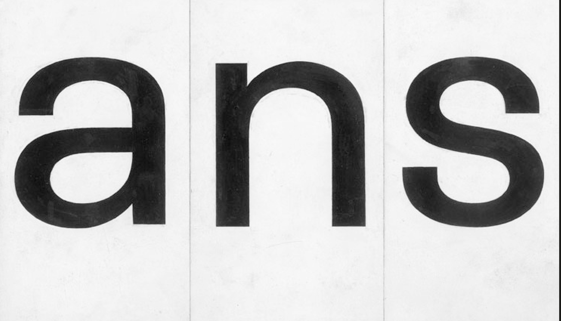
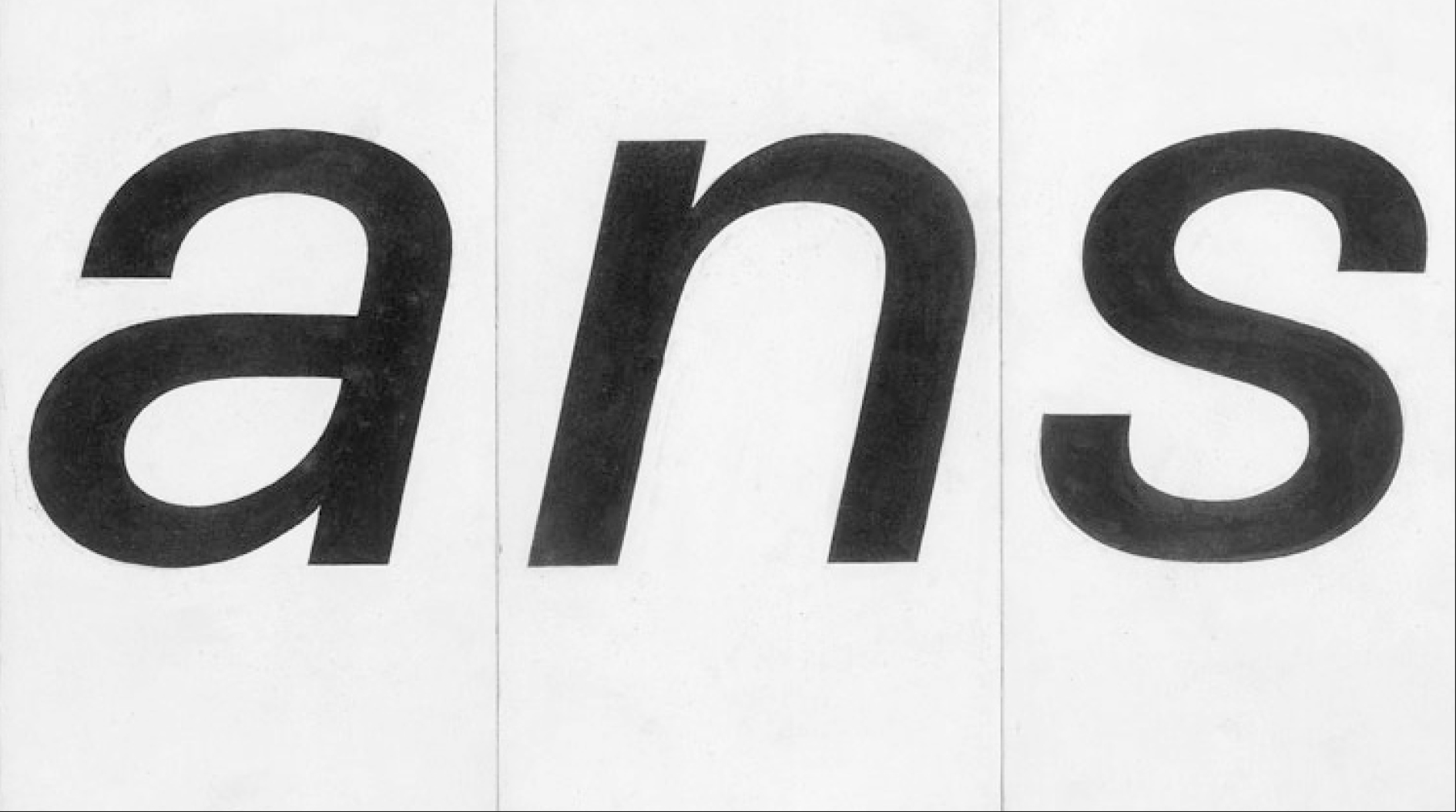
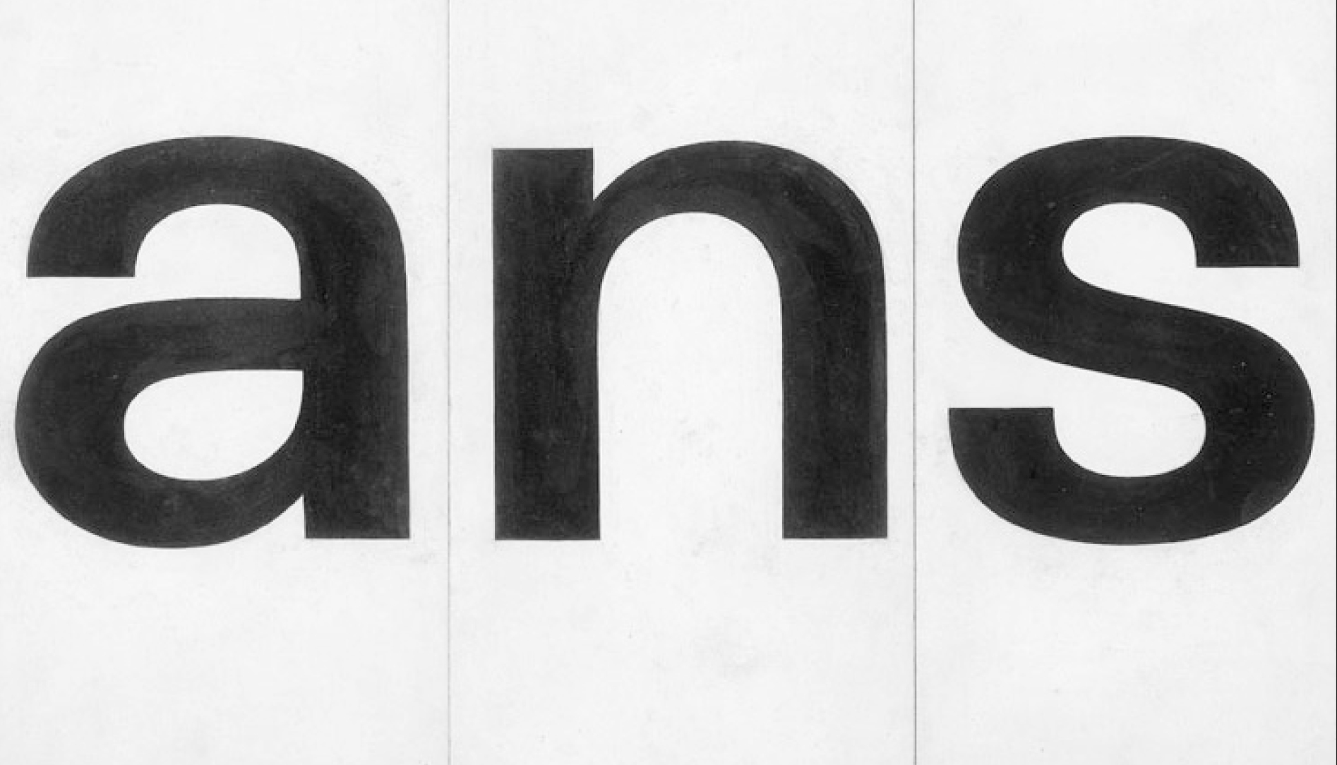
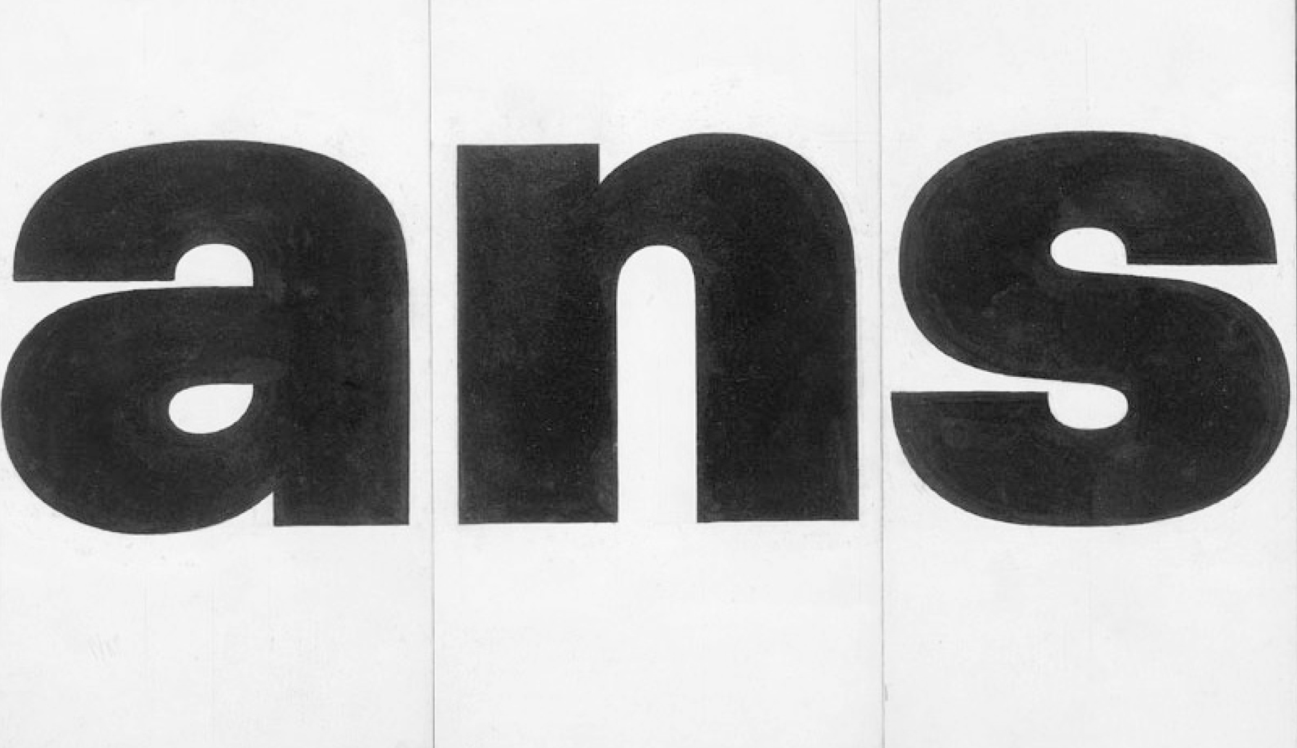
Mahendra: Sure. Actually, André Gürtler worked on the Univers typeface with Adrian Frutiger. So when I was in Basel, I had thorough training with André Gürtler, I designed ‘a’, ‘n’, and ‘s’ and some basic model capitals. These were with serifs, but without brackets. I did it freehand which was a self-imposed control constraint.
Salomi: What materials did you use?
Mahendra: In those days in Switzerland we had a waterproof colour called plaka which came in black and white and was opaque.You can cover a mount board with white plaka in the same way you’d coat a canvas. We’d layer the whole thing so that letters had the same background, then we’d draw with pencil lines and fill them in with black. These are opaque colours - both white and black. So if you have a little more black you can correct with white if you want to, and if you want to add a little more black you can add it. So the work becomes perfectly a hundred percent black and white.
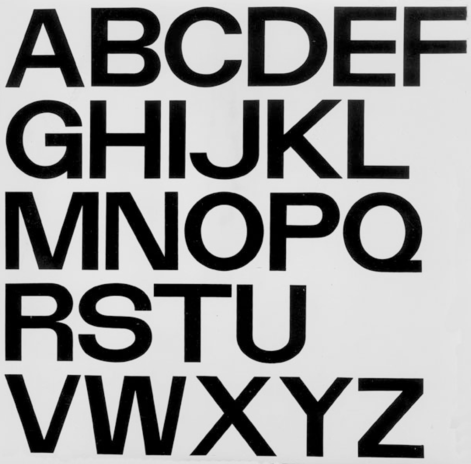
I did ‘a’, ‘n’ and ‘s’ for the Linotype system [with André Gürtler at the School of Design, Basel] - the width remains the same while the style changes. I learnt the basic principle of constructing letterforms on a vertical and horizontal axis. I did three styles - regular, italic and bold which have different weights but the physical width is the same. The letterform has a form width and space on the right hand side and space on the left hand side. When you compose anything on a Linotype system in hot metal - if you change the weight from one weight to another weight it doesn’t change the width so you can easily replace it. Part of my training was to deal with form and technology at the same time.
Gunnar: This project trained you towards working on Univers Devanagari?
Mahendra: Yes, Gürtler gave me thorough training on constructing letterforms on the x and y axis’ which is what Univers is based on.
It has no diagonal, but all horizontal and vertical endings. The trace of the curvilinear stroke works on the x and y axis. And when I started working with Adrian he fine tuned it with Devanagari. Actually there were no French curves suitable to Devanagari, so we drew four representative letters and shortlisted what kind of curves it would require.
Actually there were no French curves suitable to Devanagari, so we drew four representative letters and shortlisted what kind of curves it would require.
We cut special French curves with laser-cut and that was used for creating Univers Devanagari. I worked on a polyester film which was 25 cm or 10 inches tall. Before I went to polyester I worked on paper and put the drawings on the board. This is put on a wall and using a reduction glass we’d go away from the wall and judge them in reduction. This glass had parallel corrections so it wouldn't disturb the letters. You don’t need so much distance to judge, so that glass corrects the perspective to give the reduction on a flat surface. And that glass had a centimetre grid also, so we could see a corrected image in reduction and check the weights, joints and endings of the strokes of the letterform.
Salomi: How did you approach the ink traps?
Mahendra: Because it was phototypesetting, there’s an exposure which causes blurring at the joint which is similar to ink clotting in letterpress - Univers has it. So he also trained me on how much and where to give and where not to give ink traps corrections, and how to create acute angles so it becomes readable and visible at smaller reductions. We call our designs a linear Devanagari, but in artworks it has varied weights and optical corrections.
I had that training in Basel with André Gürtler on this, but with Adrian Frutiger it was even further fine tuned. So the blurring at the joints, the horizontal and vertical relations, the curvilinear stroke compared to the vertical stroke or straight stroke - all had been fine tuned. And I even had a French centimetre scale which didn't slide on the paper because there was a little rubber padding at the bottom. It is raised a little bit from the paper so when you draw a line it doesn’t strain on the paper. That was a special technical centimetre scale we bought for it, which for an Indian was very eye-opening.
Salomi: How did you work on the reduction?
Mahendra: At Atelier Frutiger there was a special parallel camera which was used for repro photography as well as printmaking. The reduction is controlled by a certain proportion. With the reduction, we did the text style. So the contact print would be of the same size whether I took the repro today or tomorrow. We had a fixed distance under the camera and it was a parallel camera so there’s no distortion in that. It was very precise. A French lady, Suzy, was operating this and was in charge of the photography studio. She was a secretary as well as a photo assistant. As she was very busy, I learnt it from her and did all the work myself.
At Atelier Frutiger there was a special parallel camera which was used for repro photography as well as printmaking.
So then we made contact prints, cut them, created a text and made a block. As they didn’t have block-making in house, we got it done externally. But they had a letterpress proofing machine and Bruno Pfäffli was in charge of the letterpress studio. Here we had all the types in large and small sizes, so we got a letterpress plate mounted on a wooden base, and we printed it. And when we are printing the pressure is very important, so we realised that the ink should not be pressed too much. Then we checked the readability and legibility of it, and once that was done we corrected that design, and then did the final corrections. Then the individual letter/glyph artwork was sent to Salford for digitising.
Gunnar: Did you visit Salford?
Mahendra: I met Fiona Ross in those days at Salford. I don’t remember exactly, but when I went there for a week of training on how my artwork would be digitised and drawn again. Our design was more visual, so they redrew it to adjust them to fit on a grid of 64 units per em, and they fine-tuned the sidebearings. I was not very aware of sidebearings in type design, but Monotype was giving sidebearings to the master design. Now they give sidebearings in FontLab and Fontographer. But in those days when we did artwork we were not aware of it. Later on when I came to India I added sidebearings as part of my artworks.
Frutiger says - Mahendra you don’t have to draw another artwork. People are going to redraw it as your drawings on paper are good enough. So I started drawing letters free hand on paper and my judgement was good. By the time I did all the basic letters (not the text style) - my time in Paris was over. So in 1972 I came back to India. And I continue doing the same thing at NID.
Gunnar: Did you work on the reduction in a similar way to the process in Paris?
Mahendra: Here we didn’t have a parallel camera, but we had an animation camera with each frame on a slow film. Later we had a microfilm with a 35 mm specific repro camera. So we did what you call a sound film or microfilm of large artwork. I cut and pasted all the letters, and created text styles. I sent the text styles (to Frutiger) and because of my earlier experience, there were very few corrections from Frutiger.
For proofing of the text style we tested by letterpress blocks to simulate cut and paste from bromide prints. We took half and full letters and mounted them on the drafting table. Then with a process camera we’d take a perfect film and make a block of different sizes. We used this for proofing at Atelier Frutiger for Univers Devanagari and at NID for Nayee Nagari.
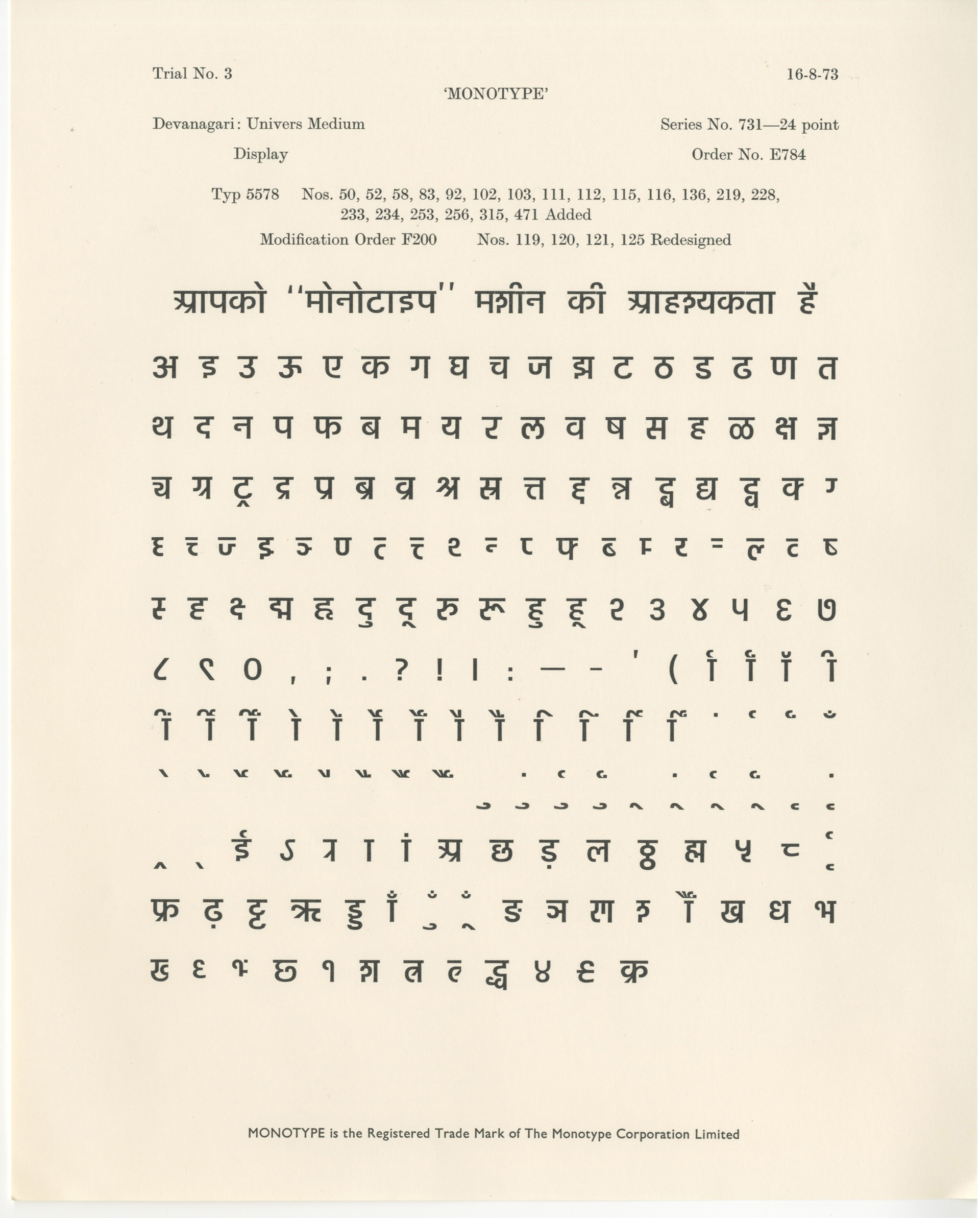
Meanwhile, our typeface for Univers Devanagari was manufactured and executed by the Monotype corporation and they brought it in ‘74. They sent one type case of the hot metal version of it to India. So I returned to NID, and I completed my Nayee Nagari – basic letters, not matras, then reduced them, saw them, corrected them, created the matras but not jod-aksharas so much. And that remained on the paper until today.
Salomi: On returning to NID you continued work on Univers Devanagari and completed it in India?
Mahendra: I did almost 80% of the work with him [Adrian Frutiger in Paris]. For the other 20% I came back to NID and finished it. In those days we didn’t even have a good Photostat copy. You sandwiched and you got a copy of it. It wasn't like a Xerox copy. So I used to create ammonia prints like RTX on the sheets and send them to him. He corrected them with a red pencil and sent them back. In those days sending and receiving back would take a minimum of two weeks, coming back with an answer would take another week. So around 15 to 20 days it would take to get feedback. We didn’t have anything else in those days. Telephones were extremely expensive, so we used telegrams to communicate. And I finished it.
Salomi: Was there a specific process that you followed to define this character set?
Mahendra: In those days language engineering was not there. It was the basic characters so I referred to the Monotype non-Latin hot metal type and followed their character set.
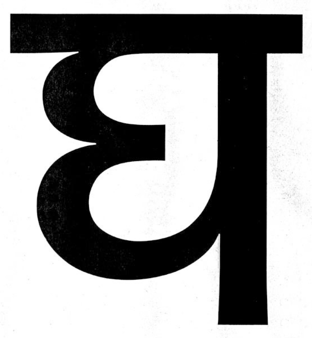
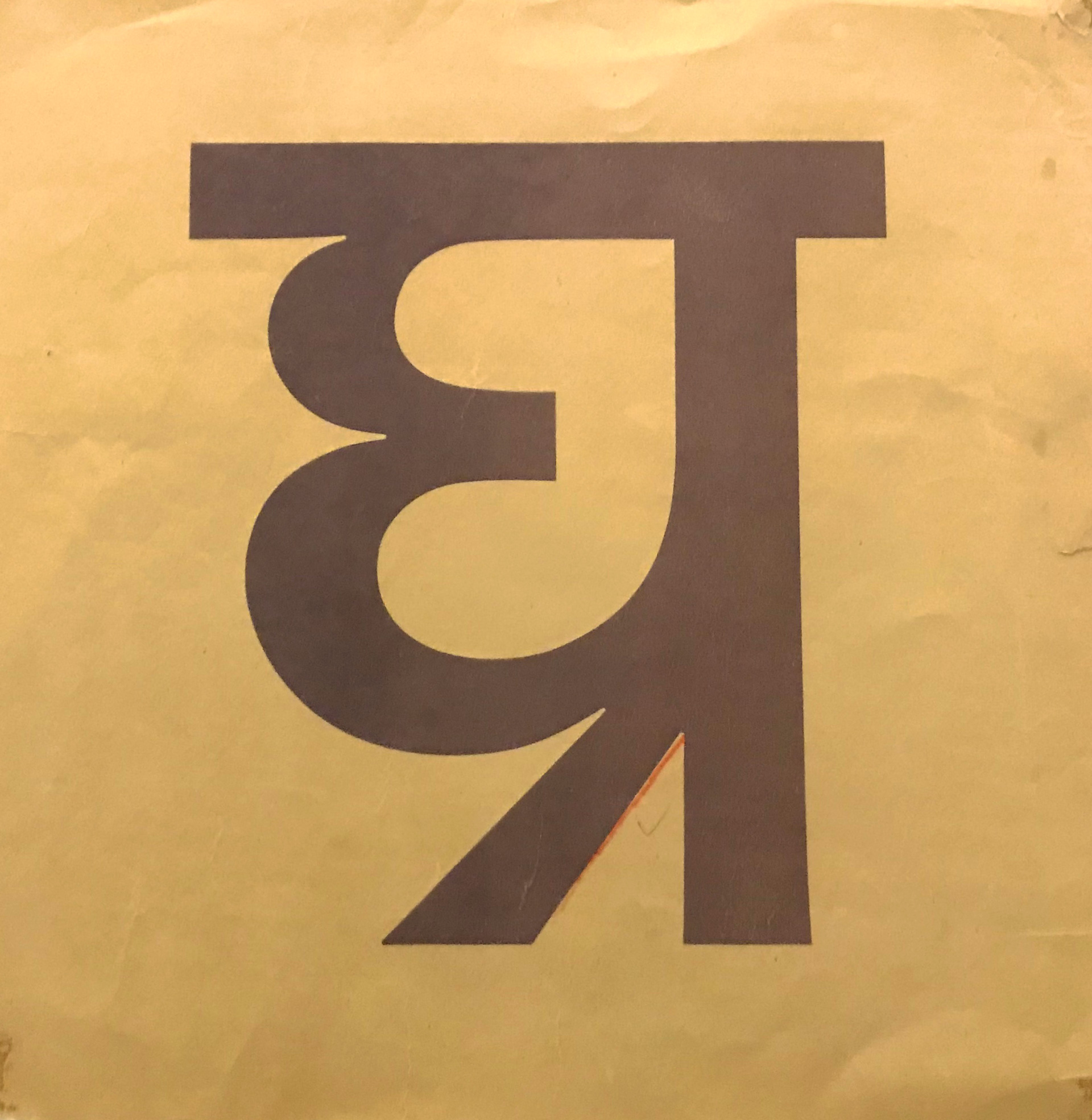
Salomi: And what I noticed was that you have the current style of the Devanagari ‘अ’ that we are using today, but then you also have the option of the older version - the older style of the ‘अ’ and also the other forms like the ‘ल’ for instance. Was there a reason for having two styles?
Mahendra: I created two types of ‘ ल’ and two types of ‘श’ and two types of ‘अ’ to cope with Marathi and Hindi. Because Marathi people prefer ‘छ’, ‘श’ and ‘ल’ in a different structure. That’s why there were two options.
I created two types of ‘ ल’ and two types of ‘श’ and two types of ‘अ’ to cope with Marathi and Hindi. Because Marathi people prefer ‘छ’, ‘श’ and ‘ल’ in a different structure.
Salomi: This was the Bombay style and the Calcutta style?
Mahendra: Ya
Salomi: The final character set was standardised with a government resolution in 1962 to follow certain styles of the Bombay characters and then certain styles of the Calcutta style. But do you think both the styles were used much after the standardisation also took place?
Mahendra: There were two views on vowelisation and they did not settle down with regard to which vowelisation they would follow. We follow linear vowelisation. So I don’t have a conjunct which is a vertical conjunct. It is all horizontal in the Univers Devanagari typeface, while during my design of Neue Frutiger Devanagari I took an appropriate decision whether it is vertical or horizontal conjuncts.
Salomi: So this is what you mean when you describe the typeface as a contemporary linear style typeface? Horizontal conjuncts as opposed to vertical conjunts?
Mahendra: Ya. Double ट, ठ. So ट्ठ - I had a ट, halant and ठ in Univer Devanagari, but not Frutiger Devanagari, ठ comes at the bottom.
Salomi: Was there a reasoning that went behind a linear route as opposed to a more vertical approach?
Mahendra: Well (laughs) I wanted to follow reform structure rather than conservative classical structure, because Univers Devanagari itself was a breakthrough in the country. There was no sans serif or linear typeface. And I had a hard time too - all the conferences I attended people said - how can you westernise Indian script? So it was rejected. Actually it was rejected totally. I tried everywhere in the beginning.
I wanted to follow reform structure rather than conservative classical structure, because Univers Devanagari itself was a breakthrough in the country.
Slowly, slowly people started copying and people started realising. So as a result I started using it myself. I used it for all international airports, for example. I did Bengali, Tamil and Devanagari for airport signage. I used it for the State Bank of India - all nine scripts in linear style - in a contemporary style. On a small scale I started using it on my own. I designed Devanagari to be used for exhibition purposes for all NID exhibitions. I have done three exhibitions and we used our own Devanagari. I tried to promote it that way.
Gunnar: Did you experience any resistance?
Mahendra: Ya, the Poona group had some resistance to the linear style (sans serif), thinking it is of European influence. They have more of a mindset towards hand lettering and the calligraphic style of reed pen. And I had a more contemporary approach with a constructed letterform with a monoline weight (like sans serif). They very much confuse calligraphy with typography, because calligraphic tools and hand tools are God’s words and the letter उ or ॐ comes from Shiva’s damru.
They create stories of all the letters and sounds and God’s words and all, while I have a more logistic and scientific approach, or a more graphic and structural approach. So in the beginning it was resisted but slowly they accepted it for logos and exhibitions among other things. There is an advantage to being at NID - I had lots of clients coming to NID, and it was the premier institute, so I could apply my logic to that. Most of the NID work with postal stamps, exhibitions and logos were based on the new style that I was proposing.
Salomi: And this logical and scientific approach that you put towards type design, do you think that was also partly influenced from your experience working with Adrian Frutiger and visiting Basel and studying over there?
Mahendra: Very much. It was influenced by the Basel School of Design. Armin Hoffman was a hard taskmaster. His forms are perfect. Upper and lower strokes, weight differences and joint differences were the major breakthrough in my training at Basel with André Gürtler. And it was enhanced with Adrian Frutiger, when we worked on the Roissy airport letterforms - which were the origin of the Frutiger typeface. I realised that a graphic approach like Univers is limited to display faces and is more geometric. It has its own rigidity and discipline. It is not humanistic. So he had started already working toward a humanistic design.
Upper and lower strokes, weight differences and joint differences were the major breakthrough in my training at Basel with André Gürtler.
Gunnar: And you have a lot of vertical conjuncts as well.
Mahendra: Ya, almost all horizontal conjuncts, not vertical conjuncts. Ya, द्व - that was a little difficult to find, so there are a few. But it's possible in both ways. This is just to cope with when you create a typeface, sometimes completely radical reform doesn’t work. So you give both choices.
Gunnar: What was the thought behind the space that you give between the matra and shirorekha?
Mahendra: Yes, I gave a little space between matra and kana too. ओ, इ and all. There is a space between the shirorekha and the matras. This is a breakthrough from the writing. It is because it is constructed and we wanted to have floating matras. I created the space to distinguish between इ and ई, and it becomes easier to register on the system so if it is a little floating it doesn’t create visual confusion. That is the major thing, and then we did it consistently.
I created the space to distinguish between इ and ई, and it becomes easier to register on the system so if it is a little floating it doesn’t create visual confusion.
Salomi: How did you work out the structure of the letterforms?
Mahendra: I learned how to cut a reed pen first, and then write in a correct angle and hold the reed pen - because a reed pen requires a particular holding of the pen to write it. Then I constructed well proportioned letters on the paper and traced them out - the outline, then rationalised the outline and then created a paper artwork.
I learned how to cut a reed pen first, and then write in a correct angle and hold the reed pen - because a reed pen requires a particular holding of the pen to write it.
When you draw with a reed pen, your hand may not be consistent or it sometimes may vary and not have the geometrical flow or smooth flow. Sometimes it may have some errors, so during refinement you rationalise it. At a micro level there is geometry everywhere.
I used to create a large size reed pen - I don’t remember but 5 to 6mm nib width and then write with it into 5 cm height, and then enlarge it to almost 25 cm height and rationalise in a larger size so it becomes like a sculpture, with 25 cm kana height. I took a photograph of my line drawing of just 5 cm and then enlarged it on photo paper. The drawing was photographed under a repro camera so there is no distortion.This was not done on the mount board because the quantity was very large, and my hand was very well trained. So I used ordinary letter paper to do the artwork.

Salomi: In India, how did you take your learnings onto other projects?
Mahendra: On my return to India I started working on the humanistic aspect of the Devanagari script which I used for exhibitions and also airport letterforms and the State Bank of India logo names. And I continued that with Kannada, Malayalam, Gujarati, Telugu and Tamil letterforms for different type foundries in India or different things I worked for.
On my return to India I started working on the humanistic aspect of the Devanagari script which I used for exhibitions and also airport letterforms and the State Bank of India logo names.
The first typeface was commissioned by ITR in Gujarati for Gujarati Type Foundry. That was in ‘81. Gopalkrishna Modi, an old friend of mine, who was the owner of Gujarati type foundry, wanted to have a new and professional approach to type design so he contacted me. I had met him at ATypI in Paris. We came to attend ATypI when I was with Frutiger at that time. And so that relation continued with him and I produced Gujarati normal and bold styles for him on paper. Then Vasant Desai at ITR executed it on pantograph (This is a large scale drawing and you can reduce the scale and engrave as well), and also for phototypesetting for Gujarati Type Foundry. It was a development project for them.
Salomi: You worked for some newspaper publications as well?
Mahendra: I worked for Deccan Herald in Bangalore for Kannada for their publications Prajavani and others. Their brief was a design for magazines - so a text face for them. Kannada is heavy at the bottom if you see it in Bangalore, so I had a normal Latin script or sans serif typeface - vertical stresses are heavier and horizontal are lighter.
The Malayalam Manorama newspaper heard about me working for the Deccan Herald, and they are competitors, so they said we also would like a new typeface. But they were more conservative, so they selected a pen tool rather than a linear tool. I presented all types of directions with different angles and they selected the quill pen style with the Latin slant for the design. Malayalam has lots of horizontal letters and they wanted to have it for newspapers, so I created a little condensed version of it but in a classical form based on reed pen form. And that was developed by Monotype.
Gunnar: At which Monotype office?
Mahendra: In Salford. I visited to see what they were doing with my typeface, and also met with Fiona Ross, took one specific letter form, created it in the unit system and sold it to them. Their digitisation was done in Lucerne, so I went to Lucerne to understand how my typeface was digitised. It was all digitised on a computer so we enlarged it 100 times and there were aesthetic corrections which I learned there.
This was 1984. I also designed a map and signage typeface in Kannada, Telugu and Tamil for Tirumala and Tirupati Devasthanam, which required five-language communication. I went to C-DAC in Pune, where they had a script letterforms ISFOC (Indian Standard Font Code) phonetic keyboard. They put all my designs on that computer to create a downloadable font. So according to their character set and system we created this font for my wayfinding design for Tirupati.
I also designed a map and signage typeface in Kannada, Telugu and Tamil for Tirumala and Tirupati Devasthanam, which required five-language communication.
Salomi: How was that technology different from the previous technologies that you worked with?
Mahindra: Univers was on frisket - a polyester film. Nayee Nagari was on manifold paper, which is semi translucent. And I had a drafting table and a backlit glass table in the studio at Atelier Frutiger. Then I think Malayalam, Kannada and Gujarati were done on paper. And others were done directly on paper because now the sophistication of taking a repro was there. Then came Fontographer and I had Fontographer 4.1. And then after Fontographer came FontLab, so I started working on FontLab. I have not worked with Glyphs yet. I have a trial version but I am so habituated to working on FontLab and FontLab 7 is as comfortable as Glyphs.
Part two of our interview with Mahendra will follow.