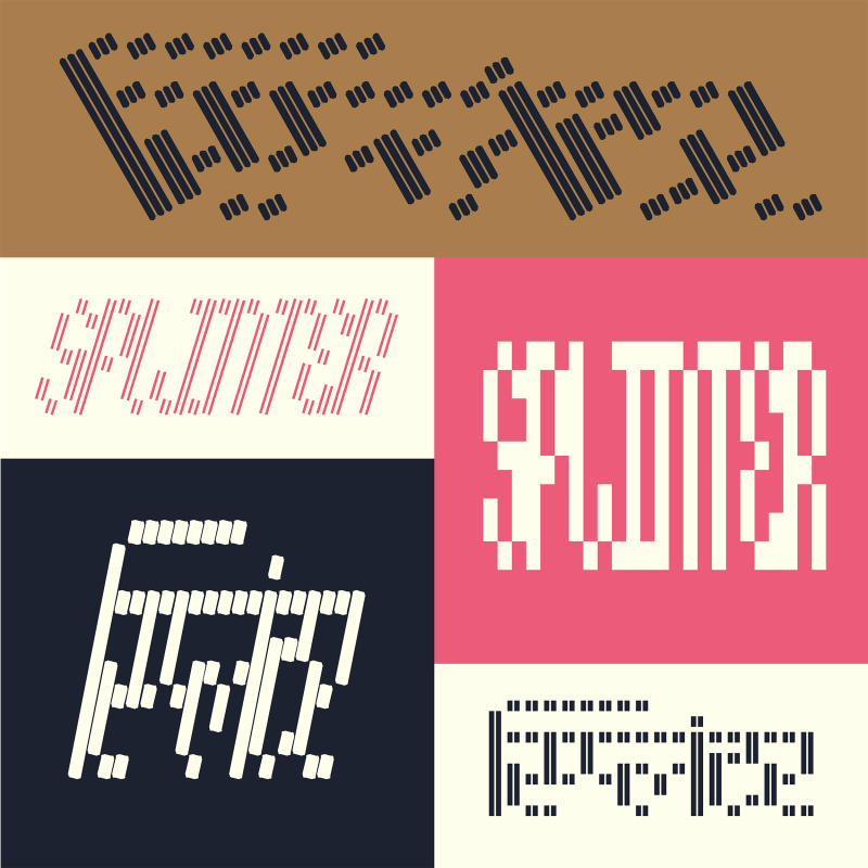
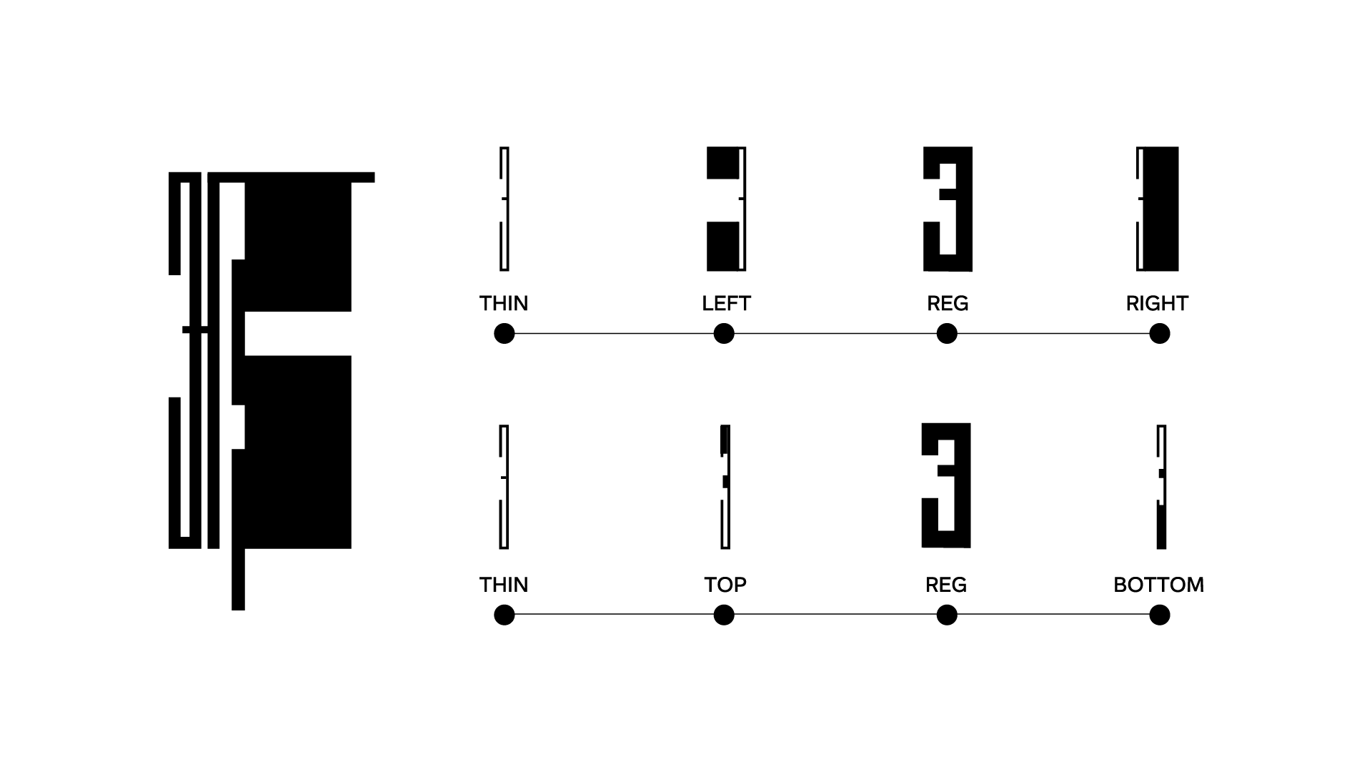
Splinter is a display typeface designed and developed by Namrata Goyal and Frederik Berlaen in collaboration with Universal Thirst. Version 0.1 is now live on Future Fonts! It explores variable axes in a grid-based, modular Devanagari typeface, pushing legibility to the extremes and creating letterforms that can be used beyond text – as patterns, or other graphic elements. The seed of this design lies in a piece of lettering found in a long-forgotten book from Goyal’s aunt’s library – which is filled with 1960s and 70s titles, many of them in Hindi. Over time, and with ongoing exploration of the design possibilities, Splinter found the light of day. At the centre of Splinter’s design space is a pliable, pixel font. This source stretches into five variable axes and three binaries for inline styles. The variables are 1. Weight, 2. Width, 3. Gutter, 4. Slant and 5. Caps. And three inline styles of 1. No inline, 2. Single Inline and 3. Double Inline
Due to its experimental nature and the extensive research and design process, it took some time to bring this project to launch. For now that means Splinter supports the basic Devanagari character set as well as some (not extensive) support for conjuncts, Marathi and Nepali glyphs. This will allow us to test the water with what we have and continue to experiment with future versions. As it develops, the font will expand to cover Latin characters followed by other Indic scripts.
To share some deeper insight into the design process, Splinter designer Namrata Goyal will be sharing her journey of inspiration and iteration – including the software and tools she used and the experiments that led to the final typeface – through a series of upcoming posts we’re calling Splinter Diaries.
Namrata: This project was a major learning curve for me, especially regarding what is ‘possible’. As a native reader and viewer of Devanagari, I had (and still have) preconceived notions about what could and could not be done with the letterforms, which created doubt around where the process was leading me and if I should take the time to explore it. In this first Splinter Diaries post, I will share how Splinter came to be, starting with its foundations and the early bits of the process.
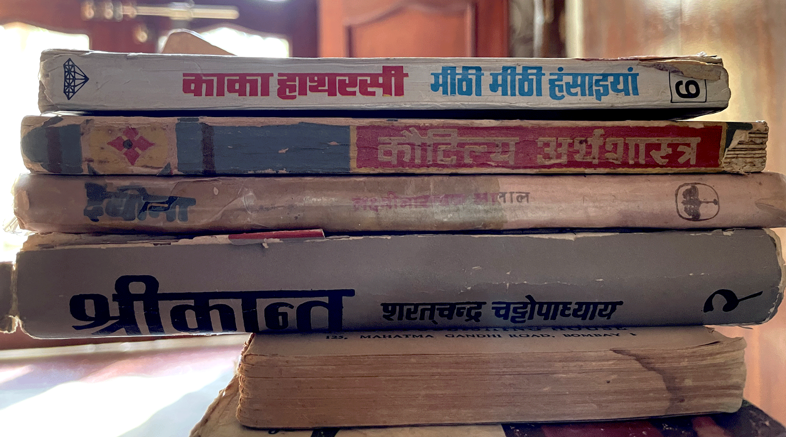
Like most font inspirations, Splinter started with a piece of lettering – found in the title of a book from my aunt’s library of titles dating back to the 60s and 70s. I love visiting local libraries or scrounging around dusty bookshelves in search of interesting letterforms; sometimes it’s the entire title that triggers something, and sometimes it’s a single element, like a drop cap.
The discovery coincided with my need to draw some ‘fun’ letter shapes without limiting myself to established styles – such as classical, monolinear, geometric – or usages.
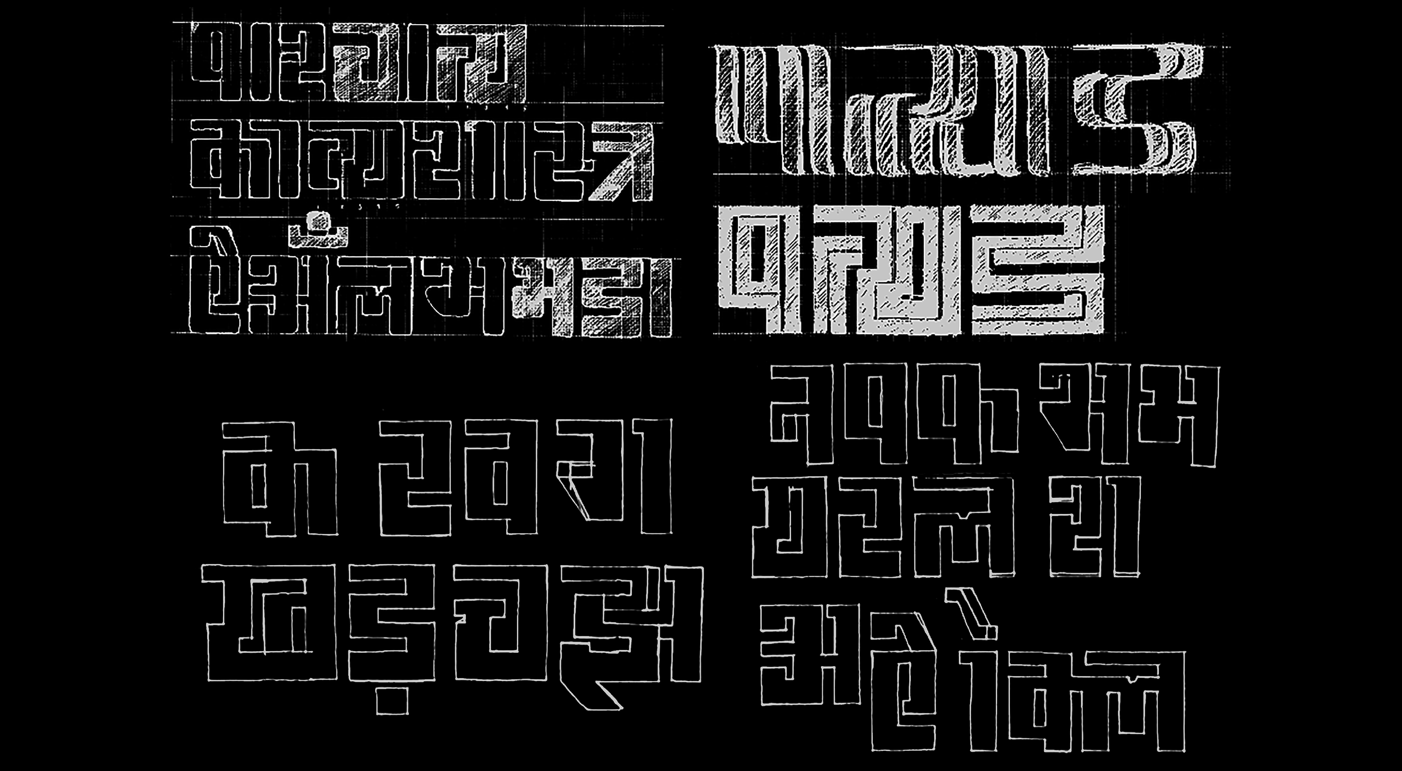
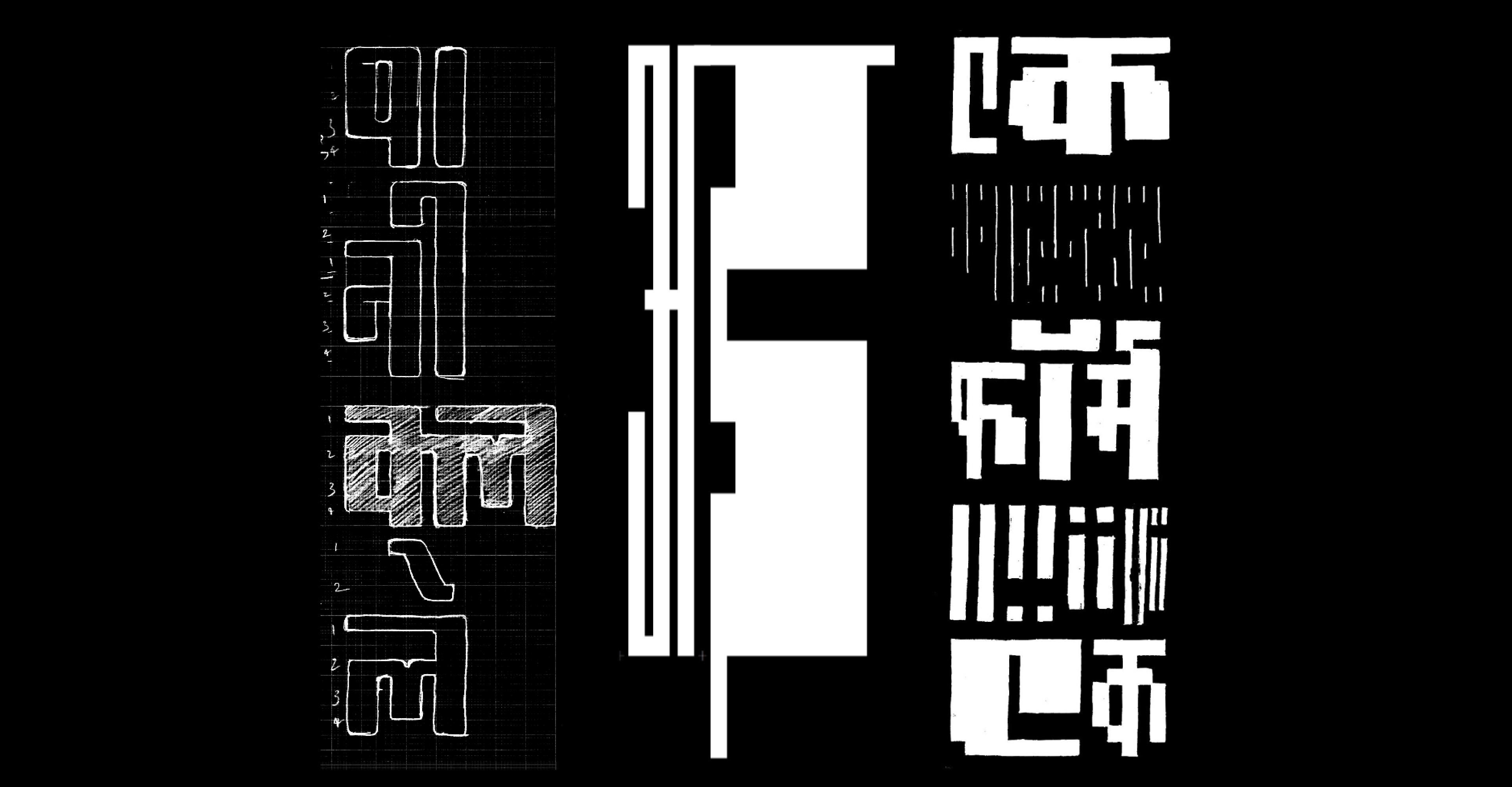
As I studied the nuances of this lettering, I started to sketch out a few ideas to see where it could go. My initial observations and thoughts were:
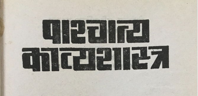
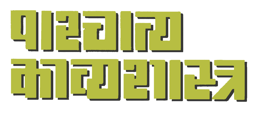
- This is a grid-based design. The shirorekha is broken; i.e. the headline over each glyph did not overlap.
- There is some interlocking of shapes, creating ligatures (see का, first combination in the second line). This feature seemed like an interesting element to include though there are no other examples in the reference.This would work in glyphs that have a central vertical stem or kana such as the क, ठ. Also it is not just the matras that would need separate alternates or ligatures, but also every combination with क & ठ would need an alternate version. This analysis kept me interested enough to try to figure out how this would carry into other letterforms, and how the character set would expand.
- In शा, the kana and the following aaMatra are differentiated with a little spurt of a headline in the former.
- How will the knots work in this design?
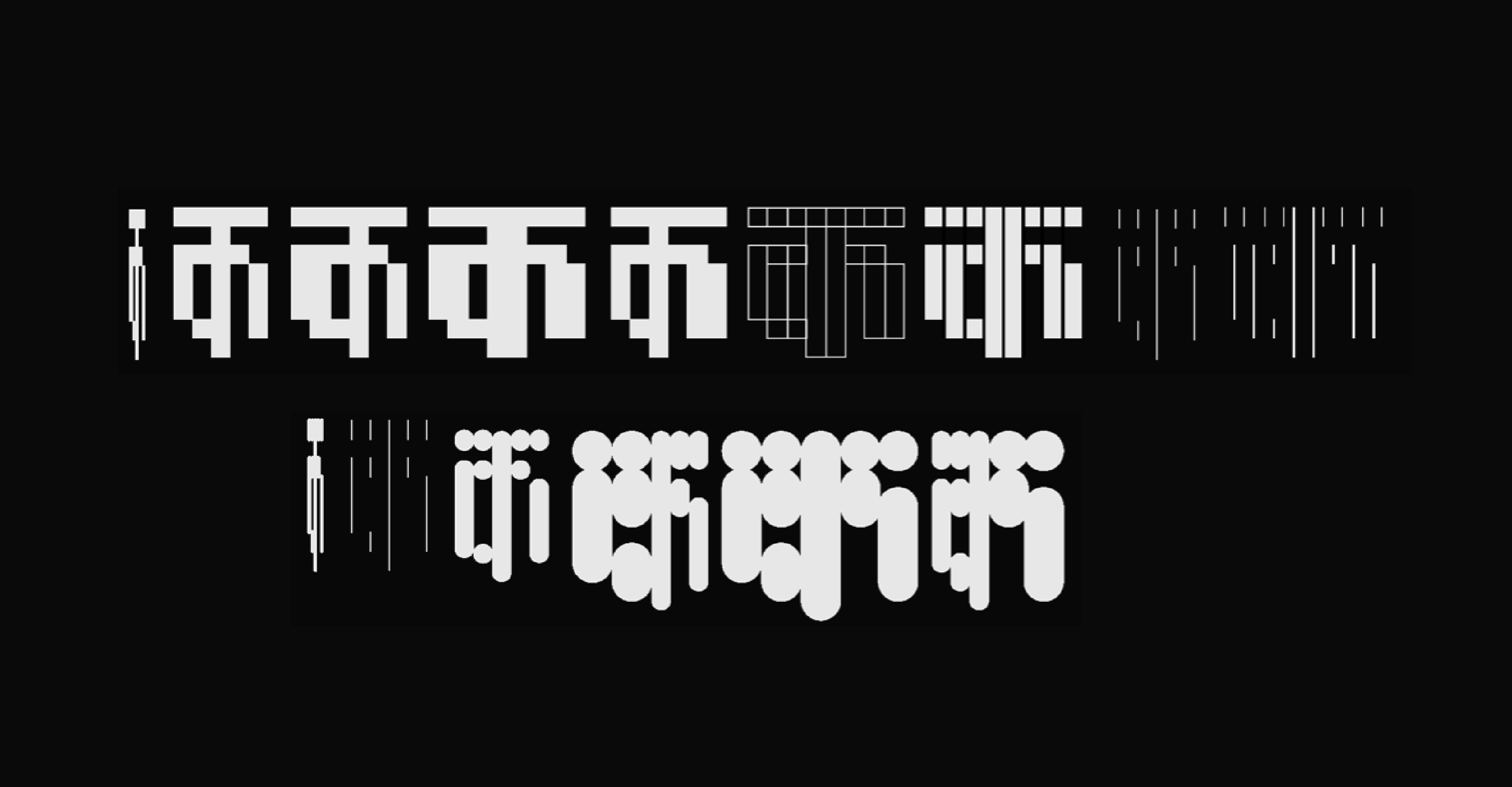
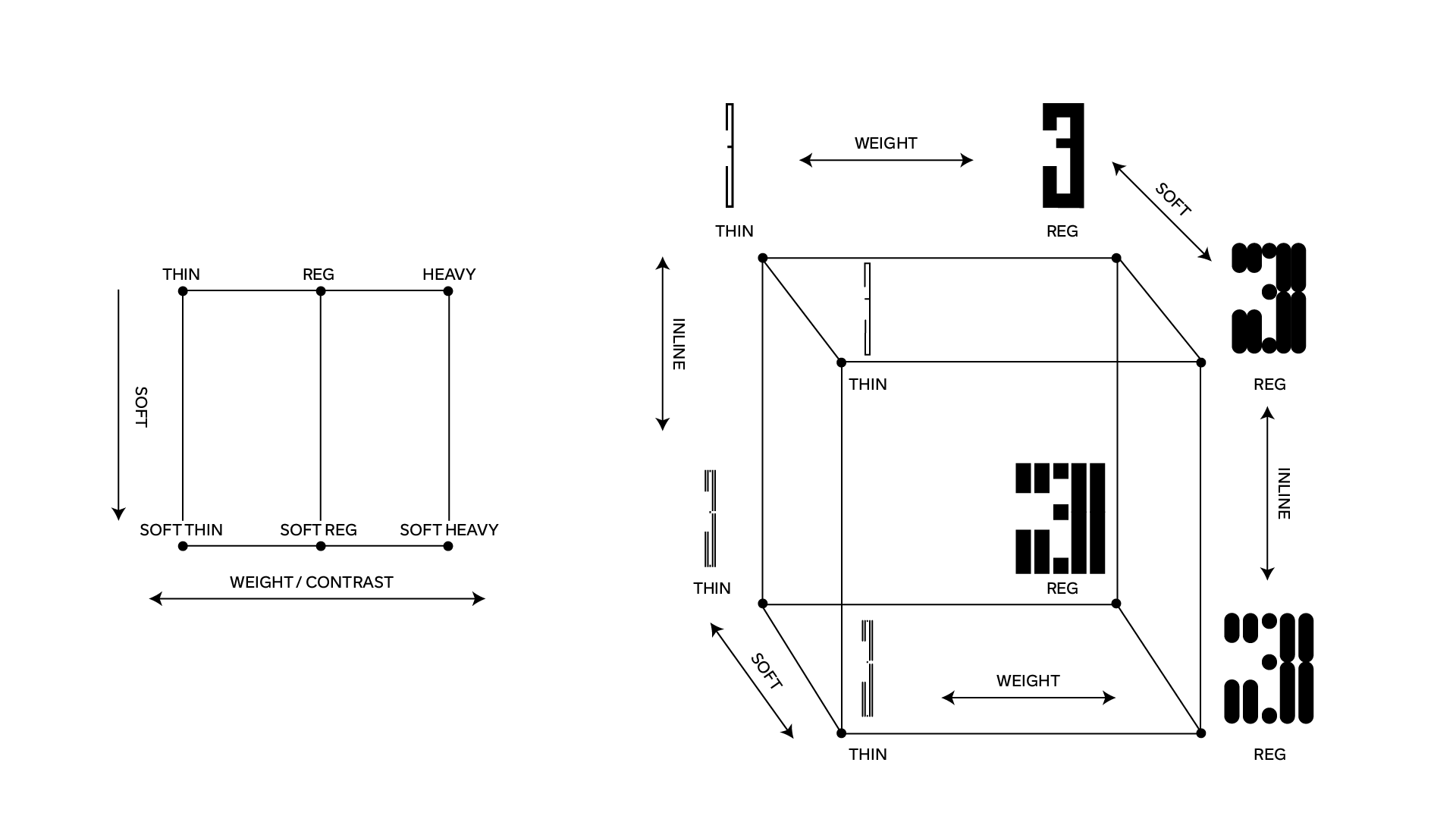
There were a few design routes that began to emerge from the first sketches. The main feature of this font project was that there were going to be styles and variables (and each style could be interpolated).
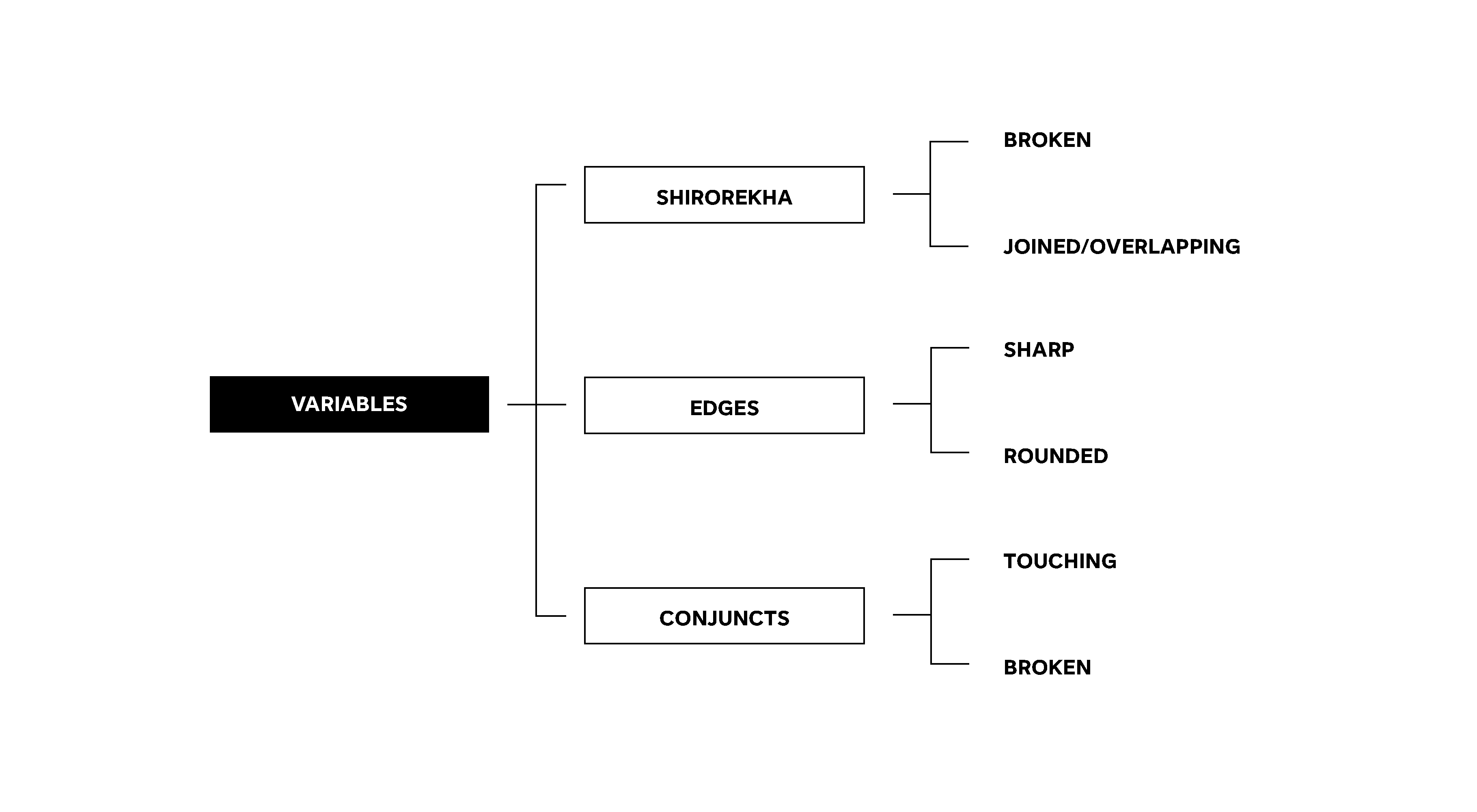
- This would be a family of styles instead of weights, and these would be: soft, square, inline, flourished.
- The connections of conjuncts and shirorekha would be set up as a variable axis.
After a bit of early sketching, I felt like I needed some more references to expand my idea of what a grid-based design could look like. These new references were mainly Latin, though still useful in exploring the concept. A generic Google image search on hand-made signs led me to these images:
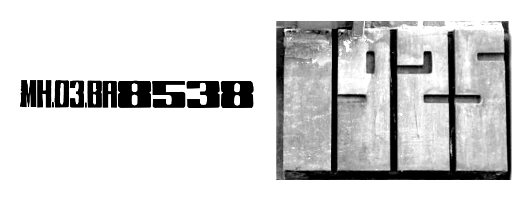
Within the grid-letterform family, I would further classify the type in the signs above into subcategories of weight and contrast. The image on the left shows the numerals becoming bolder and wider to fill the space. It is a combination of different weights and contrasts. Around my day-to-day environment, I also see hand-painted signs with mixed widths and weight, and one may call it human error but it still inspires.
There were also some experimental projects that had unconventional variation, as suggested by Frederik Berlaen – who later became my collaborator on this project.
- BitMapMM, Peter Bilak – experiments with multiple masters and pixels.
- History, Peter Bilak & Typotheque – possibilities of a design space.
- Calcula, Shiva Nalleperumal, Frederik Berlaen & Typotheque – ligatures and interlocking shapes.
Looking at the work of contemporaries in the formalised type category led me to Fit by David Jonathan Ross and Fit Devanagari by Kimya Gandhi of Mota Italic. They display a wide range of widths and weights without changes to vertical metrics, which makes it easy to type-set mixed widths together.
There have been other typefaces which explore the concept of a rotating pen angle, and Céline Odermatt’s TypeMedia thesis project Coat immediately comes to mind. In the designer’s own words: “Coat is a typeface family that explores different ways contrast can be added to letter skeletons.”
I had been toying with the idea of a rotating weight axis for quite some time and looking for the right project to test it out.
Starting to create a design space
Such an axis would mean that the letterform could add weight in any direction – top, bottom, left or right. Every letterform could be an amalgamation of thin and heavy weights. The question was, how would this translate into sources and what would the values be? As stand-alone binaries, this would mean that each shape had four alternates. Or rather six alternates including completely thin and completely heavy. The ‘regular’ wouldn't exactly be necessary, or perhaps it could work as a central point for the design space.
There were more questions at this stage:
- What other variations are possible beyond styles and could these be set up as sliders/axes?
- Height of ascenders and descenders: Devanagari forms usually go higher and lower than the Latin – though at this stage I was only focusing on the Devanagari, how is that balanced in this font?
- How would this font look when letterforms were vertically stacked – could it be used vertically in signage?
- Could this design translate into a monospace design? If not monospaced, is there a way to make the letters proportionally related?
- What is the grid system here? Is this a pixel font?
All these questions and experimentation became a recursive cycle and went on until I could properly visualise the possibilities. Every new question and possibility involved drawing some shapes, putting together and experimenting with a new design space followed by testing the variables. The weight variation axis was just another possibility.
Individually all these were threads of a similar nature, but the fabric of this project still seemed unclear. I was searching for a common string to tie all these styles and possibilities together. Like the other sketches, this was also stored for later.
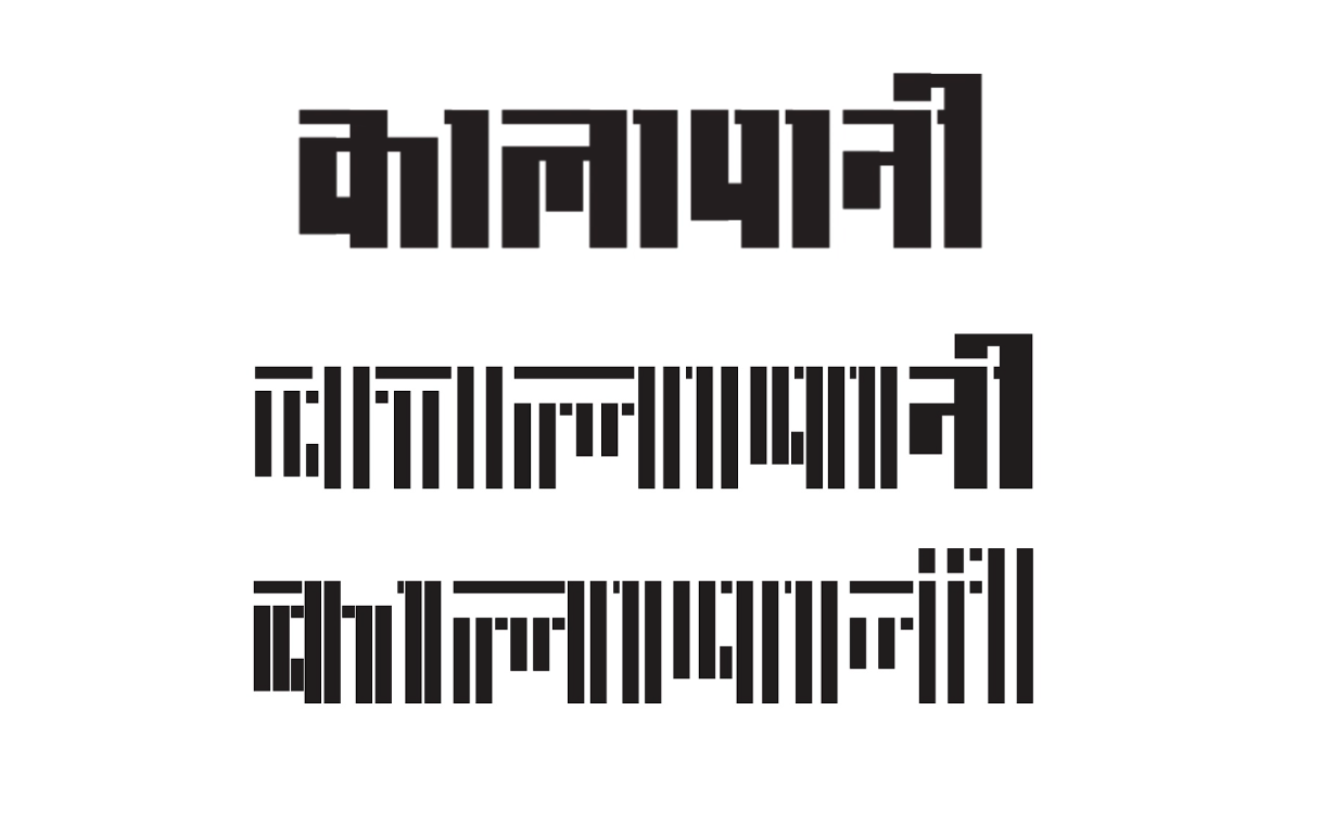
I drew and tested the broken shirorekha concept but quickly scrapped it since it did not seem to be adding much to the project overall. There is a saying by one of my teachers that I try to keep in mind while working on anything: “when in doubt, draw!” And so, I was back to the drawing board.
For the second design space concept, I went back to the initial idea of the various styles. I figured out how to connect them in a variable design space and incorporated the thin weights into it. All letterforms could be interpolated and each point and pixel drawn and placed by me. Setting this design space as the new starting point, I moved on to expanding the digitised forms to include a few control characters.
Even though I was using the smart components feature on GlyphsApp, it was looking like a lengthy and uncomfortable journey. There were too many components within a single glyph and the file got bigger (read, slower rendering) each time I added a new character.
The sketching stage, as they say, is not only to see how the letterforms look. It also includes sketching out the workflow, systems and methodology needed to bring a project to successful completion.
To be honest, I had set out with the goal that this new ‘fun’ project would bring experimentation, inspiration and, most importantly, play into my workflow. And through its rigorous process of discovery and research it felt like I was successful in what I had set out to achieve, despite not being entirely sure of where it would lead me.
In my projects since my graduation from typeMedia, my work hours have mostly consisted of professional commitments and deadlines, where taking a decision is imperative. Splinter's process felt refreshing as it was free of the need to take a call on anything, and this allowed room for slowing down and exploration purely for the sake of exploration. It gave me respite from a sort of burnout from productivity and hustling, which over the last few years had started to feel a bit shallow and unfulfilling.
In many ways, the iterative nature of the process itself inspired the gradual evolution of an idea into something more – without the pressure that it had to become something more.
In the next post, I will elaborate on how these iterations and ideas became my only reference and helped me build a design space that I could visualise entirely because of the ‘rules’ that were set in place, and the recursive testing throughout the process. I will also discuss the need for collaboration, which brought in a fresh new perspective and helped me look at the whole project without any blinders of a native Devanagari reader and user.