Splinter Diaries: Making and Breaking the Rules
Splinter Diaries is a series of posts in which designer Namrata Goyal reflects on the journey of inspiration and iteration behind the modular display typeface, Splinter. This second post in the series elaborates on the collaborative workflow of the Splinter design space. This is followed by a short Q&A with co-designer Frederik Berlaen.
Namrata: In the previous post I shared insight into how the iterative and exploratory sketching process of Splinter helped me break my preconceived notions of Devanagari and grid-based letterforms in general. And so, with continued research and trials over time I had a progression of the design space, which meant letterforms and control points of the design began falling into place.
It dawned on me that bringing this design space to life by myself meant (as I was seeing already) dealing with multiple interpolation errors across masters, wasting resources to constantly fix these errors and still not being 100% in the clear – because of getting lost in this massive design space. Upon discussion with Universal Thirst’s – Gunnar Vilhjálmsson and Kalapi Gajjar – my next step involved figuring out a better workflow with some level of automation and a partner to help me build the necessary tools for this project.
I started collaborating with Frederik Berlaen, who brought a unique set of skills and perspective, and added a new dimension to Splinter. Frederik is an educator, font designer and developer, tool-maker and the author of type design software Robofont. He is also an alumni of Type Media, where we originally met and briefly discussed the lack of software support to create Indic type. Through our collaboration – more on that later in this piece – we initiated work on open-source tools and some software support for Indic type development, and we hope it will only grow from here. Moving onto how Splinter was made:
1. Working on a skeleton master
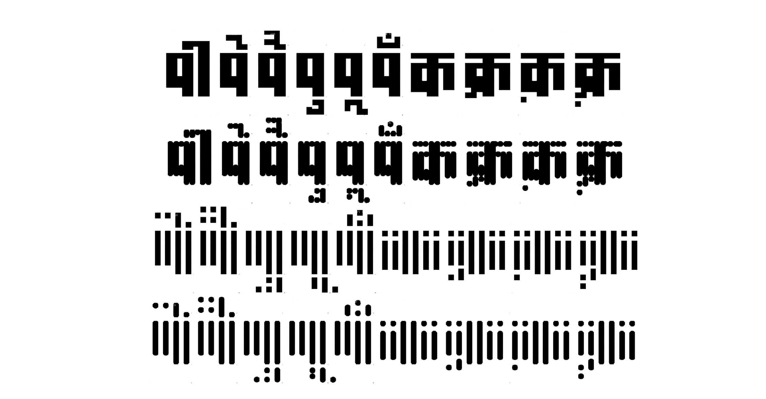
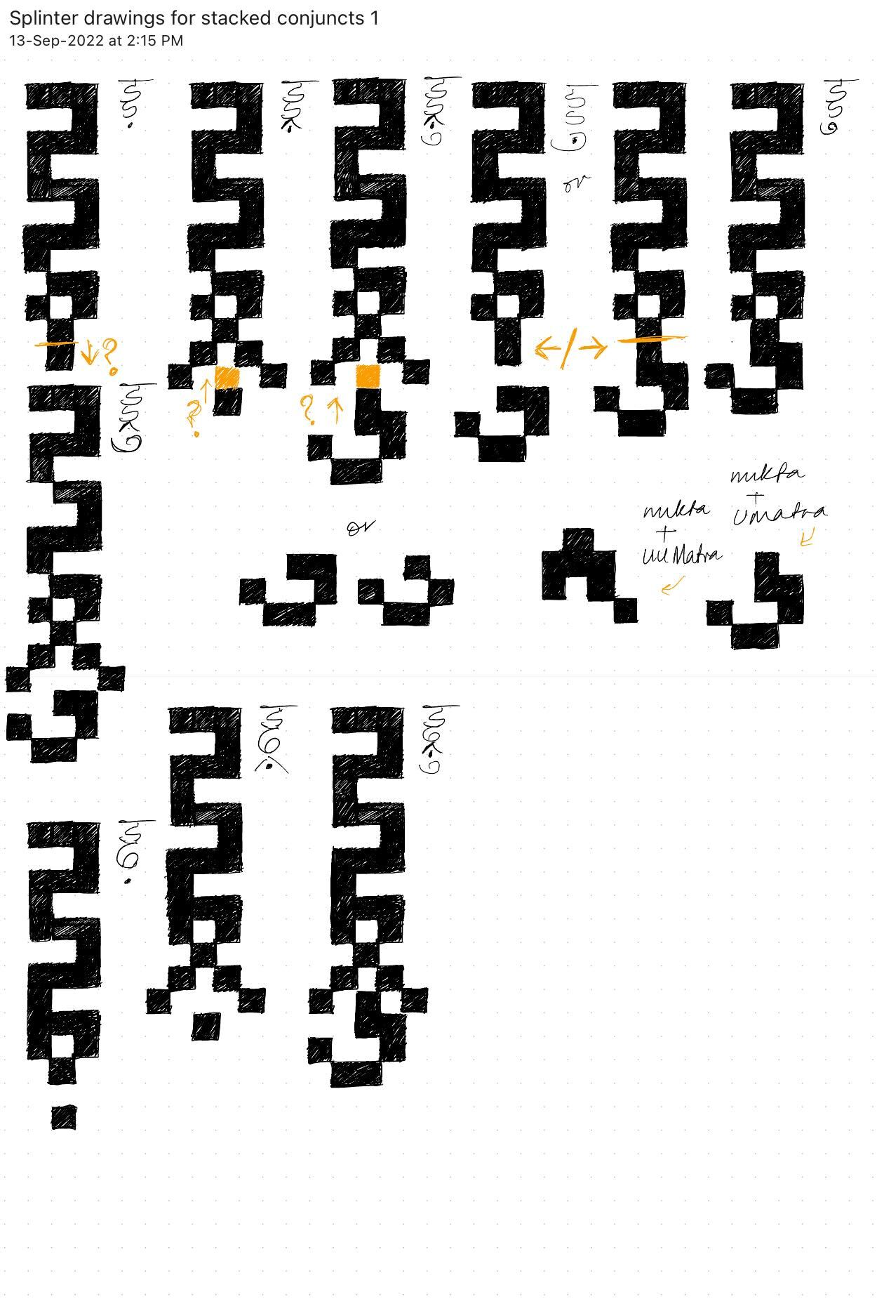
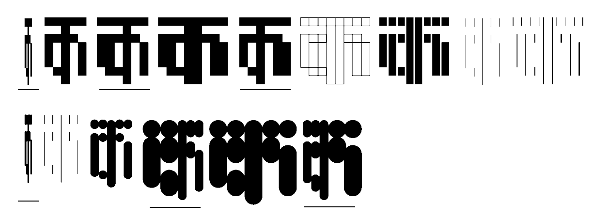
I first began work on the ‘skeleton master’ which would become the centre of the new design space. I drew the Devanagari test-glyphs1 and the Indic Assistant RF Extension, along with the Preview Tools scripted by Frederik for Splinter’s drawing process, were of particular use here.
In my opinion, using Robofont (RF) to design Indic typefaces is not very different from Glyphs. The two just use different approaches; the latter is more beginner-friendly and sets up the file for you, while RF requires you to customise your workflow and setup. I began this project in Glyphs, because generating tests from there was easier. I was able to iterate and visualise design spaces throughout my sketching stage using actual, working examples. We all have our own favourite tools but in the long run, being flexible in these matters is wise.
I switched to RF after ideation because of the collaboration and Frederik‘s expertise with using UFO2 sources, which worked in line with the build system he would be creating for Splinter. Having said that, some of these tools and plugins will be made open-source and so can be used as a base for anyone else to build on top of for their own projects, RF or not.
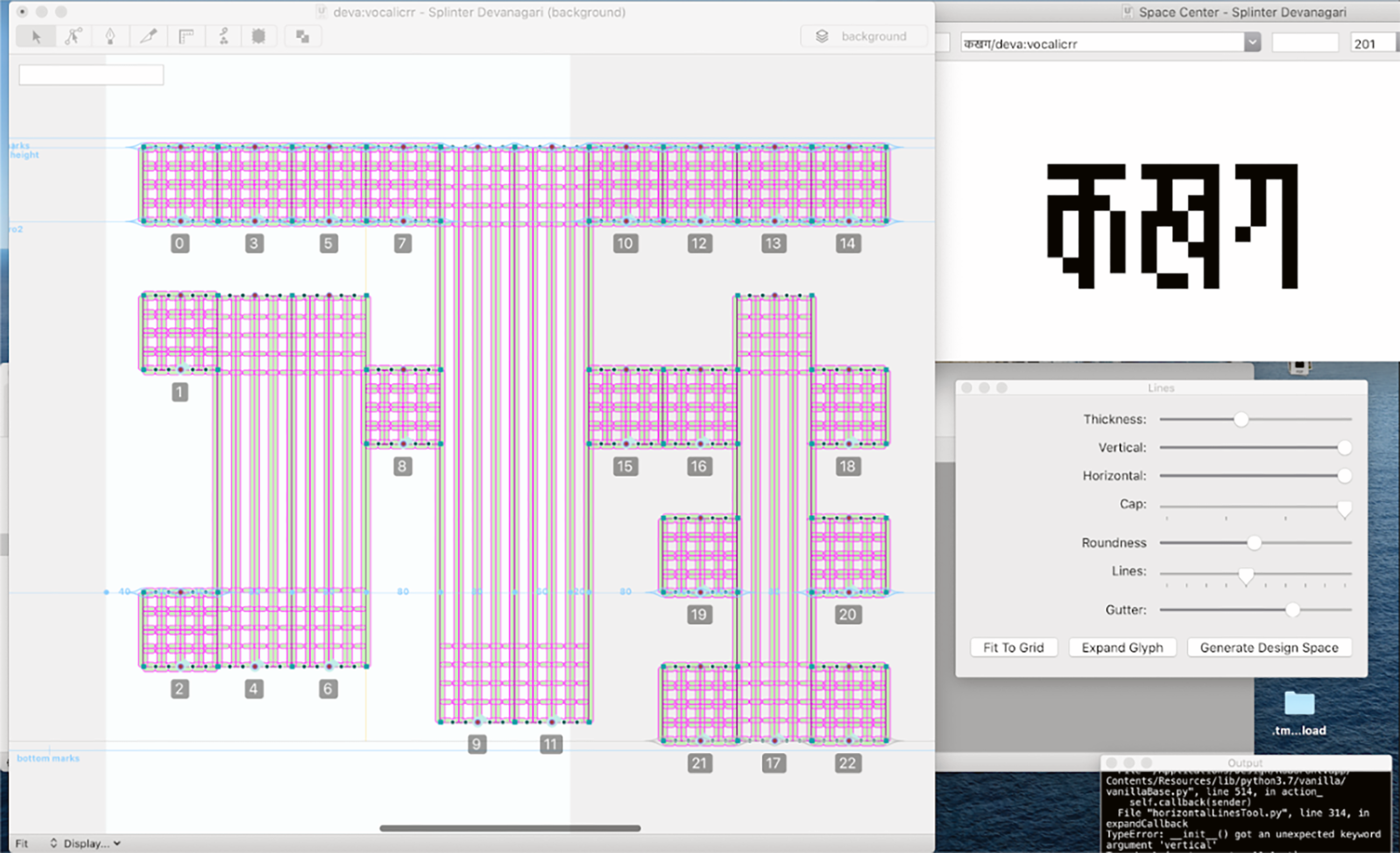
I used GlyphBrowser to add unicode characters from Devanagari into my UFO and began working on the source file, aka the skeleton master, and soon enough, met with my first challenge: open paths or ‘skeletons’.
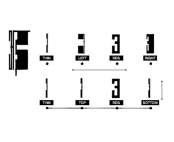
A path needs to be a closed shape to be previewed in a font editor. Open paths or contours cannot be previewed or visualised and will appear empty. This seemed to be a hurdle because the skeleton master I was working on only consisted of open contours, and while drawing I needed to visualise various elements of the design. These were the core elements, such as spacing and the positive-negative counters of each letterform. Secondly, I had to be able to preview how the variable axes3 would distort these skeletons.
As the first step of our collaboration, Frederik wrote a tool which used the glyphs in the skeleton master and exported a test ‘background’ layer converting the open to closed paths or shapes that aided the preview of the glyphs. With this I was able to visualise the different axes, test the spacing and also generate a test font file to aid the drawing process of the letterforms.
2. Setting the “rules” of the design space
The new workflow made it seem like nothing was too far fetched, because Frederik was open to exploring every new pitch while not being worried about the complexities of Devanagari. His thought process and willingness to experiment made me think beyond the conventions of native readership, which earlier, I may have been using as an excuse for sticking to what was familiar and comfortable while designing.
We both had our respective areas of work chalked out, as well as our individual ideas on how growing/altering the design space, or existing tools, would challenge the other to make it work. This back and forth created dialogue that resulted in varied and new approaches to problem solving giving room for both of us to learn.
3. Executing the design space build
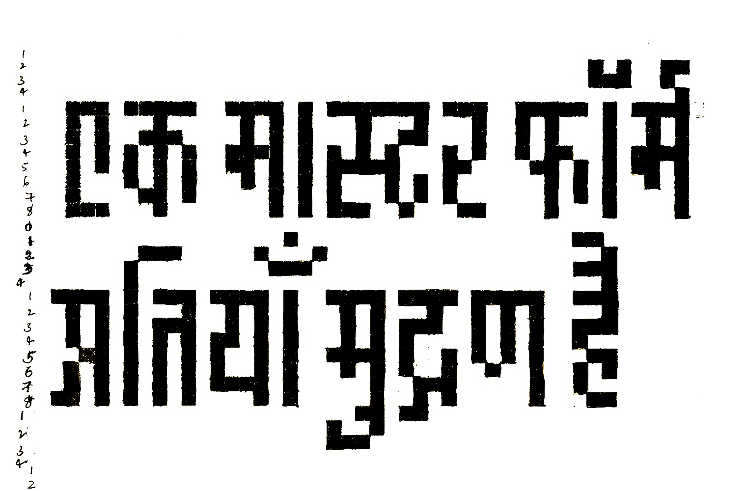
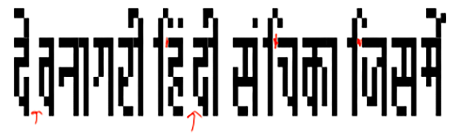
There were no curves involved in the drawing of the letters, and so the central skeleton master did not take as long to draw as a Devanagari character set usually does. The time was instead used to figure out the production of the font. Normally I would pass the file onto a font engineer at this stage. As standard procedure, after adding the OpenType feature code, to generate a [good quality] font, the typeface is put through a number of tests that are necessary for quality assurance, to spot and get rid of any issues in the font file.
With Splinter, I was curious to test my understanding of this side of the design process. So far, Frederik and I had been creating our own versions of cogs and tools to get the ball rolling, and these tools had tackled the ‘drawing of Indic letters in Robofont’ aspect of the project successfully, and as per requirement. But once I started to export and test my shapes with the OpenType feature code, some of the more complex substitutions (GSUB) did not work. Actually, even basic shaping had literal ‘gaps’.
I learnt later that it was because of the missing GDEF4 table in my feature code. This table classifies the different types of glyphs in the font and is normally automatic and in-built in some font production apps. But adding it manually with the RF editor gave me the opportunity to learn its proper use and need.
All said and done, this stage was the heart of this project. My initial ideas, sketching and research might have been a springboard but the production of Splinter had so much practical testing, learning and play involved that even failures felt like stepping stones. There was no pressure of an end goal necessarily, we both were making it up as we went along. As a project I think Splinter really embodies that. It is about curiosity and play.
Q&A with Frederik Berlaen
The following is a conversation between Frederik and I, discussing the development of Splinter’s design space and the challenges of creating multiple axis and multi script variable typefaces
N: Frederik, what interested you in the project and how did you approach the design space?
F: Firstly, what really interested me was collaborating with you. And also to help from the workflow perspective. You came up with a very funky-crazy idea that was pushing the limits of existing tools. We had to build something very custom for you to create your own kind of crazy world that you were drawing and trying to do all kinds of interpolations. I also think about how you approach the world outside, because I believe that the designer has to try to envision and draw things that just aren’t possible, and then you will get new stuff out of it.
“At some point you were inside the box and then you could not get out of the box. But your ideas were bigger than the box or the application or the tools that were available. So that was my interest in working on this.”
N: How did you work with a foreign script5 like Devanagari and what was different in comparison to, say, working with Latin?
F: From a tool point of view, there is no difference at all. A letter is a letter and it doesn't matter what language or script you're working on. Only the complexity adds up with different scripts.
In your project I had some comments about shapes, but I did not have any real critiques because my knowledge about the script is limited. I just asked questions related to readability when the shapes are close together [in some variable axis combinations, the inter-character space is almost 0] because I'm curious to learn more about this. I have also never visited India and so I don't know what the street signs look like. I’ve only seen pictures taken by other people, of type and paintings and people writing this kind of stuff on top [referring to marks and matras]. But for you, it makes sense that you made such a display typeface in the digital space because we are working with computers. And designers can use computers as a design tool to create something different.
I also noticed a lack of support for writing systems outside of the Latin world which is also a problem with Robofont and though it’s open for anyone to script6 , one needs some guidance to know where to start. The interest for me is also the fascination and development of other scripts and for this project it's nice to abstract it down to a set of functions and classes, and coding to make tools for the whole thing.
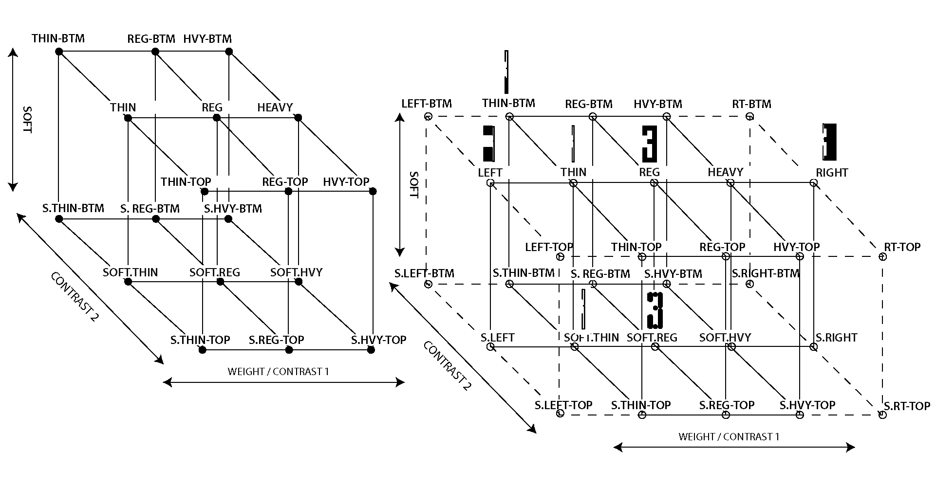
N: What might be the challenges related to multiple masters in a design space? Can you expand more on how automating the build changed the possibilities?
F: I will answer the second part first – automating helps to design by numbers; just fill in some numbers and then expand the axes to any limit, in any kind of direction. This is useful (and fast) and one can quickly test it out as the whole system is very flexible when designing with automation. The design space stretches out to different numeric values that can be changeable for every axis that we want to have. And also expanding it is possible by adding more axes without having to redraw something. In Splinter’s case, we started from a single skeleton source and from there on, new design space(s) were built with different kinds of settings. The core of the whole build script is just four or five lines of settings of minimum and maximum values for different kinds of axes that the Splinter family has.
One of the challenges is that everything has to be interpolatable7 . (It was also nice that we started from single skeletons for Splinter.) If we just build an outline of the whole thing we can control where the points are. Then we avoid mistakes of missing a point or adding any extra and skip over any accidents because everything is generated via automating the build. This way we have control over the whole outline and point setting system.
The other challenge is to fit automation into an idea. It works for Splinter because you made a lot of sketches that visualised the possibilities, you had many ideas. The difficulty of automating an idea is that you have to find an abstraction that works in both worlds: here one is very perfect – every point is on the same spot every time because you can generate and regenerate. Whereas the other means you draw and sketch (digitally or otherwise) and the placement is different every time. While the second one gets you new ideas and it expands your drawing skills and your project, you have to find this middle ground that works with automation. And I think that this can be the most difficult thing in some projects where we want to have control on the outputs, on every point and every axis to be able to regenerate it multiple times.
Also ‘visual coding’ – coding for when you have a piece of art resulting from the whole thing – allows a lot of freedom in the numerical value inputs. It's a very flexible system, where the output also matches this flexibility.
N: Could you expand a little bit on what discrete axes are and how they could be applied to a project like Splinter?
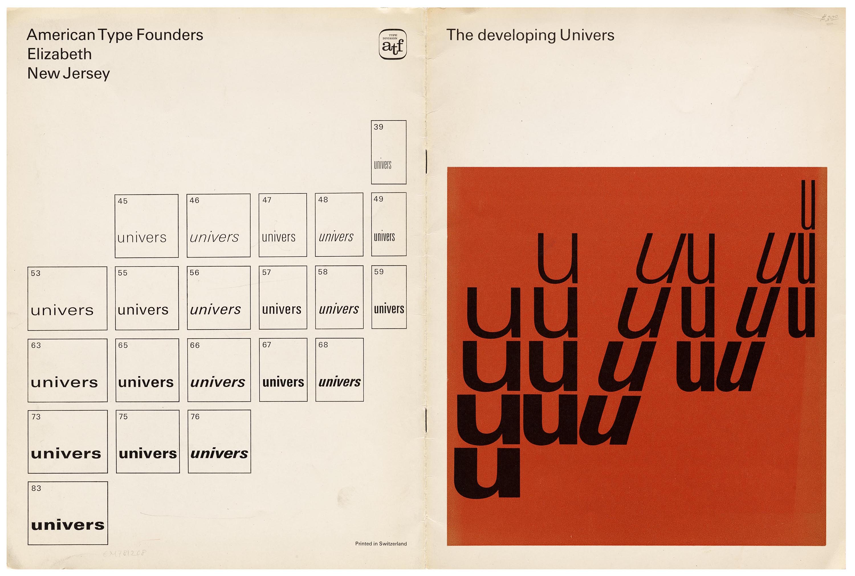
F: I think they only work in Chrome. For now there is avar28 table that we can use to limit the variable output and make design spaces that are not rectangular, but in trapezium-like shapes or anything else that the design requires. To explain, I refer to this as a city – sometimes there are nice spots in the city; you are pointed to a famous building, nice restaurant, and to avoid another direction because there is nothing there or it's a bad neighbourhood. Similarly, this is a way to define a design space because not every spot in the design space is nice or usable. The famous Univers type specimen is a good example of visualising a discrete axis.
A discrete axis is just splitting your design space into further, sub design spaces. It will generate a multiple of variable fonts because a variable font can only contain interpolatable drawings/glyphs/contours, there will be different font files.
N: Frederik, what was your process for making tools for developing complex script systems? How can these extensions make it easier to design types for other writing systems in Robofont?
F: There is a lot of knowledge that you have to have before you can just draw a few Indic letters and I think the starting is already complex. You need to know about OpenType features and how to cross-reference them. This can both be automated and also not. And so there's a risk of a mismatch between knowledge that the designer has to have, and what can be given in terms of script plugins. I think Robofont is not efficient in this at the moment, because it asks you to build as per requirement of the project. There are ways you can generate OpenType features out of glyph names, as Bahman Eslami has done for Arabic because they are facing a similar kind of problem.
“In a way even if you look back to before computers – when we were in the cast type era or even with writing – you would think ahead on how you would write something because you see the width of the page or the length of a word. The guy who is doing the calligraphy or doing the typesetting with metal type has the knowledge of the scripts, and their typesetting.”
Today, it looks very easy to draw a letterform. The problem for complex scripts is knowing when to do a replacement; to draw a character which has the same sounds and unicode value, with a different kind of drawing. In a way, we need an assistant of sorts that just gives hints like, “hey, you have this and this letter maybe you want to have an OpenType feature that looks like this?”
N: Like MS Office had the paperclip!
F: Yes, but also in your case, you re-used your OpenType feature code, which is natural, but you had to change all the glyphNames to match your file and that wasted so much time and energy. So also having standards in these areas of font development across apps will make the process smoother. Having more resources in this space is a good starting point I think.
N: I also think of these third party apps– InDesign, for example, in Adobe you have to have knowledge of the HarfBuzz shaping and so on.
Automating Splinter’s design build can be compared to using power tools instead of manually chiselling out each master – it made the entire process a lot quicker and less painful. Any future explorations and refinements of the design space will consequently also be much easier to test and eventually build. In terms of future plans, what do you think we should explore further?
F: The future plans that you already sketched out – to have different axes that can control the thickness of different parts of letters. This could be very interesting to research and make it work. We will have to look into this in-depth and how the different sliders could control this.

Maybe experimenting with curves too. That could be cool, but the limitation is the flipping (or reversing) of the curve. As long as we stick with all the rectangles and the straight lines those things are relatively easy to build. Curves will add complexity so looking at the rounded masters will give us more insight. There are some existing packages that I could build on top of as well, so it gives us a starting point.
I was very intrigued by the drawings that you made with different thickness of strokes. I think that could also lead us to very unexpected trials and results.
N: Yes, I am also curious to see how the Splinter design space grows further to incorporate all the wild ideas in my sketches, ideas that have already been imagined. Secondly, I want to finish the character sets of Latin and Devanagari. Drawing these strange letterforms to complement the different possibilities is also an exciting role to be in. But finishing these would mean we can see the type be used in real-life projects. Applications of the typefaces always lead to unexpected spin-off ideas that will contribute to the continued experimentation of this project.
Splinter v0.5
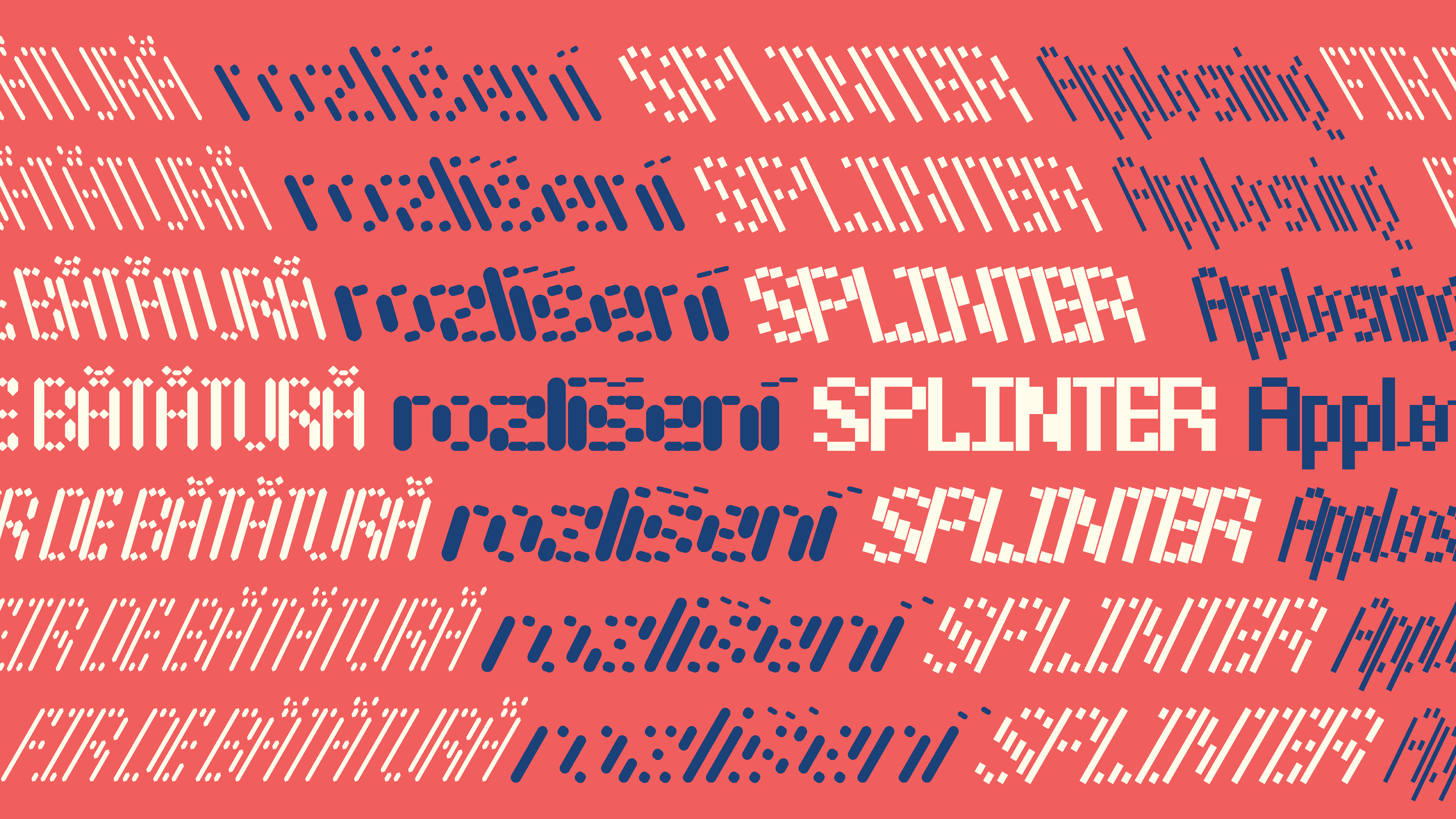
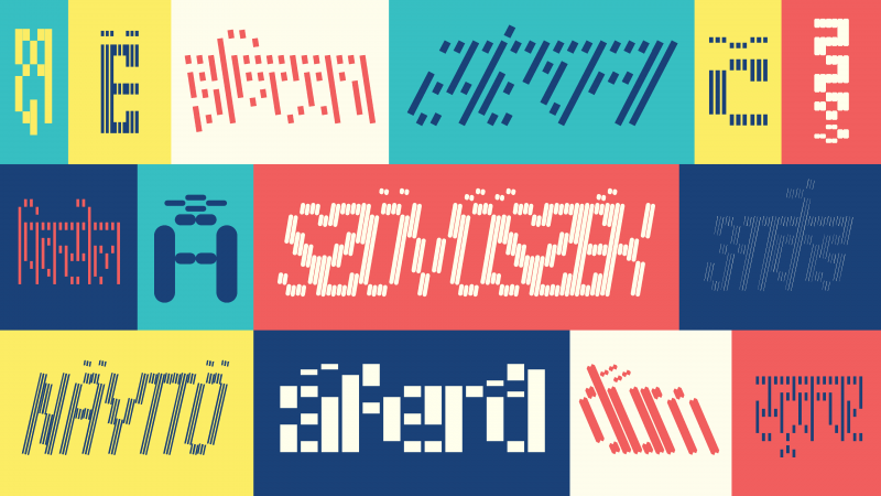
This version 0.5 update brings Latin support to the widely modular design space. Splinter’s Latin character set covers basic uppercase, lowercase, punctuation and numerals as well as support for European diacritics.
But this is not all – keeping in mind the display nature of the design we created a stylistic set to make vertical and all-uppercase type-setting easy, where the accented glyphs align with the cap height.
Additionally, there is a small update to the Devanagari character set too. The typeface now includes all rakar and half forms, rendering the character sets of both Latin and Devanagari as nearly complete.
Splinter v0.5 is now live on Future Fonts!
In the next article in the series, Lynne Yun and Kevin Yeh from Space Type Co will share their experience and exploration using Splinter to create graphics and animations.