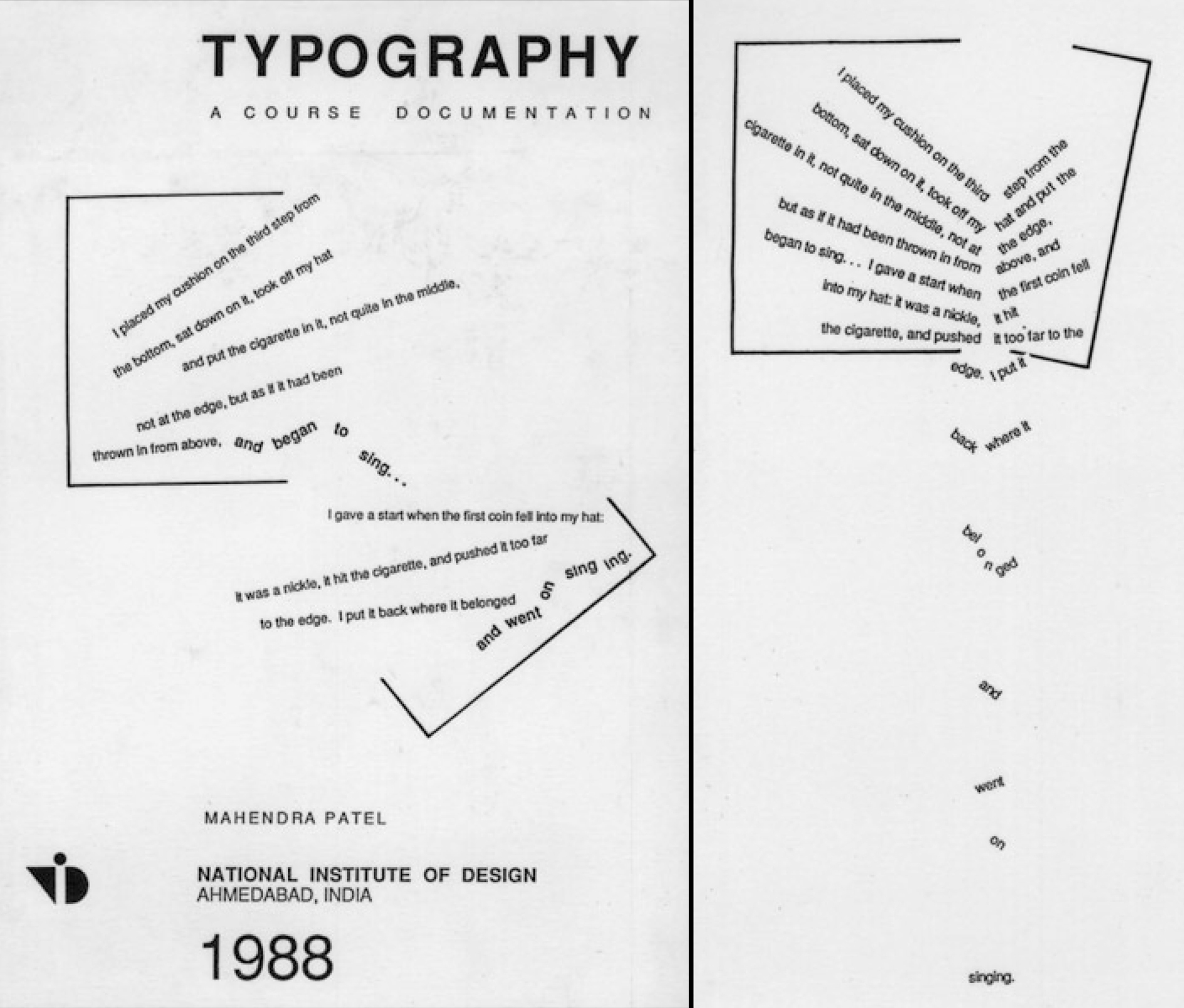
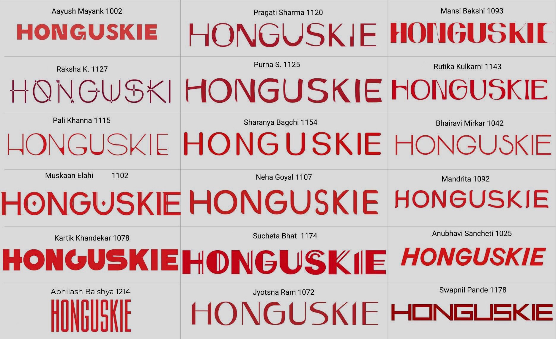
Mahendra Patel: a 60-year journey of design in India
Part 2
Welcome to part two of our interview with type and graphic design legend Mahendra Patel. If you missed the first part, click here to read about how he came to be a designer, including his stories about working with Adrian Frutiger and the development of type design in India.
In this final part, we discuss Mahendra’s map, signage and exhibition designs, and his thoughts on teaching graphic design and type design development in Indic scripts in his home country.
Gunnar: Type design has always been there for you, but not always your main profession - you’ve worked on a lot of other design projects alongside it?
Mahendra: Not my only profession I would say. But it was always on my table. I was always longing and working for it. I’ve been very busy all 55 years of my professional life and not only in font design – I have done maps, I have done exhibitions. You know when a font doesn’t sell and nobody buys the font, I ventured to do something else with typography so I have done many other things also.
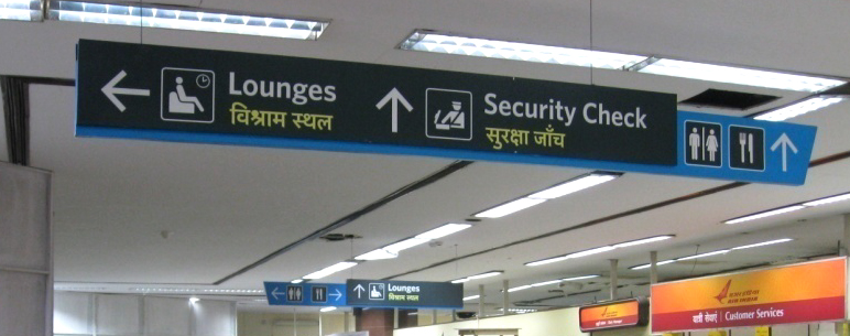
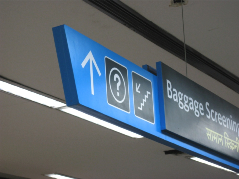
Salomi: Can we talk about your experience designing signage for airports in India?
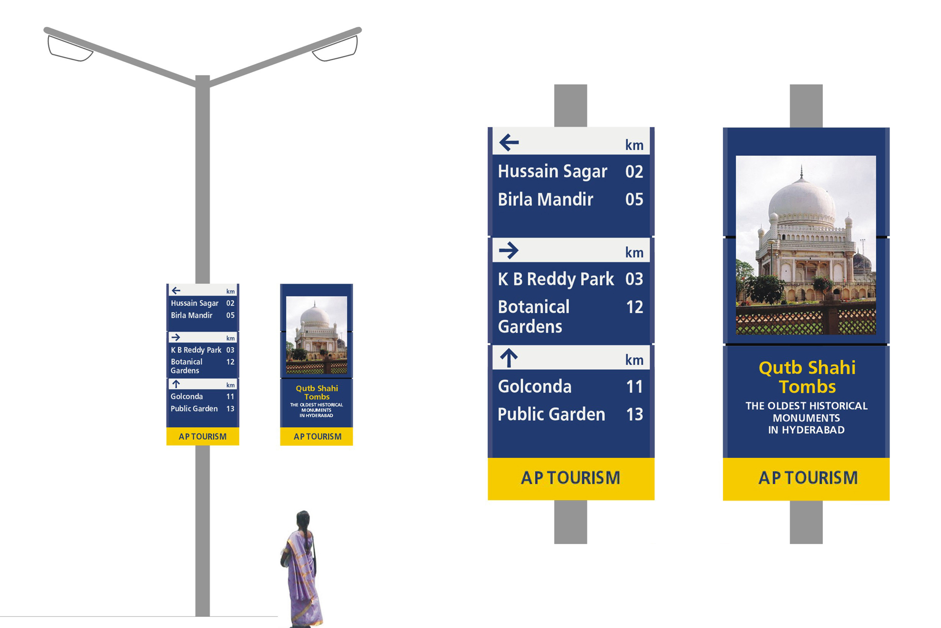
Mahendra: Not all the airports, only Bombay international and domestic airports. Ya, when it was privatised, they approached me at the National Institute of Design (NID) and because of my experience designing signage for the Tirupati temple and Hyderabad city. At that time I was fully free from academics so I decided I would work with Leaf Design, which is my son’s graphic design office in Bombay. His partner is also my student from NID.
We had special permission to go and walk around the airport and find out what the needs and problems were. Wayfinding is not signage. Signage design is part of the wayfinding system
Gunnar: How did you approach the brief?
Mahendra: Leaf Design took me on as a chief consultant in 2007, and I went to them for my early information collection and problem statement. We had special permission to go and walk around the airport and find out what the needs and problems were. Wayfinding is not signage. Signage design is part of the wayfinding system. So what are the problems – where people get confused, what should be said, how it should be said. Thus, I have contributed to all relevant information collection and navigation plans.
We located where the signage should be, at what height, what should be said, what languages we should use, what emphasis we should give – so strategy planning was done by me. And then they started working on the signage design system. I was with them all the time. We were required to hire a product designer or material expert for detailing and finishing because it was moulded aluminium and done industrially. Indian signage doesn’t have to be international but it should have the international quality. That’s the difference we made.
Gunnar: And is your signage being used in the new Bombay Airport?
Mahendra: Yes, at the new airport which has been completed now. We had temporary signage while the airport was built.
Salomi: How did you test all this signage?
Mahendra: We did primary testing in the studio and around. Then we created an actual prototype in the airport and tested it out. Then we corrected it. And created prototypes of all represented signage categories. Not only for Bombay airport, even for later signage projects in Hyderabad and Tirupati we erected signage units and got feedback and trained local people to erect it because most of them have their own in-house engineering department, so we also taught them how to handle it, maintain it and update it.
With all these capabilities of one year of training in Paris and one year of education in Basel, I didn’t have food to eat. I mean I didn’t have a job to do, I didn’t have any commission
Gunnar: When it comes to the history of making type in India the technology is always a really big factor and in a sense always the biggest obstacle for the development of Indic type. You have experienced all the different kinds of technologies in printing and later in digital type. Was there ever a moment when you’ve just wanted to quit because you were not able to get your ideas out there?
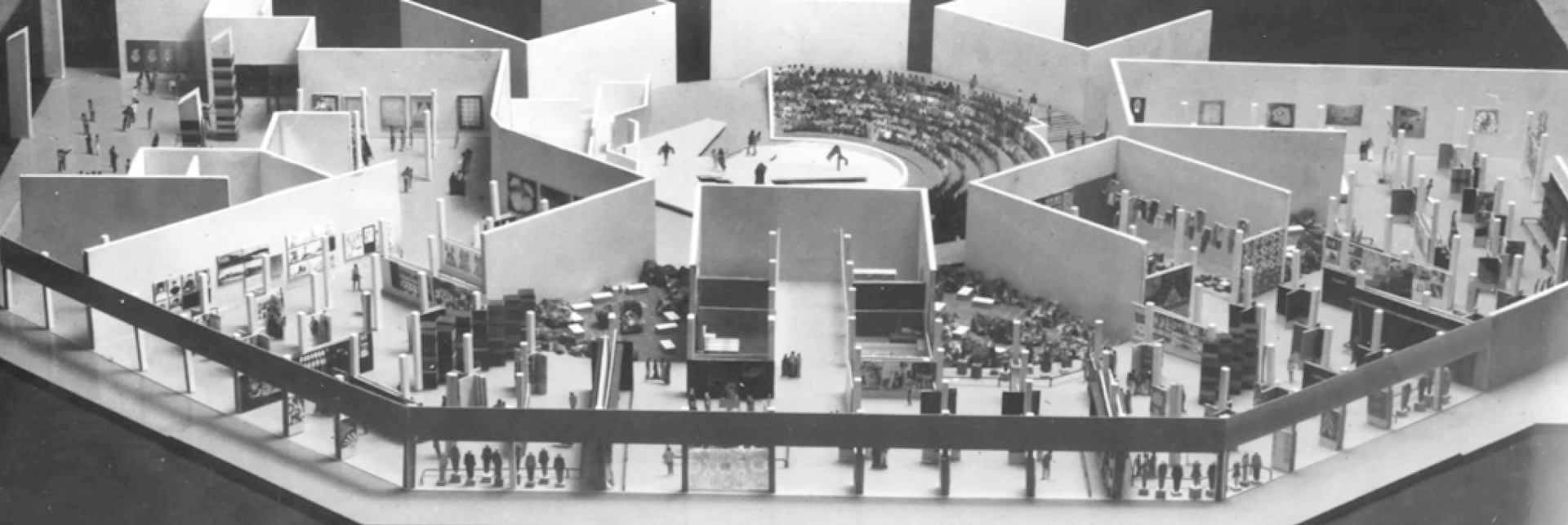
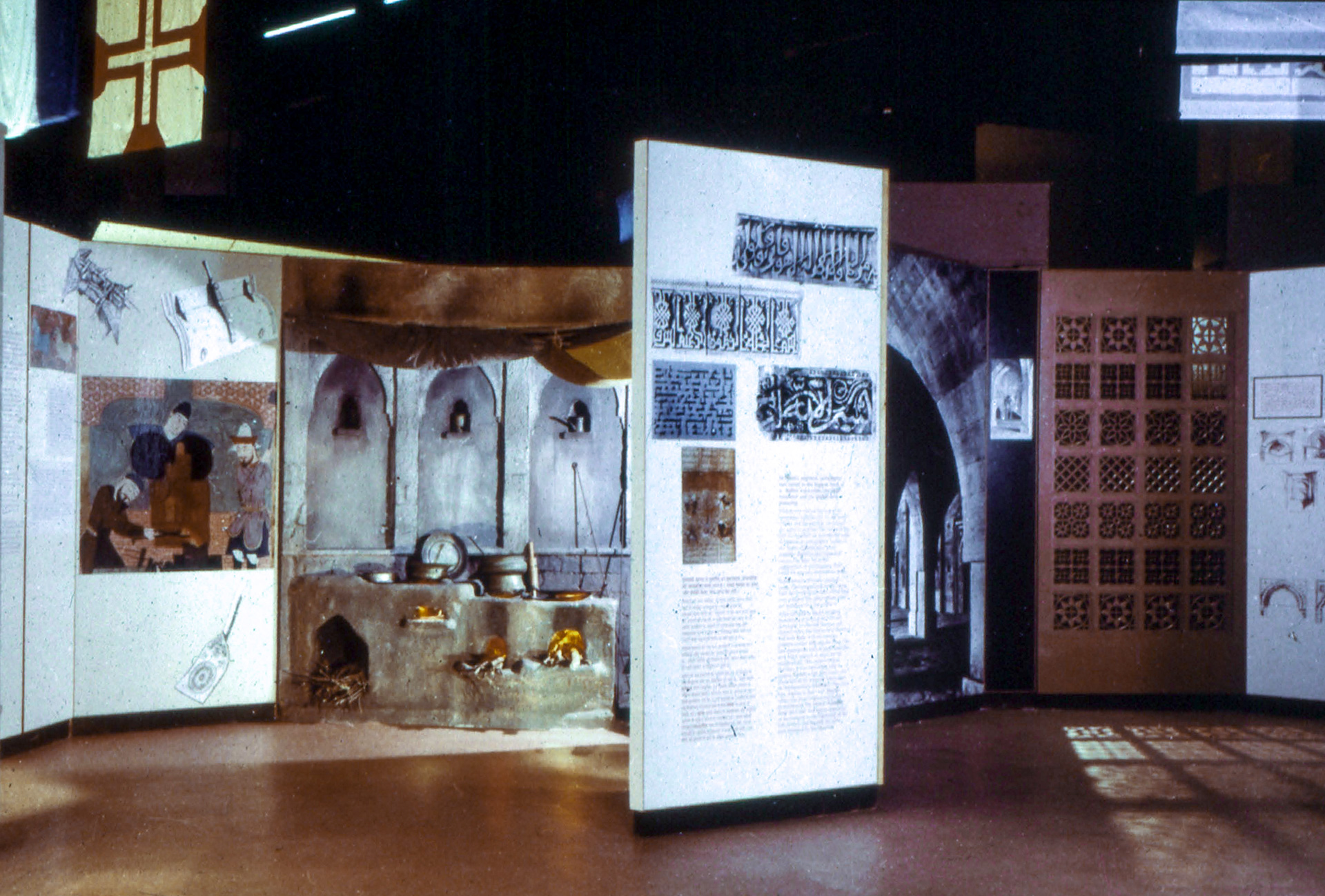
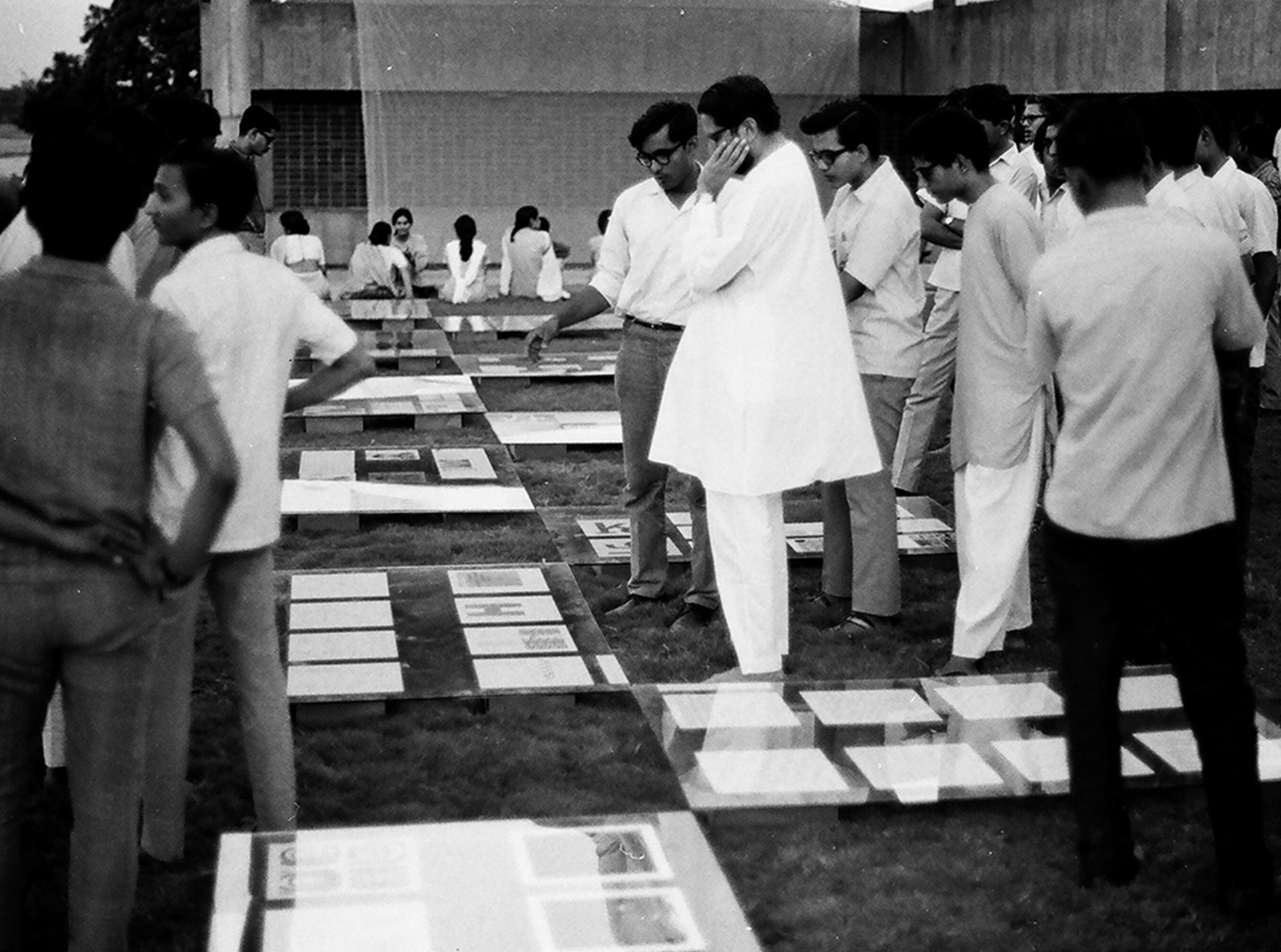
Mahendra: Ya, there was frustration in the beginning. Nobody understood that there can be a type designer. I’m talking about 1972-74. With all these capabilities of one year of training in Paris and one year of education in Basel, I didn’t have food to eat. I mean I didn’t have a job to do, I didn’t have any commission. So I got into exhibition design for Asia ’72. Exhibition design is momentary – you finish it in one year’s time and there is nothing left.
Salomi: Was the Textiles of India exhibition your first exhibition design?
Mahendra: Yes, it was my very first exhibition design in 1972. It was part of Asia ’72 in Delhi. I designed it at NID. I came back from Paris in January ’72 and it took place in December ’72. I was one of three visualisers for floor plans, panel layouts and flow of the exhibits. There was another person looking into structure and execution. And another into visual, text and exhibit data sourcing and collection.
Salomi: You also designed all the signage and wayfinding through the exhibition?
Mahendra: For the exhibition, it was not very critical. In Asia ’72 there were several pavilions. I didn’t do that, I did only the theme pavilion, Textiles of India, as the one and main pavilion.
Salomi: Who did you work with on this?
Mahendra: Nilendu Shah and Ishu Patel. Nilendu was an architect doing furniture design at NID. He was in charge of workshops at NID at that time. Ishu Patel was an animator and graphic designer keenly interested in photography.
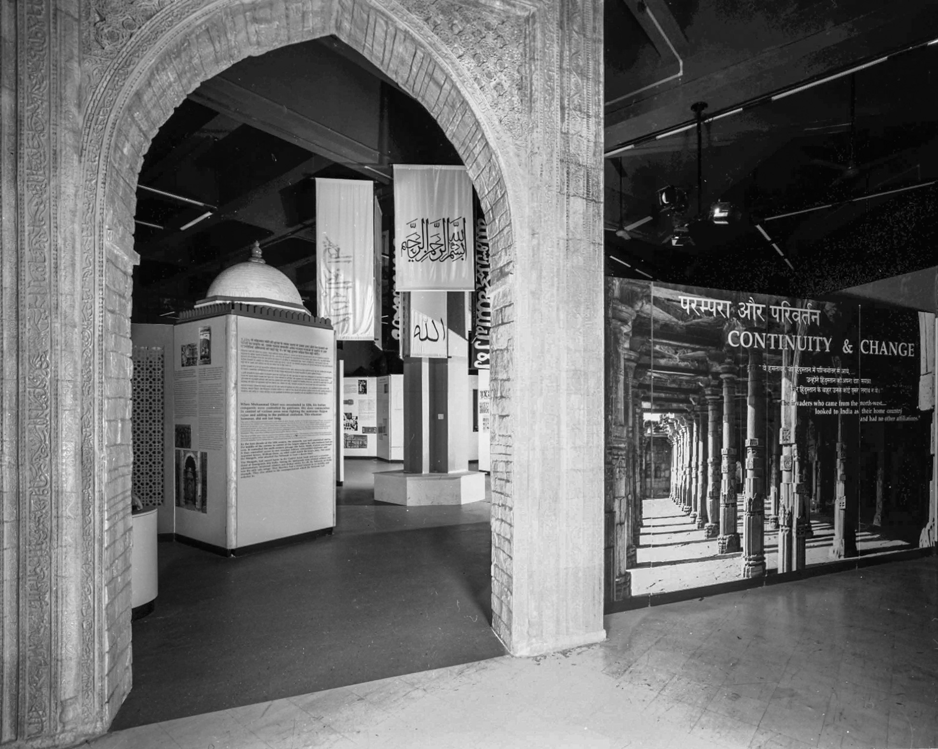
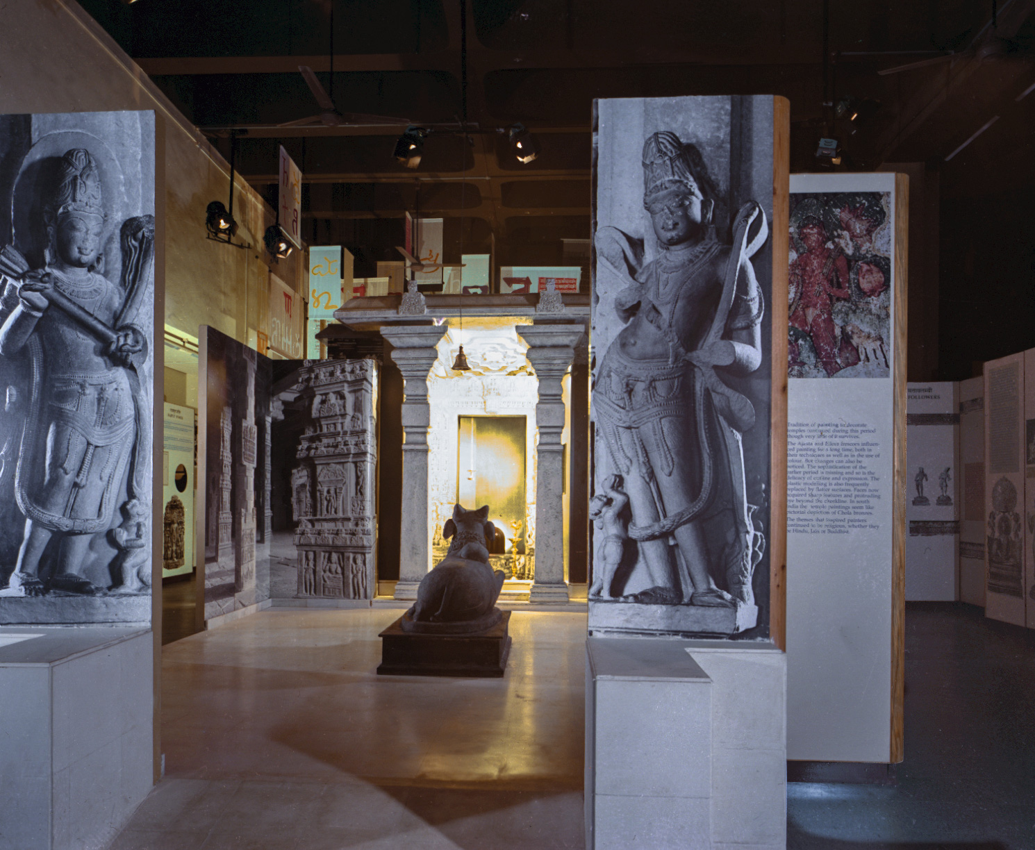
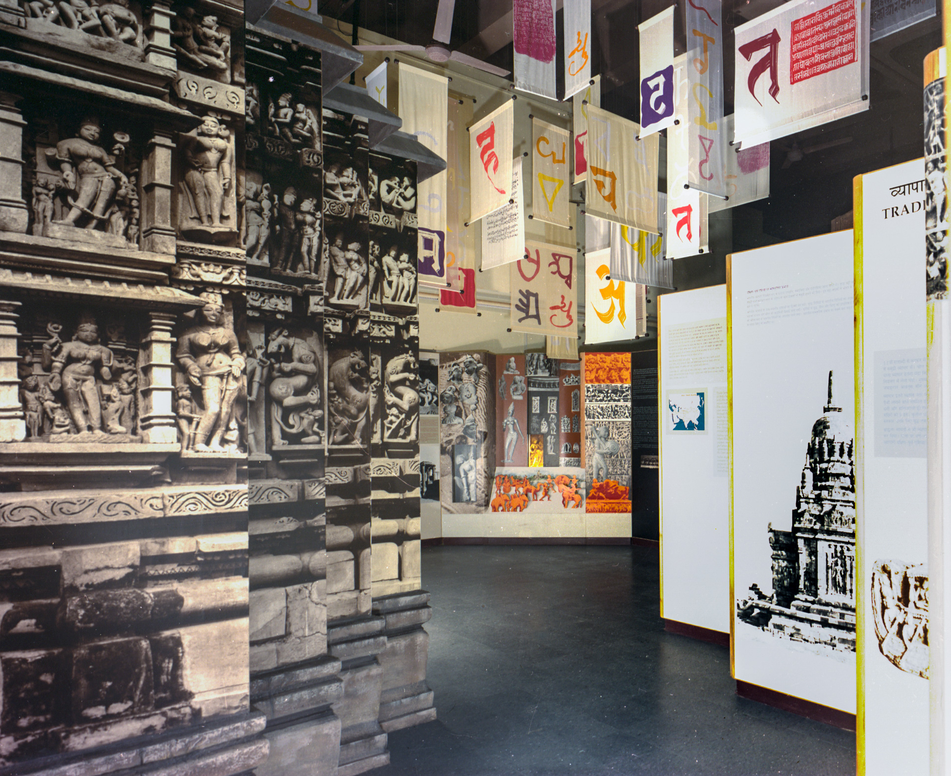
Salomi: You also designed the Nehru Centre Exhibition in 1988. Can you tell us a little bit about that?
Mahendra: At the Nehru Centre we did the Discovery of India exhibition based on Nehru’s philosophy, extending it to the history of India from prehistoric times till independence. It was divided into seven different sections and I worked on one of the sections – based on the mediaeval period. And I designed an overall typography and layout grid design system for all the seven sections.
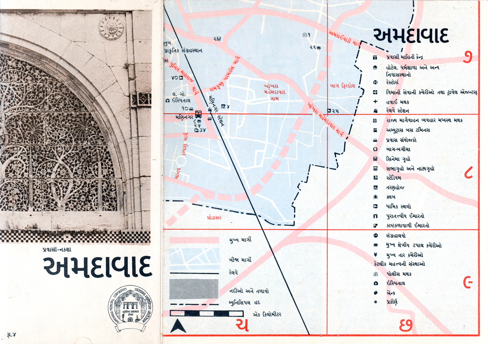
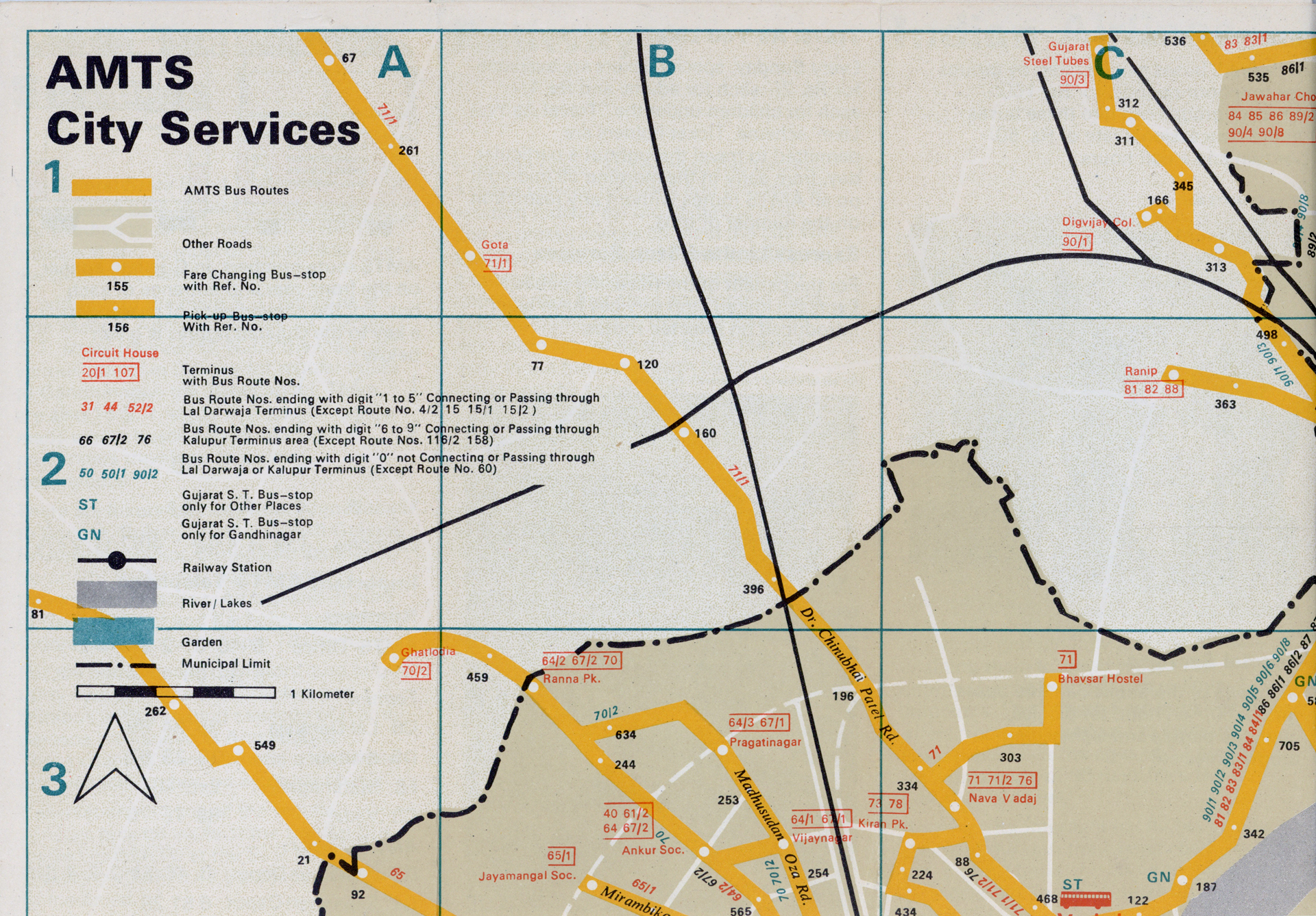
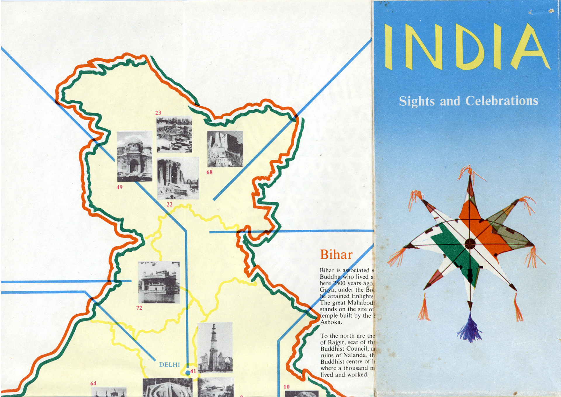
In Basel I used to use the city map and I didn’t have to ask anybody to travel anywhere. So I proposed to my director Gira Sarabhai that I can design a map for Ahmedabad city
Salomi: You are also known to have created many well designed maps.
Mahendra: In Basel I used to use the city map and I didn’t have to ask anybody to travel anywhere. So I proposed to my director Gira Sarabhai that I can design a map for Ahmedabad city. It’s like saying you want to start a Mexican restaurant when you like Mexican food. Preparing food is easy but running a restaurant is a different thing. I enjoyed using the Basel map and I wanted to make people enjoy my Ahmedabad city, so she said – okay, what do you need? I said – just six months of my time.
I started working from the beginning. I drew on paper with poster colours. I created a mockup of 1 ½ feet by 1 ½ feet of how my map would look and I showed it to my director. She said sell it now. So I went to the tourism department, to the road department and to the municipal corporation. They said this sort of map exists abroad, in India we can’t have this. Nobody came forward to commission it and it was very frustrating.
The moment the copies reached him (the Governor of Gujarat), the tourism department corporation woke up. They said we want copies. So I now had an upper hand
Salomi: I’m sure it must have been. But the maps did end up getting printed. How did the first order come about?
Mahendra: Sarabhai said don’t worry about these people, let’s go to the highest authority. She is a millionaire. She directly got in touch with the Governor of Gujarat and got me an appointment. I was shaking to meet the Governor so I took our librarian with me. The governor, Starawala, gave us an early morning time because he was too busy. And when we went there in his lovely garden – he had a coffee table there and he said – yes Mr. Patel, what do you want? I said – I have done this. He said – I don’t want to look at anything, Gira Sarabhai has referred you, tell me what you want. I said – I want my map to be printed. He said – ok done, how many copies do you require? And we got an order for 25,000 copies from him.
Gunnar: Where was it printed?
Mahendra: We had a printing department at NID so we didn’t have to go anywhere. I went to collect all the information and plot all the information. This took six months and then I created the artworks separately for each colour. We printed 25,000 copies and sent them to his office. We printed 25,000 copies on one colour offset machine, and 5,000 extra copies. The moment the copies reached him, the tourism department corporation woke up. They said we want copies. So I now had an upper hand.
Your first map is like your first baby... I did all seven different types of maps – city map, route map, state map, tourism map, and planner’s map for the prime minister’s office until my colleague and director at that time, Vikas Satwalekar, said – Mahendra, stop now and focus on font design before you retire
Salomi: Did you make any changes before you sent it for a second print?
Mahendra: Your first map is like your first baby. I learned that I made some mistakes which I wanted to correct. I decided to cover up what we spent on our first map from my second map design. The second map was not a reprinting, it was a new design. The first map was only in English. The second map was in English and Gujarati language editions and 25,000 copies each – and both got sold. And then this slowly continued. It continued for ten years, map after map design. I almost became a Map Patel. I did all seven different types of maps – city map, route map, state map, tourism map, and planner’s map for the prime minister’s office until my colleague and director at that time, Vikas Satwalekar, said – Mahendra, stop now and focus on font design before you retire.
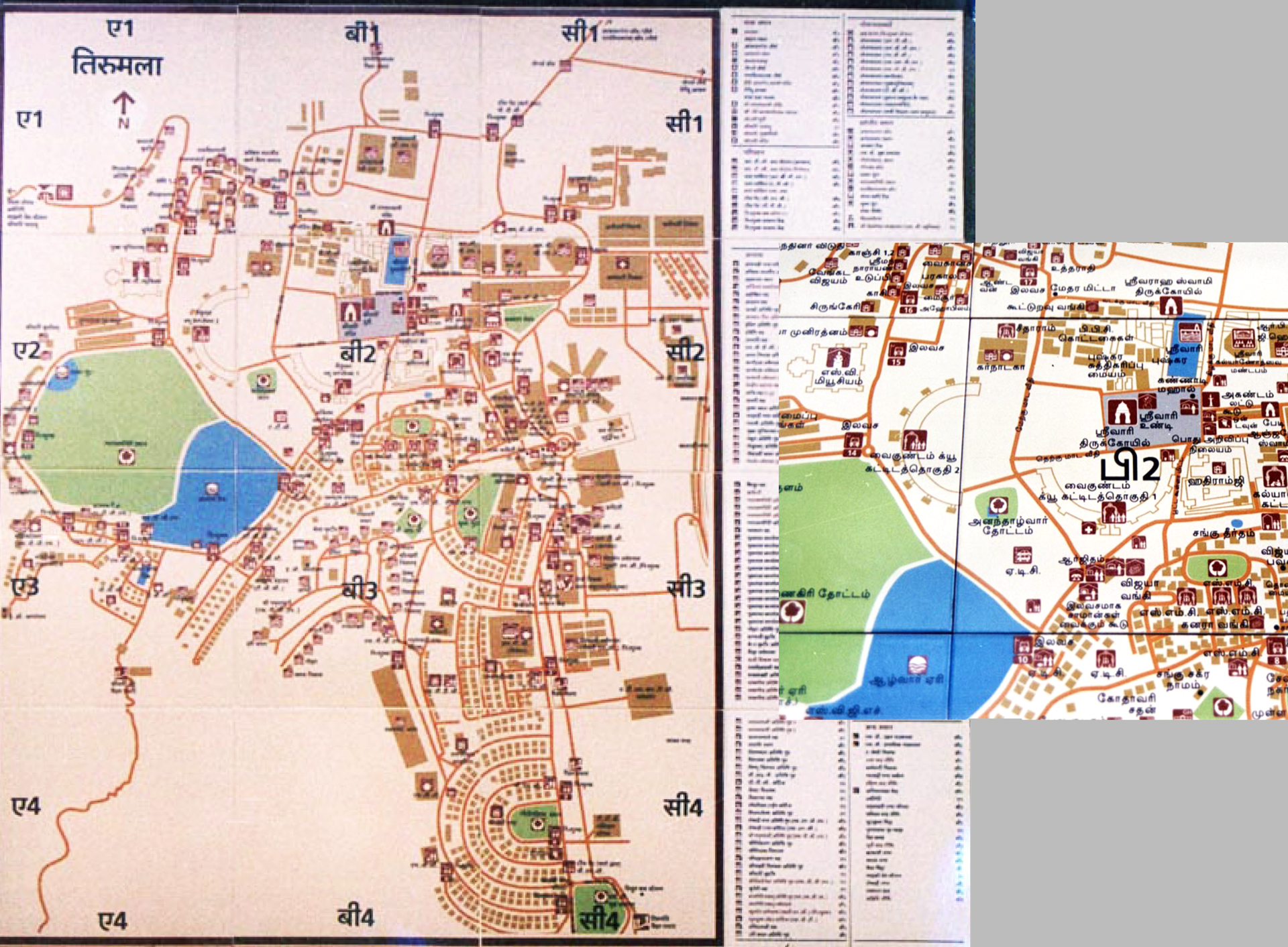
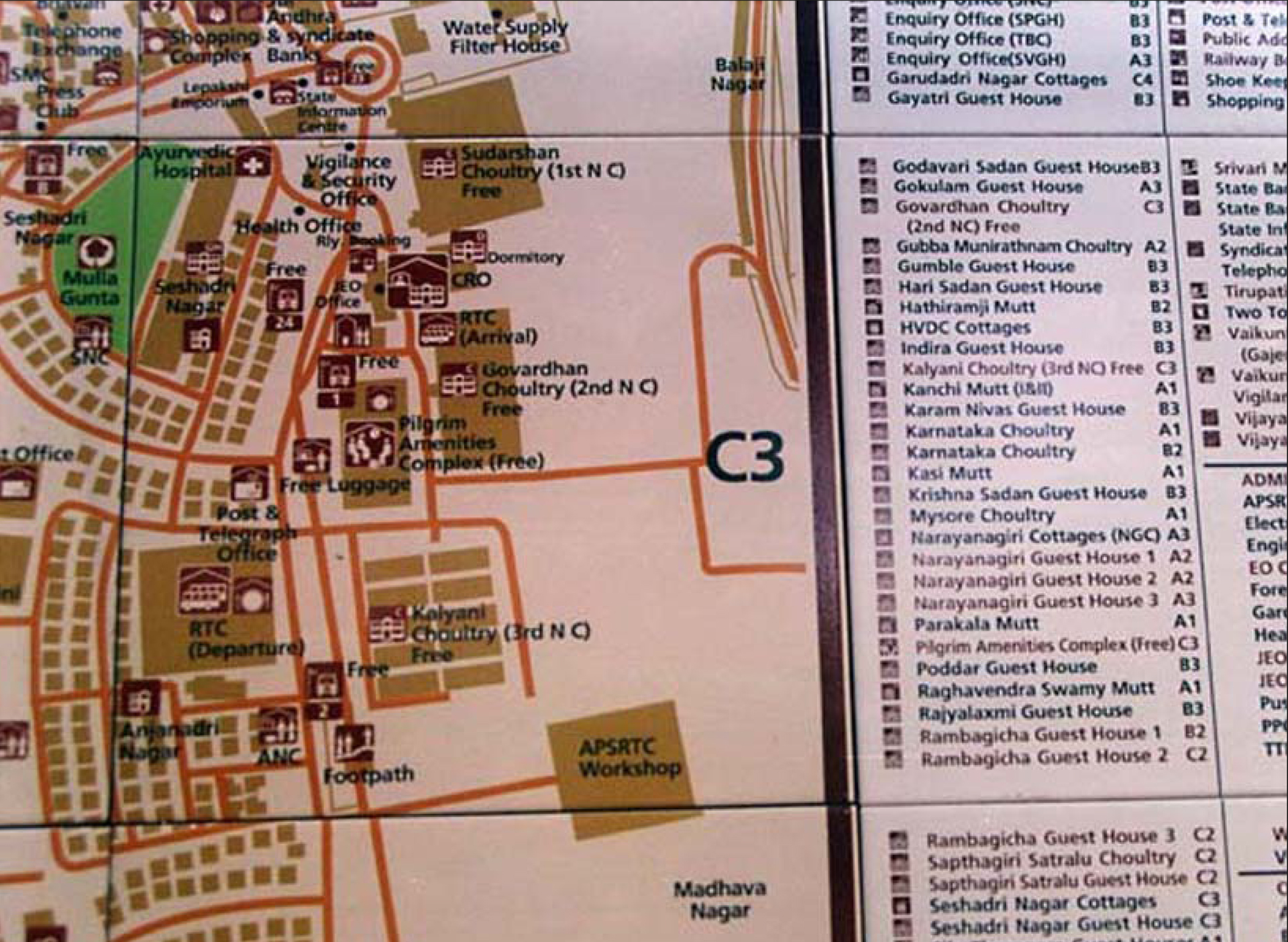
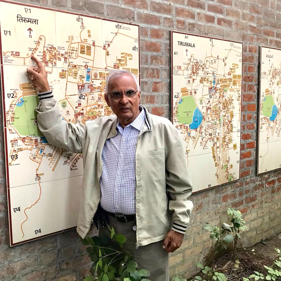
It (Tirupati) was total planning – of languages, spot locations, what we say, appropriate direction arrows and pictograms, and what would be the naming of the place
Salomi: Which project got you back to designing letters?
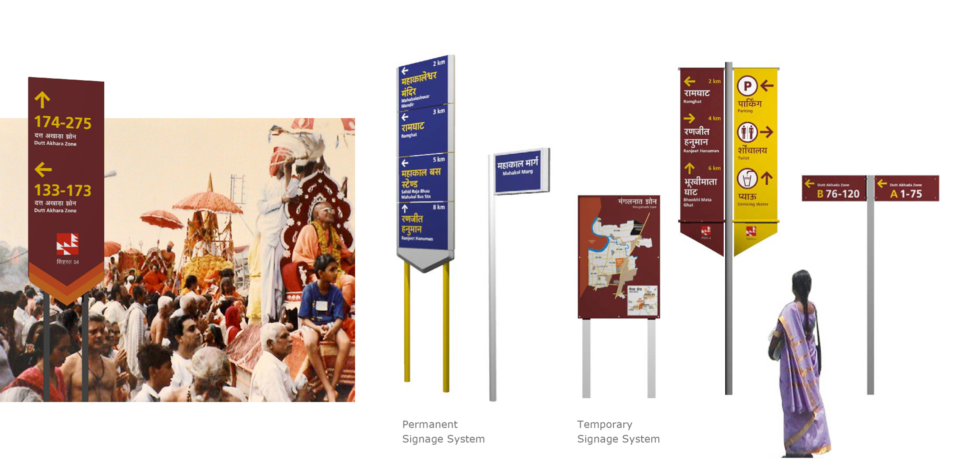
Mahendra: In 2000 Tirupati came to me, and I designed type designs for four scripts for the city – Devanagari, Telugu, Kannada and Tamil. For English we used Frutiger. But my Tirupati project, which included a semi bold style for maps and signage, was a breakthrough in the wayfinding system design. It got so popular that the Andhra Pradesh chief minister, Chandra babu Naidu, was in Tirupati and he said – aah this sort of thing should be there in Hyderabad. He contacted NID for Hyderabad signage design in 2003, when I did a signage design system in English for international tourism. Then, in 2004, I did bilingual signage design for Kumbh Mela in Ujjain. This was made at Leaf Design, the year after I retired from NID. And so it continued with signage design and wayfinding design. I’m an opportunist and I keep myself busy all the time.
Salomi: And these were all custom type projects?
Mahendra: Ya, ya. All of them. All are with different structures and different designs. In Ujjain, for example, 90% is Hindi speaking, so the emphasis is more on Hindi than English.
In Tirupati there were three approaches – a three-language solution for roads, a five-language edition for orientation maps and direction arrows, pictogram and text for direction signage posts. So it was total planning – of languages, spot locations, what we say, appropriate direction arrows and pictograms, and what would be the naming of the place. Numbering and naming is part of the wayfinding system, so people don’t get confused and get lost. In Kumbh Mela there are 45,000 people everyday taking a bath. 4 lakh people stay in tents – they should not get lost. So tent numbering and satellite city naming is also part of wayfinding design.
Salomi: For your Hyderabad signage, how did you approach the design of the letters so that you can see them from a distance? Did you work on optical adjustments?
Mahendra: We physically tested it. There is a formula – one multiplied by 200 and 300. All capital letters and with lowercase. Based on that hypothetically we created a size, and created an actual board. I was working with Leaf Design at that time at our Bandra office, so we put text at a 16 feet height on a pole and then we did a readability test from different distances. And then we found out the optimum readability distance.
Salomi: Where did you get this formula from?
Mahendra: You can find out more in the book Signage and Wayfinding Design by Chris Calori and David Vanden-Eynden. For example 1cm cap height is readable at 300 cm distance. And lowercase x–height is multiplied by 200 cm. For design students we create a corridor, we create that text – in all capital, and cap lowercase, English and Devanagari – and then we ask them to read and make a mark on the floor to show optimum reading.
Salomi: Were you using existing fonts as well for these signage projects?
Mahendra. For Hyderabad we used Frutiger only. For Kumbh Mela we used my first draft of Nayee Nagari [soon to be released with UT], and for English we used Frutiger.
Salomi: All of these projects led to the honour of you receiving the Gutenberg Award.
Mahendra: In 2009 design professionals and professors from all over the world visited Symbiosis, Pune, and they were going round and my director was showing things. I told the director that I have a presentation ready about my journey, and I presented it with all the things that I’m talking to you about. They were very much impressed, and they invited me for lunch together.
It was the first time I met them so I was helping them with lunch telling them – this is called dal, this is called roti, you can eat like that, it’s very spicy. It was just 15 minutes of discussion with three or four people who were design-based, who were typographers, and it finished. One and a half years later I heard from Uta, a friend of one of them.
Uta – who is the administrative secretary for the Gutenberg International Award – told me – Mahendra Patel, I heard about you from a friend who met you over lunch there. And he wants me to recommend you, but I require data. So I sent all my key work on map design, wayfinding and font design to her. In those days sending data to Germany was very difficult. So I created a, b, c, d, e and f folders and she combined the whole thing together and presented it directly to the committee for consideration and luckily they considered me for the award for 2010.
They gave me a choice to either fine tune Univers Devanagari or to create another design. So I proposed that I would like to give a tribute to Frutiger

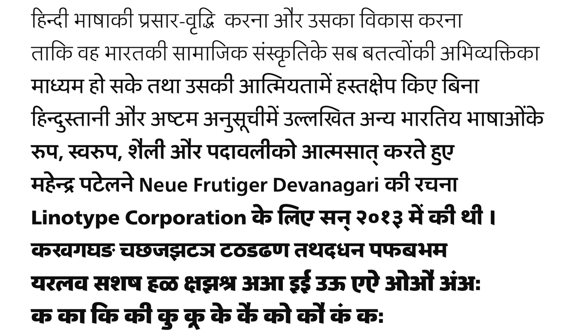
Salomi: That’s brilliant. And this also led to a new project – Neue Frutiger Devanagari.
Mahendra: They had an award dinner and a director from Linotype came to me and said – Mr. Patel, greetings from my father. His father happened to be Mr. Hans-Jürg Hunziker who I worked with during those two weeks in Frankfurt back in 1971. He said – Mr. Patel, I would like to come back to you, we would like to do something with you. And it was a five-minute talk (during networking). You know they stand around, they have drinks, I think I had a tomato juice – I don’t drink (laughs) – in my glass and I was going around with that.
But in 2011 he sent two people to NID to discuss the possibility of a project with Linotype. And they talked to me. They gave me a choice to either fine tune Univers Devanagari or to create another design. So I proposed that I would like to give a tribute to Frutiger. I love the Frutiger typeface and I wanted to make a matching font for Frutiger in Devanagari.
Salomi: And they straightaway liked the idea?
Mahendra: Immediately they agreed and I sent them a proposal. Somehow it got through and in 2013 they launched Neue Frutiger Devanagari at the Typography Day in Guwahati. I think just around that time Monotype had taken over Linotype, so a Monotype person, Linotype person and Monotype Indian person – all three came there to felicitate and launch this new font at Guwahati.
Monotype was interested in creating the Neue Frutiger style in other languages but unfortunately at that felicitation function for me, one of the Indians stood up and said – how can you rasterize Indian scripts. Later I found out that it was only the letter ॐ he didn’t agree with. But I would have said – one minute, how can you ridicule the rest of the work only because one letter doesn’t suit your aesthetic. But I didn’t have time and it was such an occasion of celebration.
That stirred the Linotype and Monotype people and they said – Mr. Patel, we would like to come back later on this. Otherwise we were about to sign the contract the next day. We met at lunch and they told me we’ll come back to you. Unfortunately I corresponded with them and the plan to extend Neue Frutiger to other Indian languages never took place.
Each letterform is like a symbol, the way we construct it. It is not just drawing. Many people take स and make द out of it and all sorts of things. It’s not that. There is very fine tuning which requires more time rather than just adaptation
Gunnar: Has the need for more typefaces covering more scripts been there for a while now?
Mahendra: Ya, ya. Advertising agencies are in need. Graphic designers are in need. But for one typeface you work for 1 ½ years to develop and do. For one logotype you work for hardly two weeks to three weeks and you earn the same money, so people go in for more brand design or branding, rather than type design. And each letterform is like a symbol, the way we construct it. It is not just drawing. Many people take स and make द out of it and all sorts of things. It’s not that. There is very fine tuning which requires more time rather than just adaptation.
Gunnar: In the 80s and 90s, were there a lot of graphic designers in India doing typefaces on the side?
In those days nobody would pay for typography. Layout was done by printers, they would pay a printer but they wouldn’t hire a designer
Mahendra: In type design there was R.K. Joshi. He worked with C–DAC, Bombay with the scientist Dr. Mudur. They were creating a software application, Vinyas, for type design. There was Vasant Desai at the Institute for Technology and Research. There was Mukund Gokhale who was also a type designer, he was from JJ school. We meet quite often together.
In those days nobody would pay for typography. Layout was done by printers, they would pay a printer but they wouldn’t hire a designer. People would get surprised if I designed a magazine for them and charged a separate design fee from printing. Normally you’d get 15% of printing and that covers the design fee. And at NID I had a hard time getting credit for my designs. I would sometimes take back my design and say if you don’t print me a credit, we won’t print it. And I had proved that design can make a difference.
Salomi: So the practice at that time was to have the designing and printing as a package?
Mahendra: Ya, ya. Advertising for example was done on commission – 15% commission of the space they hired. They didn’t charge separately for creative work or design. It was only NID who started charging separately for design and recognising or even giving credit to designers.
My Gujarat map had seven layers. I had seven different artworks to print on each other to print correct and precisely
Salomi: How did you respond to this practice?
Mahendra: I didn’t want to work on a project unless they gave credit to me in print. So all my map designs had ‘Map designed by Mahendra Patel’ printed on them. I wouldn’t even sell my maps to clients, because map design looks very simple but it takes months of drawing by hand and layering and registering. Nowadays it is a very simple job. But before computers it was a very, very hard job. My Gujarat map had seven layers. I had seven different artworks to print on each other to print correct and precisely. By the time you get to seven layers the lower layer would expand a little bit. That’s why I did all those artworks on polyester film, so registration is not a problem.
They would give a symbol design project and they thought the design of the envelope, visiting card and letterhead would be part of it. I started charging for stationery design. Logo identity and stationery were separate projects. And people said – why are you doing it? Then I’d say – you do it yourself, I don’t give away my design for free. And I proved that designers can make a difference. Design can make a difference.
Gunnar: Did the connection to the Basel school help bring the separation of the printer and designer into India?
Mahendra: Absolutely right. But selling that design is an Indian venture. Switzerland is very well educated. They didn’t have any problem with the recognition of design. Now we don’t follow Swiss design thoroughly at NID, because we realised that we’d created an Indian version of it which is mid way. It is well designed, but also user-friendly and user-relevant. In Switzerland users are well educated to appreciate design. All posters are like art pieces. But here nobody bothers who designs the posters or how good it is so far as it sells the product.
To establish that was a big task for all of us at NID. My appointment to NID included professional work, research work, development work and teaching. We didn’t have separate payments. So I didn’t get one rupee extra if I did projects. I got pride, I got lots of experience with that and lots of opportunity. That’s why I could do so much work at NID – you know, doing work for crores of rupees.
The Nehru Centre Exhibition was 2 crore rupees in ’88. It was a huge project. Even now it is too big. I’m talking about the design fee, not the execution fee. NID used to get good projects like that. We trained people, we asked people what they needed, what they experienced and then allocated. And because my type design was not flourishing, or not appreciated, I jumped everywhere. But not only one area, I continued developing and got expertise into each one of them.
We became an institute of national importance. I was one of the planners for the faculty development there. I started as a student and I retired as a principal designer there
Gunnar: Were there any other design schools in India doing a similar thing?
Mahendra: Ya, there’s IDC – Industrial Design Centre, IIT Bombay which is now called IDC School of Design. They were parallel to us. They started a little later – I think six to seven years later than us. But they started with a postgraduate programme. They started their undergraduate programme just four years back. NID started with an undergraduate programme and then added a postgraduate programme. NID is a design school only, while IDC is a part of Indian Institute of Technology.
Gunnar: And did they have a strong relationship with the global design scene like NID did?
Mahendra: Ya. IDC does because of IIT. IIT, Powai – Indian Institute of Technology has a very good reputation abroad.
Gunnar: And how did that come about?
Mahendra: When we got independence, Pandit Jawaharlal Nehru established the Institute of National Importance. It was 100% funded, but NID was not 100% funded. At NID we had to earn our own additional money in order to run the institute. That’s why we got so many projects until 2009 or 2010, when we were also awarded the title of Institute of National Importance. The government grant was hardly 30 - 40% of what we spent at NID, and our teachers worked on 40 - 60 % through professional projects.
Now things are different. We became an institute of national importance. I was one of the planners for the faculty development there. I started as a student and I retired as a principal designer there.
Gunnar: So you’ve been there since the beginning.
Mahendra: Ya. All my life for 39 years at that same institute from 1964.
Gunnar: Was Gira Sarabhai appointed by the Nehru Government to found NID?
Mahendra: Charles Eames visited India on invitation. He went around the country and saw that there should be an institute of research and training and project work in the country. People should be taken at a higher level to do research and serve the country’s industrial needs. With the India Report, in 1968, Nehru called all the industrialists to Delhi and discussed this scheme with them. The Tatas and Birlas all went. And the Lalbhai Group and people from Ahmedabad also went.
They proposed that Gautam Sarabhai – Giraben’s elder brother, the owner of Calico Mills would be appropriate to master this. Based on this, NID was founded. So that’s how Gautam Sarabhai became the first chairperson of the institute. And Gira Sarabhai, with her training as an architect, took the responsibility of the design director at that time. While Gautam Sarabhai visualised the total institute, Gita Sarabhai concentrated on human development and departmental academics.
Salomi: They were very progressive.
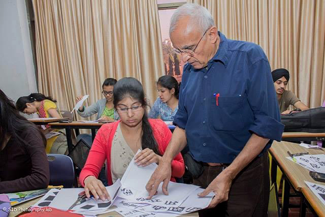
Mahendra: They experimented and they were very open-minded. Gautam Sarabhai’s daughter was studying at Yale University, so he knew the American system. From the beginning we didn’t have a mark system, we didn’t have a grade system. We had a very open-ended education system and approach. The overall development of the faculty resources was the main objective – so we spent around seven to eight years on that. Before I retired it took eight years to train other people to take over my responsibility. So it is an excellent institute from the point of view of human resources development and institution building.
Gunnar: When you joined NID, did you immediately start teaching type design?
Mahendra: Not type, I started teaching letter design and typography or metal typography and letter design.
Gunnar: Can you tell us about the type module you taught – was it mainly Latin script typography or was it also Devanagari?
Mahendra: It depended on the students. NID is a very student-based education. Before ’71 there was only one Gujarati student – so one Gujarati and the rest of them English. I taught on paper and most of my time went on teaching hot metal typography. We had a proofing machine and printing machine. We used to teach them how to compose letters, how to do typesetting, how to align, how to take a proof and all. And how to use hierarchy, fine leading. But after retiring from NID I managed students to do many other scripts with me.
Gunnar: And you have been teaching type design for 50 years now?
Mahendra: Around 45 years.
Salomi: During this period you also taught at other colleges across the world?
Mahendra: Ya. I had three classes at RISD – Rhode Island School Design. I taught one winter semester there. I taught them letter design, illustrative typography and map design.
I have one little module called exploring vernacularism to get them interested to explore, experiment, and wonder about their own vernacular interest and vernacular roots
Salomi: Were there any other colleges where you taught abroad besides RISD?
Mahendra: I have taught at Indus Valley School of Art, Design & Technology, Karachi, Pakistan; I have taught at Nova Scotia College of Art and Design in Halifax in Canada. And I have taught also in New Zealand at the School of Arts at Christ Church.
Salomi: And were these similar classes?
Mahendra: At Nova Scotia School of Art and Design I taught functional typography. I asked them to select existing typographic problems and give a creative solution/proposal. It was just before Christmas. And in New Zealand I taught them similar to in the USA – letter design, type design and logotype design. I took three separate classes for second year, third year and fourth year. To make it economic for the institute I used to teach the three-year students simultaneously in separate classes. I would divide my time accordingly. I taught them for three weeks.
Gunnar: Coming back to India, do you think students are more interested in Indic scripts than before?
Mahendra: I had another module – exploring vernacularism. Our friend Salomi is Gujarati, but she may not be as familiar with Gujarati as she is with English. She can fluently speak, write and think in English, but Gujarati is just okay.
Indian script is more expressive and more based on handwriting so the visual proportion plays differently there
Now many students are like that. So I have one little module called exploring vernacularism to get them interested to explore, experiment, and wonder about their own vernacular interest and vernacular roots. I took all types of students – painting students and non–design students – and they all worked on that and I gave that module to them to get them interested.
Salomi: How do you support students in learning type design?
Mahendra: I give them the basic discipline because Latin script is more geometric – the visual principles are much faster and easier to learn through it. Indian script is more expressive and more based on handwriting so the visual proportion plays differently there.
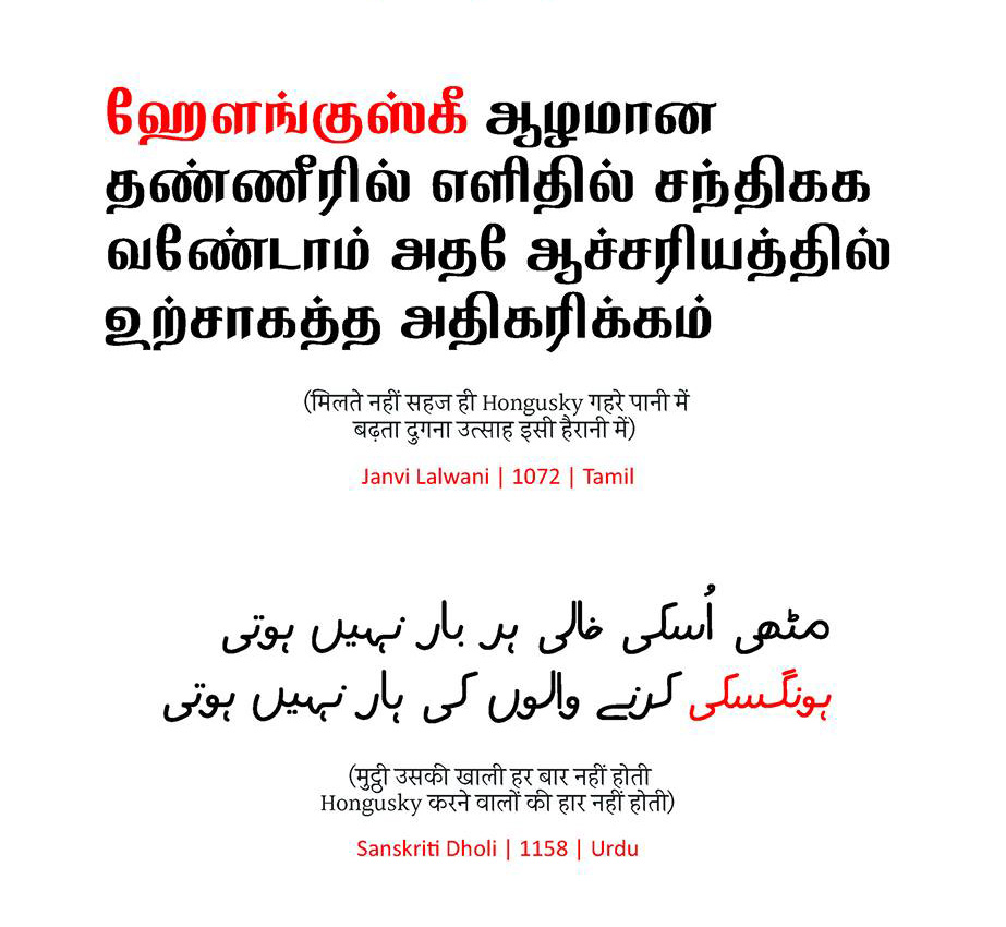
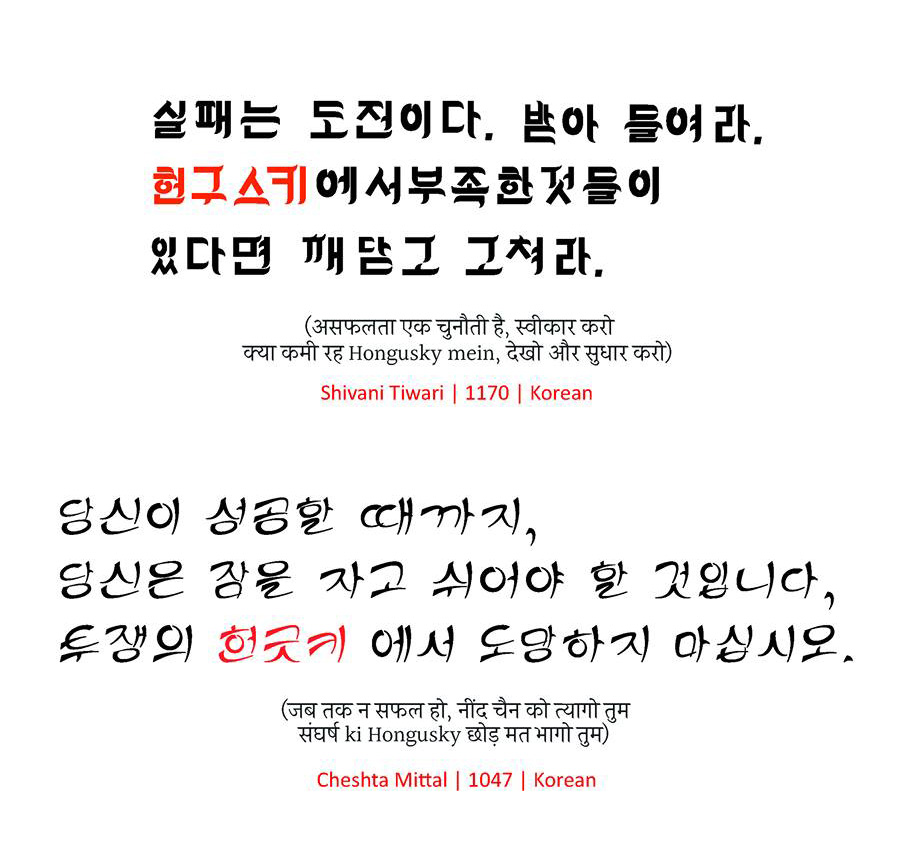
I then started giving them projects for matching fonts – one with their regional language and one with English. Or regional language to English, English to regional language – like that. And sometimes students have worked on scripts unknown to them such as Brahmi, Korean, Urdu, Gurumukhi, Tamil and Malayalam. There was a thing that each student should not have the same scripts. The batch of students worked on different scripts and I took a whole six-week module with them.
I don’t know Malayalam, I don’t know Tamil, I don’t know Telugu or Kannada or Bengali, but still I understand – I can work with them
And in the end they were very happy because it is professionalism. It is not to worry about what they solve, but to understand how to go about dealing with the script they don’t know. I don’t know Malayalam, I don’t know Tamil, I don’t know Telugu or Kannada or Bengali, but still I understand – I can work with them. Indian people won’t trust you if you don’t know the language. I have to take them in confidence in order to serve them, so I work accordingly.
If you have jaundice and you go to the doctor, and the doctor never had jaundice, would you take medicine from him? He never had jaundice, but he is an expert in medicine. I am an expert in font design and letterform structure, and the science of type design
Gunnar: So you believe you don’t have to be a native to the script to design for it?
Mahendra: If you have jaundice and you go to the doctor, and the doctor never had jaundice, would you take medicine from him? He never had jaundice, but he is an expert in medicine. I am an expert in font design and letterform structure, and the science of type design. So I tell them – the language is yours, the script is yours. I will help you to make appropriate decisions. I won’t make decisions, I will create options. I will do all the donkey work for you. Creatively I’ll help you to decide and in the end I’ll charge and serve.
In the beginning they hesitated, but the moment they had one or two discussions like this they were very happy with me. The Tirupati people even sent seven people to NID to get trained by me. That is not part of the contract, but the chief engineer said – sir the way you talk, the way you work on the project, I want to bring my team to NID; we would like to come to your institute and have a workshop with you. Nowadays it’s very easy. Everybody talks about user friendliness. User experience design in my time, we were doing in our way without computers.
We are still living with the influence of the tool of writing
Gunnar: Do you think the Latin script is more geometric and systematic in its nature than Indic scripts? My experience is that Indic scripts are also systematic in a sense, and mostly start being harmonised or regulated through calligraphy.
Mahendra: In my opinion Indic scripts are more phonetic, while Latin scripts are more alphabetic. The same letterform is contextually pronounced differently. In Indian scripts we have strict rules for pronunciation and construction of sounds. Now traditionally technology is secondary before writing. This is a major thing in Indian scripts. We are still living with the influence of the tool of writing.
The way you write is different from the letterforms you read. And many celebrities or many good scholars who write may not have good handwriting. Handwriting which is called democratic can be read comfortably by everybody. Now it requires maturity. And it requires scientific study to make handwriting into writing for the general public. So that’s where you require some logical thinking and approach.
Salomi: Can you explain a bit more what you mean, when you say logical thinking?
Mahendra: I’m talking about visual logic rather than phonetic logic. I say expressive because it is artistic. What is artistic is individual and I would have different proportions. But when people read, they read like a pearl. Pearls have ideal proportions. It has only one shape and that can be recognised by everybody. To recognise what would be the ideal letterform requires some sort of a structural logical approach. It is more like good writing than personal writing. Calligraphy is beautiful writing, but not necessarily good writing for reading by the general public.
Indian script came from reed pen writing. When you write with a reed tool, it is more organic rather than geometric
Salomi: If you look at the अ in Devanagari, one person can write it differently from another. But typographically there’s a balance of shapes and counterforms. Maybe the letters of the Latin script are more defined because they had hundreds of years to get from handwriting to that typographic form. That transition from calligraphy to typographic form in India is shorter.
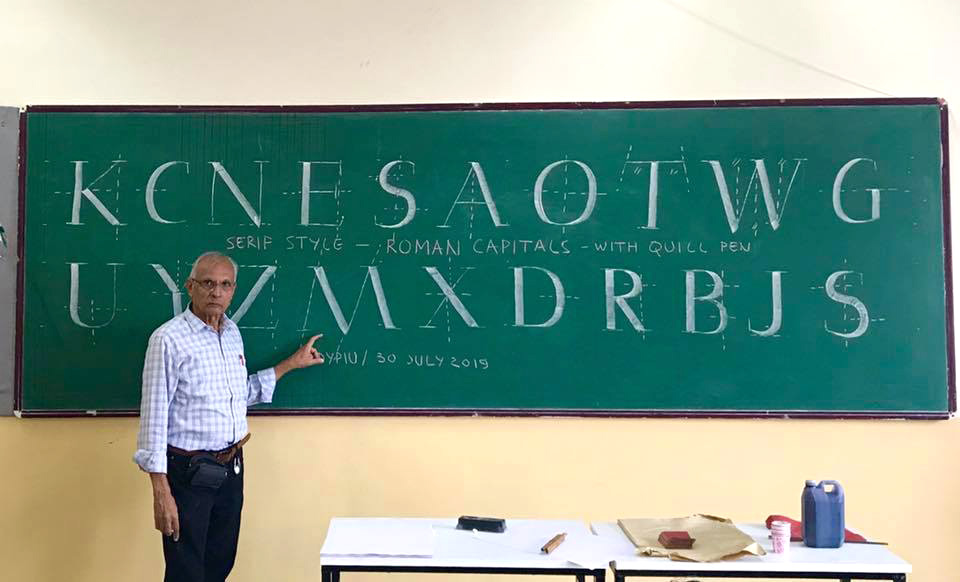
Mahendra: Latin script came from early stone engraving. When you engrave letterforms on stone you have to be very responsible and in control of the tool. Indian script came from reed pen writing. When you write with a reed tool, it is more organic rather than geometric. But Roman script, even when they came to quill pen, they were influenced by early stone engraving.
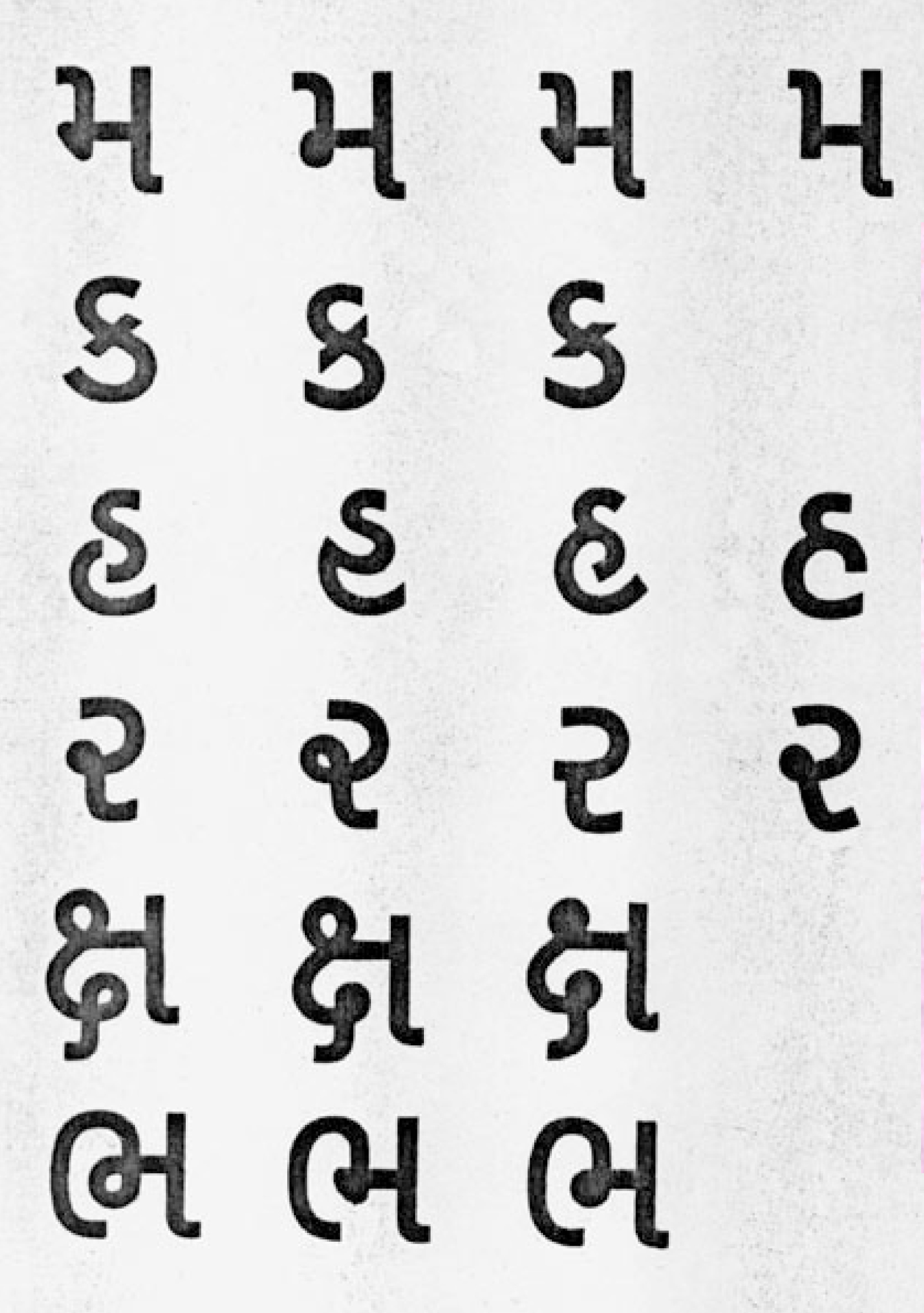
Indian scripts also started with palm leaves earlier, they were always scratched by hand with a tool-stylus; it was tool-based not media-based. And still now both Latin script and Indian script are becoming democratic. It is not only a few people reading this, or not only a few people’s writing. Everybody reads and everybody writes. That’s why it is required to standardise or rationalise so other people at large can read and write it. If you see Gujarati ક, the first curve goes to the right then comes back to the left – it is one continuous stroke letter. It is not like an s with a horizontal diagonal added to it.
Salomi: When we talk about the Latin script, for example the engravings from the Roman columns. Those were the origins of the uppercase letters. But when we look at the lowercase letters, they have had a lot of difference in script styles over many centuries. That’s similar to when you think of calligraphy with reed pens in India.
Anytime I teach type design or letter design I start with a tool so they write with a simulated reed pen and a simulated quill pen
Mahendra: They were also influenced by copper engravings, lithography and all those technologies which came later on.
Gunnar: What I’ve encountered with some Indic designers is that when something is called systematic, they feel it’s been invaded by Western thought. I don’t understand this, because manuscripts like Sanskrit are actually quite systematic, right?
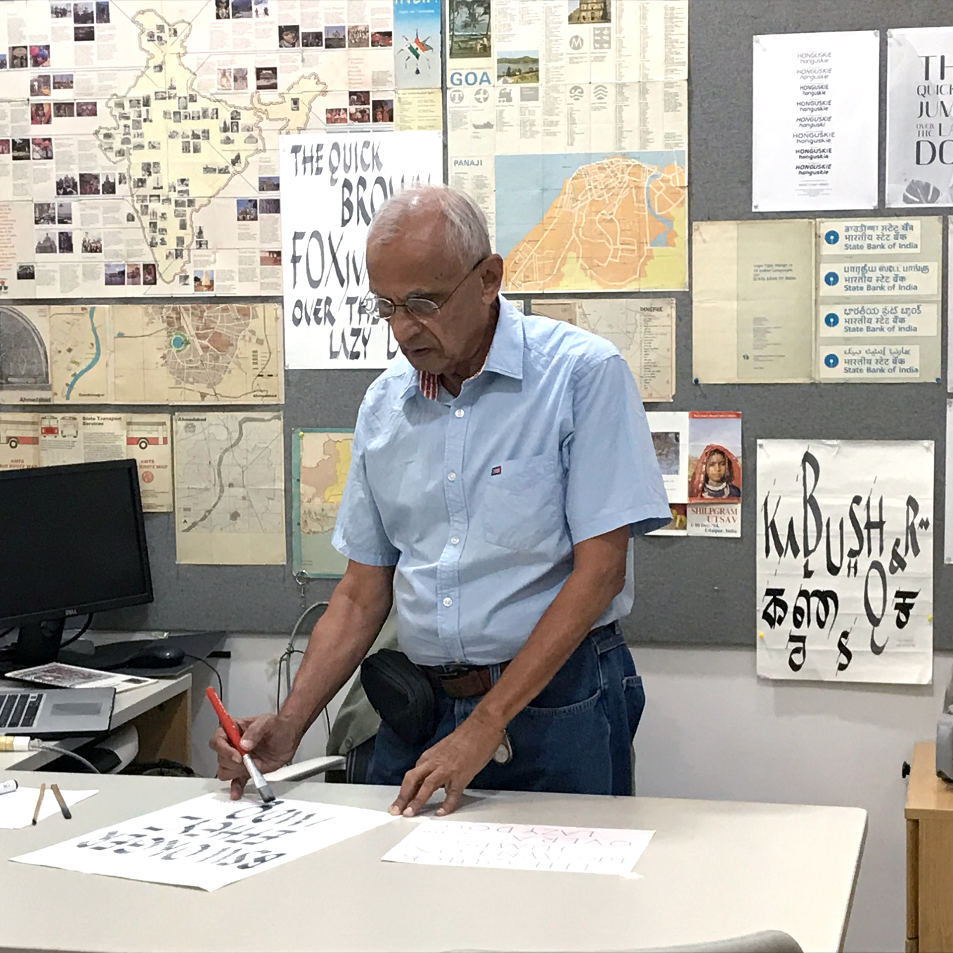
Mahendra: You’re right. Anytime I teach type design or letter design I start with a tool so they write with a simulated reed pen and a simulated quill pen. These are the three basic tools I use – reed pen, quill pen, linear pen. They write with it, they understand the differences, and the common principles that go into it. Structure is a common principle, but the way the tool runs from left to right with modulation and flow is different.
Actually in the early days it took 30 hours to teach and orient them before they went to construct letterforms on paper. Nowadays I give it in three days, because students don’t have patience anymore. But when they come to type design I am very strict with them. Not strict, but I make sure that they understand that well, if you don’t have an understanding of the skeleton and proportion of the letterform, you can make some mistakes even with sans serif letterforms or what you call low contrast letterforms.
Another thing that happened with our script writing now – we are influenced by early print forms – those early people who created a font for us who didn’t know the language and they manipulated the pen to write characters
Salomi: Is it challenging, trying to help students understand these letterform skeletons and proportions?
Mahendra: Another thing that happened with our script writing now – we are influenced by early print forms – those early people who created a font for us who didn’t know the language and they manipulated the pen to write characters. And now the new generation has not seen anything else than this. So they are influenced by this logic and for them the printed word and letterforms are God’s word, so they believe in it and it’s very difficult to bring back to the rational and good forms. That’s where my training came in – to question those forms to create your own forms and interpret them with the tool afresh and understand the skeleton and tool together.
Gunnar: It’s like you’re trying to bring back this kind of systematic approach.
Mahendra: As well as the sensitivity I would say.
Gunnar: This harmonisation of how the shapes relate to each other is lost in typefaces that were made early on. They don’t have this kind of sensibility.
I said you can’t teach type design in two weeks, you have to warm up for type design for two weeks
Mahendra: Ya, ya.
Gunnar: I think that there are a lot of these misconceptions in the type design scene in India. This burden needs to be brushed off to move on.
Mahendra: It happens to me when I start the course – people say – my god! – but when I finish the course they say – why is it finished so early, we would like to work more. So to keep that heart and interest into it is the major task I’m playing with them.
I call it letter design rather than type design. No doubt people call it type design. That is another confusion. People mean letter design but they call it type design. So now for example, Nirma University called me and invited me to teach a two-week course in type design. I said you can’t teach type design in two weeks, you have to warm up for type design for two weeks. People don’t understand, so I understand their point of view and I teach them in a relevant way.
Let’s not talk about the past, we have to jump onto the contemporary scene and start working towards it
Salomi: Where do you see the landscape of Indian type design heading? Is anything happening now that excites you and you want to see more of today?
Mahendra: Many young people are coming forward and the future is with language engineering, as well as digital design and more typefaces. Let’s not talk about the past, we have to jump onto the contemporary scene and start working towards it.
With new technology creating a type family is not that difficult. Earlier it would take a lot of work. Now it doesn’t take a lot of work, if you are clear about your master design. That master design is the major task – whatever design you do, later on it becomes easier. The computer takes almost 80% of the task. That is the new thing which is coming in.
Salomi: What do you think needs to change for type design in India to move forward?
Mahendra: Believe me, nowadays we Indians also need excitement – visual pleasure rather than functional pleasure. Because Indians are not behind on the global scene. Earlier we were required to organise ourselves and tidy up. Now in professional life, we talk about leisure time. They have enough of the basics. Almost 60% are aspiring to more than the basics. In my time we were struggling only for basics. Around 80% were struggling for primary work. Nowadays hardly 30-40% is that kind of struggle, so the need for variable type and visual excitement is also there.
That would give a big challenge to new type designers. But not at the sake of functional type designs. We have skipped a total era of readable typefaces. Hot metal has been created, but we have not re–created them on digital. That’s why I hope this transitional typeface currently called Nayee Nagari, which I’m working on with Universal Thirst, will serve as the bridge between that. It is low contrast, like Frutiger, but absolutely readable text, whether it’s digital media or print media. Though I am not a calligraphic or a visually exciting typeface designer. You can’t do all ya?