The evolution of the Telugu script’s characters was meagre in comparison with its counterpart Kannada, despite the two scripts sharing extensive similarities.
The evolution of the Telugu script’s characters was meagre in comparison with its counterpart Kannada, despite the two scripts sharing extensive similarities.
Over decades, the evolution of the Kannada script hinged on the strides made by foundries such as The National Type Foundry and The Wesleyan Mission Press in Bangalore, and the Basel Mission Press in Mangalore. Although these foundries made advancements with hot-metal type for the Kannada script, the refinements needed to improve the Telugu script during the same era were scarce, mostly as a result of the limitations in print and typesetting technology.
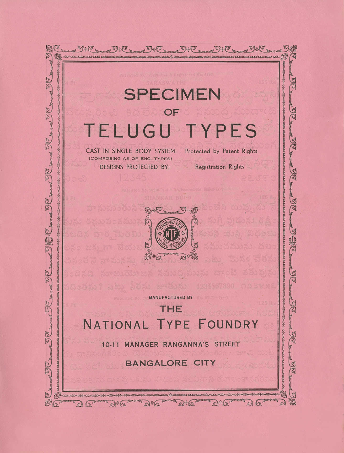
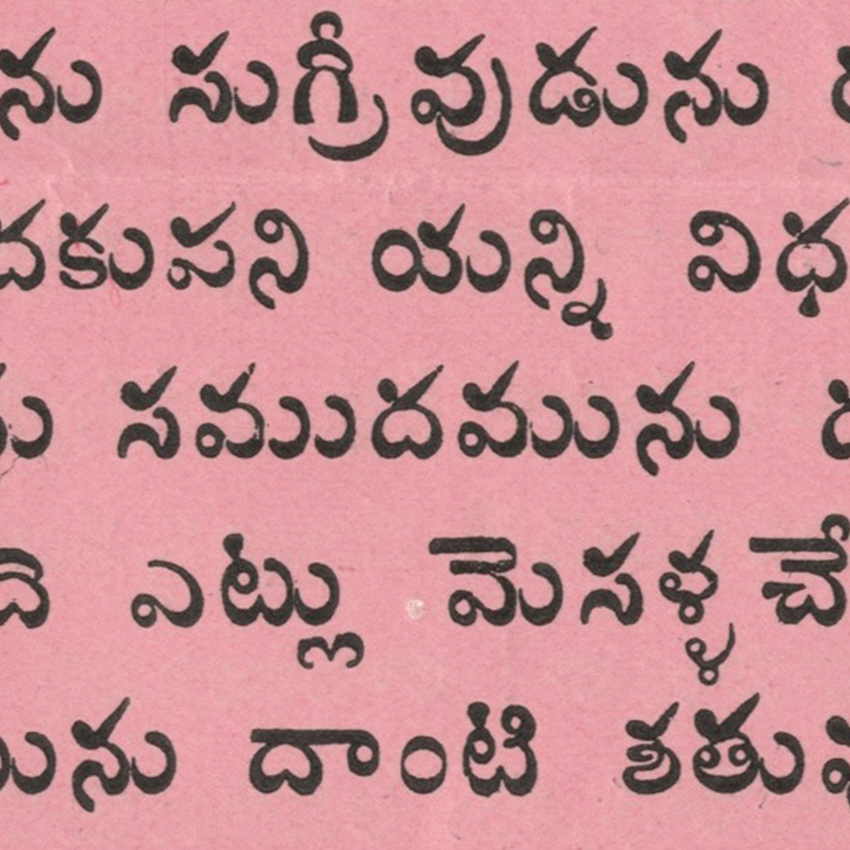
This specimen printed by The National Type Foundry consists of the Telugu script, which is used across Andhra Pradesh and Telangana, among other regions, and like Kannada, follows an Abugida form of a writing system. Abugida is a segmental writing system in which consonant-vowel sequences are written as units; each unit is based on a consonant letter, and vowel notation is secondary, like a diacritical mark. For example, ర + ా = రా which is one unit.
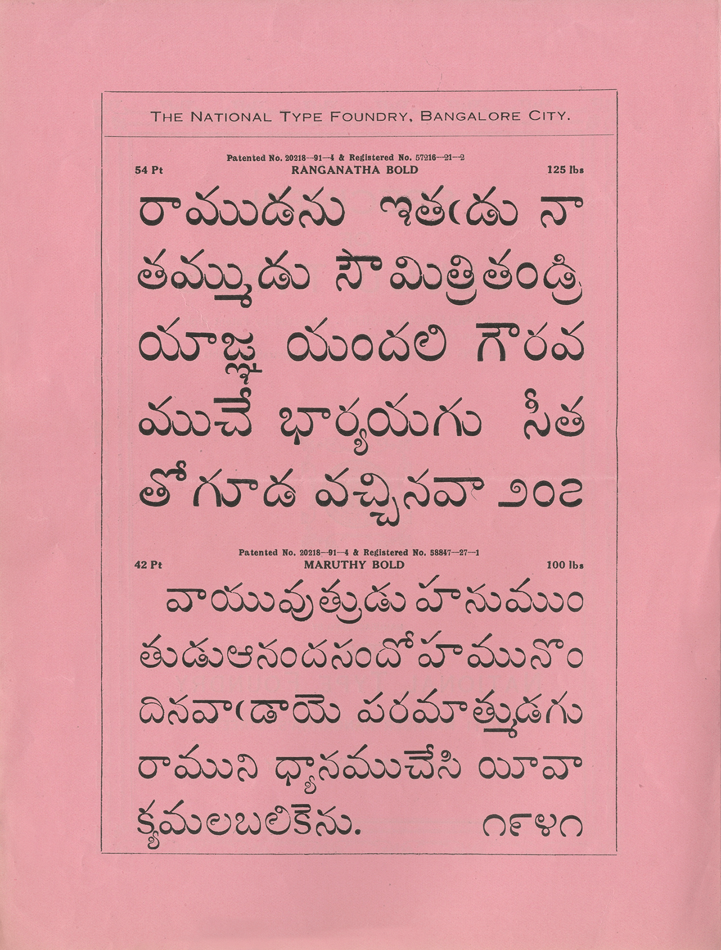
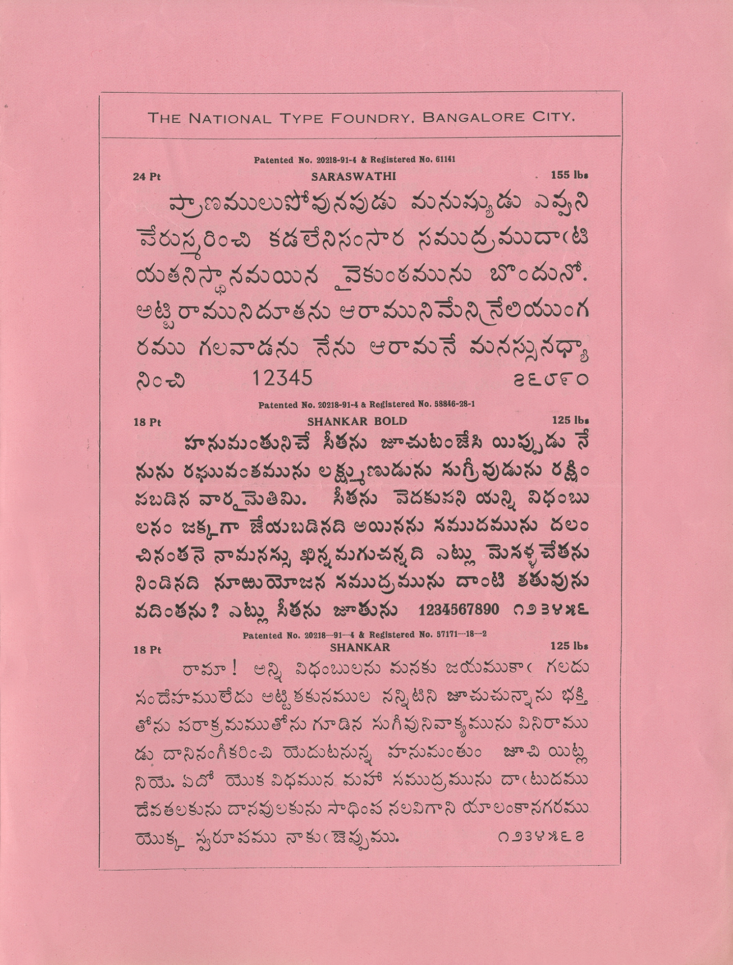
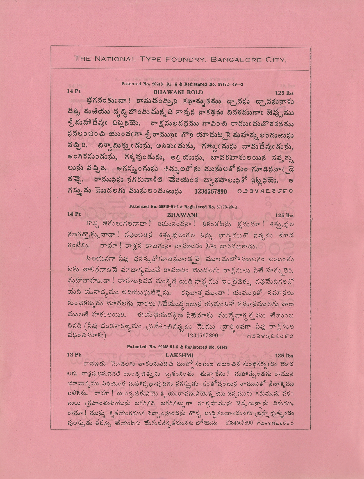
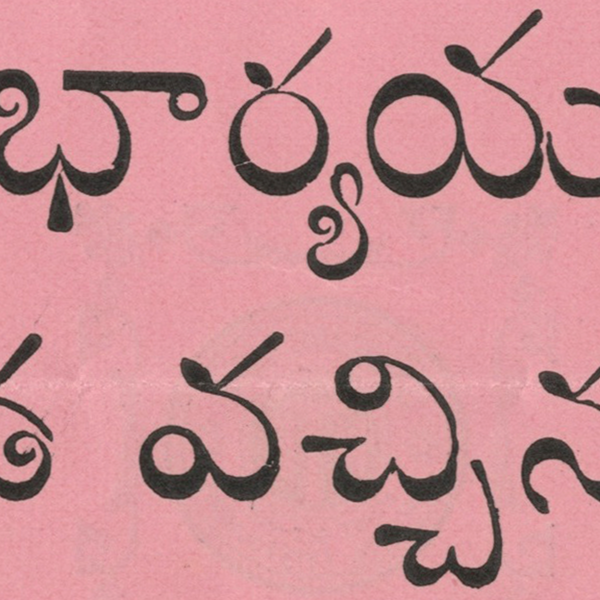
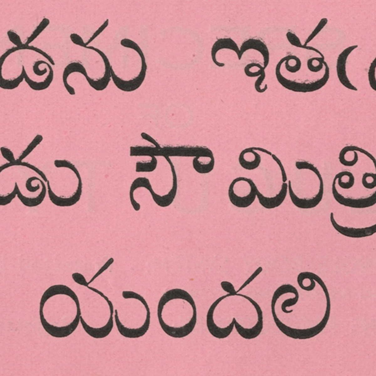
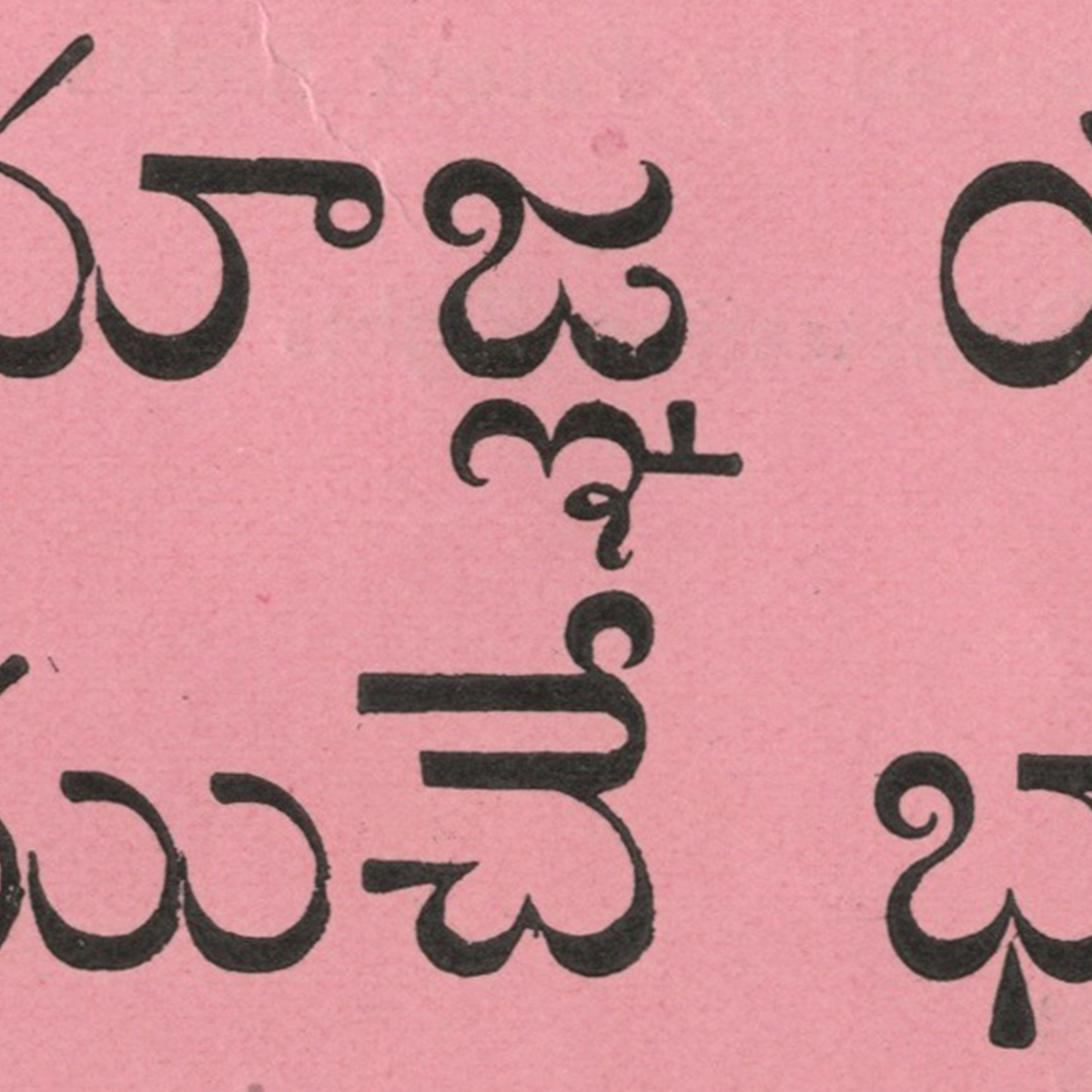
The purpose of this specimen was likely two-fold, primarily showcasing the differences between Telugu faces meant for display and text sizes, as well as advances with Telugu hot-metal type. Like this Kannada Aksharagalu printed by The National Type Foundry, the display faces shown here – Ranganatha Bold and Maruthy Bold – consist of exaggerated flourishes within letterforms such as ఇ(i) ల(la) జ(ja) and ్య (ya vattu or below-base form). With the text faces such as Bhawani Bold and Shankar Bold, the low contrast style, aggressive headstrokes and dynamic forms (a prominent feature also seen in old-style display faces of Kannada) are what sets them apart.
We usually see Telugu typefaces more like Lakshmi and Bhawani during this period. However, the bold counterparts have significant differences that do not coincide with their regular weights – making them inconsistent but also distinct at the same time.
The text faces are narrower in proportions, unlike the display faces. This measure does not ensure graceful readability, specifically in characters such as త(ta) డ(dda) అ(a), which innately require room in their respective counters.
Furthermore, the paradox between the text and display faces is the placement of a few ‘vattus’ or below-base forms, which, unlike age-old conventions, are horizontally stacked rather than vertically – as a result of limitations of technology, and probably devised as a solution based on the Kannada script.
Preserving these designs could help progress contemporary Telugu faces in myriad ways. Nevertheless, replicating this could also hinder development as a result of their absence of consistency with design, spacing and proportions. The takeaways are understanding and investigating the possibilities of what performs and what does not, especially with a contemporary outlook.
South Indian scripts do not have distinct tools to communicate their traditional styles. Kannada and Telugu manuscripts were made of palm leaves and were inscribed with pointed objects/tools, and the debossed area was loaded with ink. The traditional writing style did not borrow calligraphy styles from scripts like Devanagari, Arabic and Latin. The reason could be the region's distance from the earliest silk route, which helped with many areas of import, such as food, culture, technology and more. Hence, relying on local resources and ideas for documenting the region's history and way of life. This was a positive as it unlocked routes to more creative solutions, leading to lettering and betterment of type design.