The foundry was set up in October 1900 by Ichharam Suryaram Desai and Maganlal Thakordas Modi to manufacture types for the Gujarati Printing Press, and it went on to cut Marathi, Gujarati, Urdu, Sindhi, Kannada and Gurmukhi along with pioneering Italic types in both Devanagari and Gujarati scripts.
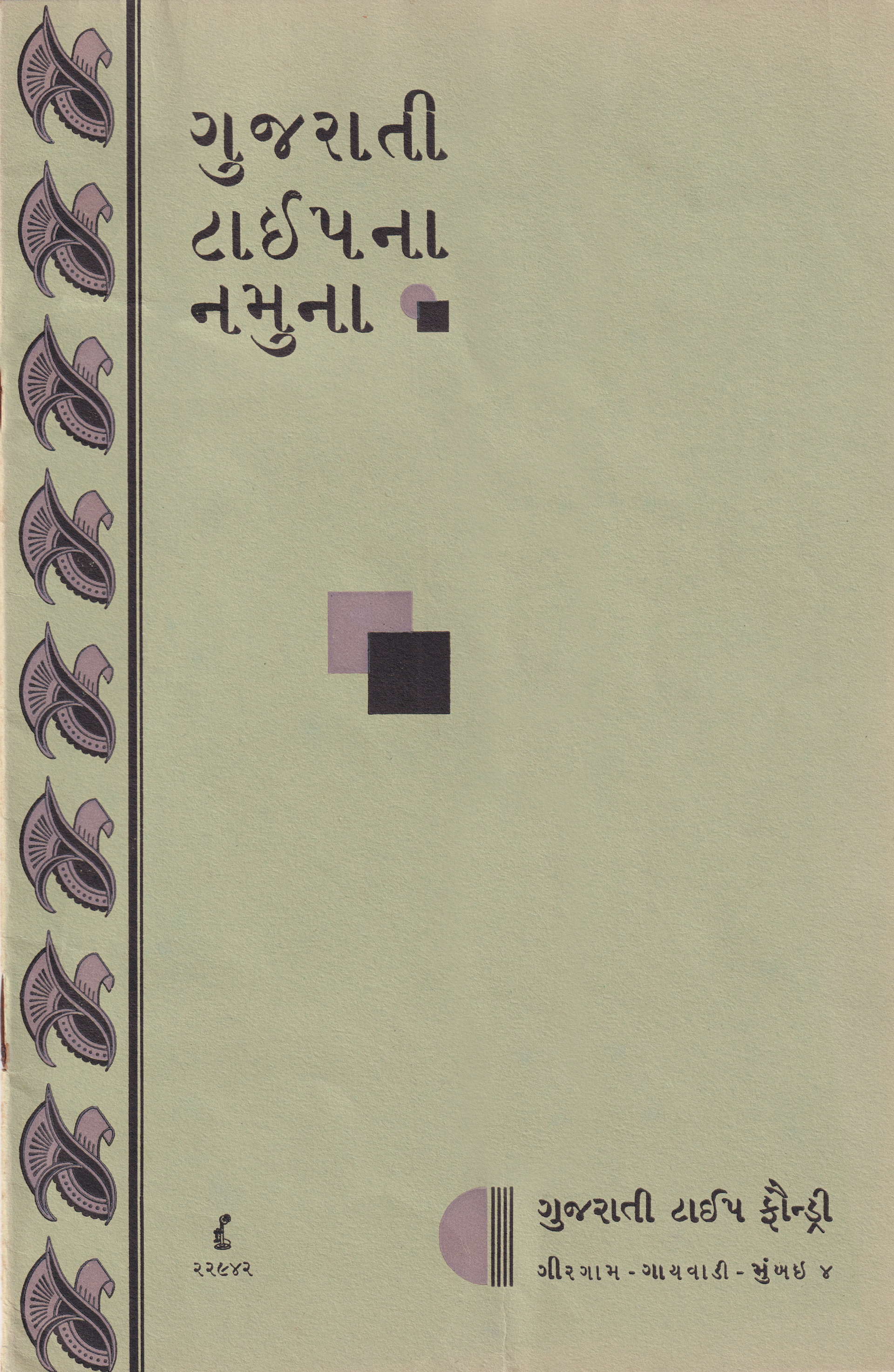
This 20-page specimen consists of Gujarati display and text styles in a range of sizes from 72 pt to 9 pt, and uses both the Imperial system and the American Point system for measuring sizes for their new styles.
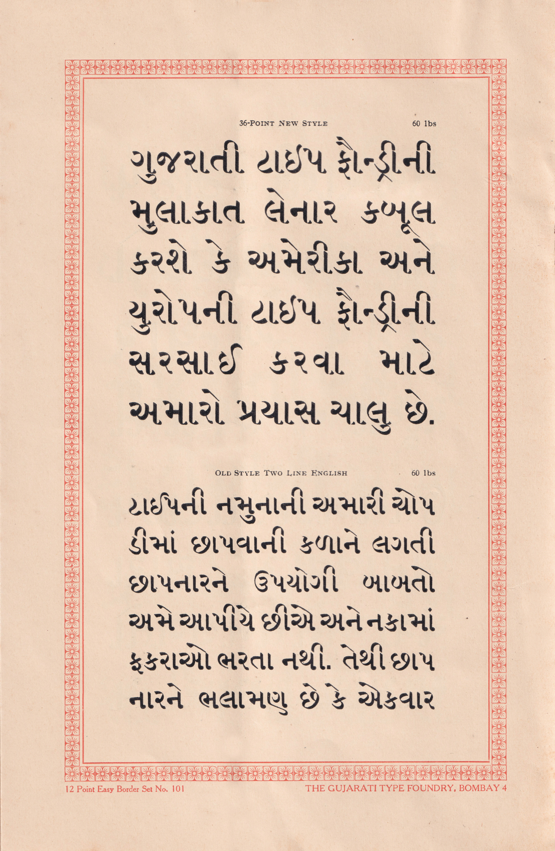
The text used to showcase the designs isn’t random, and in fact illustrates fragments of the history of the foundry and the state of type-making in India – serving to educate the printers of India so that the industry could grow further. Translating from the type samples, it reads: In our book of type specimens we give useful information to the printer concerning the art of printing, and do not fill up paragraphs in paper with useless information.
The date of the specimen is unknown, however from the text we can place it around 1928-30. In June 1901, the foundry started making plates to create type in a space of about 30 square feet in Panjarapol's Gaiwadi at Girgaum. Two months later they rented a room of 150 square feet a little distance from there and started making two moulds for type casting; it took four months to prepare this mould. In January 1902 they started selling type, with ‘Gujarati’ Pess their first buyer. Gradually the demand for type began to increase and by the end of 1902 the foundry had six moulds to cast type. As GTF grew, they believed that visitors to their foundry would see that they had the finest machines for making type that was comparable to the best foundries in America and Europe.
This specimen reveals that they were pioneers when it came to adding copper to the combination of metals used in creating metal types. Taking inspiration from the American type foundries, they invested a lot of research and labour to discover the best proportions for producing types that enjoyed a longer lifespan than those being made in England and Europe.
Another inspiration from American type foundries helped GTF become the first in India to produce type on the point standard – something that surprised some of their competitors. The foundry used their specimen to relate a short history of the Didot Point System, and the invention of the American point, as well as the benefits that encouraged them to adopt it.
GTF’s founders believed that American foundries operated on certain standards which weren’t in place when it came to the English scale which was used in India.The 72 divisions of an inch – called 'point' or 'mindu' in Gujarati – meant there was no need to learn names like the original ‘pica’ and 'great primer' etc. Instead they reckoned the body of type using numbers created a standard system which was beneficial for printers. Some of the benefits in the opinion of GTF are explained in the below direct translation from the specimen:
(1) English type can be used without hindrance along with Gujarati and Sanskrit type.
(2) The type of one foundry does not need to be used with type of another foundry.
(3) There is no need to keep separate squares, spaces etc. of different type foundries and therefore the printer does not have to depend on the typesetter.
(4) In job and newsprint work, if point type is used, the printer gains about fifty percent of the convenience in composing.
(5) The 'point' can be easily justified.
(6) Types of different sizes can be used with each other easily.

When using type on a 'point' system, two or more colours can be printed, and for book work and making grid forms the type can be composed easily. For example, if we want to print an eight-page book, we need to know how many lines it will contain. The page is six inches. One inch is equal to 72 points. All we have to do is to multiply the number of inches on the page with the number of points that you need.
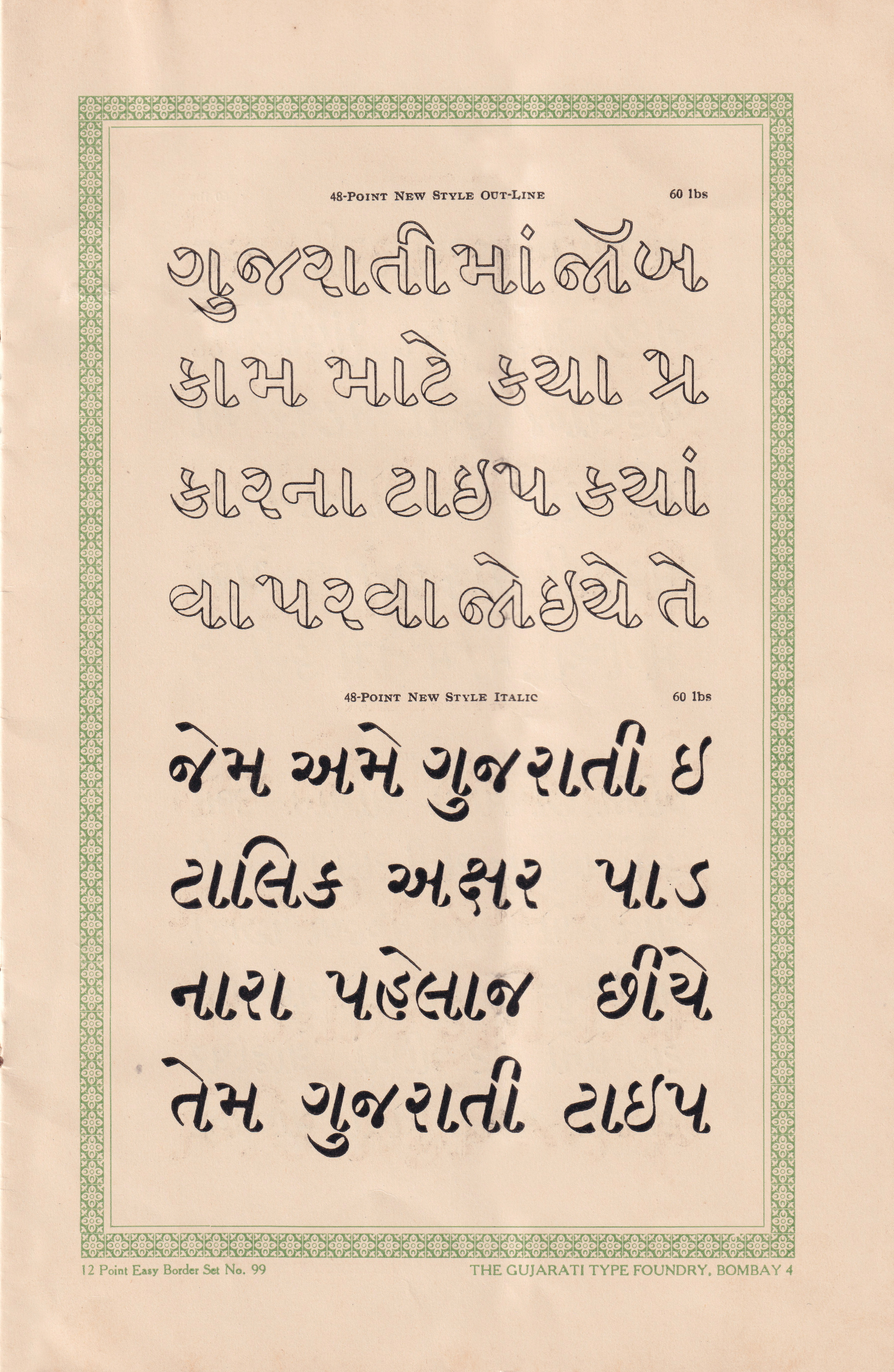
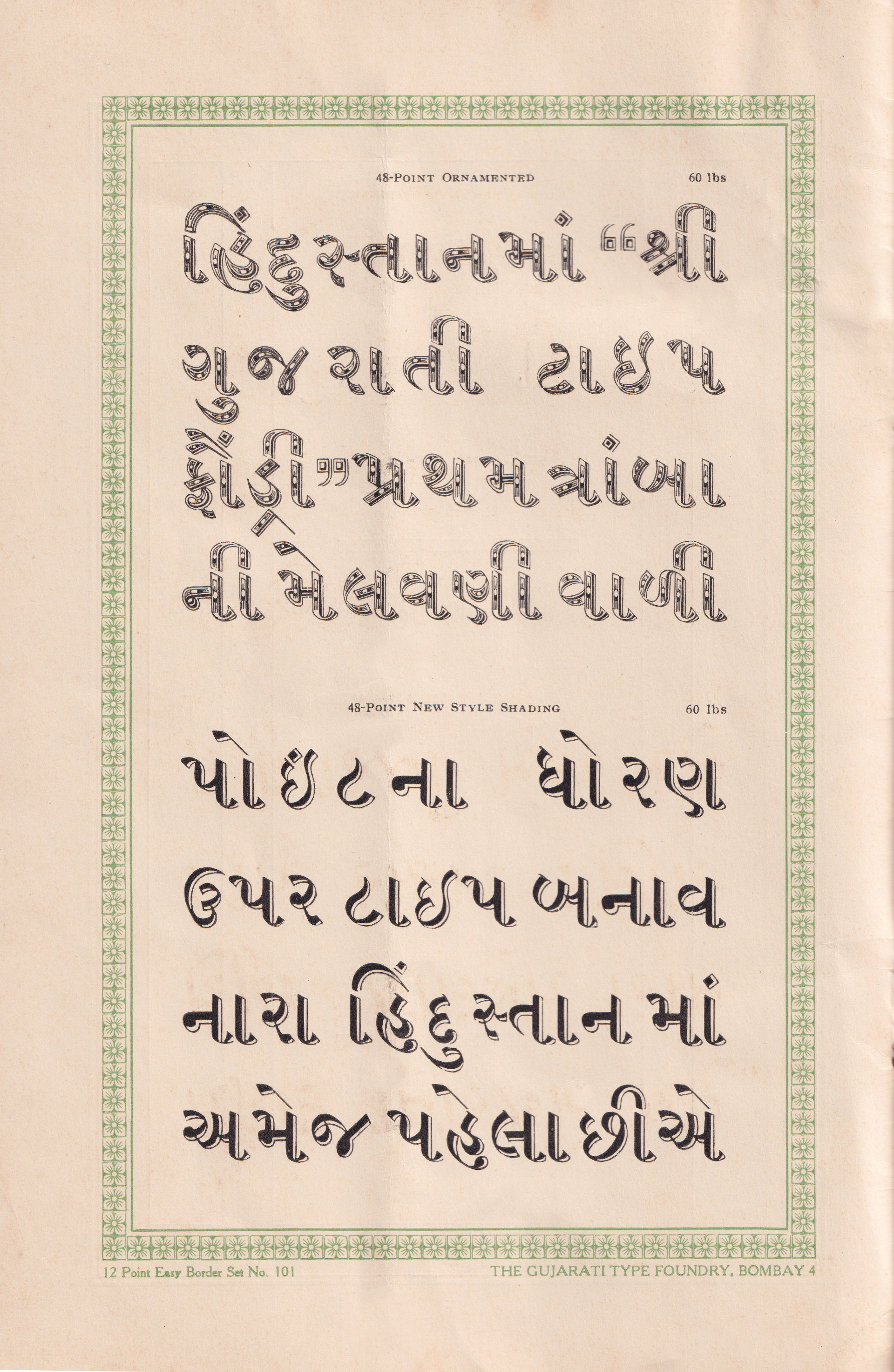
This kind of forward thinking extended to GTF’s designs as well. They were the first to design large Gujarati types at 60 points and larger, and also introduced Italic types in Devanagari and Gujarati which could be set with their upright designs.
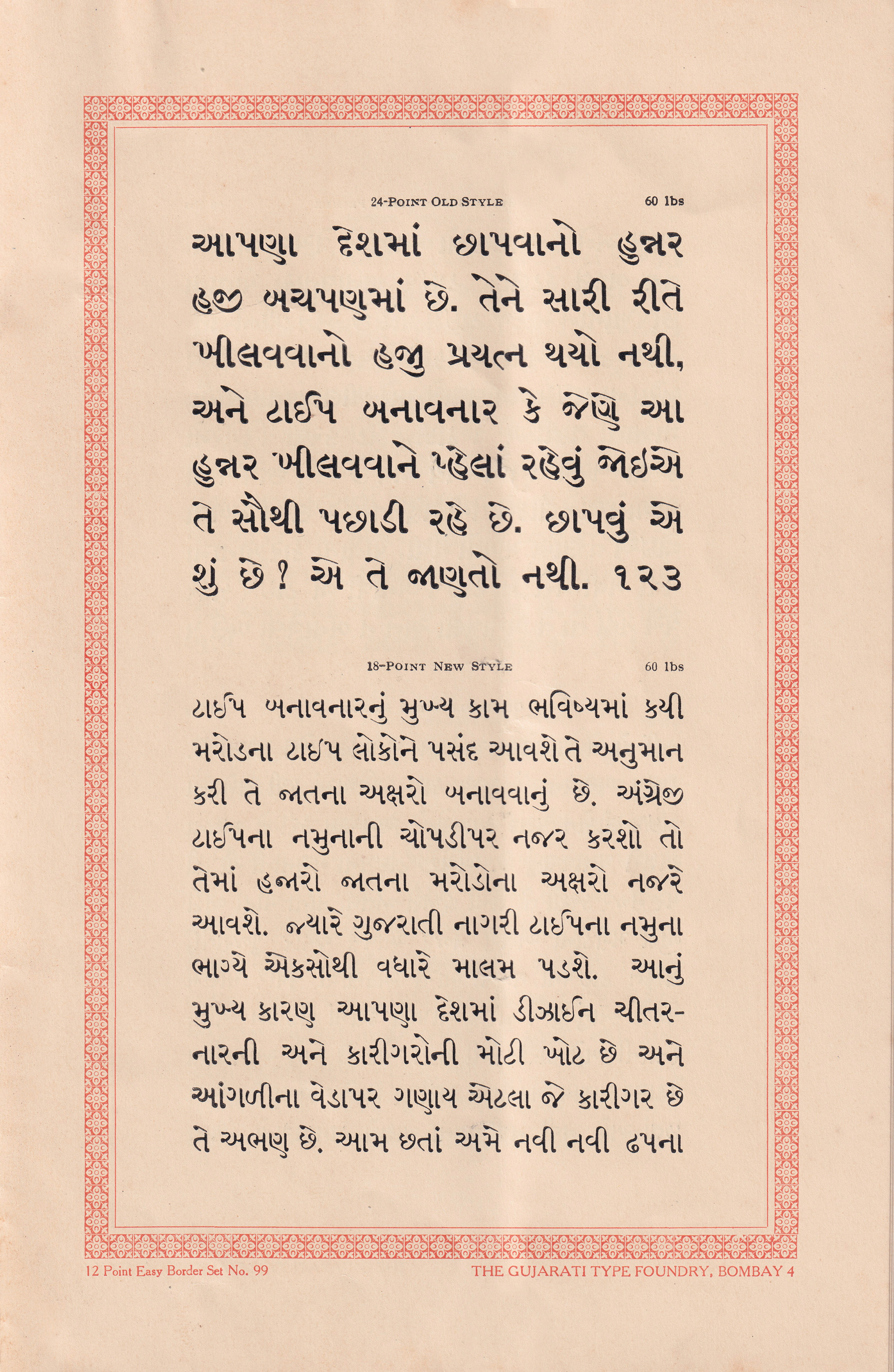
In comparison to thousands of designs of different sizes in English type specimens at the time, one would find only around a hundred designs in Gujarati and Nagari or Sanskrit specimens. According to GTF the main reason for this was the great loss of designers and craftsmen in the country; there were only so many craftsmen, many of whom were not knowledgeable enough. In addition to this some type-makers made type only for their own printing house and did not sell them, out of fear that others would copy them. Therefore the cost of making nails, hammering and fitting would be in vain, and the printer and the craftsman wouldn’t get the reward they deserved for their hard work.
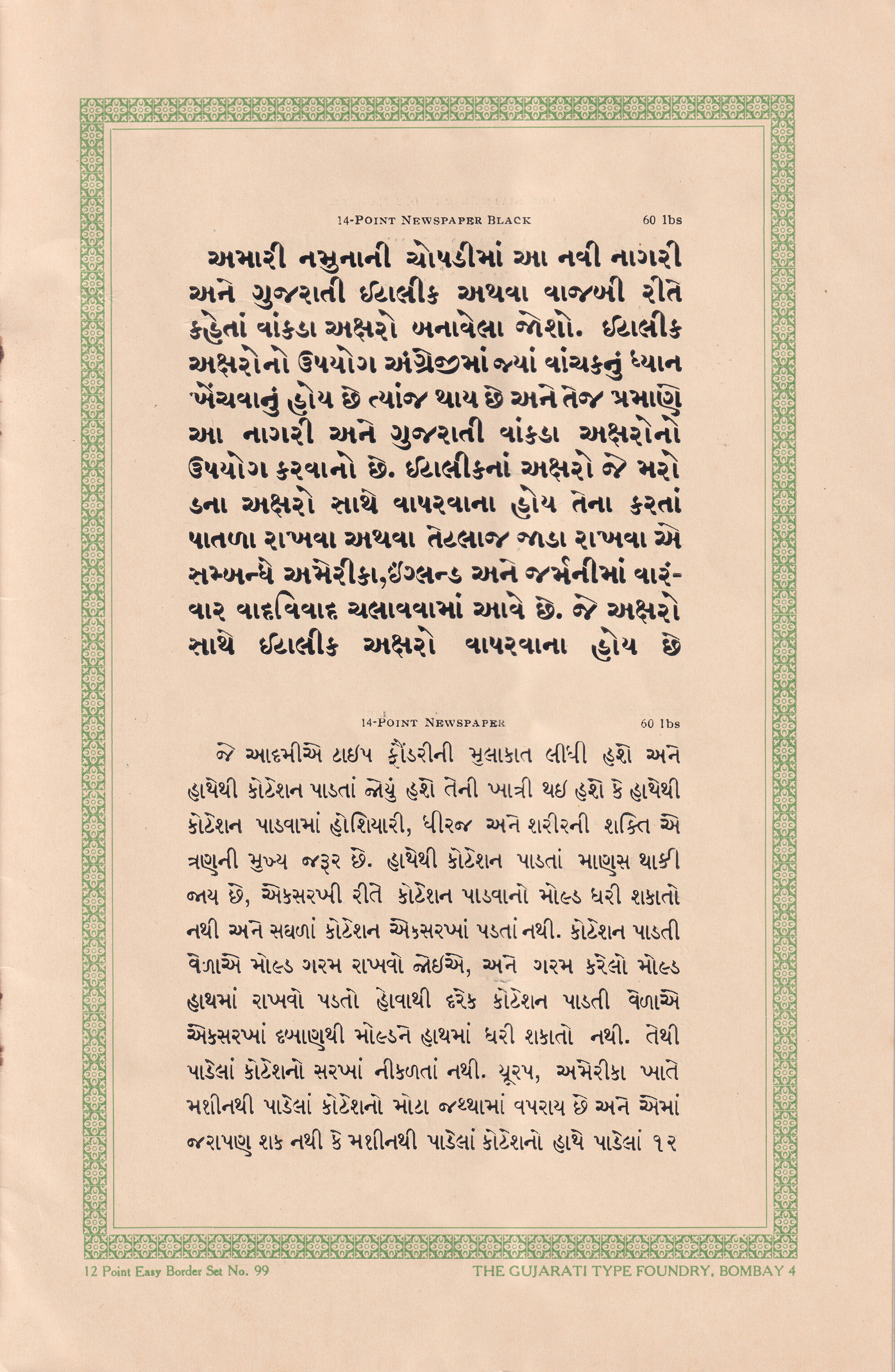
GTF believed that despite this they should continue to create and sell typefaces, and they strived to produce new designs of letters in their type specimens. As a result they introduced a new type specimen book with Sanskrit and Gujarati Italics or slanted characters to form Gujarati Italics. These italics, which were used in combination with uprights in the US, England and Germany, were often made to be thinner or thicker than the upright letters. As their use in English was to draw in the reader's attention, these Sanskrit and Gujarati italics were designed to work in the same way.
Observing the designs of the letters across the different styles, one can notice a few characteristic differences. The અ is constructed with a second loop in the larger italic sizes of 48, 36 and 24 points as opposed to the 12 point. The design without the second loop that’s included in the 12-point new style italic is incorporated in all the upright styles. Moving to the ઇ, it has a more defined curve in the 72 points as opposed to 60 points and below, where it retains a cut to the top right curve which removes the extra white space that would be created beneath. And overall, we can see a higher contrast in the larger sizes and the tails of the italics have a more prominent end curve that adds to its cursive character.
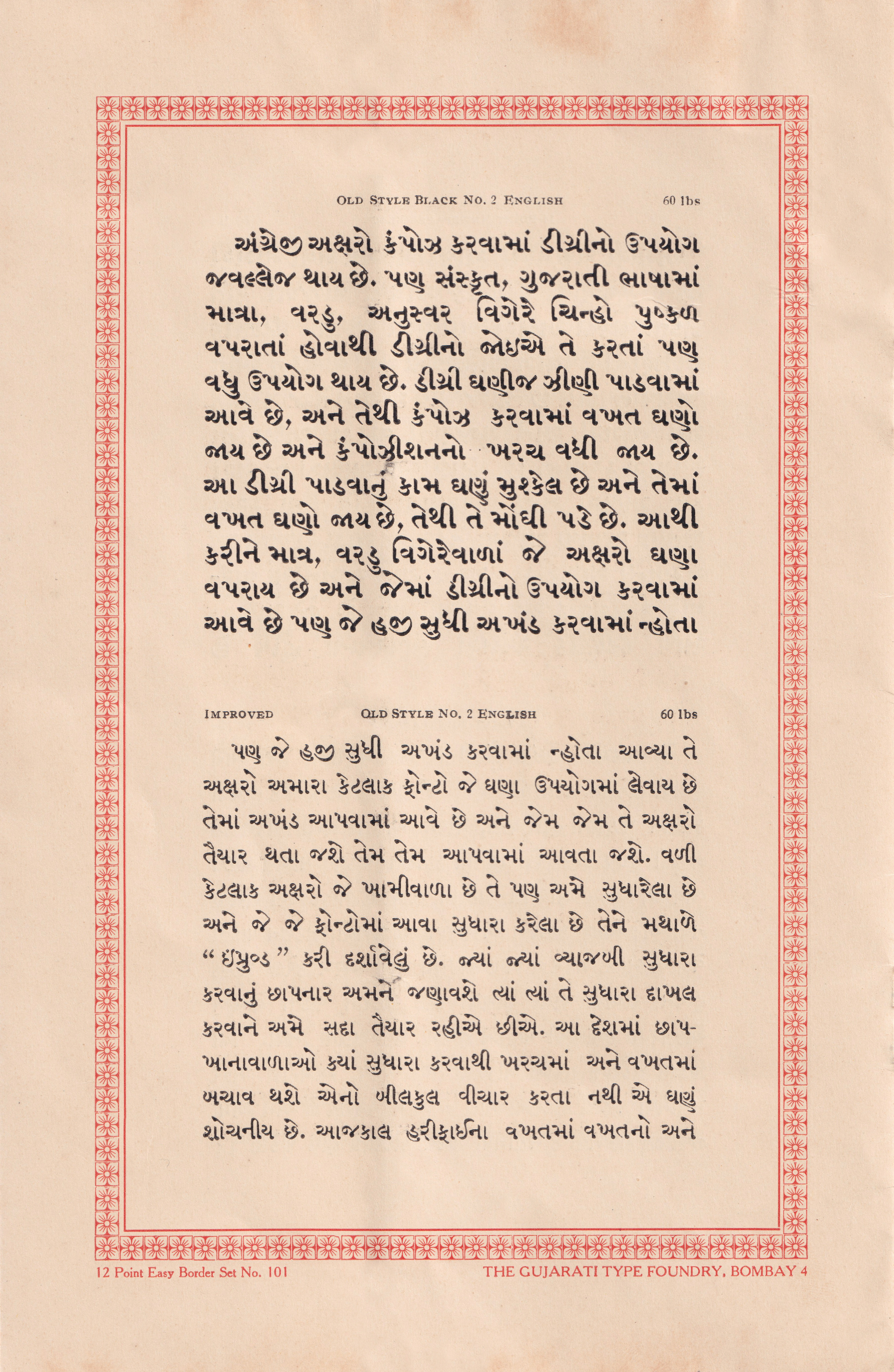
GTF used the degree system of composing letters, which worked well with Latin scripts. However, with the many above and below base signs such as matras, vardus and anusvars used in scripts such as Devanagari and Gujarati, they were prompted to adopt the akhand system. The gradual integration of akhands in their most used fonts reduced the time and cost of composition. The foundry also corrected some of the characters which were defective and the fonts which have such corrections are shown with Improved in the heading.
As well as overseas foundries,, GTF’s type designers were inspired by their contemporaries in Mumbai, including Jawaji Dadaji’s Type Foundry (JDTF). One can see similarities between the two foundry’s designs, though the Gujarati types from JDTF appear narrower with some characteristic differences, while the curves are more elaborate in GTF’s samples.
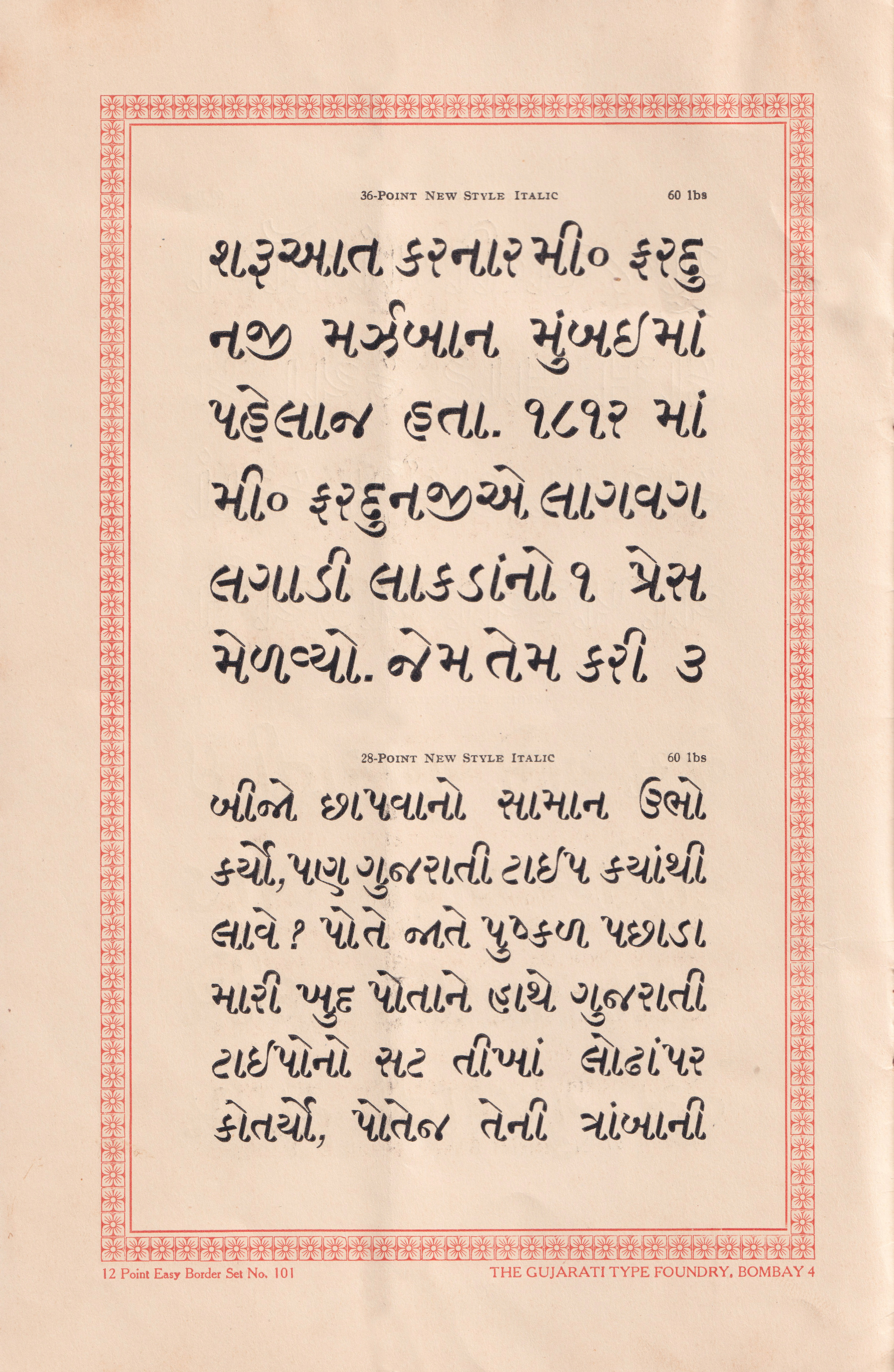
In the specimen we also learn that they were inspired by the history of Gujarati type development in the city. They give homage to Mr. Fardunji Marzban, who was the first to introduce Gujarati type in Mumbai by casting his own type. These types were used in the Bombay Samachar.
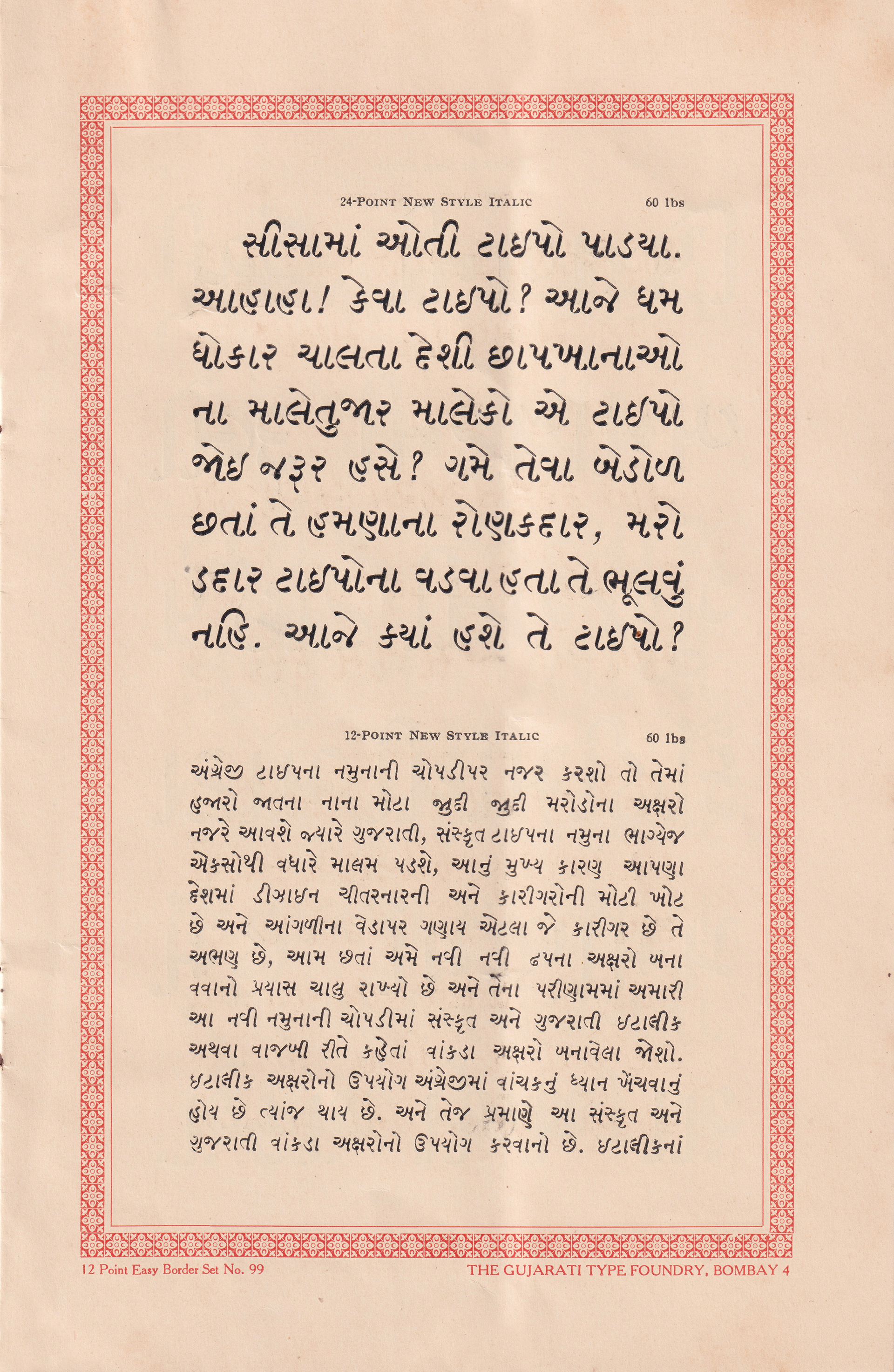
Such information educated readers about the type industry in the country, and especially in the city of Mumbai. The specimen mentions that the art of printing at the time in the country was still in its infancy. A type designer's main job was to anticipate which kinds of type people would like in the future and to create characters of that type. Beyond that they needed to understand the skill of printing as well.
GTF made prints by hand. The mould had to be kept warm during inking, and since the heated mould had to be held in the hand, it could not be applied with the same pressure during each inking. So the prints were not identical. In comparison, prints of large quantities were made by machines in Europe and America, which led them to be more uniform. Prints from the Gujarati Type Foundry were lighter in weight, good in appearance and had sharp edges on all four corners just like the type. For this reason they had specially designed their machines with the latest inventions and also offered printing from these machines.
In view of development and to keep up with competition the Gujarati Type Foundry was always ready to make reasonable amendments wherever the printer required them. They believed that the printers should keep in mind that resolving mistakes would save time and money. Their own ingenuity as well as determination to ensure the growth of type in India ensured their strength in the market and their place in creating some groundbreaking type that was used extensively back in the day before digital printing took over the industry.