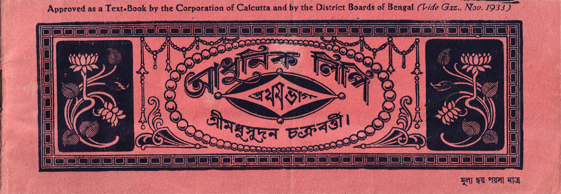
How it was made
The booklet appears to have been printed with woodcut or wood type, due to the wood grain texture and lines visible in some of the letters, as well as the relief marks left by the printing process. The use of metal type is unlikely: it’s rare to see metal type this big, and the different shapes for the same letters point to different carvings, rather than castings from the same mould.
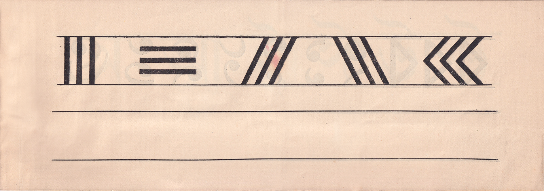
The lack of modulation in the straight practice strokes points to the potential use of type furniture, since a calligraphy pen would have left modulated marks.
Features of note
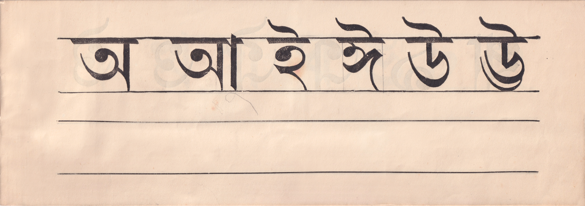
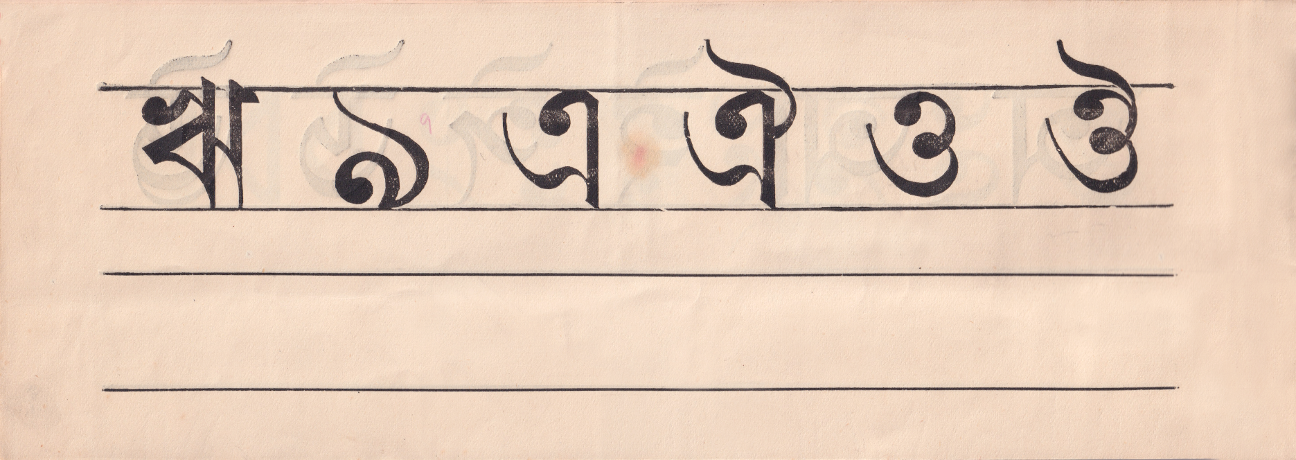
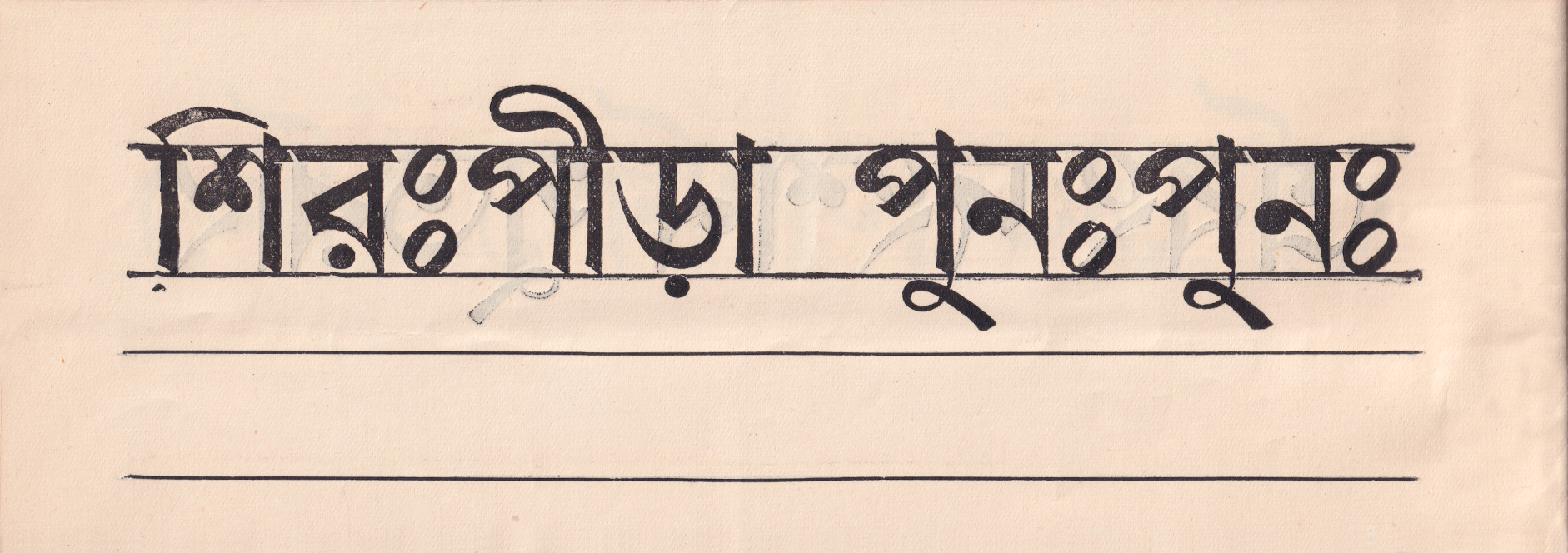
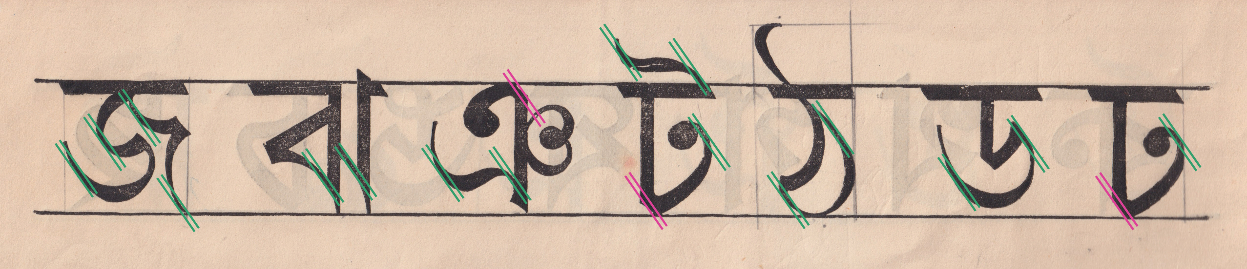
The horizontal proportions of the letterforms are quite even, with some of the wider characters appearing slightly compact. For example, the এ (e) and ঐ (ai) are narrower than usual, making use of a high hook to create enough space between the knot and the tip of the tail.
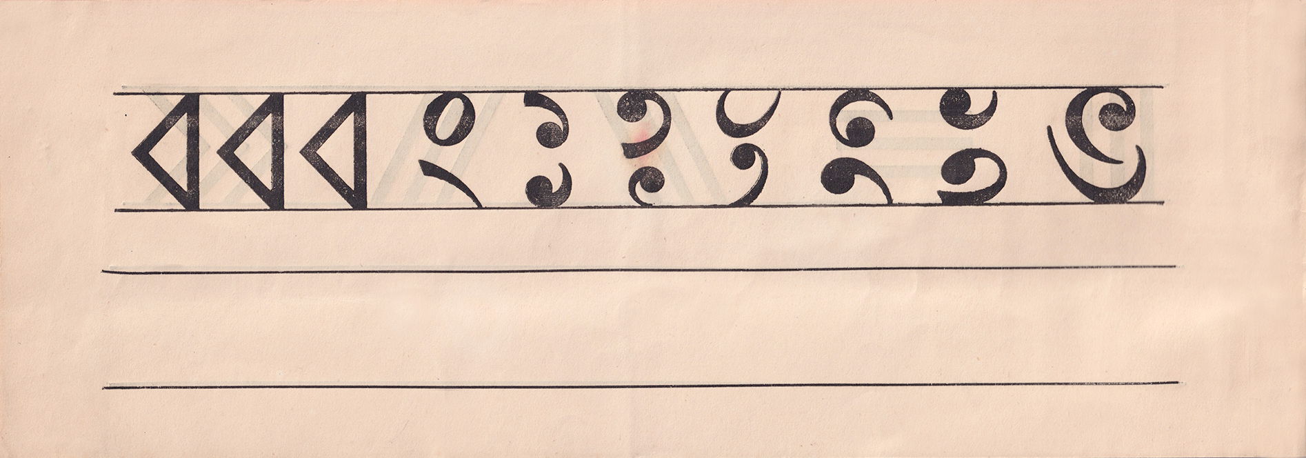
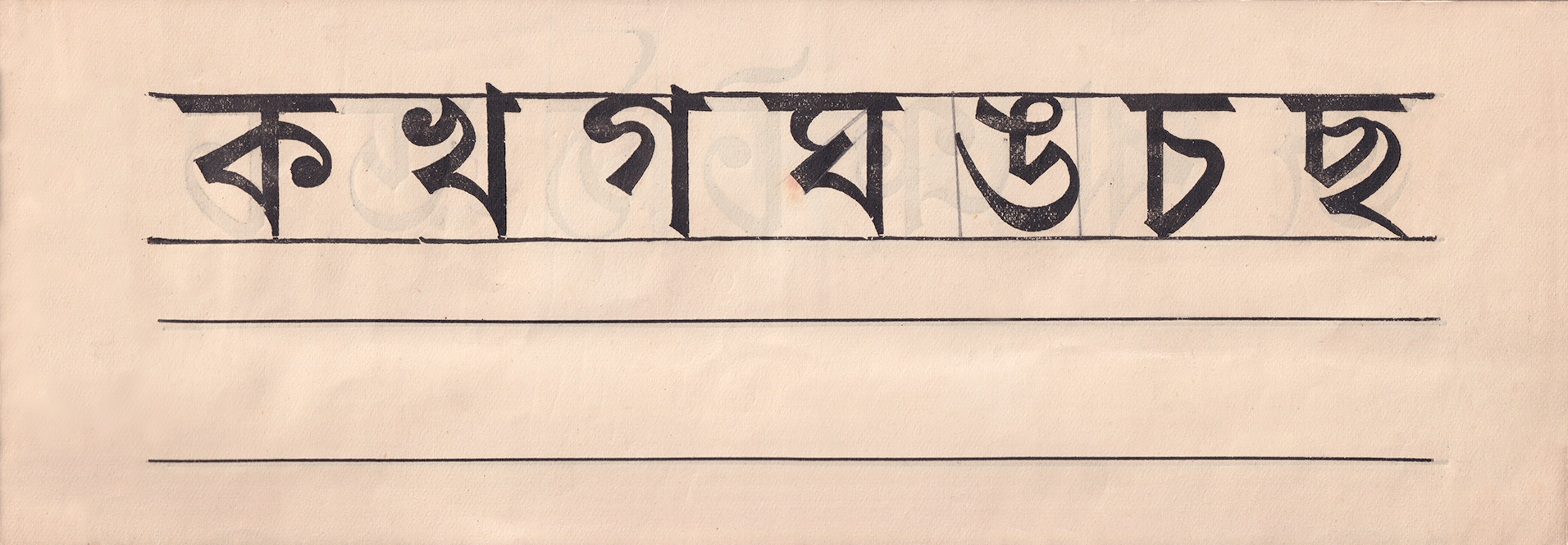
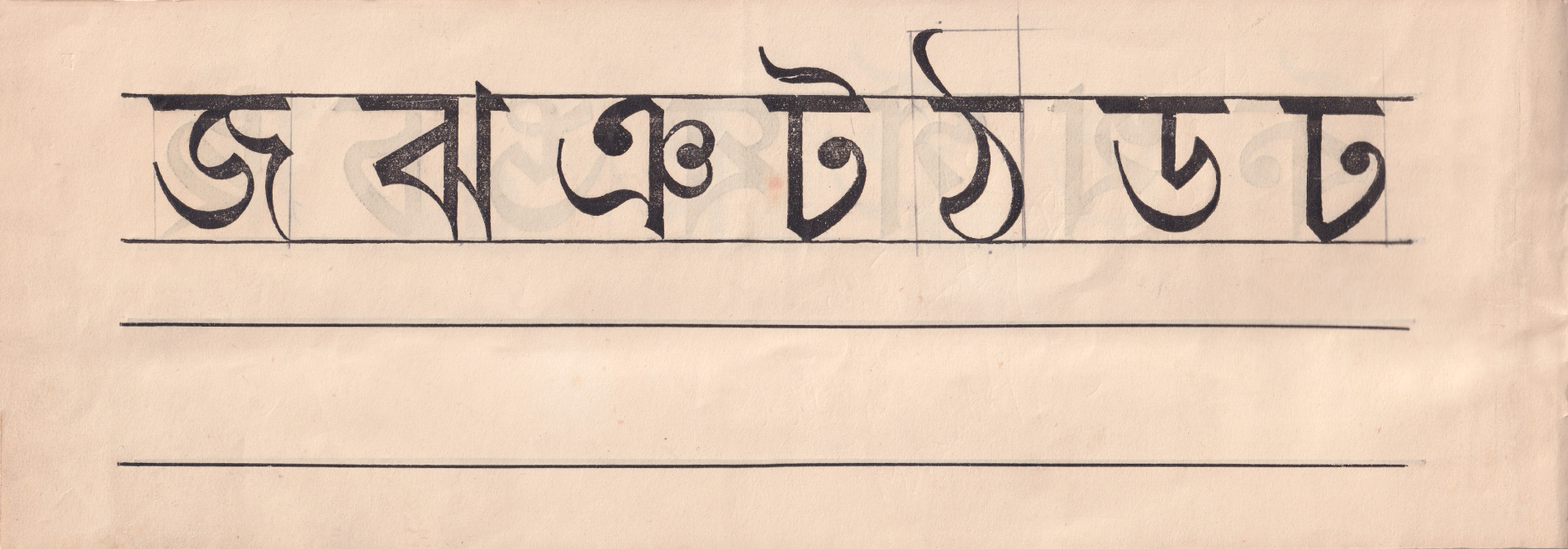
The triangular shapes, like ক (ka), ব (ba), য (ya), present a classical distribution of weight, with high connections, quick turns and sharp details. These features are shared with the tails (in এ, ঞ), flags (in ই, উ), and with the ি (short i matra), with its sharp hard turn, giving the letterforms their defined and assertive look.
This idea of definition carries over to letters like ঊ (uu) and ছ (cha), which make use of explicit separate strokes, rather than blending the strokes together, as is common in modern typefaces.
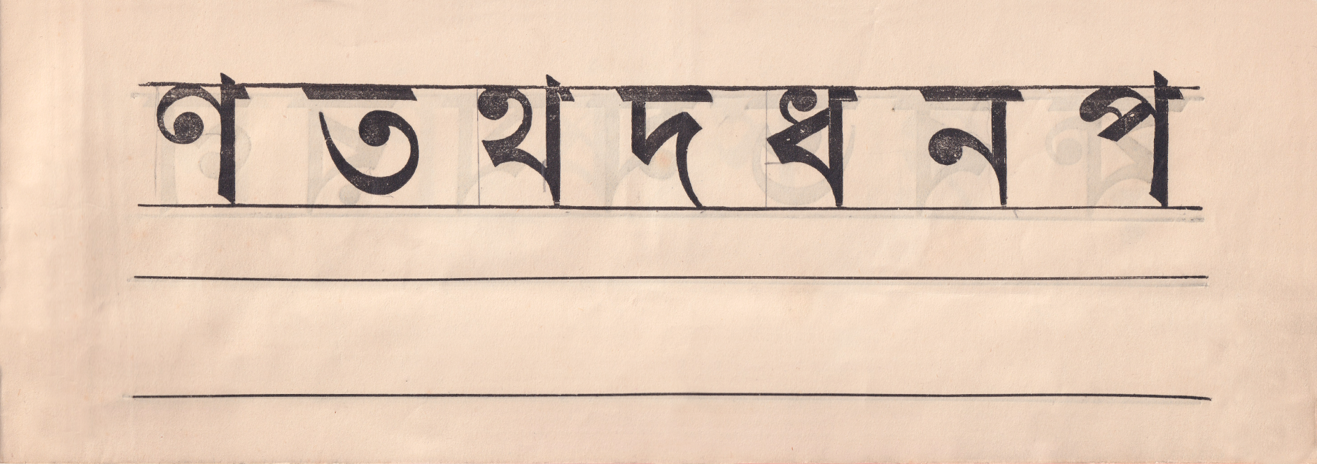
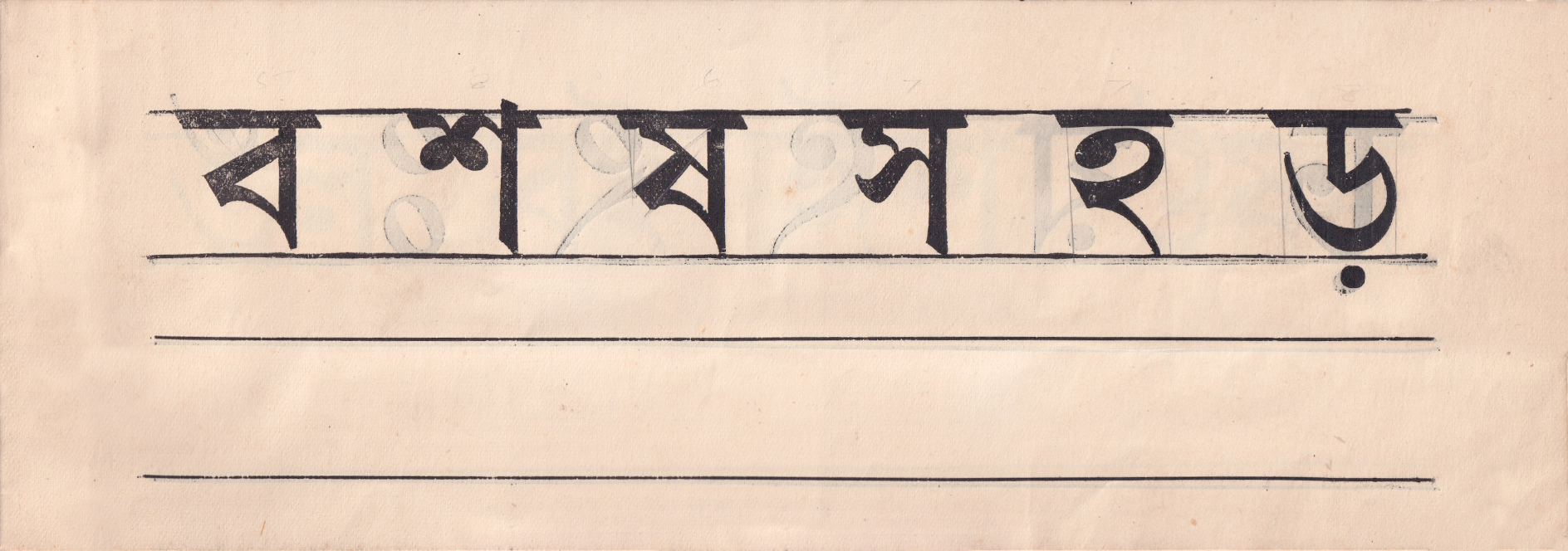
Some characters, like শ (sha), প (pa) and স (ssa), appear smaller and ‘high-waisted’ compared to the more generous proportions of modern typefaces, which sets them apart and gives them an interesting character.
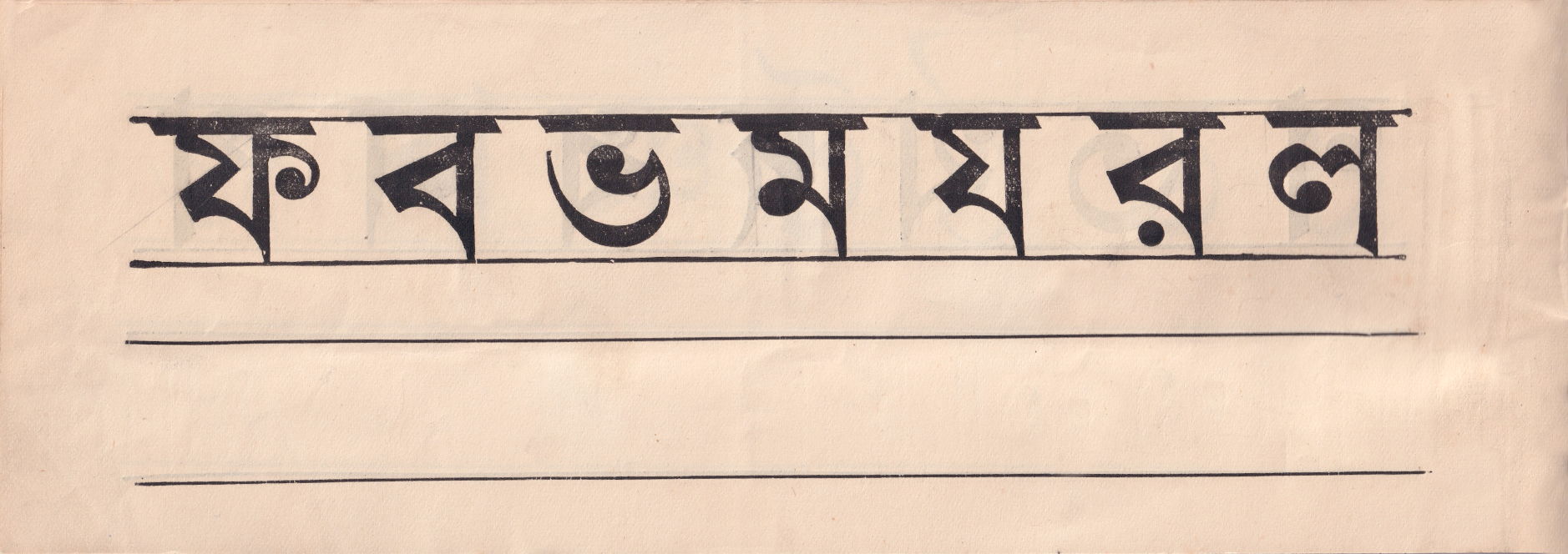
The design of ফ (pha) is also different from most typefaces we see today. Its middle vertical stroke rises all the way up the shirorekha, like the য (ya), instead of stopping shorter and leaving a gap between the arm and the shirorekha.
Design issues:
A few letterforms display some inconsistencies, especially when it comes to the distribution of weight.
Throughout the primer, the weight on the curved strokes (especially those related to ত (ta) ড (da)) tends to sit on the lower horizontal, rather than the lower-right diagonal, as would be more common and aligned with the indian reed pen.
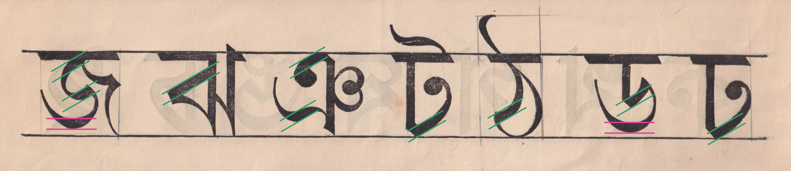
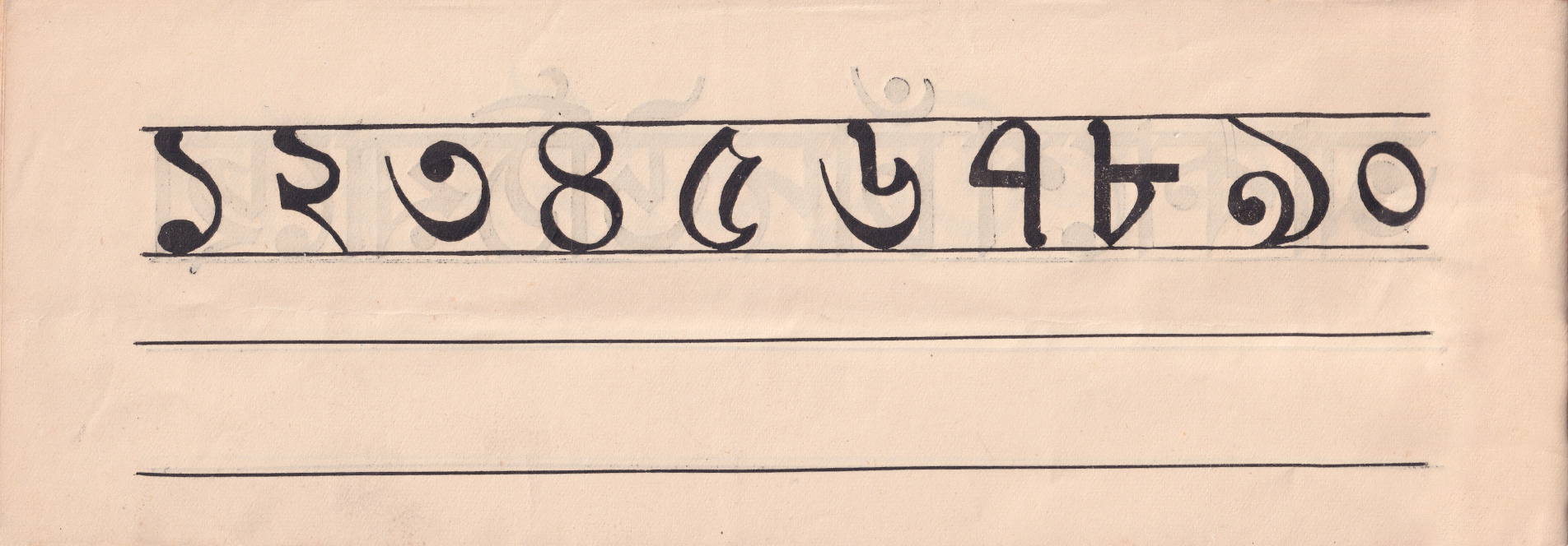
In particular, ঠ (ttha) appears too light. Its thicks and thins don’t match those of other letters, like its neighbour ড (dda). This feature is shared by number ৫ (five).
In fact, most numbers show inconsistent modulation, which would require extreme pen rotation. For example, ১ (one) and ৭ (seven) show an inconsistent pen angle, and the modulation of ৪ (four) and ০ (zero) is entirely opposite to the traditional indian reed pen.
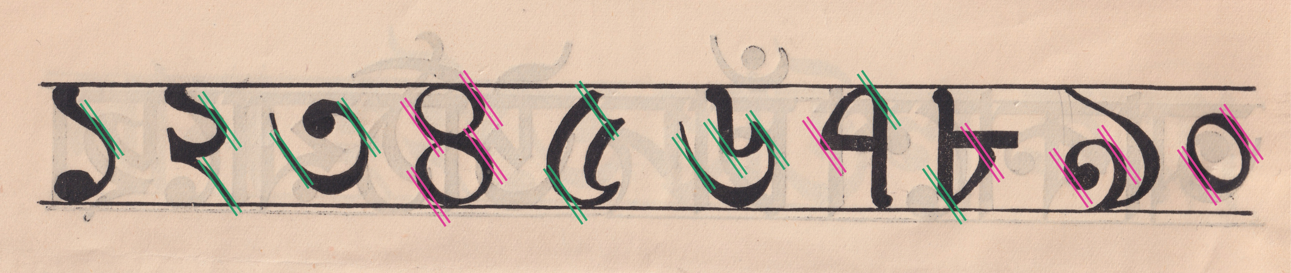
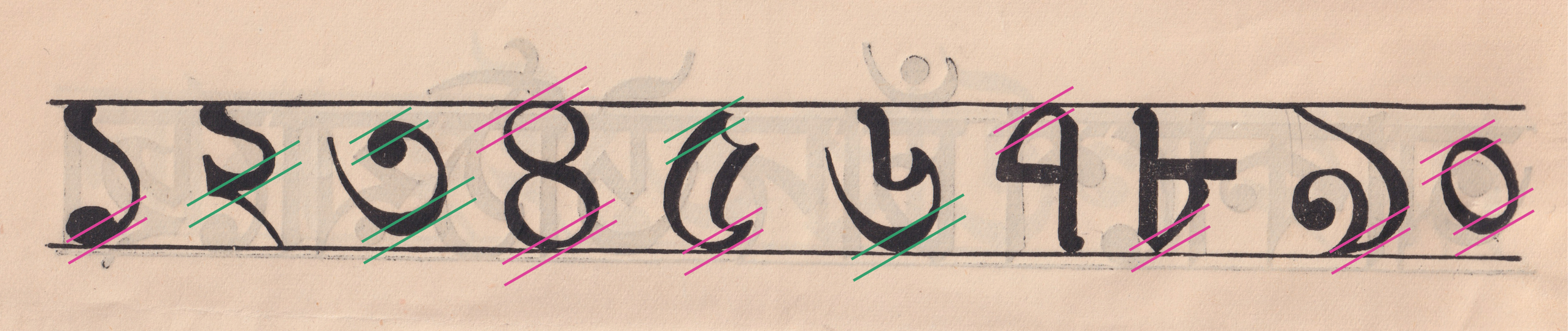
This inconsistency of modulation within the letterform is visible in other characters. ট (tta) has a very thick bottom-left corner, but a very thin top-right corner. According to the logic of the calligraphy pen, these two should be the same weight.
In conclusion
The idiosyncrasies that make this booklet interesting might work in the context of calligraphy, where there is a natural variation in proportions and pen rotation, and where two characters are never the same. But in order to use similar shapes in a typeface design, it would be necessary to iron out some of the inconsistencies especially when it comes to weight modulation. Otherwise, the resulting design would lead to uneven texture, and a jarring effect due to type’s inherent repetition of the same shapes. Calligraphy primers like this are an interesting source of inspiration for type design, but must always be approached with a critical eye.